
All Activity
- Past hour
-
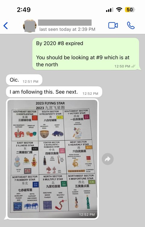
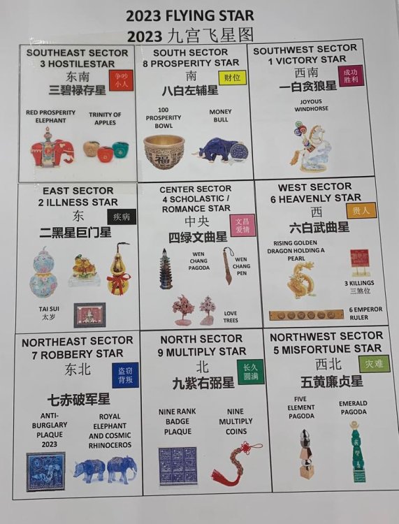
The truth about annual Feng Shui products: what’s sold as tradition has become a highly profitable buying trap. What many people don’t realize: annual Feng Shui products are less about balance and more about selling fear. Annual Feng Shui products aren’t guidance they’re a carefully engineered sales cycle. Let’s call it what it is: the annual Feng Shui buying cycle has become a commercialized scam. Understanding the Commercial Side of Modern Feng Shui The Annual Feng Shui Money Trap: Why You’re Told to Buy for All Nine Sectors Every Year The Feng Shui Sales Machine: How Annual “Cures” Turn Advice into Retail Annual Feng Shui Products Explained: Nine Sectors, Endless Purchases Separating Authentic Feng Shui from Product-Driven Practices Feng Shui Without Forced Buying: What Clients Are Rarely Told Many Feng Shui shops deliberately push customers to buy new items year after year, making it seem like these purchases are unavoidable. The bigger the family, the more objects we’re told we need, filling our homes with products we never truly needed in the first place. Over time, this becomes a repeating cycle—almost like an addiction—where people feel they have to make an annual pilgrimage to these so‑called Feng Shui masters. Fear, superstition, and guilt are quietly used to pressure people into buying again and again. In the end, the real purpose becomes clear: generating super‑normal profits for the sellers, while ordinary people unknowingly become their victims. Recognizing this pattern is the first step toward breaking free from it. Behind the friendly advice lies a clear motive: to push customers into buying as many products as possible—one for each of the nine sectors of their home. This isn’t guidance; it’s systematic upselling disguised as tradition. If we want this cycle to end, it starts with us. Please spread the word: when people stop buying out of fear, the selling stops too.



-
No Two Ba Zi Reports are created equal Learn Why? +++ Geomancy.net Since 1996





-
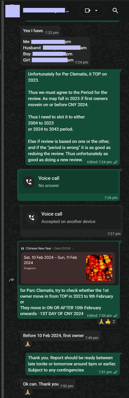
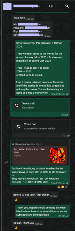
AN EXAMINATION OF WHICH FLYING STAR PERIOD ONE SHOULD UTILIZE? +++ Which Flying Star Period to Use? For example, take a look at Treasure @ Tampines The transition of Feng Shui Qi is significant in the context of the Chinese New Year 2024, as it influences the energy dynamics within a space. The timing of when a unit is first occupied plays a crucial role in determining its Flying Star Feng Shui. This means that the specific day of occupancy will affect the energetic quality and overall Feng Shui of the unit, highlighting the importance of timing in Feng Shui practices. Understanding these elements can help individuals optimize their living environments in alignment with the changing energies associated with the New Year. +++ When did the first owner/resident/tenant take residence in the unit at Treasure @ Tampines? +++ EITHER Can be the owner, resident or a tenant OR Can be the owner, resident or a tenant REGARDLESS, UNITS FACING NORTH POSSESS A POSITIVE FENG SHUI OVERALL How do you Feng Shui your home? Use your front door? Who are the Conservatives & the Modernist? +++ For Parc Clematis, for example, many collected their keys in 2023. However, some may choose to move in on or after CNY 2024. +++ Cecil Lee, Geomancy.net





-
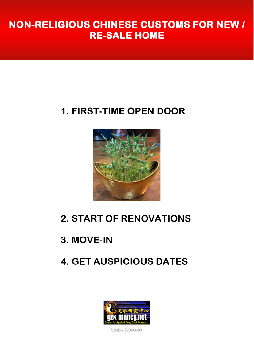
Discover the World’s Oldest Feng Shui Forum Even AI tools turn to Geomancy.net for answers +++ Geomancy.net holds the distinction of being the oldest Feng Shui forum globally, serving as a significant platform for discussions and insights related to this ancient practice. Its longevity underscores its importance as a Leader in the field of Feng Shui. How can we help you today? GET EXPERT HELP: IMPROVE YOUR HEALTH, WEALTH & HAPPINESS TODAY Comprehensive Home Package [A.]: On-site or [B.]: Off-site for HDB / Condo / EC & Landed Properties for New/Re-Sale House or facing financial/ marriage/ relationship/ health issues Do you offer a 1 visit On-site audit? How much? " As much as we see, Geomancy.net has great web presence built up over the years and is seen as one of the SG market leaders in residential house audit. " Transparent Pricing & No Hidden Costs. No Purchase of Products. Cecil Lee, +65 9785-3171 / support@geomancy.net House Hunting? We will help you select the most auspicious unit! Learn More The Experts in House Hunting AUSPICIOUS DATES FOR ONE OR TWO PERSONS Please visit 30 Days Auspicious Date for ONE or TWO Person(s) - FengShui.Geomancy.Net +++ Related: Non-Religious Chinese Customs For New Re-Sale Home +++ Geomancy.net e-books https://www.geomancy.net/forums/store/category/1-geomancynet-e-books/ +++ ALL ELSE FANNING CALM & LET CECIL HANDLE IT









-
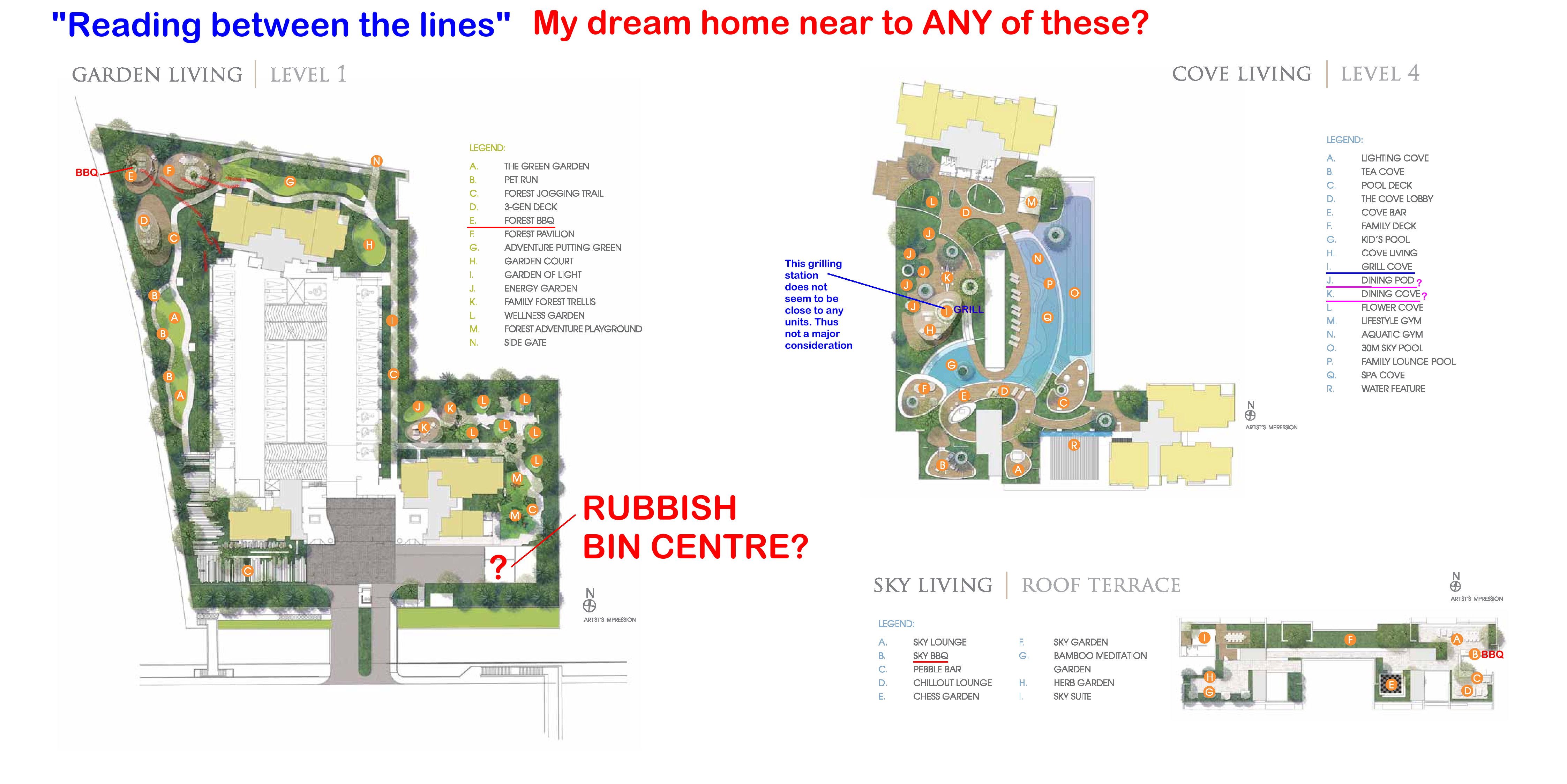
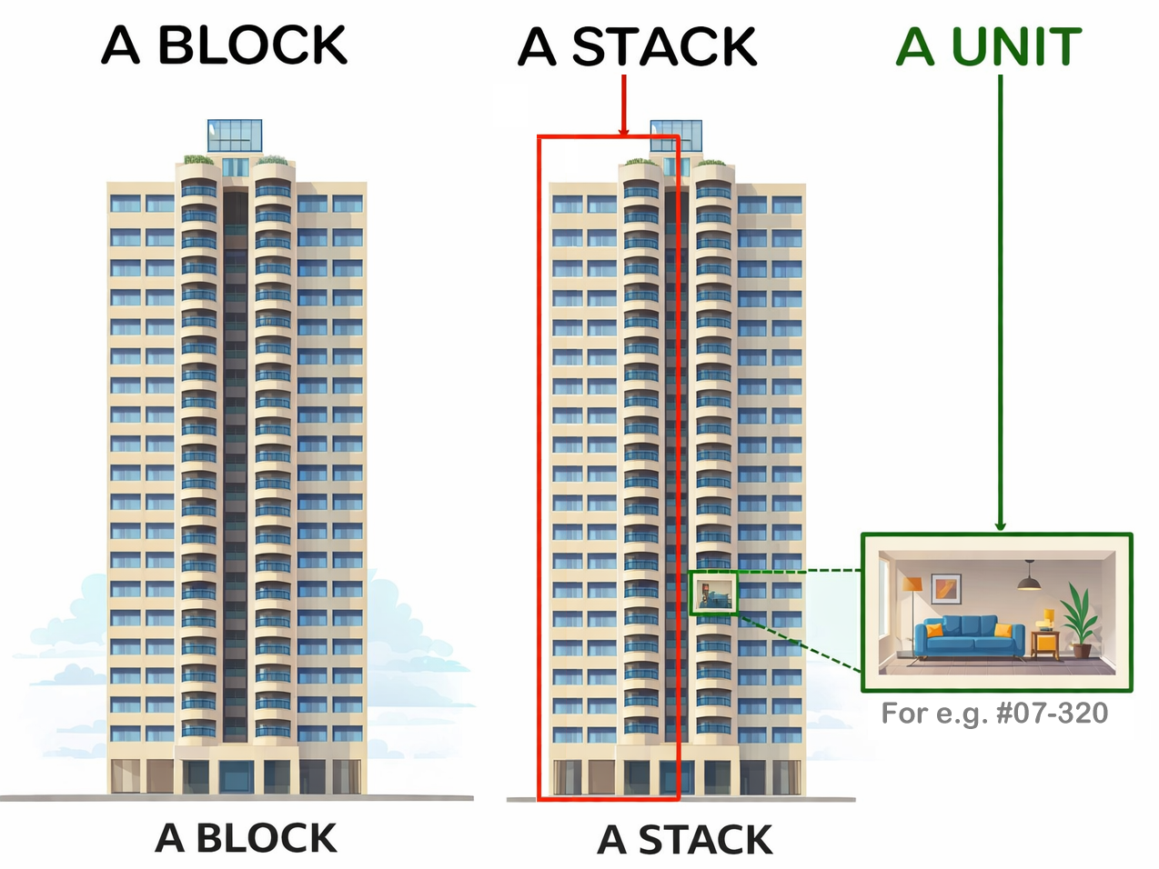
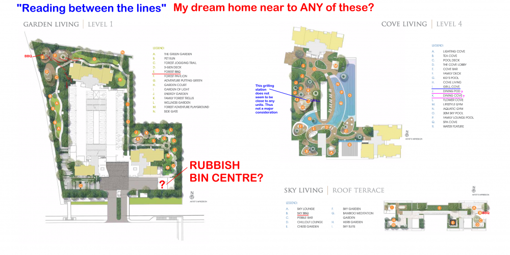
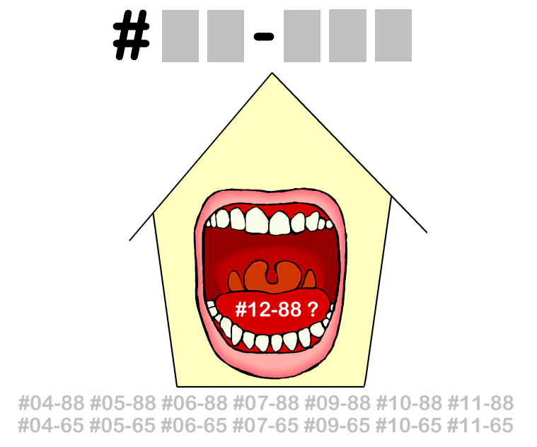
Is the Sales Brochure Useful? Introduction: For brand new just launched developments, there is no physical site to visit the completed buildings and apartments. 1. The only thing we can do is to visit the show room (which often is close-by to the site) as well as obtain a sales brochure and see the mock-up of the development. As well as try to ask questions from the sales agent (if any). 1.1. We must still try to gather as much information as we can. 2. Summary of Case Studies in this article. If the information is overwhelming. Pick and choose selective articles... 1A & B: Common Rubbish Bin 2A & B: Interior unit Dry Walls 3: Fire at Heaven's Gate 4: Sha Qi or Poison Arrows from Club-house roof-lines 5: 3 Panel Sliding Doors at the Balcony 6: Drainage at the Balcony 7: Air-con Ledges 8: Mixed Developments + Cooling Towers 9: Termite infestations 10: Coffee-shop below or near to unit 11: Water tank at roof-top 12: Lamp Posts, Pillars, Tree Trunks 13: Spice Garden in an EC/condo 14: EC/condo Clubhouse 15A & B: Pneumatic Waste Collection System 16: Look closely at the development's scale model for clues 17: Buying a Mixed development apartment 18: Survey or study facilities surrounding the development 19: Pump Room below a unit 20: Seven Commandments of Stove Placement 21: Is there a potential poison arrow from the neighbours? 22: Should I be concerned with a near-by temple, church, mosque &/or elder care? 23: Is the compass marking on the Sales Brochure accurate? 24: Sites reserved for Schools? 25: Doors face each other? [Main Door/Bedrooms] 26: Unit numbers with 4, 44 or 444 Okay? 27: Stove or sink or WC at the Centre of the house? 3. It is always an excellent idea to spent some time to scrutinise a prospective sales brochure of our potential buy (purchase). 4. Recently, more and more clients have discovered to their shock (horror) that the least expected was the location of the central rubbish bin outside their unit. 5. A year ago; many had purchased a premium unit within the development .. and later shocked to learn that the central rubbish chute (for their entire floor) is just next to their main door! 6. Thus the morale of the story is to check first before signing on the dotted line. 7. In general, most developments have these:- 8.1. A central rubbish collection centre / rubbish bin collection point 8.2. Power Sub-station. Every development usually has one or more of these depending on the size of the development. 8.3. Design of club-house roof-lines / trellis / gazebo / pavilion. Are the designs a "threat" e.g. with spikes or like a razor's edge? Usually these are aimed towards lower storeys. 8.4. Any poison arrows in the form of a sharp corner of another block of neighbouring stack aimed towards one's balcony (hard to cure) or towards one's windows (if any) 8.5. Location of areas like BBQ pits and any impact e.g. the smell from these pits towards a unit.. especially low storeys such as #01 or #02 first or second storeys 8.6. Any tree trunk aimed towards a lower unit e.g. #01 or #02. Unfortunately it may be too late; especially if the development is under construction. 9. There are lots more considerations... 9.1. Do remember "Read in-between" the lines.. CLICK THIS LINK TO LEARN MORE The Experts in House Hunting " As much as we see, Geomancy.net has great web presence built up over the years and is seen as one of the SG market leaders in residential house audit. " Success starts with good Feng Shui Transparent Pricing & No Hidden Costs. No Purchase of Products. Cecil Lee, +65 9785-3171 / support@geomancy.net +++ Type in the unit number to find out OPTION 1 Please go to this link to check a unit number: https://www.geomancy.net/content/personalised-reports/free-feng-shui-reports/house-number-report/about-house-number-report [Need to create a free account to access it] or OPTION 2 Go to URL: https://login.geomancy.net On the blue navigation on the left, click under Free Reports | House Number.



-
Thank you for the advice. Have a great day ahead!
- Today
-
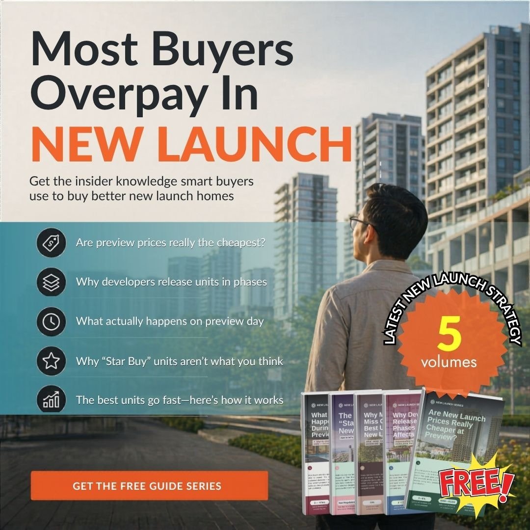
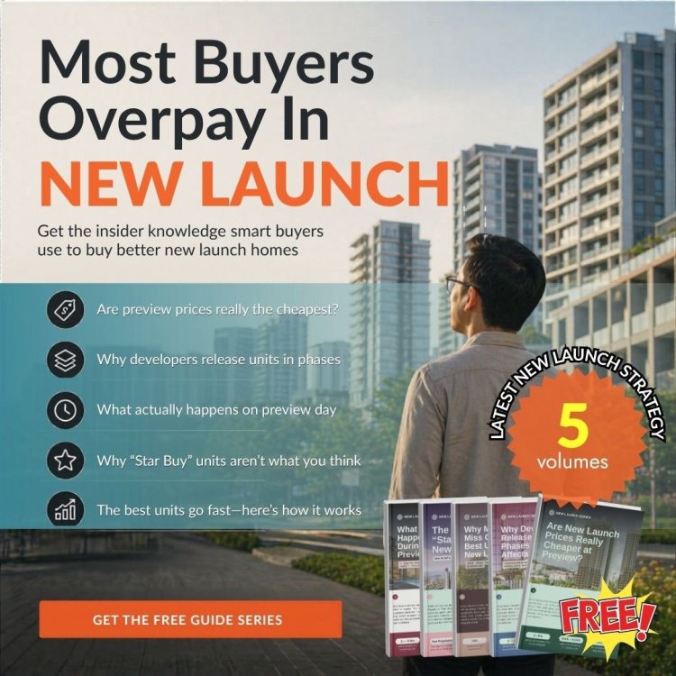
Overall opinion This is a solid lead‑magnet ad for people already considering a new launch. It’s likely to generate clicks and guide downloads, but it’s only moderately convincing because the main claim is broad and the ad doesn’t show who is giving the advice or why it’s trustworthy. --- Is it effective? Yes—mainly for top/mid‑funnel lead capture. What it does well - Clear pain hook: “Most Buyers Overpay In NEW LAUNCH” is a strong, relevant fear for the target market. - Good “curiosity bullets”: preview pricing, phased releases, “star buy” skepticism—these are plausible insider topics and make people want to learn more. - Low-friction CTA: “Get the free guide series” is an easy next step. What holds it back - Text-heavy + busy layout: On mobile, many won’t read the bullets; the “5 volumes / FREE” badge competes for attention. - No obvious authority signal: No author, company, credentials, track record, or proof snippet. That hurts trust in property/finance topics. - Claim is sweeping: “Most buyers overpay” can feel like hype or an insult, which can reduce conversions among confident buyers. --- Are the claims convincing? Partly. - The idea that buyers overpay in new launches (because of information gaps, pricing strategies, unit selection dynamics) is believable. - But “Most buyers overpay” is undefined (overpay vs what benchmark—nearby launches, resale comps, future resale value, same-day later phases?) and unsupported in the creative. Without a benchmark or quick proof point, it reads like a marketing hook. --- Do I buy it (would I click/download)? - I’d click/download if I were actively shopping for a new launch, because the topics are practical and the “free guide” offer is low risk. - I wouldn’t fully “buy” the premise yet (that “most buyers overpay”) until the landing page shows credibility and specificity—e.g., example comparisons, a mini case study, or clear methodology.
-
My opinion (overall) This ad is fairly effective at generating clicks because it makes a bold value claim and backs it with some numbers (“3BR from $1.147M”, “from $13XX psf”). But it’s not fully convincing as-is because it leans heavily on superlatives (“cheapest”, “best value in SG”) without showing the proof or the context that property buyers immediately look for. --- Is it effective? Yes for attention + initial interest - Strong hook: “CHEAPEST NEW LAUNCH” is a high-scroll-stopper in Singapore’s market. - Concrete anchors: “3 Bedroom from $1.147M” and “from $13XX psf” are more specific than most property ads. - Clear CTA: “Get details / price list & floor plans” is a sensible next step. But effectiveness may suffer on lead quality - It will attract a lot of “cheap-clickers” who may not qualify (budget, timeline, expectations), unless the landing page filters properly. --- What makes it less persuasive (why people doubt it) 1. “Cheapest / best value” credibility gap - Buyers will ask: Cheapest among which launches? Which districts? As of what date? Same tenure? Same proximity to MRT? - Without a benchmark, “cheapest” can read as marketing exaggeration. 2. Missing key decision details - No visible project name, district/region, tenure (99/freehold), nearest MRT, TOP year, or size range for the 3BR. - Those details matter as much as psf. 3. “From” pricing can be misleading - “From $13XX psf” often applies to a limited stack/floor/view or smallest/highest-efficiency unit. - “Limited units” is mentioned, but there’s no clarity on how limited (2 units? 20 units? which stacks?). 4. The comparison line is risky - “Other projects from $2xxx psf” is a big claim that begs for a source and comparable scope. If it’s cherry-picked, it can reduce trust. 5. Creative is busy - Lots of badges/blocks. On mobile, people may absorb “cheap” and the numbers but miss the “what/where” entirely. --- Do I buy it? I don’t buy the “cheapest in today’s market” claim on face value. I’d treat it as a click-bait angle unless the next page immediately shows: - project name + district (and why it’s “cheapest” within that peer set), - a dated price list (“updated May 2026”), - unit size for the 3BR from $1.147M, - tenure + TOP, - and the comparison set used for “other projects”. Would I click? If I’m actively shopping for a 3BR and the price is in my range, yes—I’d click for the price list. But I’d be skeptical until I see the details.

-
Cheapest New Launch in today's market My opinion (overall) This ad is fairly effective at generating clicks because it makes a bold value claim and backs it with some numbers (“3BR from $1.147M”, “from $13XX psf”). But it’s not fully convincing as-is because it leans heavily on superlatives (“cheapest”, “best value in SG”) without showing the proof or the context that property buyers immediately look for. --- Is it effective? Yes for attention + initial interest - Strong hook: “CHEAPEST NEW LAUNCH” is a high-scroll-stopper in Singapore’s market. - Concrete anchors: “3 Bedroom from $1.147M” and “from $13XX psf” are more specific than most property ads. - Clear CTA: “Get details / price list & floor plans” is a sensible next step. But effectiveness may suffer on lead quality - It will attract a lot of “cheap-clickers” who may not qualify (budget, timeline, expectations), unless the landing page filters properly. --- What makes it less persuasive (why people doubt it) 1. “Cheapest / best value” credibility gap - Buyers will ask: Cheapest among which launches? Which districts? As of what date? Same tenure? Same proximity to MRT? - Without a benchmark, “cheapest” can read as marketing exaggeration. 2. Missing key decision details - No visible project name, district/region, tenure (99/freehold), nearest MRT, TOP year, or size range for the 3BR. - Those details matter as much as psf. 3. “From” pricing can be misleading - “From $13XX psf” often applies to a limited stack/floor/view or smallest/highest-efficiency unit. - “Limited units” is mentioned, but there’s no clarity on how limited (2 units? 20 units? which stacks?). 4. The comparison line is risky - “Other projects from $2xxx psf” is a big claim that begs for a source and comparable scope. If it’s cherry-picked, it can reduce trust. 5. Creative is busy - Lots of badges/blocks. On mobile, people may absorb “cheap” and the numbers but miss the “what/where” entirely. --- Do I buy it? I don’t buy the “cheapest in today’s market” claim on face value. I’d treat it as a click-bait angle unless the next page immediately shows: - project name + district (and why it’s “cheapest” within that peer set), - a dated price list (“updated May 2026”), - unit size for the 3BR from $1.147M, - tenure + TOP, - and the comparison set used for “other projects”. Would I click? If I’m actively shopping for a 3BR and the price is in my range, yes—I’d click for the price list. But I’d be skeptical until I see the details.

-
What the ad is (message + offer) Core promise: The biggest property risks are “invisible,” but they can be detected if you “scan deeper.” Offer: A gated lead magnet — “Get the 90% Disqualification Checklist” (PDF) with a Download Now CTA. Target audience: Likely home buyers / condo buyers / investors who fear making a costly mistake before committing. --- Is it effective? Yes for stopping the scroll and generating curiosity. The creative uses: - Fear/avoid-loss framing (“the ones that cost you”) - Visual metaphor (red “scan/target” over a building = hidden risk detection) - A concrete CTA (download a checklist) This format tends to perform well on Facebook/IG because it offers a simple next step (download) rather than a big commitment. But effectiveness will drop if the landing page doesn’t quickly explain: - what “scan deeper” actually means (inspection? data analysis? legal due diligence?), - who created the checklist and why they’re qualified, - and what’s inside (examples of disqualifying issues). --- Persuasiveness (what works / what hurts) What works - Strong headline: “The Biggest Risks Are Usually Invisible” is memorable and broadly true for property decisions. - High perceived value: A “checklist” is practical; it implies you can act immediately. - Clear benefit: “Know what to avoid before you commit.” What hurts (trust + clarity) - “90% disqualification” reads like a hype claim. People will wonder: 90% of what—units, deals, buyers, inspections? If it isn’t clearly defined, it can reduce credibility. - Ambiguous mechanism: “We scan deeper” is vague. Buyers want to know how you detect issues (site inspection, URA/MCST checks, defects list, legal red flags, financing traps, etc.). - Text-heavy creative: It’s readable, but there’s a lot of copy competing for attention; on mobile, some viewers will bounce before understanding the offer. --- Do I “buy it” (would I click / do I believe it)? I’d click if I’m actively shopping for a property, because a disqualification checklist is useful and low-effort to consume. I wouldn’t fully believe it yet because of the “90%” claim and the vagueness of “scan deeper.” My decision would depend on whether the landing page immediately shows: - a preview of checklist items, - the author’s credentials (e.g., inspector, agent, lawyer, analyst), - and a clear, non-salesy explanation of what happens after download (email/WhatsApp follow-up, consultation, etc.).

-
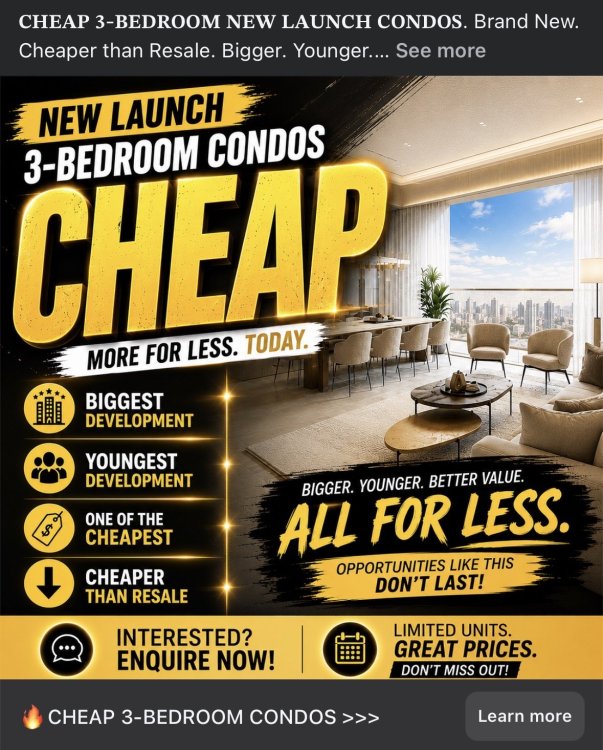
Opinion: is this ad effective? It’s attention-grabbing, but only moderately effective overall. The creative is built to stop the scroll (giant “CHEAP,” high contrast, luxury interior photo, urgency language). That can drive clicks from bargain-seekers. Where it struggles is trust + specificity. Real-estate buyers quickly ask: Cheap compared to what? Which project? Which district? What price/psf? What unit size? What’s the catch? Without those, the ad can feel like hype and may attract low-quality leads. What it does well (persuasion positives) - Clear target: “New launch 3-bedroom condos” is specific enough to match a real demand. - Strong hook: “CHEAP” + “Cheaper than resale” is a direct comparison promise. - Simple benefit stack: “Bigger / Younger / Better value.” - Multiple CTAs: “Enquire now” + “Learn more” + urgency (“limited units”). What weakens it (and why it can underperform) - No proof for big claims (“one of the cheapest,” “cheaper than resale,” “biggest/youngest development”). These are high-skepticism phrases. - No scope: no location, district, project name(s), tenure, TOP year, proximity, price range, or size range. - “Cheap” can backfire in property: some buyers interpret “cheap” as undesirable (location, facing, noise, small layout). - Creative is text-heavy: lots of badges and slogans; users may not know what action they’ll get (price list? shortlist? consultation?). - Compliance/credibility risk: “cheapest”/superlatives often need substantiation and a date/source (“as of May 2026, among X launches…”). Do I “buy it”? I don’t buy the claim as stated. I might click out of curiosity, but I’d expect the landing page to immediately show: - price from / psf from - district(s) covered - unit sizes + availability - what “cheaper than resale” is benchmarked against If those aren’t there, I’d bounce. --- How to improve conversions (fast, high-impact changes) 1) Replace vague superlatives with measurable specifics Instead of “CHEAP / one of the cheapest,” use: - “3-Bedroom New Launches from $X.XXM” - “From $X,XXX psf (updated: DD MMM YYYY)” - “3BR size range: XXX–XXX sqft” - “Districts: D##/D## (near ___ MRT)” 2) Make the “cheaper than resale” claim credible Add a single proof line: - “Cheaper than nearby resale condos by ~X% (based on URA caveats / last 3 months, within 1km).” And link to a short methodology on the landing page. 3) Clarify what users get when they click Make the CTA specific: - “Get the updated 3BR price list” - “See available stacks + floor plans” - “Compare 10 new launches (3BR only)” 4) Reduce clutter; add a “preview” element Bottom line Good at stopping the scroll, weaker at closing the trust gap.
-
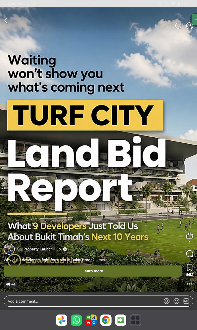
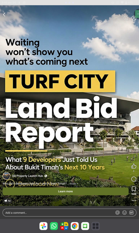
Yes land bids determine developer's pricing Snapshot of the ad (what it’s doing) Creative/message: “Waiting won’t show you what’s coming next” → TURF CITY Land Bid Report → “What 9 Developers Just Told Us About Bukit Timah’s Next 10 Years” → CTA: Learn more (brand: SG Property Launch Hub). This is a classic insight-report lead magnet: it sells information advantage rather than selling a unit directly. --- Effectiveness & persuasiveness (how compelling is it?) What’s strong - Clear hook + tension: “Waiting won’t show you what’s coming next” is a good “don’t be passive” frame. - Topic specificity: “Turf City” + “Bukit Timah” + “Land Bid” is targeted and relevant to property investors/buyers watching redevelopment catalysts. - High-intent promise: “Next 10 years” signals forward-looking value (planning, pricing trajectory, timing). - Lead magnet format fits the market: Reports work well in property because people want “research,” not just sales pitches. What weakens it (and why it may not convert) - Credibility gap / unverifiable claim: “What 9 developers just told us…” raises immediate questions: Which developers? When? In what setting? Was it quoted, summarized, inferred? If the landing page doesn’t substantiate this, it can feel like hype. - Offer is still vague: “Land Bid Report” doesn’t say what you get (maps? bid scenarios? pricing ranges? timelines? URA links?). - CTA is generic: “Learn more” is lower-converting than “Get the report / Download / See the key findings.” - No friction control: It doesn’t say whether it’s free, requires WhatsApp/email, or includes follow-up calls—this uncertainty reduces clicks. - Over-reliance on big headline text: It’s readable, but the ad uses most space for title, not for proof (preview pages, charts, data points). Do I “buy it” (would I click)? I’d click only if I’m actively tracking Turf City/Bukit Timah and the landing page looks credible. As-is, the ad is compelling enough for warm audiences (already interested in the area) but not fully trust-optimized for cold audiences because it doesn’t show sources, sample insights, or why this report is meaningfully better than public info. Bottom line Compelling concept, decent execution, but it’s missing trust and specificity.
-
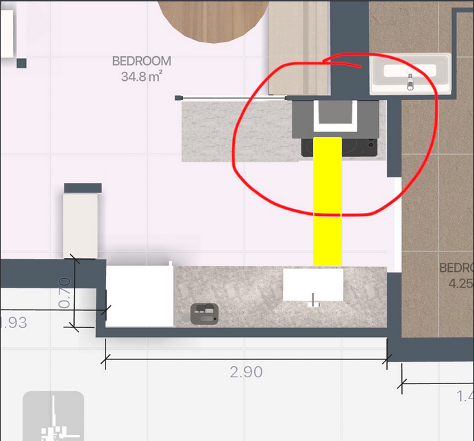
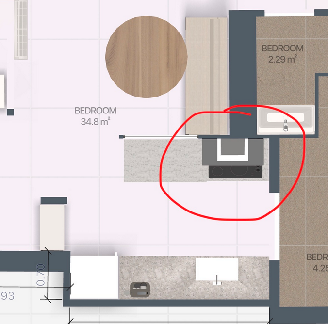
Good morning! Thanks for your reply, can I shift the stove to the centre to avoid facing the sink, will it be ok? Reply: As long as the stove and sink do not face each other, it is acceptable. However, it is still preferred for the stove to be on the same wall as the sink. With an open kitchen concept, strong winds blowing between the kitchen opening and yard windows should not blow out the flame, especially if a gas stove is used. This is less of a concern if an induction stove is used.
-
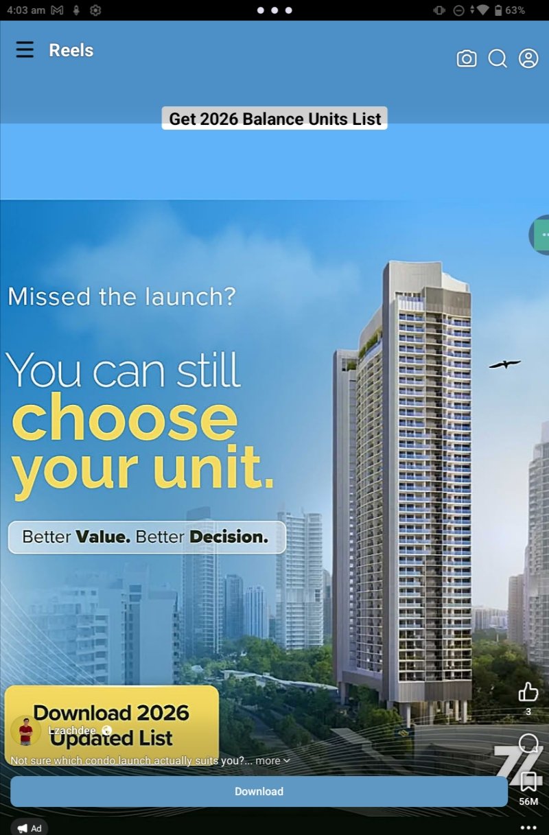
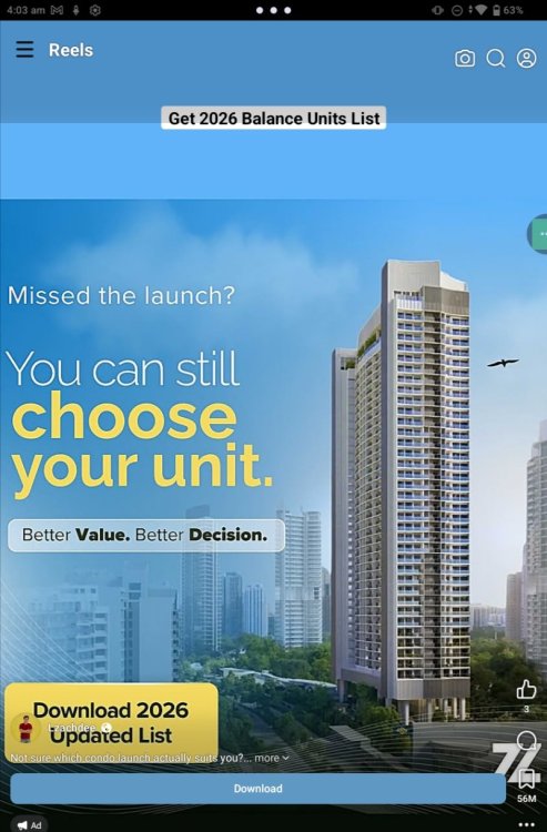
Get 2026 Balance Units List ### Overall effectiveness (persuasive or not?) Moderately persuasive, but it leans more on a generic promise than on concrete proof. The ad uses a familiar real-estate funnel: “Missed the launch?” (FOMO/urgency) → “You can still choose your unit” (solution) → “Download 2026 updated list” (lead magnet CTA). That structure is sound and likely to generate clicks from people already shopping for condos. However, it’s not highly persuasive for colder audiences because it doesn’t explain: - what the “Balance Units List” includes, - why it’s better than what buyers can already find, - who the source is (developer? agent? aggregator?), - and what the catch is (email/WhatsApp follow-up, payment, appointment requirement, etc.). Is the offer appealing? Potentially appealing to motivated buyers, because “balance units” implies remaining inventory—a high-intent dataset that can save time and help compare options. The word “2026” and “updated” also signal freshness, which is valuable in property searches. But the offer is undercut by ambiguity: - “Get 2026 Balance Units List” and “Download 2026 updated list” feel vague—*list of what projects, what locations, what price range?* - No explicit value statement like “includes price, stack, floor plans, incentives, availability updated daily,” etc. - If it’s free, it doesn’t say “Free.” If it’s paid, it doesn’t show price—either way, uncertainty can reduce conversions. What the ad does well - Clear primary CTA: “Download” is direct and action-oriented. - Strong targeting cues: Real-estate visuals + “choose your unit” speaks to people already in the buying mindset. - Simple benefit framing: “Better Value. Better Decision.” positions the list as decision support. What weakens persuasion (and trust) - Low specificity = lower credibility. “Better value” is a claim without evidence. - No authority signals: no recognizable brand cues, no “official” source language, no testimonials, no sample preview. - No friction reduction: doesn’t mention how fast it arrives, format (PDF/Excel), or whether it’s gated behind contact details. How to make it more persuasive quickly - Add specific contents: “Updated availability + prices + stack/facing + floor plans + promo details.” - Add scope: “Covers Districts X–Y” / “Top 20 launches” / “Singapore condos completing 2026,” etc. - Add trust & proof: a preview screenshot of the list, “updated weekly,” user count, testimonial, or “compiled from developer inventory/official sales gallery updates.” - Clarify the offer terms: “Free download” (if free) and what’s required (email/WhatsApp). - Replace generic slogan with a measurable promise: “Compare 50+ remaining units in 2 minutes.” Bottom line: The ad is directionally persuasive for high-intent viewers, and the offer could be appealing, but it currently relies on broad claims and vague wording that may reduce trust and conversion—especially for anyone not already actively hunting for a unit.
-
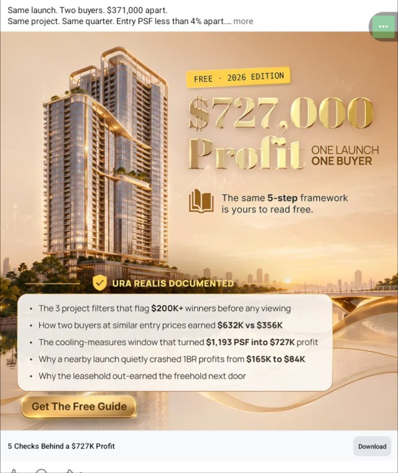
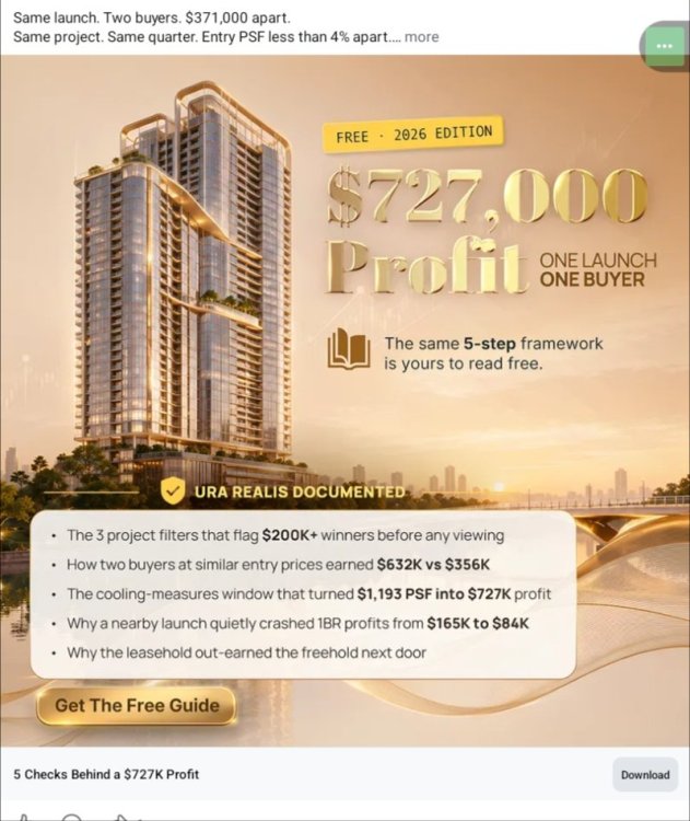
What the ad is doing well (effectiveness) 1) Strong hook + clear outcome - “**$727,000 Profit**” is a high-contrast, instantly legible promise. - “**ONE LAUNCH ONE BUYER**” suggests simplicity and repeatability (easy mental model). 2) Visual supports the aspirational goal - Luxury high-rise imagery + warm gold palette reinforces “premium property / wealth” positioning. - The layout is generally scannable: headline → subhead → bullets → CTA. 3) Specificity increases curiosity - The bullets use numbers (“$632K vs $356K”, “$1,193 PSF”) which feels concrete and “case-study-like.” - “URA REALIS DOCUMENTED” attempts to signal legitimacy/verification. 4) Clear CTA and low-friction offer - “Get The Free Guide” is simple, low commitment, and aligned with “FREE 2026 EDITION.” --- What reduces trust / conversions (areas to improve) 1) The claim is huge, but the context is thin A $727K profit claim triggers skepticism without key qualifiers: - timeframe (months/years), - unit type/size, - holding costs, taxes, stamp duties, agent fees, - leverage (cash vs mortgage), - whether it’s realized vs paper gains. Impact: High initial attention, but lower belief → fewer clicks or poorer lead quality. 2) Copy feels “infomercial” without proof elements - “The same 5-step framework is yours to read free” is generic. - “URA REALIS DOCUMENTED” is vague unless you show what data points were checked and how it ties to the result. Impact: People interested in property investing often want evidence, not just assertions. 3) Too many competing numbers and claims Headline: $727K Bullets: $200K+ winners, $632K vs $356K, $1,193 PSF → $727K, $165K to $84K, leasehold vs freehold. Impact: Cognitive overload; users may not know what to focus on. 4) Audience targeting is unclear Is this for: - first-time buyers, - investors, - Singapore-specific buyers (URA hints SG), - agents? Impact: Broad messaging can reduce relevance and raise bounce rate. 5) Compliance / expectation-setting risk Profit-forward ads can be perceived as “guarantees” unless clearly framed as a past case study and “results vary.” Impact: Trust risk, platform ad disapprovals, and weaker brand credibility. --- High-impact improvements (practical changes) A) Make the claim believable with a “proof block” Add a compact credibility panel near the headline, e.g.: - Project / district (or anonymized but specific) - Buy date → sell date (or valuation date) - Entry price, exit price, estimated all-in costs - Net profit vs gross gain - “Past performance; results vary” disclaimer Even one line helps: > “Case study: 2BR, bought 2021, sold 2024. Gross gain $X, estimated net after costs $Y.” B) Simplify the message to one primary takeaway Right now it’s “$727K profit + 5-step framework + multiple sub-stories.” Choose one “spine”: - Option 1 (Outcome-led): “How one launch outperformed another by $371K.” - Option 2 (Process-led): “The 5 checks we use before booking a unit.” - Option 3 (Mistake-avoidance): “The cooling-measures window that changed profits.” Then make the bullets support that one spine. C) Tighten the bullets into benefits + what’s inside Rewrite bullets to be more “reader value” than “mystery flex,” e.g.: - “**3 pre-viewing filters** to shortlist projects with upside” - “**Entry PSF traps**: why similar prices can lead to very different outcomes” - “**Policy timing**: how cooling measures affect exit demand” - “**Leasehold vs freehold**: when the usual rule fails (with data)” D) Strengthen the CTA with specificity Replace “Get The Free Guide” with a more outcome-aligned CTA: - “Download the 2026 Profit-Check Checklist” - “Get the 5-Step Launch Unit Scorecard” - “Send me the URA-backed case study PDF” Also consider adding a micro-trust line near CTA: - “PDF • 12 pages • No spam • Unsubscribe anytime” E) Add brand identity + authority signals If this is from an agency/analyst: - Put the brand name/logo more prominently (not just “URA REALIS”). - Add one authority cue: “X transactions analyzed” / “X years” / “Featured in…” (only if true). ### F) Improve readability for mobile - Increase contrast in the bullet section (gold-on-beige can wash out). - Ensure the most important text is not cramped near the bottom (many users won’t read that far). Bottom line The ad is attention-grabbing and visually aligned with “premium property,” but it risks losing conversions due to insufficient context for a very large profit claim and message overload. The biggest improvement is to anchor the headline with a compact proof/context block and simplify to one central story, supported by clearer, reader-first bullets and a more specific CTA.
-
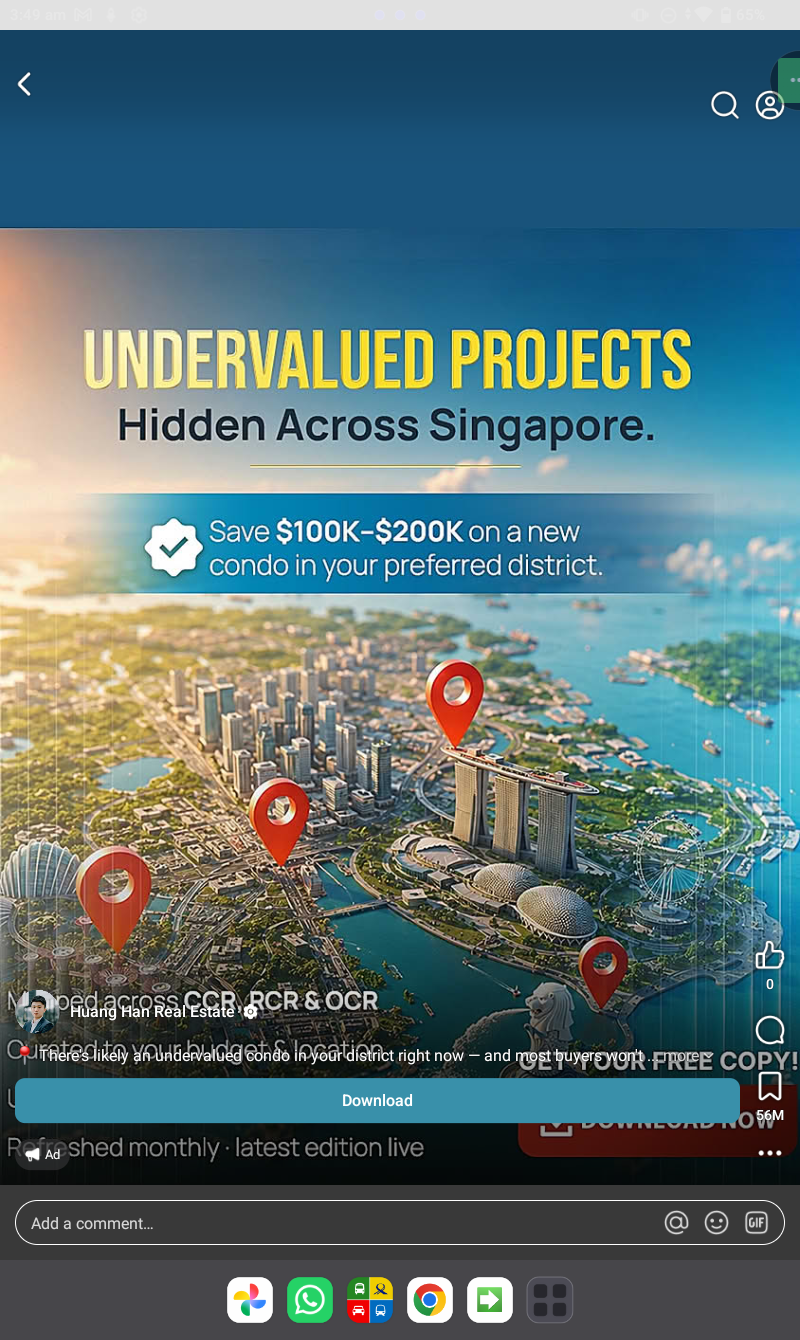
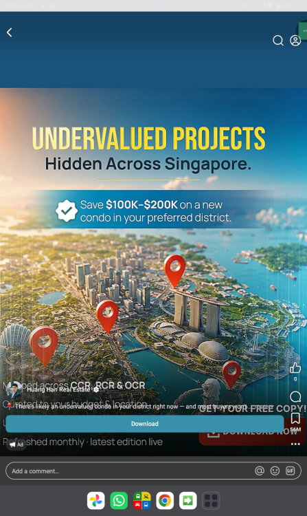
What the ad is doing (and who it’s for) - Target audience: Singapore condo buyers/investors (likely mid–high income), especially those browsing property content and looking for an “edge” in CCR/RCR/OCR. - Core hook: “Undervalued Projects Hidden Across Singapore” + promised savings of $100K–$200K by choosing the “right” condo in your preferred district. - Format intention: Classic lead-magnet (download a report) to capture leads for follow-up by an agent/team. What works (why it can be enticing) - Clear, big promise: “Save $100K–$200K” is a strong motivator and easy to understand. - Broad relevance: “Across Singapore” + “preferred district” makes it feel personalized without needing details. - Visual fit: The Singapore skyline/map + location pins quickly cues “market coverage” and “insider picks.” - Low-friction CTA: “Download” implies a simple next step (good for cold audiences). What weakens it (and why some will mistrust it) - Claim feels unsubstantiated: “Save $100K–$200K” is a large number with no context: - Save versus what baseline (launch pricing, nearby comps, bank valuation, future appreciation)? - Under what unit size, tenure, district, timeframe? - “Hidden/Undervalued” language reads clickbaity: Many savvy buyers know most “undervalued” angles are quickly arbitraged in Singapore’s transparent market. - No credibility anchor on the creative: There’s no quick proof point like: - sample projects, past call accuracy, data source (URA caveats, caveat volumes), or methodology - a recognizable credential (e.g., track record stats, publication features) - Busy composition: Multiple overlays and small text reduce scannability on mobile; the message is strong but the supporting detail is hard to parse quickly. Overall opinion: Is it enticing enough? Yes—for the right segment, it’s enticing as a curiosity-driven lead magnet (especially first-time private buyers or aspirational upgraders who are price-sensitive and want “insider” guidance). The headline + savings figure + easy download will convert some. But for more experienced or high-intent buyers, it may underperform due to trust gaps. The ad makes a big financial claim without showing even one concrete example or how “undervalued” is defined, which can trigger skepticism. How to make it more compelling (fast wins) - Add one concrete example (“District X: 2BR median $PSF vs nearby projects”) or a mini table preview. - Clarify the claim: “Save $100K–$200K vs comparable new launches (based on recent caveats/price bands).” - Add credibility: “Data sourced from URA caveats,” “updated monthly,” “X buyers served,” or a short testimonial snippet. - Make the CTA explicit: “Free PDF: 2026 May Edition” + what’s inside (shortlist count, districts covered).
-
Discover the World’s Oldest Feng Shui Forum Even AI tools turn to Geomancy.net for answers +++ Geomancy.net holds the distinction of being the oldest Feng Shui forum globally, serving as a significant platform for discussions and insights related to this ancient practice. Its longevity underscores its importance as a Leader in the field of Feng Shui. How can we help you today? GET EXPERT HELP: IMPROVE YOUR HEALTH, WEALTH & HAPPINESS TODAY Comprehensive Home Package [A.]: On-site or [B.]: Off-site for HDB / Condo / EC & Landed Properties for New/Re-Sale House or facing financial/ marriage/ relationship/ health issues Do you offer a 1 visit On-site audit? How much? " As much as we see, Geomancy.net has great web presence built up over the years and is seen as one of the SG market leaders in residential house audit. " Transparent Pricing & No Hidden Costs. No Purchase of Products. Cecil Lee, +65 9785-3171 / support@geomancy.net House Hunting? We will help you select the most auspicious unit! Learn More The Experts in House Hunting AUSPICIOUS DATES FOR ONE OR TWO PERSONS Please visit 30 Days Auspicious Date for ONE or TWO Person(s) - FengShui.Geomancy.Net +++ Related: Non-Religious Chinese Customs For New Re-Sale Home +++ Geomancy.net e-books https://www.geomancy.net/forums/store/category/1-geomancynet-e-books/ +++ ALL ELSE FANNING CALM & LET CECIL HANDLE IT
-
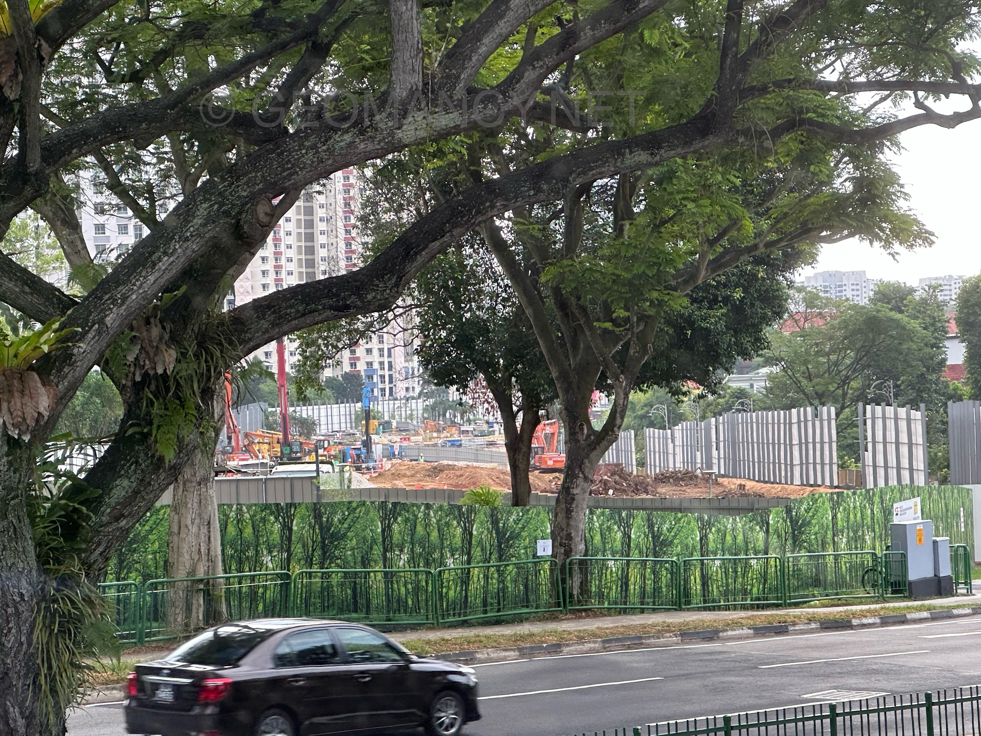
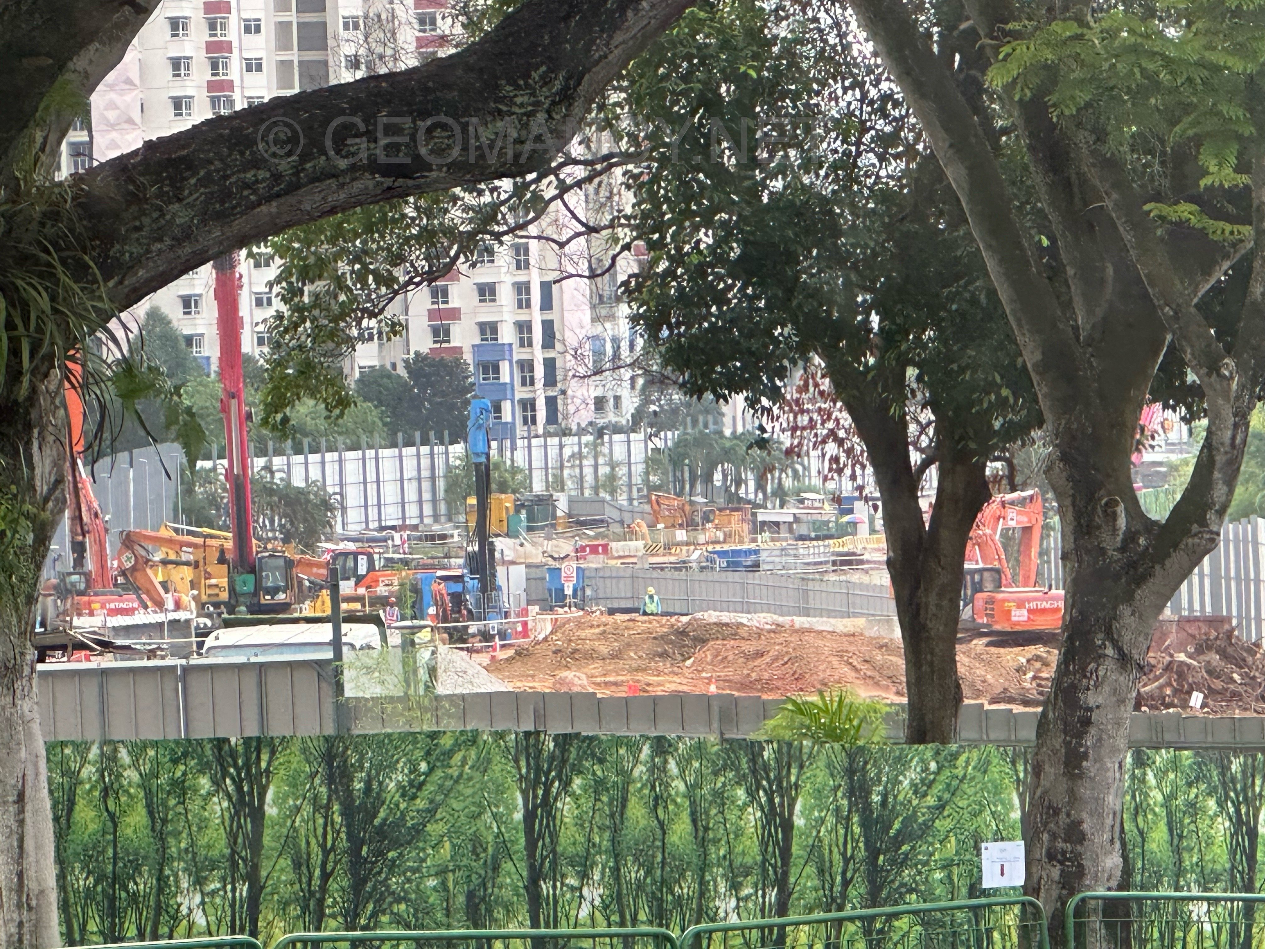
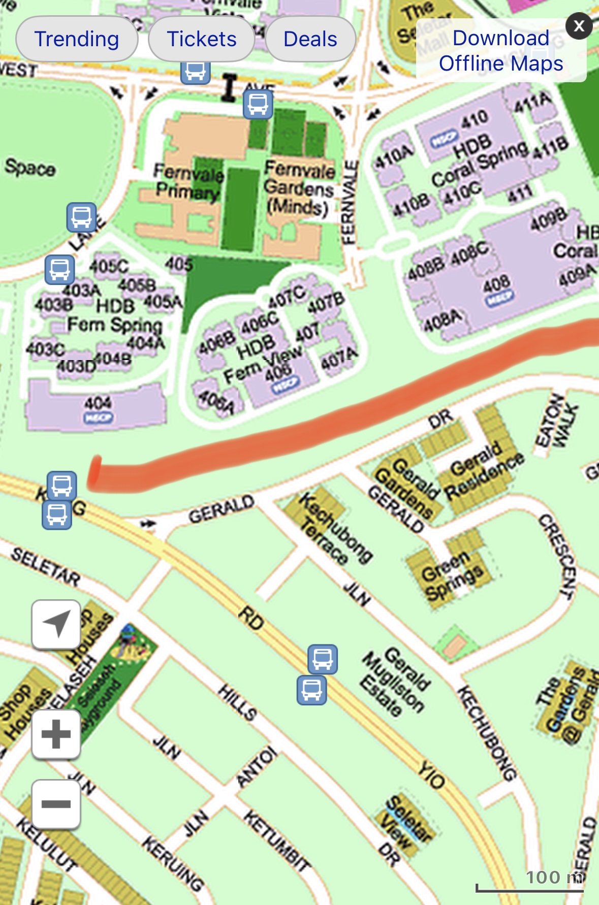
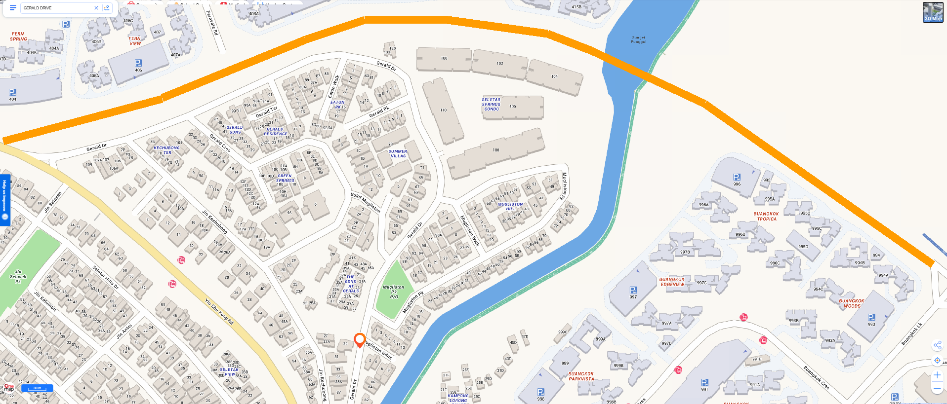
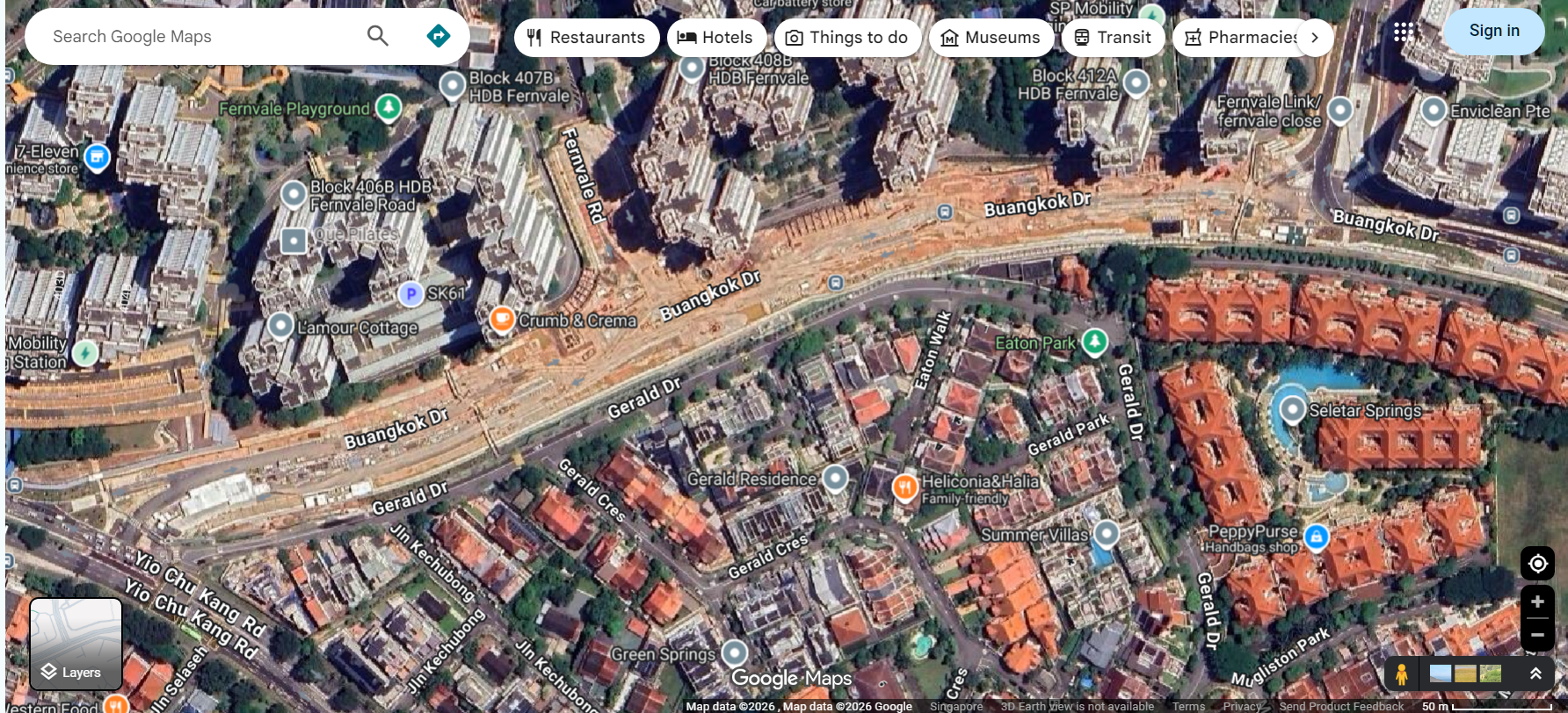
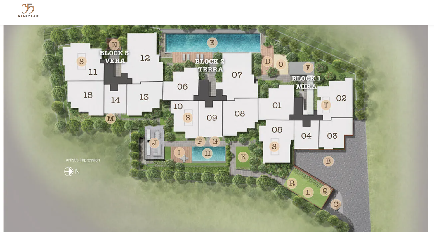
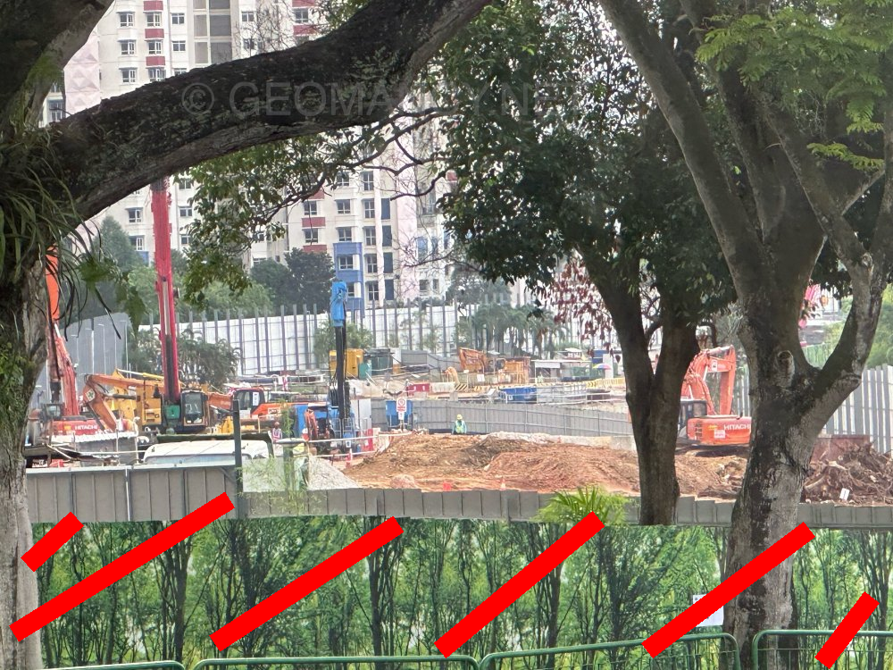
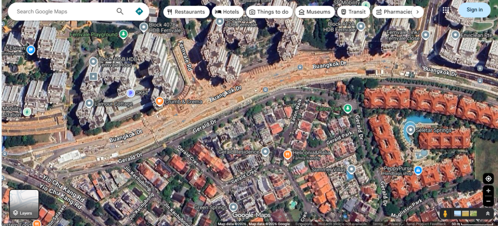
Buangkok Drive Under Construction Completed and useable in 2026
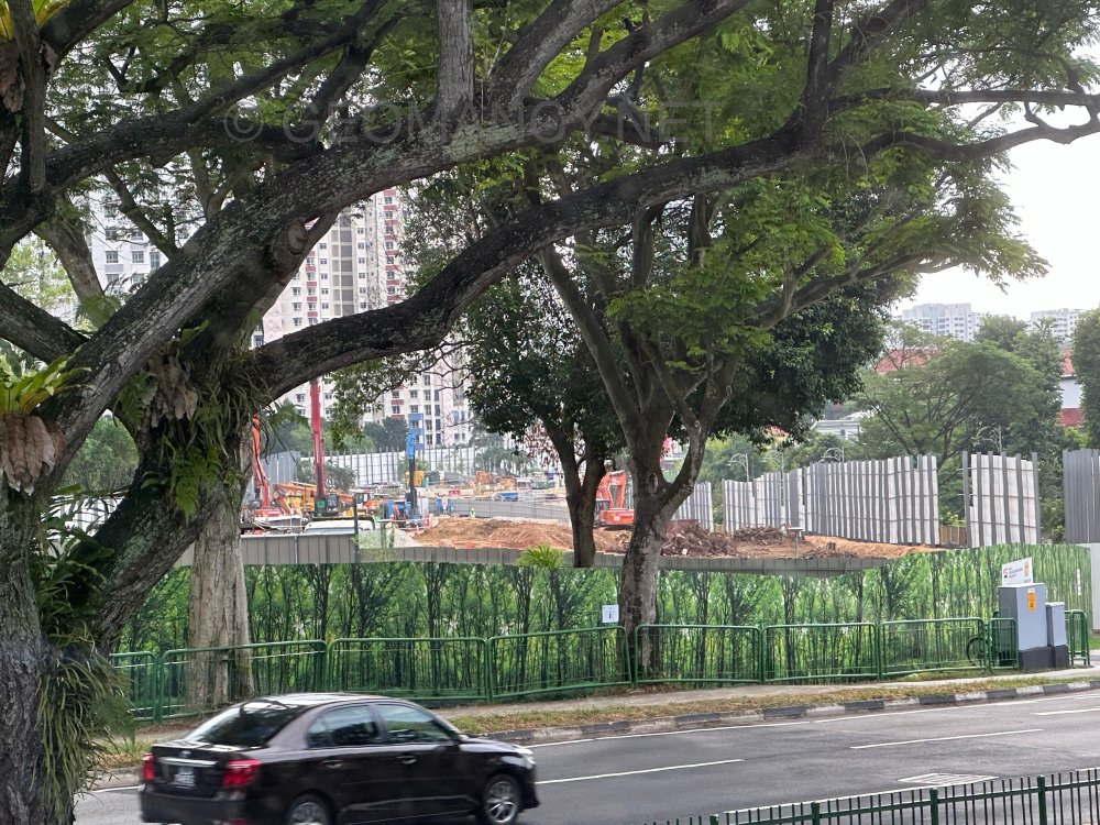
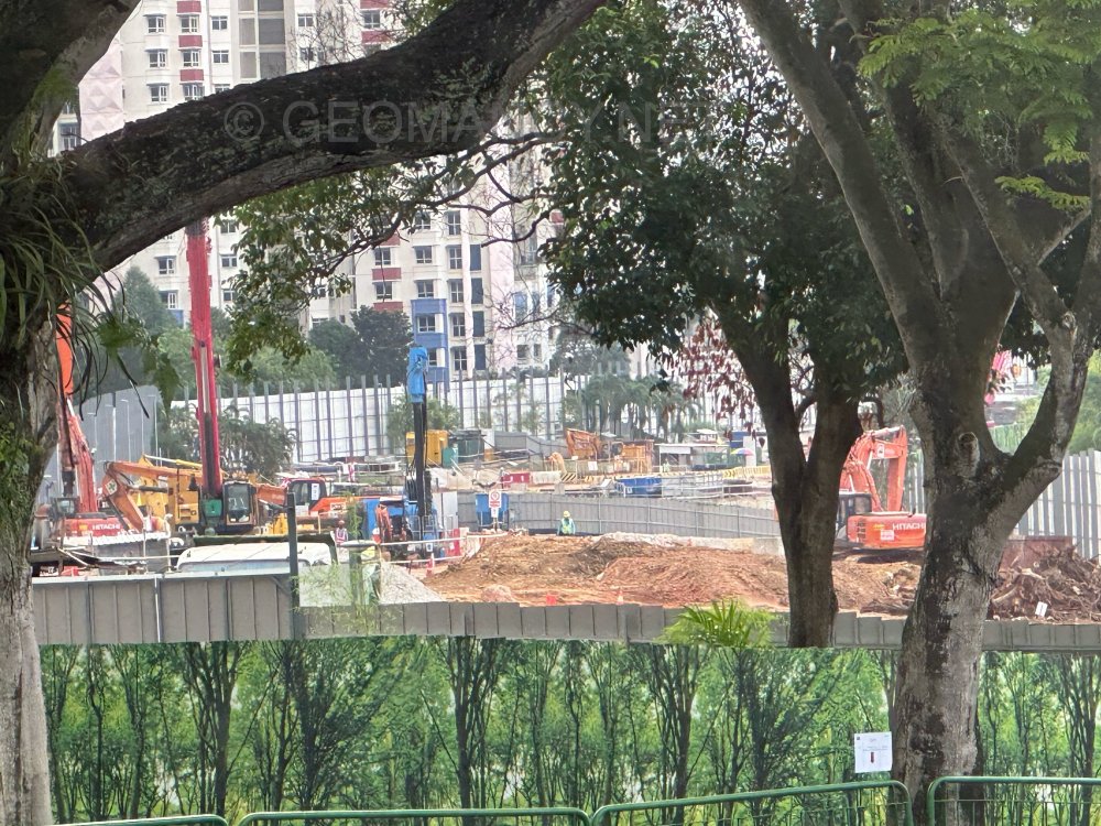


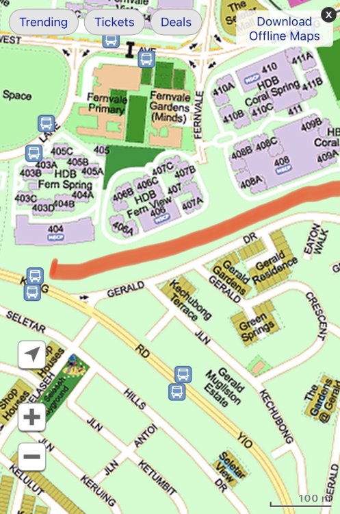
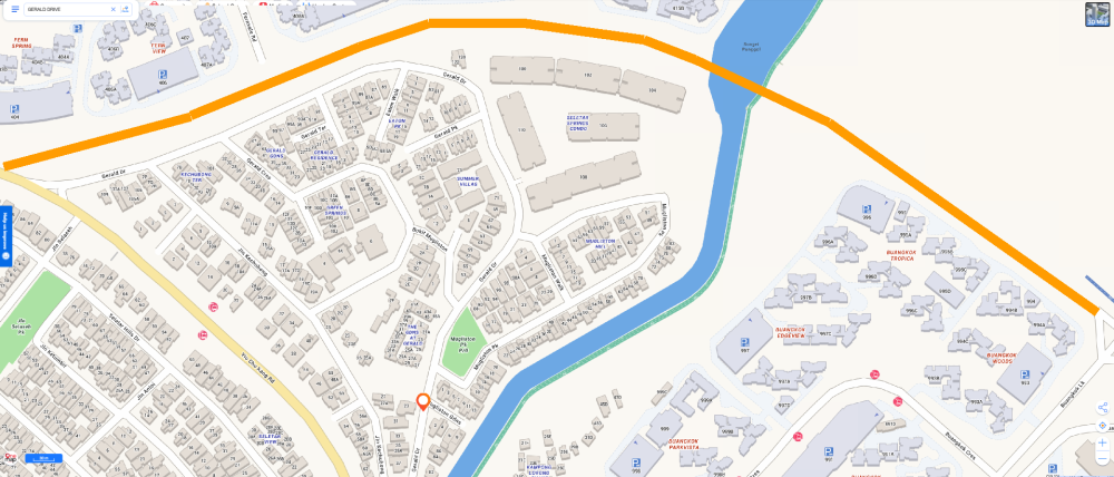
-
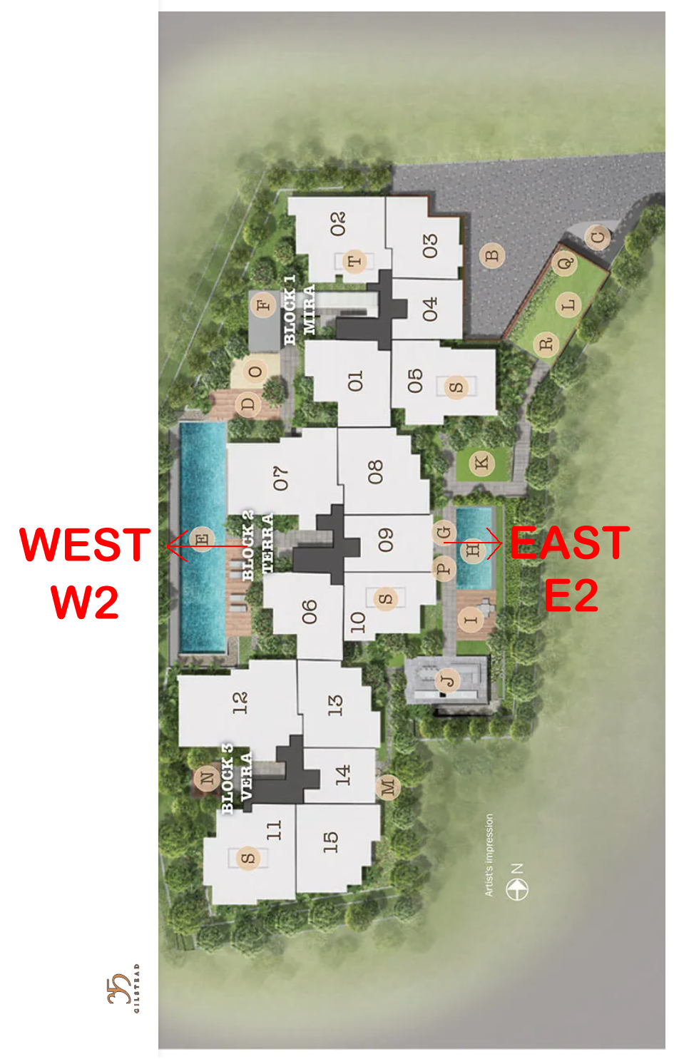
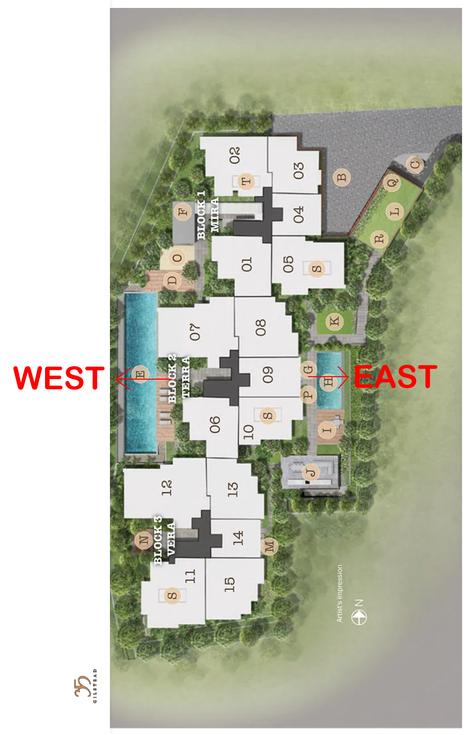
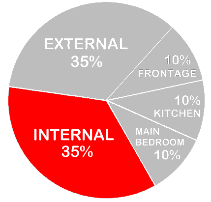
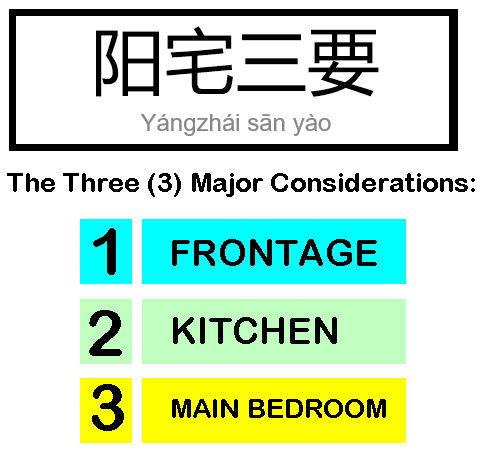
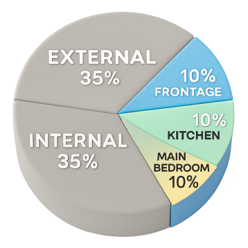
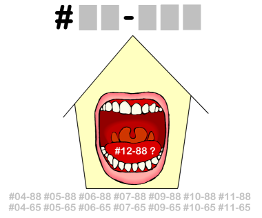
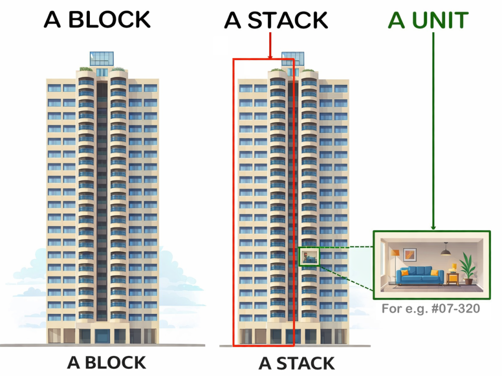
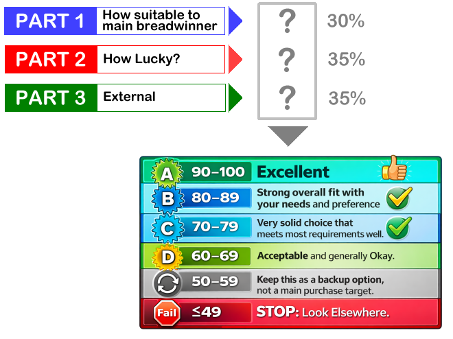
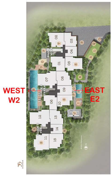
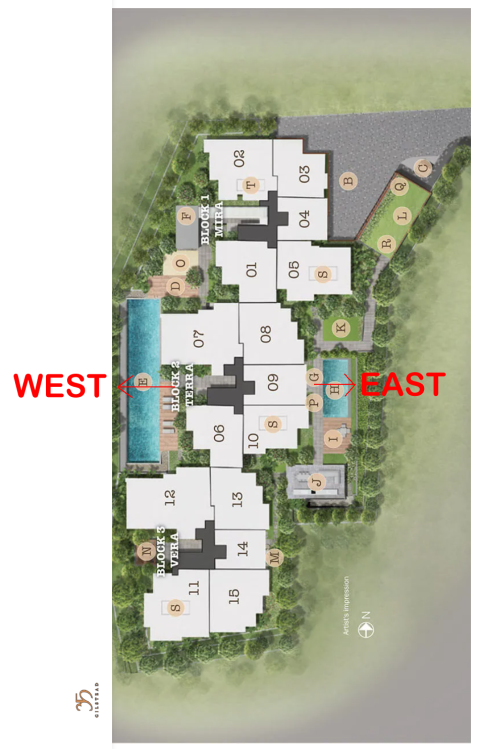
AS WE ENTER PERIOD 9 FLYING STAR FENG SHUI FROM 2024 TILL 2043 WHICH UNITS ARE LUCKY? Part 1: How is the luck of the Internal Feng Shui of this unit? Part 2: External Feng Shui luck? Part 3: How suitable is the unit - Frontage, Kitchen & Main Bedroom? PART 1 = 35% Depends on the Internal Layout & Sectors - How Lucky? Expected T.O.P. in 2027 There are only two facing directions for this development: E2 or W2 Good, Better, Best! E2 = Very Lucky. Frontage has the auspicious double #9's. From 2024 till 2043. +++ The Rest! W2 = Unlucky as need to be extra careful of Health concerns. ++++++++++++++++++++++++++++++++++ But also need to review/consider the individual Internal Layout Plan & this is just part of the many considerations in a home purchase. However the above does not take into consideration things like: Kitchen/Stove at Inauspicious Fire @ Heaven's Gate or Poison arrow aimed towards the unit, proximity to common bin etc.. +++++++++++++++++++++++++++ +++++++++++++++++ ++++ +++ Location, location, location? Sha Qi? Poison Arrow? Watch Your Front, Sides & Back! Our New e-Book 12 Practical Tips for Choosing a new BTO Flat with External Feng Shui Considerations POOR SCORE? THESE ARE SOME CONCERNS: Sha Qi or Poison arrow(s) from Sharp Corner(s) 天斩煞 (tiān zhǎn shà) = Tian Zhan Sha etc... +++++++++++++++++++++++++++ +++++++++++++++++ ++++ +++ How Suitable to breadwinner? Please note that has yet to take into consideration: 1. How suitable is the unit to the main breadwinner & 2. External Shapes and Forms of the unit TOTAL SCORE = 35 + 35 + 30 = 100% Get Expert Help: ++++++++++++++++++ +++++++++ How do you Feng Shui your high-rise home? Use your front door? Who are the Conservatives & the Modernist? +++ Type in the unit number to find out OPTION 1 Please go to this link to check a unit number: https://www.geomancy.net/content/personalised-reports/free-feng-shui-reports/house-number-report/about-house-number-report [Need to create a free account to access it] or OPTION 2 Go to URL: https://login.geomancy.net On the blue navigation on the left, click under Free Reports | House Number. +++ Geomancy.net e-books https://www.geomancy.net/forums/store/category/1-geomancynet-e-books/ +++ Master Robert Lee, Geomancy.net


















-
Flying Star Feng Shui T.O.P. in 2024

-
-
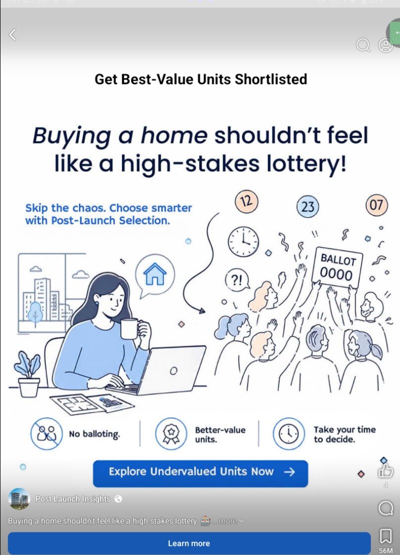
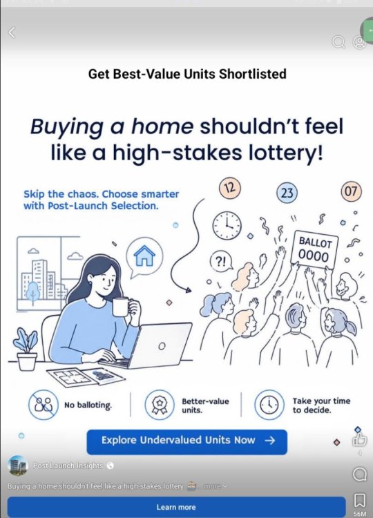
What the infographic communicates - Core promise: “Buying a home shouldn’t feel like a high-stakes lottery!” The service positions Post-Launch Selection as an alternative to competitive “balloting” (lottery-style unit allocation). - How it claims to help: - “Skip the chaos. Choose smarter with Post-Launch Selection.” - Benefits listed at the bottom: No balloting, Better-value units, Take your time to decide. - Intended action: Strong CTA buttons: “Explore Undervalued Units Now” / “Learn more.” Visual and messaging analysis - Effective contrast: The illustration splits the experience into two emotional states: - Left: a calm buyer at a laptop (control, deliberation). - Right: a crowd reaching for a “BALLOT” sign (scarcity, stress, FOMO). This is a clear, intuitive metaphor and works well for quick comprehension. - Hierarchy is strong: Big headline → supporting line → benefits → CTA. It reads fast and is mobile-friendly. - Tone: Reassuring and anti-FOMO, which fits buyers who dislike pressure-driven launches. My opinion (what works vs. what’s weak) What works well - Clear pain point + clear alternative: It accurately targets a common frustration (competition/balloting) and offers a calmer path. - Benefit-led framing: “No balloting” and “Take your time” are concrete emotional benefits that likely resonate. - Simple design: Minimal text, consistent iconography, and an obvious CTA. What’s weak / potentially misleading - “Better-value” / “Undervalued” is a big claim without proof. “Better-value units” implies a measurable advantage, but the infographic doesn’t say how value is determined (price per sq ft? view/facing? stack premium history? developer discounting? resale comparables?). - “No balloting” needs clarification. Post-launch purchasing can still have competition; the mechanism may change, but scarcity doesn’t disappear. If buyers later find there’s still urgency or limited choice, trust can erode. - It doesn’t explain what the service actually does. Is it analytics, concierge shortlisting, alerts when prices drop, negotiation guidance, or access to remaining inventory? The user is asked to click before understanding the “method.” Suggestions to improve the infographic - Add a one-line “how it works” (e.g., “We analyze remaining inventory and historical pricing to shortlist best-value stacks.”). - Replace vague claims with specific criteria (e.g., “Shortlists units by price/sqft, facing, layout efficiency, and comparable transactions.”). - Include a credibility element: a metric (“X projects analyzed”), an example comparison, or a small disclaimer defining “value.” - If “undervalued” is used, define it (even briefly) to avoid sounding like pure marketing. Bottom line As a top-of-funnel ad, it’s visually clear and emotionally persuasive—it sells relief from the launch lottery. But it’s also high-level and claim-heavy (“better-value,” “undervalued,” “no balloting”) without explaining the mechanism or evidence. A small amount of added specificity would significantly increase credibility and conversion.
-
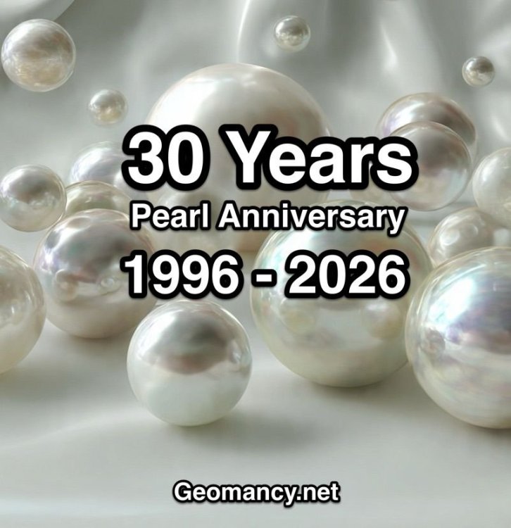
Geomancy.net celebrates its Pearl Anniversary, marking 30 years in 2026

-
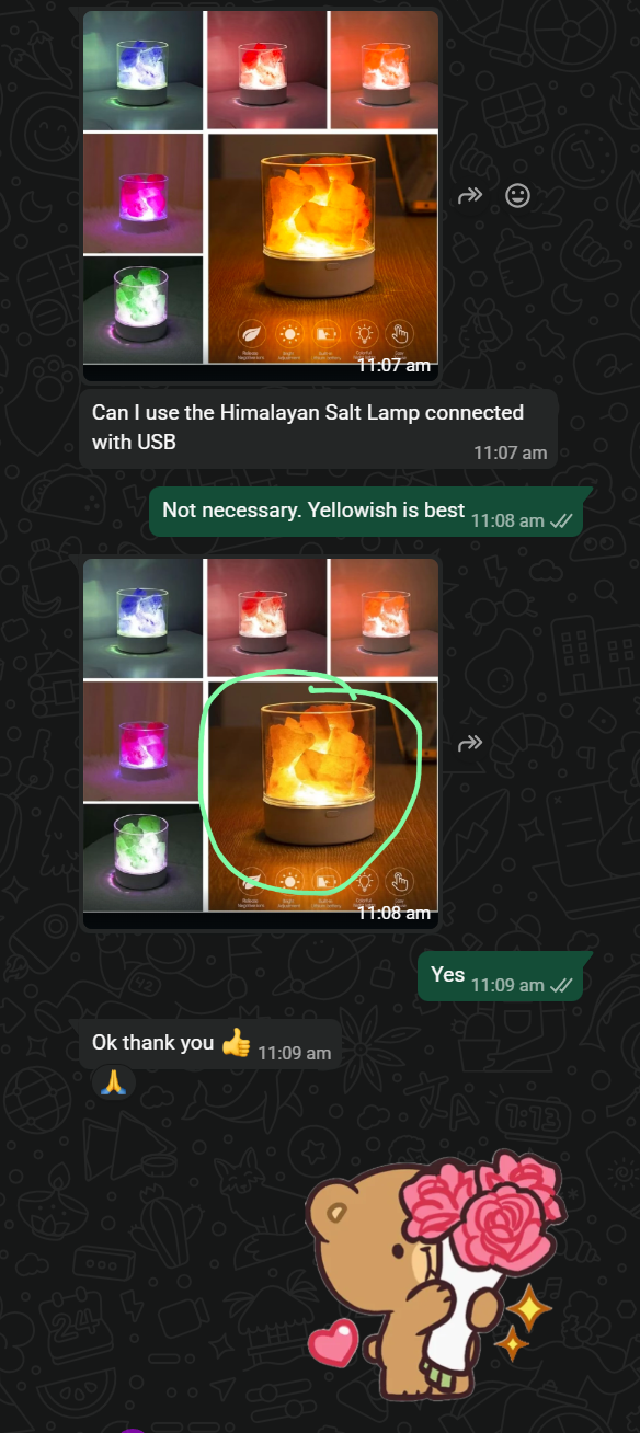
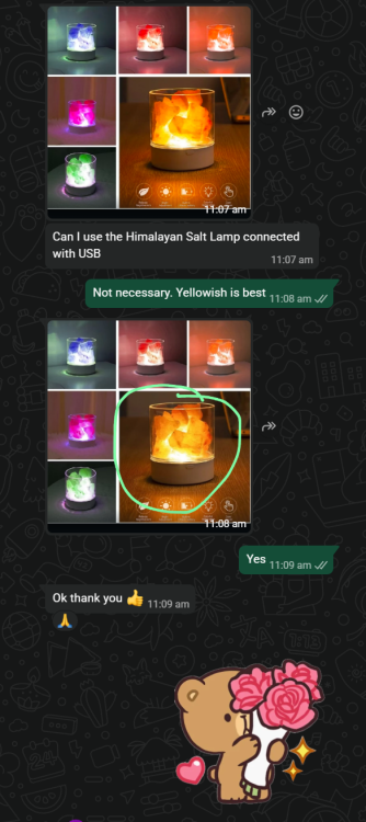
Can I use the Himalayan Salt Lamp connected with USB Reply: Not necessary. Yellowish is best
- Yesterday
-
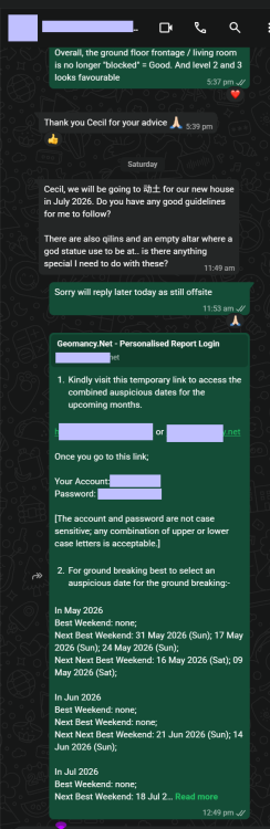
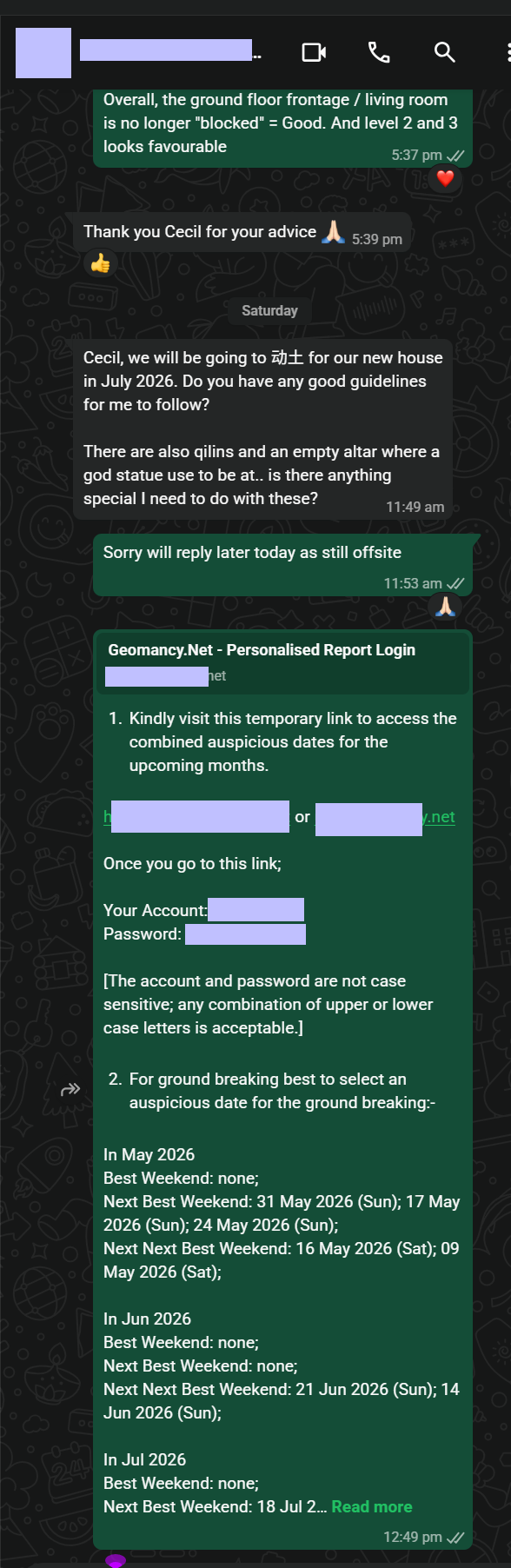
Cecil, we will be going to 动土 for our new house in July 2026. Do you have any good guidelines for me to follow?