

Skip to content
View in the app

A better way to browse. Learn more.

FengShui.Geomancy.Net

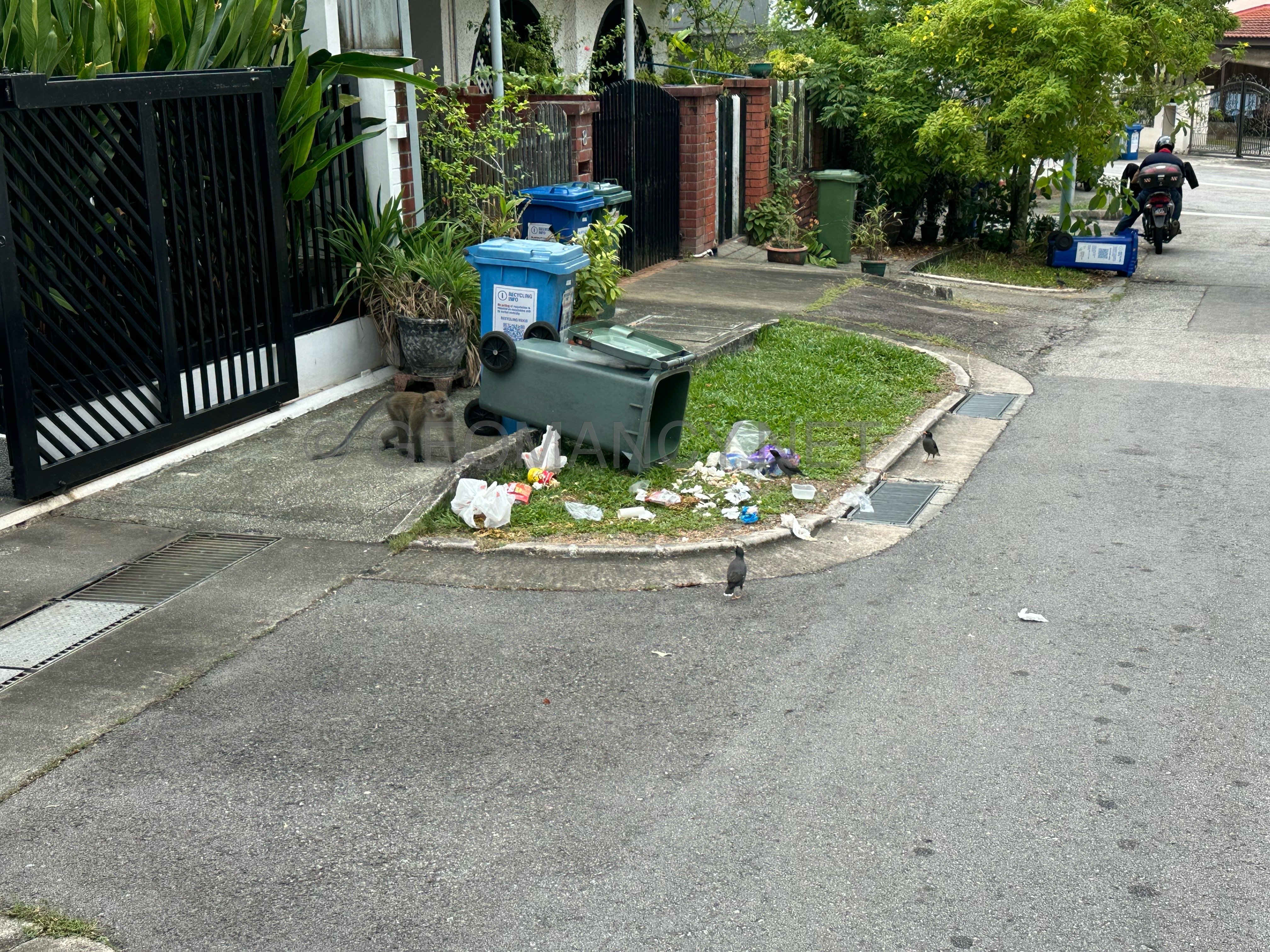
A full-screen app on your home screen with push notifications, badges and more.

To install this app on iOS and iPadOS
  1. Tap the Share icon in Safari
  2. Scroll the menu and tap Add to Home Screen.
  3. Tap Add in the top-right corner.
To install this app on Android
  1. Tap the 3-dot menu (⋮) in the top-right corner of the browser.
  2. Tap Add to Home screen or Install app.
  3. Confirm by tapping Install.
About Feng Shui at Geomancy.Net
Sponsored Link
 

Cecil Lee

Staff
  • Joined

  • Last visited

Everything posted by Cecil Lee

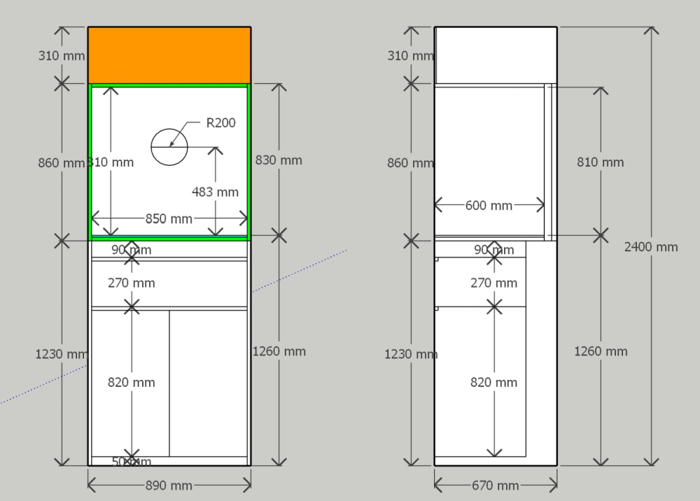
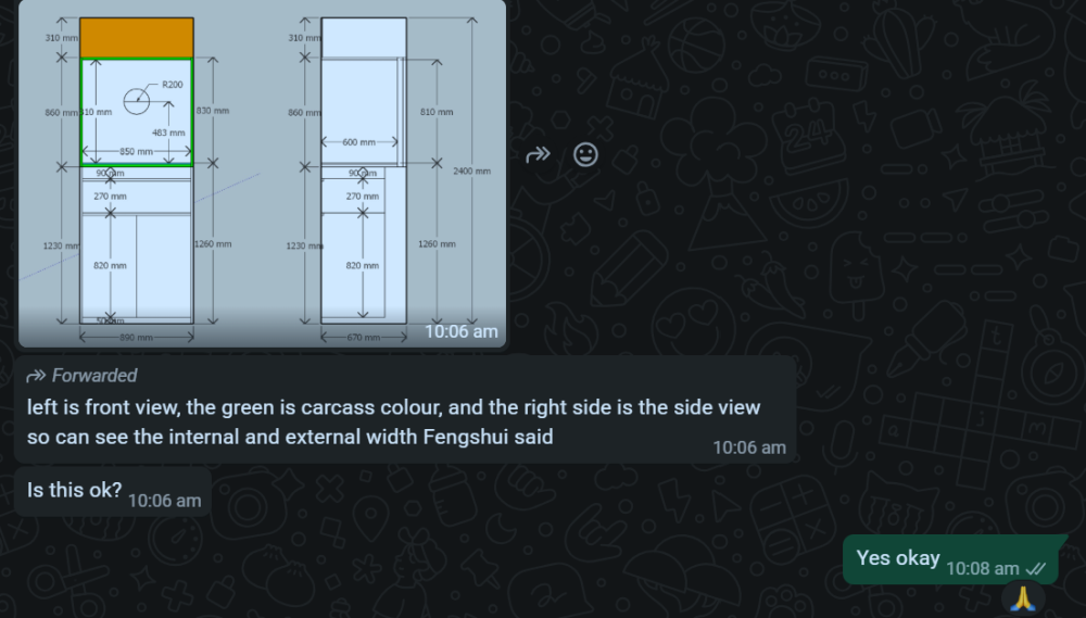
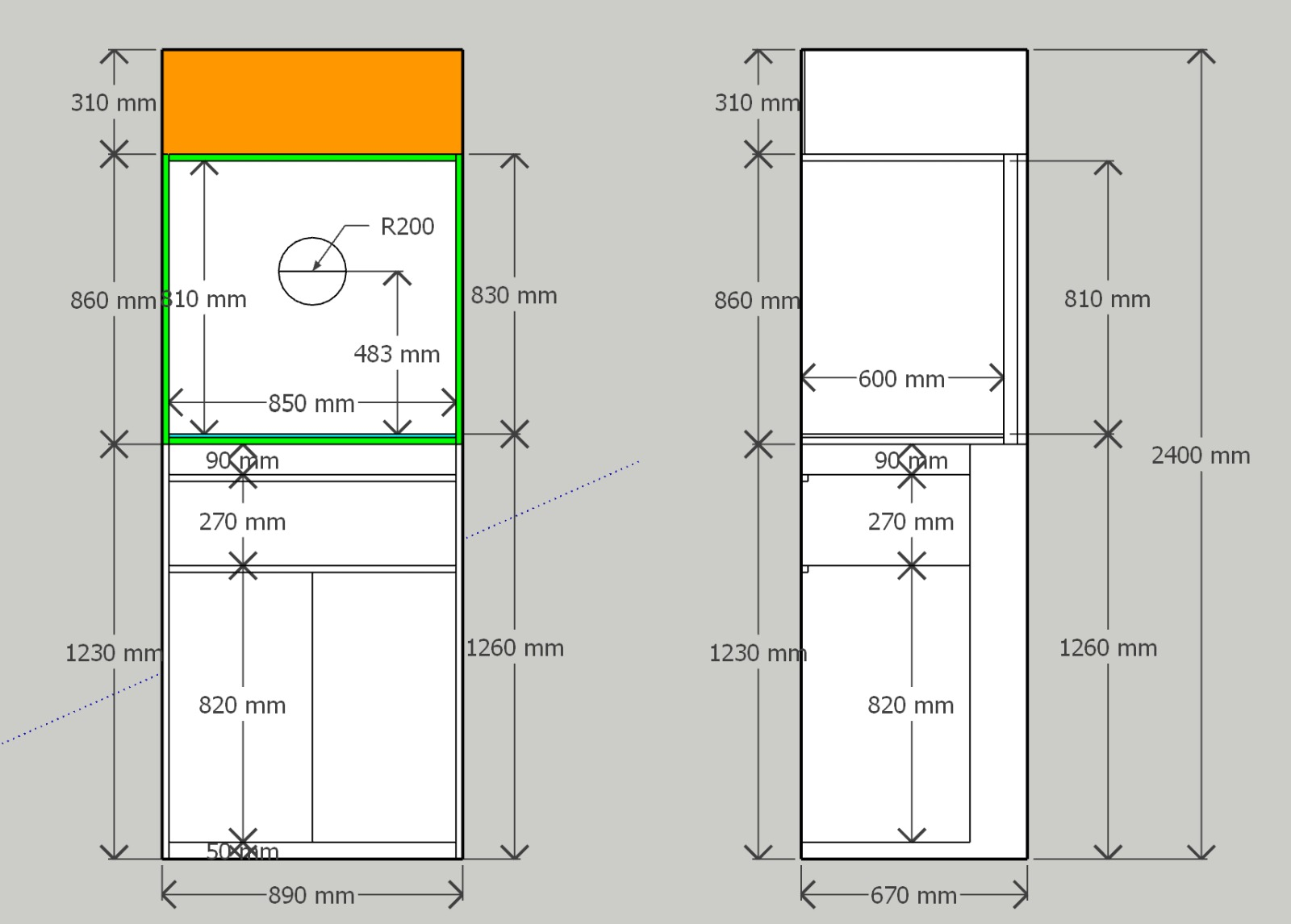
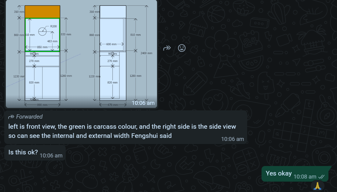
  1. A wardrobe with an indent for a side table is okay or preferred
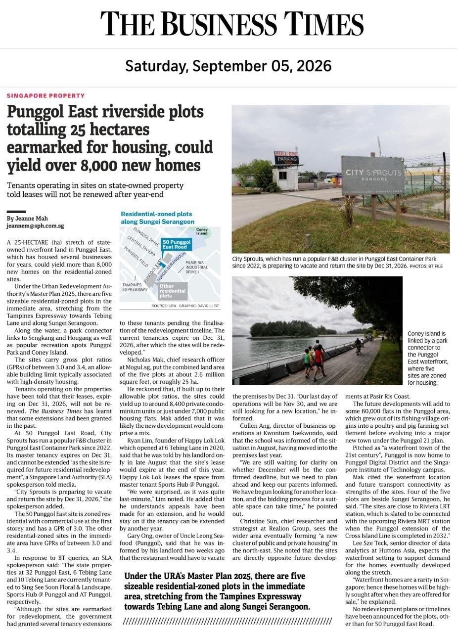
  2. Man, 42, Dies in Fall Through Walkway Roof at Blk 107 Yishun Ring Road
  3. AD NO. 8Thought provoking...Open your eyes before purchase! Don't buy blindly! This creative is a future-demand + “value-buy” list pitch. It’s telling buyers: don’t just look for the cheapest today—buy where the next wave of buyers will come from in 3–5 years, and download a curated list of “entry price” private properties (including bounce-out units, subsales, and discounted developer inventory). Persuasive elements (how it tries to get the click)- Aspirational framing: “**Looking For A Value-Buy?**” appeals to identity (“I’m a smart buyer”), not just price. - Future-proofing hook: “**Where are buyers likely to come from 3–5 years from now?**” reframes the decision around exit liquidity and resale demand—very compelling for investment-minded buyers. - Implied proprietary research: “**We screened hundreds of properties…**” signals effort and expertise, implying you’ll get a filtered shortlist rather than doing homework yourself. - Specific deal buckets: Naming bounce-out units / sub-sale opportunities / developer discounted inventory makes the list feel concrete and “inside access,” not generic advice. - Low-friction CTA: “**Download the list here**” is a clear lead magnet with immediate payoff (a list), not a vague “contact us.” Critical issues / credibility gaps (what a cautious viewer will question)- Big claim, thin substantiation: Predicting “where buyers will come from” is powerful but raises questions: - What factors are used (MRT lines, schools, employment nodes, supply pipeline, affordability bands)? - Is this data-driven (URA, LTA, HDB MOP clusters, upcoming GLS) or opinion-based? - “Screened hundreds” lacks methodology: No criteria are stated (quant screens? qualitative? weighting?), so it can read as marketing fluff. - Ambiguity around “affordable & entry price”: Affordable relative to what—overall private market, OCR only, quantum (e.g., under $X), PSF bands? - Deal category caveats: - Bounce-out units: Are these real/time-stamped and actionable, or a buzzword for “units that didn’t sell”? How current is the availability? - Developer discounted inventory: “Discounted” can be headline-driven (rebates, vouchers, absorbed fees) rather than true net price cuts—needs clarity. - Sub-sale opportunities: Not always cheaper; may have assignment constraints, timelines, and fees. - Potential lead-gen expectations: A “list” often means you submit contact info and get follow-ups; some viewers will worry the list is gated and promotional. Design & messaging effectiveness- Strong hierarchy & readability: Value-buy banner → big future-demand question → credibility line → categories → CTA. Easy to scan. - Clean, “research report” vibe: The white space and restrained palette feel more analytical than hype-y, which supports trust. - CTA is visible and friendly: The peach button stands out against the property image and feels low-pressure. - Minor weakness: The headline question is intriguing but slightly abstract; without a hint of what areas/segments the list covers (OCR/RCR/CCR, districts, quantum range), some buyers may not self-qualify and scroll on. Does it entice a click?Yes—especially for buyers who: - care about resale demand/liquidity in 3–5 years, - want curated “value” options rather than browsing portals, - are deal-sensitive (entry price / discounted / subsale). It will lose some analytical buyers due to the forecasting claim without visible proof. One small addition (e.g., “based on affordability bands + upcoming transport nodes + supply pipeline” or a sample screenshot of the list) would likely boost credibility and improve lead quality.


  4. Is the Sales Brochure Useful? Introduction: For brand new just launched developments, there is no physical site to visit the completed buildings and apartments. 1. The only thing we can do is to visit the show room (which often is close-by to the site) as well as obtain a sales brochure and see the mock-up of the development. As well as try to ask questions from the sales agent (if any). 1.1. We must still try to gather as much information as we can. 2. Summary of Case Studies in this article. If the information is overwhelming. Pick and choose selective articles... 1A & B: Common Rubbish Bin 2A & B: Interior unit Dry Walls 3: Fire at Heaven's Gate 4: Sha Qi or Poison Arrows from Club-house roof-lines 5: 3 Panel Sliding Doors at the Balcony 6: Drainage at the Balcony 7: Air-con Ledges 8: Mixed Developments + Cooling Towers 9: Termite infestations 10: Coffee-shop below or near to unit 11: Water tank at roof-top 12: Lamp Posts, Pillars, Tree Trunks 13: Spice Garden in an EC/condo 14: EC/condo Clubhouse 15A & B: Pneumatic Waste Collection System 16: Look closely at the development's scale model for clues 17: Buying a Mixed development apartment 18: Survey or study facilities surrounding the development 19: Pump Room below a unit 20: Seven Commandments of Stove Placement 21: Is there a potential poison arrow from the neighbours? 22: Should I be concerned with a near-by temple, church, mosque &/or elder care? 23: Is the compass marking on the Sales Brochure accurate? 24: Sites reserved for Schools? 25: Doors face each other? [Main Door/Bedrooms] 26: Unit numbers with 4, 44 or 444 Okay? 27: Stove or sink or WC at the Centre of the house? 3. It is always an excellent idea to spent some time to scrutinise a prospective sales brochure of our potential buy (purchase). 4. Recently, more and more clients have discovered to their shock (horror) that the least expected was the location of the central rubbish bin outside their unit. 5. A year ago; many had purchased a premium unit within the development .. and later shocked to learn that the central rubbish chute (for their entire floor) is just next to their main door! 6. Thus the morale of the story is to check first before signing on the dotted line. 7. In general, most developments have these:- 8.1. A central rubbish collection centre / rubbish bin collection point 8.2. Power Sub-station. Every development usually has one or more of these depending on the size of the development. 8.3. Design of club-house roof-lines / trellis / gazebo / pavilion. Are the designs a "threat" e.g. with spikes or like a razor's edge? Usually these are aimed towards lower storeys. 8.4. Any poison arrows in the form of a sharp corner of another block of neighbouring stack aimed towards one's balcony (hard to cure) or towards one's windows (if any) 8.5. Location of areas like BBQ pits and any impact e.g. the smell from these pits towards a unit.. especially low storeys such as #01 or #02 first or second storeys 8.6. Any tree trunk aimed towards a lower unit e.g. #01 or #02. Unfortunately it may be too late; especially if the development is under construction. 9. There are lots more considerations... 9.1. Do remember "Read in-between" the lines.. CLICK THIS LINK TO LEARN MORE The Experts in House Hunting " As much as we see, Geomancy.net has great web presence built up over the years and is seen as one of the SG market leaders in residential house audit. " Success starts with good Feng Shui Transparent Pricing & No Hidden Costs. No Purchase of Products. Cecil Lee, +65 9785-3171 / support@geomancy.net +++ Type in the unit number to find out OPTION 1 Please go to this link to check a unit number: https://www.geomancy.net/content/personalised-reports/free-feng-shui-reports/house-number-report/about-house-number-report [Need to create a free account to access it] or OPTION 2 Go to URL: https://login.geomancy.net On the blue navigation on the left, click under Free Reports | House Number
  5. Duet@Emily
  6. AD NO. 7The Show flat Loop is A Trap? This creative frames new-launch buying as a psychological trap engineered by showflats, and positions the advertiser as the “exit strategy” that helps you avoid an emotional, high-pressure purchase that leads to regret. Persuasive elements (how it tries to get the click)- “Trap” narrative + naming the enemy: Calling it “THE SHOWFLAT LOOP” turns a messy buying process into a single villainous mechanism you can “break,” which is compelling and easy to remember. - Emotional sequence copy: “**See it. Like it. Buy it. Regret it later.**” is a simple four-step story that primes fear and self-doubt right before the CTA. - Fear + loss aversion stack: Visual labels like “sales talk pressure,” “booking FOMO,” “brochures & promises,” and outcomes like “overpay,” “disappointment,” “financial stress,” “years of regret” push the viewer toward a protective action (clicking). - Relatable protagonists (without needing specifics): A stressed-looking couple sitting inside the “trap” makes the risk feel personal and common—“this could be you.” - Micro-copy that implies a solution exists: “**There is a better way to buy**” hints at a method/framework, making the CTA feel like access to relief rather than a sales pitch. - **Strong, action-led CTA:** “BREAK THE LOOP” is framed as empowerment and escape, not “contact an agent,” which reduces resistance. Critical issues / credibility gaps (what a cautious viewer will question) - Overgeneralization of showflats/new launches: Showflats can be marketing-heavy, but not every buyer “regrets it later,” and not every project is overpriced. The ad treats a situational risk as an almost universal outcome. - No evidence, just assertions: It claims “how many buyers get trapped,” but shows no numbers, sources, or methodology (e.g., cancellation rates, buyer remorse surveys, price underperformance stats). - Replaces one influence with another: The ad warns about “sales talk pressure,” but the creative itself uses high-pressure fear cues. A skeptical viewer may ask: is this just a different funnel to capture leads? - Ambiguous solution: “Better way to buy” isn’t defined. Is it a checklist, a consult, a report, buyer’s agent service, or lead gen to sell other offerings? - May prime distrust broadly: Painting the entire new-launch process as manipulative can be persuasive, but it can also feel cynical or agenda-driven (especially if the advertiser benefits from steering buyers to certain alternatives). Design & messaging effectiveness- High-contrast, poster-like readability: Big type, limited palette (black/yellow/red), and bold labels make it scroll-stopping and easy to parse quickly. - Strong visual metaphor: The “loop/trap box” with repeated marketing touchpoints creates a clear mental model: inputs (pressure, FOMO) → output (regret). - Dense but structured: There’s a lot on-screen, yet the hierarchy is clear: headline → regret line → trap elements → consequences → CTA. - Tone is intentionally alarmist: The hazard-tape styling and warning signage amplify urgency. This boosts clicks but can reduce trust for analytical buyers. Does it entice a click?Yes—especially for: - first-time buyers anxious about being manipulated, - anyone who just attended showflats and felt pressured, - cautious personalities who respond to “avoid regret” messaging. The main limiter is credibility: it’s emotionally strong but fact-light. Adding one concrete, verifiable datapoint (even a small one) or previewing the actual “exit strategy” (e.g., a 5-step framework, checklist, or comparison method) would likely improve both trust and lead quality.



  7. AD NO. 6Walk-Away Price This ad sells a “price sanity-check” tool for Singapore condos, built around a single decisive concept: your walk-away price (the maximum you should pay). It’s positioned as protective, rational, and data-driven—aimed at buyers anxious about overpaying, especially for new launches. Persuasive elements (how it tries to get the click)- A powerful buyer-psychology hook: “**You haven’t… until you know the walk-away price**” reframes confidence as impossible without their tool. - Binary verdict framing: The phone screen shows a “**VERDICT: WALK-AWAY PRICE**” and “**Recommendation: AVOID**.” That decisive language reduces decision fatigue and implies authority. - Fear of overpaying / future regret: Copy like “**You may be paying tomorrow’s price today**” activates loss aversion (paying too much now, upside already priced in). - “Analysis complete” credibility cue: Suggests a systematic process rather than opinion—like an audit. - Free lead magnet: “**CLAIM YOUR FREE PRICE GUIDE (PDF)**” lowers resistance and increases clicks; the real conversion can happen after. - App-like UI features as proof: Icons such as “Market Insights,” “Price Analysis,” “Comparable Sales” imply robust inputs (comps) and a professional methodology. Critical issues / credibility gaps (what a cautious viewer will question)- What exactly is the “walk-away price”? Is it: - a valuation estimate, - a negotiation ceiling based on comps, - a forecast-adjusted fair value, - or an affordability limit? Without definition, it can mean whatever the marketer needs. - Methodology isn’t disclosed: - Which data sources (URA caveats? portals? internal database)? - How are comps selected (same project vs nearby, size adjustments, floor/facing/time)? - Is it automated or analyst-reviewed? - The “AVOID” call can be oversimplified: Property decisions depend on holding period, unit attributes, financing, and personal constraints. A binary verdict can feel authoritative but may be misleading. - Potential conflict of interest: If the tool is run by an agent/lead-gen team, the “avoid”/“buy” guidance could steer users toward inventory they benefit from—worth clarifying. - Free PDF = likely funnel: Users may wonder what they must give up (contact details, consent, follow-ups) and whether the guide is genuinely actionable or promotional. Design & messaging effectiveness- Premium, high-stakes aesthetic: Dark luxury condo background + gold accents communicates “serious money decision.” - Excellent focal point: The tilted phone mockup anchors attention; the red “AVOID” bar pops. - Strong hierarchy: Hook headline → authoritative “result” screen → big CTA button area. - However, it’s more theatrics than evidence: The UI implies rigor, but there are no sample comps, ranges, confidence bands, or “how it’s computed” cues on the ad itself. Does it entice a click?Yes—especially for first-time buyers and new-launch visitors who fear paying a premium. The combination of (1) a simple concept (“walk-away price”), (2) authoritative verdict UI, and (3) a free PDF offer is highly click-effective.



  8. AD NO. 5In a Flat Market, Entry Price is Everything This creative is a market-condition justification ad that funnels into a lead magnet (“subsale list”). It uses a “flat market” narrative to argue that entry price matters more than ever, and positions subsale as the way to get “brand-new” exposure without paying launch pricing. Persuasive elements (how it tries to get the click)- Problem framing with a punchy thesis: “**In a flat market, entry price is everything**” is a strong, memorable rule-of-thumb that makes the viewer feel time-sensitive and strategic. - Fear of overpaying: “**Overpaying at launch has nowhere to hide**” triggers loss aversion—especially effective for buyers worried about near-term downside. - One simple supporting stat: The big “**+0.3%**” and “**Private price growth – Q1 2026**” acts as a proof point that growth is weak, reinforcing the “don’t overpay” message. - Clear positioning of the solution: “**Subsale gets you in lower**” is direct and benefit-led—no jargon beyond “subsale.” - De-risking bullets: - “**Enter below the developer’s current phase**” implies you avoid later-phase price escalations. - “**Same project, same brand-new condition**” answers the common objection vs resale. - “**Backed by real URA caveat data**” borrows authority from an official source. - Freshness + relevance: “**Live subsale units across SG, refreshed for June 2026 buyers**” signals timeliness and ongoing updates. - Strong CTA: “**GET MY SUBSALE LIST**” is explicit, ownership-oriented, and benefit-aligned. Critical issues / credibility gaps (what a cautious viewer will question)- “Flat market” is asserted, not demonstrated: A single quarter “+0.3%” line doesn’t prove a flat market across segments (OCR/RCR/CCR), property types, or districts. Viewers may wonder what index/source this is based on. - Chart may oversimplify the reality: - What’s the baseline and source of the “private price growth” series? - Is it QoQ, seasonally adjusted, and which dataset (URA PPI vs caveats-derived index)? - The visual makes a complex market feel uniformly stagnant. - Subsale economics aren’t guaranteed: “Get in lower” depends heavily on unit type, phase pricing, seller motivations, and market liquidity. Many subsales can be near-launch pricing (or higher) once stack/facing scarcity is priced in. - “Same brand-new condition” can be misleading: Even if the unit is unoccupied, the buyer still faces differences vs buying from developer (warranty/defects handling process, incentives, payment timeline, and contractual structure). - “Backed by URA caveat data” needs clarity: URA caveats are useful, but the ad doesn’t specify: - the date range used, - how “subsale” is identified, - whether comparisons are like-for-like (same project, same size/floor/facing). - Unstated transactional complexity: Subsales can involve novation/assignment rules, fees, timelines, and eligibility constraints. If the “list” leads to units that are not actually actionable for many buyers, trust may drop. Design & messaging effectiveness- Strong hierarchy: Big headline → small rationale → simple chart → checkmark benefits → CTA. It reads well in a scroll. - Gold/cream palette signals “premium research”: The styling feels like a report, not a casual post, which supports perceived authority. - The chart is easy to grasp but thin on context: It works as an attention device, but the lack of labels/sourcing reduces credibility for analytical buyers. - CTA placement is excellent: It’s visually dominant and appears after the bullets that reduce objections. Does it entice a click?Yes—especially for buyers already anxious about paying peak launch prices. The creative combines a macro rationale (flat growth) with a clear, immediate solution (subsale list) and a freshness hook (June 2026 refresh). The main conversion limiter is trust: adding one line of sourcing/methodology (e.g., which index/caveat window, and what “subsale” includes/excludes) would likely improve click-to-lead quality without weakening the message.
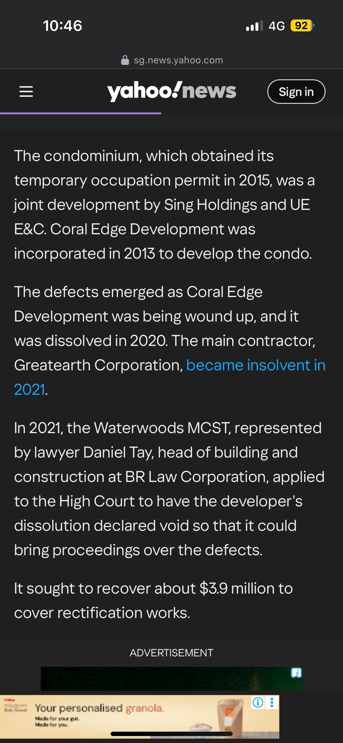
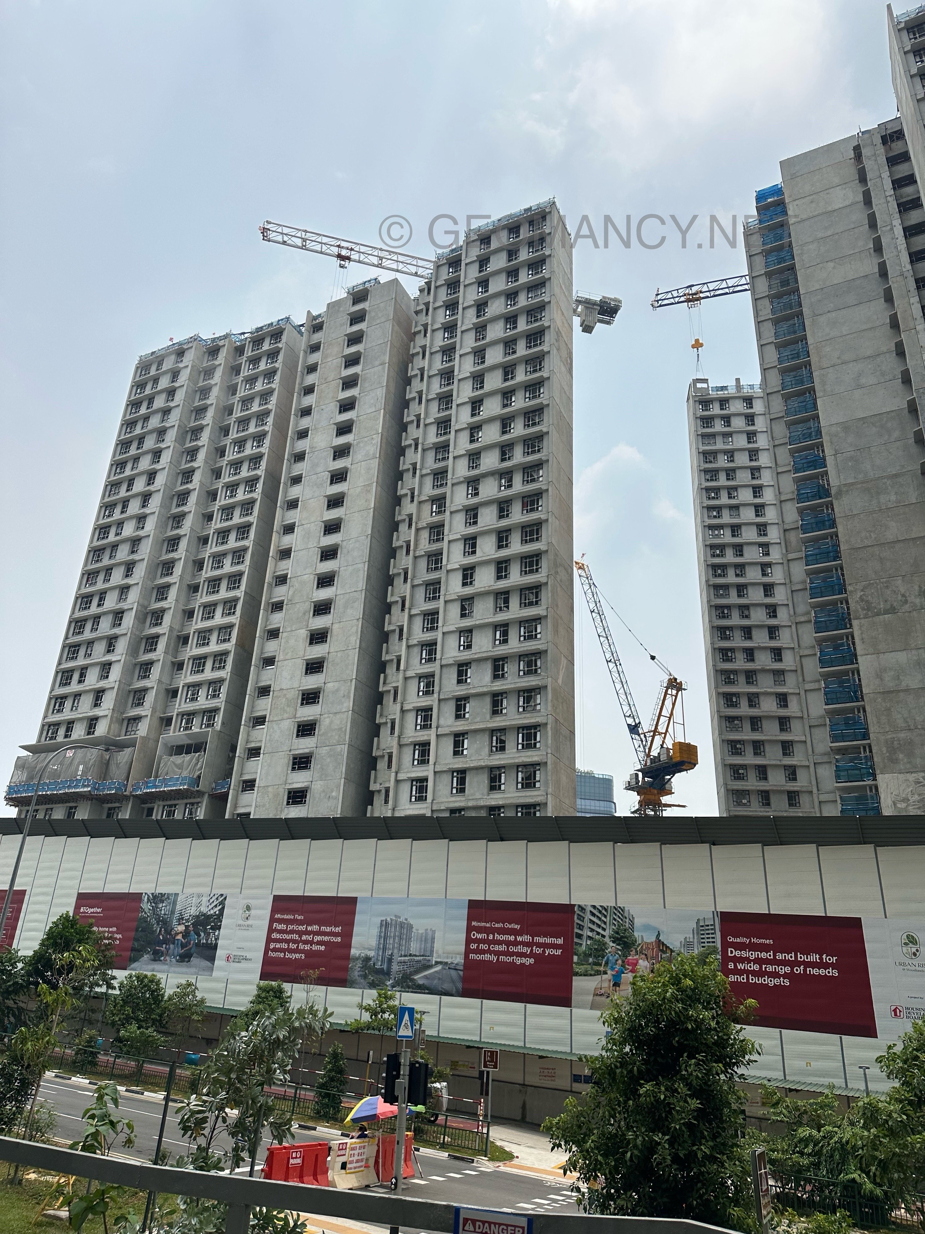
  9. Citygate Residential Block
  10. FengShui.Geomancy.NetMembers Login - FengShui.Geomancy.NetLogin Wizard Account Provide the e-mail address & password. Press 'Finish' to login to your account. Step 1: Provide your E-mail Address & Password E-mail: Pass...https://freereport.geomancy.net/ 1. Personal Ba Zi & Feng Shui Element 2. Eight House Report 3. Eight Aspirations Report 4. Gua (Kua) Number Report 5. Suitable House Report 6. Personal Stars 7. Chinese Horoscope Sign 8. Bedroom Location 9. Sleep Position 10. Work Direction 11. Study Direction
  11. Common sense vs Stigmas vs Taboos? Common sense is practical knowledge or reasoning that most people use to make everyday decisions. It’s based on general experience and logical thinking about what is safe, sensible, or effective. Stigmas are negative labels or judgments that society places on certain behaviors, conditions, or situations. They create shame or social rejection for people associated with those things, discouraging open discussion or acceptance. Taboos are strong cultural or religious prohibitions against specific actions or topics. Taboos are considered unacceptable or forbidden, and violating them often triggers strong emotional reactions or social penalties. In short, common sense helps us make good decisions, while stigmas and taboos are social pressures that shape what people think is acceptable or unacceptable.
Sponsored Link
 

Account

Navigation

Search

Search

Configure browser push notifications

Chrome (Android)
  1. Tap the lock icon next to the address bar.
  2. Tap Permissions → Notifications.
  3. Adjust your preference.
Chrome (Desktop)
  1. Click the padlock icon in the address bar.
  2. Select Site settings.
  3. Find Notifications and adjust your preference.