


Cecil Lee
Staff
-
Joined
-
Last visited
-
Currently
Viewing Topic: Will twins have the same pillar of destiny
Everything posted by Cecil Lee
-
Free Personalised Analysis Reports Personalised Reports Free Analysis Reports Find out your Life Association Sectors Find out your Gua (Kua) Number? East or West Group Person? Find out your Horoscope? Find out your Characteristics? Find out your Personal Element? How suitable is your Home? Your Favourable Sleep Position? Your Favourable Study Position? Your Favourable Work Position? Your Favourable Bedroom Location? Is your Apartment Number Auspicious? Generate Free Reports Generate 4 Good & 4 Bad Direction Report Generate Ba Zi Luck Analysis, Personal Element & Horoscope Insights- (FREEBAZI.GEOMANCY.NET) Generate 30 Days Auspicious Date for ONE or TWO Persons(DATE.GEOMANCY.NET) More FREE Reports Welcome to Personalized Analysis ReportsSince 1996, Geomancy.net has guided individuals in understanding Feng Shui and Chinese divination. With our expertise, we have assisted thousands, becoming a trusted resource for those seeking knowledge. Our personalized analysis reports empower you to tap into these ancient practices, significantly improving your quality of life. Discover the Power of Personalized Analysis ReportsAt ONLINE.GEOMANCY.NET, we provide free personalized analysis reports that empower you to understand the intricate connections between your living environment and your personal well-being. By leveraging time-honored techniques from Feng Shui and Chinese divination, our reports help you uncover valuable insights that can guide your decisions and improve your lifestyle. What We OfferOur comprehensive reports are designed to give you a holistic view of your life associations and environmental influences. Here’s what you can expect from our personalized analysis: Life Association SectorsUnderstanding your life association sectors is crucial for achieving balance and harmony. Our reports will reveal the areas of your life that are most influenced by your environment, helping you to focus your energy where it matters most. Your Gua (Kua) NumberYour Gua number is a vital aspect of Feng Shui that determines your personal energy profile. By calculating your Gua number, you can gain insights into your strengths and weaknesses, allowing you to make informed decisions that align with your true nature. East or West Group Person?Identifying whether you belong to the East or West group can significantly impact your approach to life. Our analysis will classify you accordingly, providing tailored recommendations for your personal growth and development. Horoscope InsightsAstrology plays a significant role in understanding your personality traits and life path. Our reports will include your horoscope, offering insights into your character and potential challenges you may face. Understanding Your CharacteristicsEvery individual has unique characteristics shaped by various factors. Our personalized reports will analyze these traits, helping you to understand how they influence your interactions and relationships. Your Personal ElementIn Feng Shui, the five elements (Wood, Fire, Earth, Metal, Water) play a crucial role in shaping your life. Our analysis will determine your personal element, providing insights that can help you harmonize with your environment. Assessing Your Home's SuitabilityYour living space significantly affects your overall well-being. Our reports will evaluate how suitable your home is for you, considering factors such as layout, direction, and energy flow. This assessment can guide you in making necessary adjustments to enhance your living environment. Favorable Sleep PositionDid you know that your sleep position can impact your health? Our analysis will suggest the best sleep position for you based on your personal energy profile, helping you achieve better rest and rejuvenation. Optimal Study PositionFor students and professionals alike, the right study position can enhance focus and productivity. Our reports will provide recommendations for your ideal study position, allowing you to maximize your learning potential. Favorable Work PositionYour work environment plays a critical role in your success. We will analyze your work position to ensure it aligns with your personal energy, promoting productivity and satisfaction in your professional life. Bedroom LocationThe location of your bedroom can influence your relationships and personal energy. Our reports will offer insights into the most beneficial bedroom location for you, fostering a peaceful and harmonious space. Auspicious Apartment NumbersDid you know that the number of your apartment can carry significant meaning? Our analysis will determine whether your apartment number is auspicious, guiding you towards a more favorable living situation. Generate Your Free ReportsReady to take the next step? Generating your free personalized analysis reports is simple: Login or Sign Up: Access your account at ONLINE.GEOMANCY.NET to get started. Geomancye-books Choose Your Reports: Select from various reports, including: 4 Good & 4 Bad Direction Report Ba Zi Luck Analysis Personal Element Insights Horoscope Insights Receive Your Analysis: Once generated, your reports will be available for you to explore.
-
Free Personalised Analysis Reports Personalised Reports Free Analysis Reports Find out your Life Association Sectors Find out your Gua (Kua) Number? East or West Group Person? Find out your Horoscope? Find out your Characteristics? Find out your Personal Element? How suitable is your Home? Your Favourable Sleep Position? Your Favourable Study Position? Your Favourable Work Position? Your Favourable Bedroom Location? Is your Apartment Number Auspicious? Generate Free Reports Generate 4 Good & 4 Bad Direction Report Generate Ba Zi Luck Analysis, Personal Element & Horoscope Insights- (FREEBAZI.GEOMANCY.NET) BaZi forecasts Generate 30 Days Auspicious Date for ONE or TWO Persons(DATE.GEOMANCY.NET) More FREE Reports Welcome to Personalized Analysis ReportsSince 1996, Geomancy.net has guided individuals in understanding Feng Shui and Chinese divination. With our expertise, we have assisted thousands, becoming a trusted resource for those seeking knowledge. Our personalized analysis reports empower you to tap into these ancient practices, significantly improving your quality of life. Discover the Power of Personalized Analysis ReportsAt ONLINE.GEOMANCY.NET, we provide free personalized analysis reports that empower you to understand the intricate connections between your living environment and your personal well-being. By leveraging time-honored techniques from Feng Shui and Chinese divination, our reports help you uncover valuable insights that can guide your decisions and improve your lifestyle. What We OfferOur comprehensive reports are designed to give you a holistic view of your life associations and environmental influences. Here’s what you can expect from our personalized analysis: Life Association SectorsUnderstanding your life association sectors is crucial for achieving balance and harmony. Our reports will reveal the areas of your life that are most influenced by your environment, helping you to focus your energy where it matters most. Your Gua (Kua) NumberYour Gua number is a vital aspect of Feng Shui that determines your personal energy profile. By calculating your Gua number, you can gain insights into your strengths and weaknesses, allowing you to make informed decisions that align with your true nature. East or West Group Person?Identifying whether you belong to the East or West group can significantly impact your approach to life. Our analysis will classify you accordingly, providing tailored recommendations for your personal growth and development. Horoscope InsightsAstrology plays a significant role in understanding your personality traits and life path. Our reports will include your horoscope, offering insights into your character and potential challenges you may face. Understanding Your CharacteristicsEvery individual has unique characteristics shaped by various factors. Our personalized reports will analyze these traits, helping you to understand how they influence your interactions and relationships. Your Personal ElementIn Feng Shui, the five elements (Wood, Fire, Earth, Metal, Water) play a crucial role in shaping your life. Our analysis will determine your personal element, providing insights that can help you harmonize with your environment. Assessing Your Home's SuitabilityYour living space significantly affects your overall well-being. Our reports will evaluate how suitable your home is for you, considering factors such as layout, direction, and energy flow. This assessment can guide you in making necessary adjustments to enhance your living environment. Favorable Sleep PositionDid you know that your sleep position can impact your health? Our analysis will suggest the best sleep position for you based on your personal energy profile, helping you achieve better rest and rejuvenation. Optimal Study PositionFor students and professionals alike, the right study position can enhance focus and productivity. Our reports will provide recommendations for your ideal study position, allowing you to maximize your learning potential. Favorable Work PositionYour work environment plays a critical role in your success. We will analyze your work position to ensure it aligns with your personal energy, promoting productivity and satisfaction in your professional life. Bedroom LocationThe location of your bedroom can influence your relationships and personal energy. Our reports will offer insights into the most beneficial bedroom location for you, fostering a peaceful and harmonious space. Auspicious Apartment NumbersDid you know that the number of your apartment can carry significant meaning? Our analysis will determine whether your apartment number is auspicious, guiding you towards a more favorable living situation. Generate Your Free ReportsReady to take the next step? Generating your free personalized analysis reports is simple: Login or Sign Up: Access your account at ONLINE.GEOMANCY.NET to get started. Choose Your Reports: Select from various reports, including: 4 Good & 4 Bad Direction Report Ba Zi Luck Analysis Personal Element Insights Horoscope Insights Receive Your Analysis: Once generated, your reports will be available for you to explore.
-
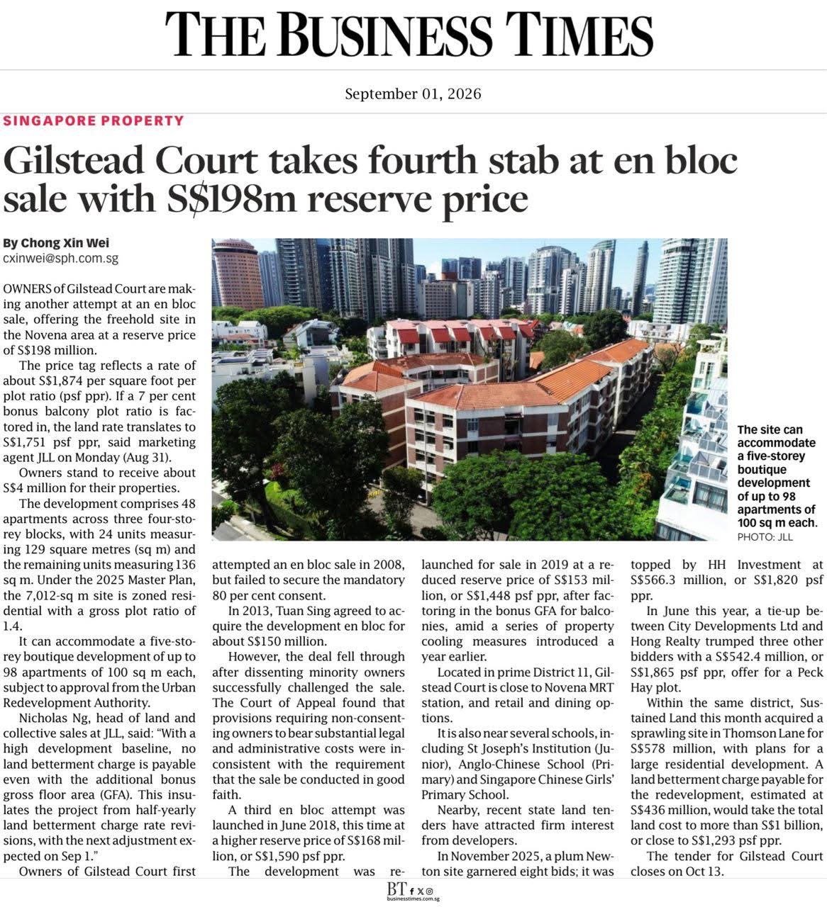
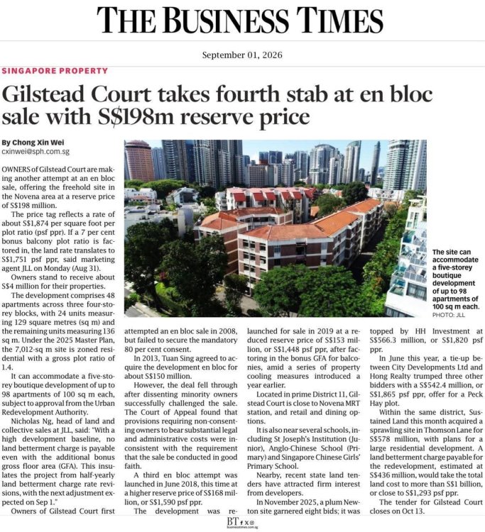
Source & Credit: Gilstead Court Tries for En Bloc Sale Again with $198 Million Price Tag Summary: The owners of Gilstead Court, a freehold residential property in the Novena area, are making their fourth attempt at a collective (en bloc) sale. They are asking for a minimum price of S$198 million. If the sale goes through, each current apartment owner could receive around S$4 million. Key Details: * The Property: Gilstead Court currently has 48 apartments. A new developer could use the land to build a brand new five-story building with up to 98 apartments. * Location: It is located in a prime area (District 11) close to the Novena MRT station, shopping, dining, and several popular schools. * Past Attempts: The owners previously tried to sell the property together in 2008, 2013, and 2018/2019. These past attempts failed for various reasons, including a lack of agreement among owners, legal challenges, and market cooling measures. The current tender for developers to bid on the property will close on October 13.
-
Personalised Analysis Reports Personalised Reports Free Analysis Reports Find out your Life Association Sectors Find out your Gua (Kua) Number? East or West Group Person? Find out your Horoscope? Find out your Characteristics? Find out your Personal Element? How suitable is your Home? Your Favourable Sleep Position? Your Favourable Study Position? Your Favourable Work Position? Your Favourable Bedroom Location? Is your Apartment Number Auspicious? Generate Free Reports Generate 4 Good & 4 Bad Direction Report Generate Ba Zi Luck Analysis, Personal Element & Horoscope Insights- (FREEBAZI.GEOMANCY.NET) Generate 30 Days Auspicious Date for ONE or TWO Persons(DATE.GEOMANCY.NET) More FREE Reports Welcome to Personalized Analysis ReportsSince 1996, Geomancy.net has guided individuals in understanding Feng Shui and Chinese divination. With our expertise, we have assisted thousands, becoming a trusted resource for those seeking knowledge. Our personalized analysis reports empower you to tap into these ancient practices, significantly improving your quality of life. Discover the Power of Personalized Analysis ReportsAt ONLINE.GEOMANCY.NET, we provide free personalized analysis reports that empower you to understand the intricate connections between your living environment and your personal well-being. By leveraging time-honored techniques from Feng Shui and Chinese divination, our reports help you uncover valuable insights that can guide your decisions and improve your lifestyle. What We OfferOur comprehensive reports are designed to give you a holistic view of your life associations and environmental influences. Here’s what you can expect from our personalized analysis: Life Association SectorsUnderstanding your life association sectors is crucial for achieving balance and harmony. Our reports will reveal the areas of your life that are most influenced by your environment, helping you to focus your energy where it matters most. Your Gua (Kua) NumberYour Gua number is a vital aspect of Feng Shui that determines your personal energy profile. By calculating your Gua number, you can gain insights into your strengths and weaknesses, allowing you to make informed decisions that align with your true nature. East or West Group Person?Identifying whether you belong to the East or West group can significantly impact your approach to life. Our analysis will classify you accordingly, providing tailored recommendations for your personal growth and development. Horoscope InsightsAstrology plays a significant role in understanding your personality traits and life path. Our reports will include your horoscope, offering insights into your character and potential challenges you may face. Understanding Your CharacteristicsEvery individual has unique characteristics shaped by various factors. Our personalized reports will analyze these traits, helping you to understand how they influence your interactions and relationships. Your Personal ElementIn Feng Shui, the five elements (Wood, Fire, Earth, Metal, Water) play a crucial role in shaping your life. Our analysis will determine your personal element, providing insights that can help you harmonize with your environment. Assessing Your Home's SuitabilityYour living space significantly affects your overall well-being. Our reports will evaluate how suitable your home is for you, considering factors such as layout, direction, and energy flow. This assessment can guide you in making necessary adjustments to enhance your living environment. Favorable Sleep PositionDid you know that your sleep position can impact your health? Our analysis will suggest the best sleep position for you based on your personal energy profile, helping you achieve better rest and rejuvenation. Optimal Study PositionFor students and professionals alike, the right study position can enhance focus and productivity. Our reports will provide recommendations for your ideal study position, allowing you to maximize your learning potential. Favorable Work PositionYour work environment plays a critical role in your success. We will analyze your work position to ensure it aligns with your personal energy, promoting productivity and satisfaction in your professional life. Bedroom LocationThe location of your bedroom can influence your relationships and personal energy. Our reports will offer insights into the most beneficial bedroom location for you, fostering a peaceful and harmonious space. Auspicious Apartment NumbersDid you know that the number of your apartment can carry significant meaning? Our analysis will determine whether your apartment number is auspicious, guiding you towards a more favorable living situation. Generate Your Free ReportsReady to take the next step? Generating your free personalized analysis reports is simple: Login or Sign Up: Access your account at ONLINE.GEOMANCY.NET to get started. Choose Your Reports: Select from various reports, including: 4 Good & 4 Bad Direction Report Ba Zi Luck Analysis Personal Element Insights Horoscope Insights Receive Your Analysis: Once generated, your reports will be available for you to explore.
-
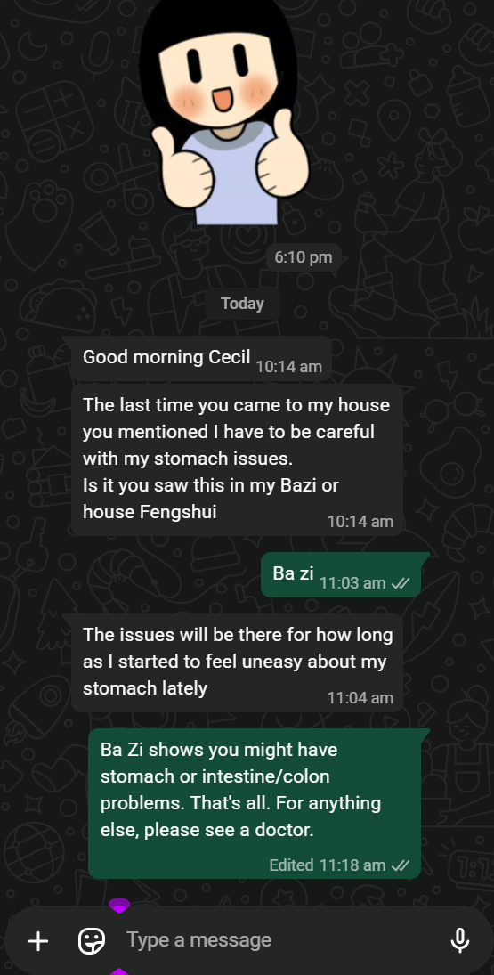
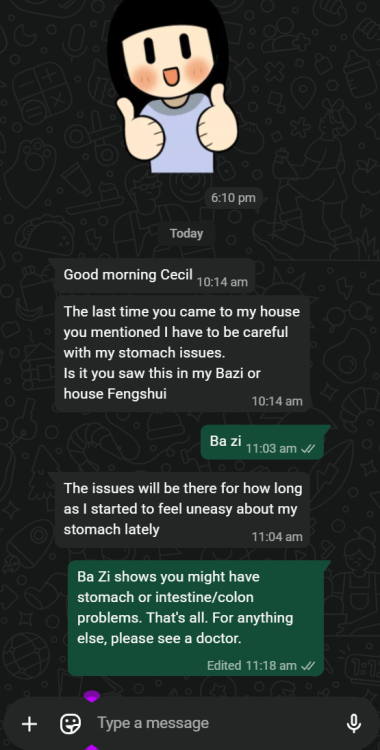
Good morning Cecil The last time you came to my house you mentioned I have to be careful with my stomach issues. Is it you saw this in my Bazi or house Fengshui. The issues will be there for how long as I started to feel uneasy about my stomach lately Ba Zi shows you might have stomach or intestine/colon problems. That's all. For anything else, please see a doctor.
-
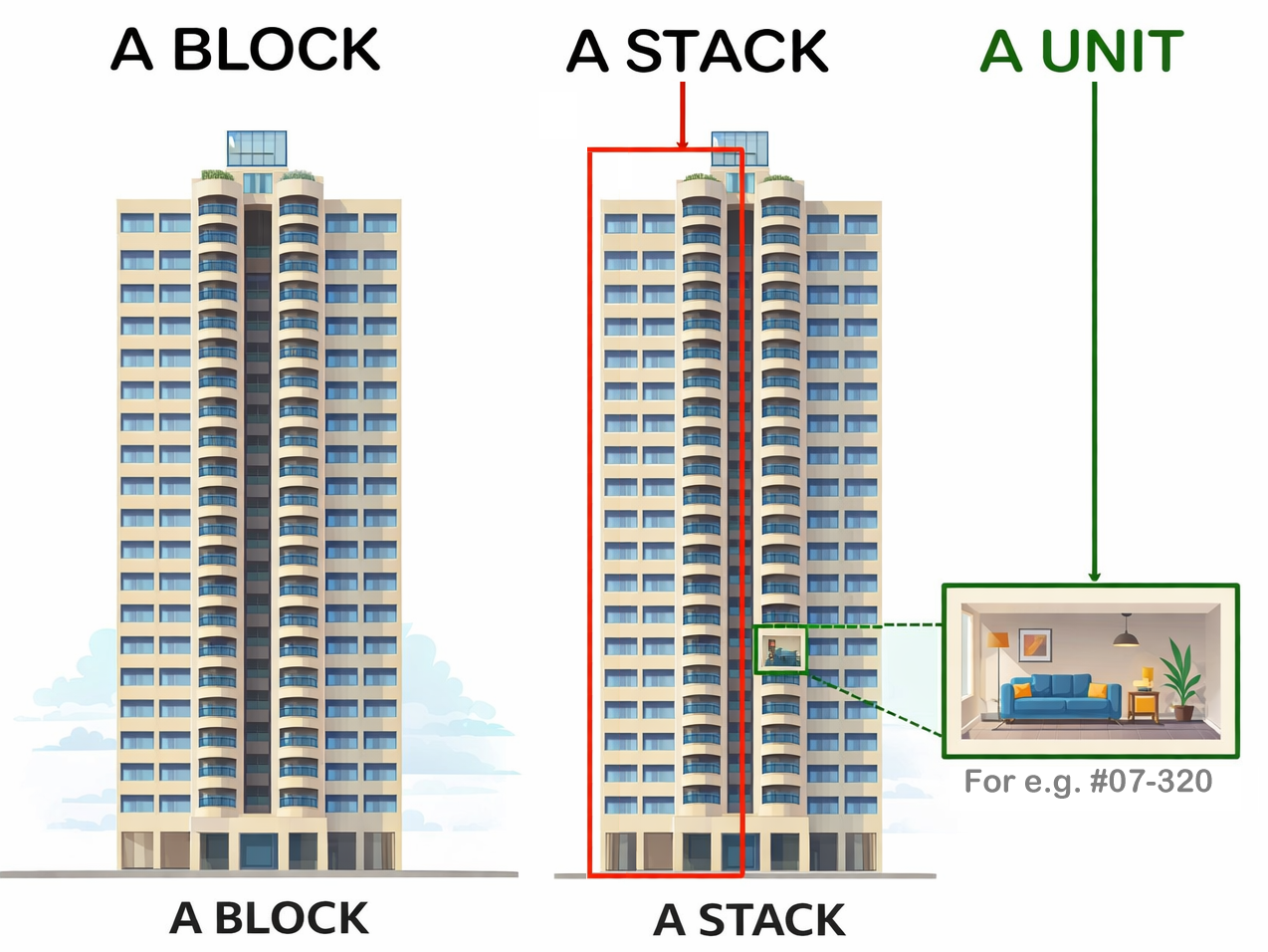
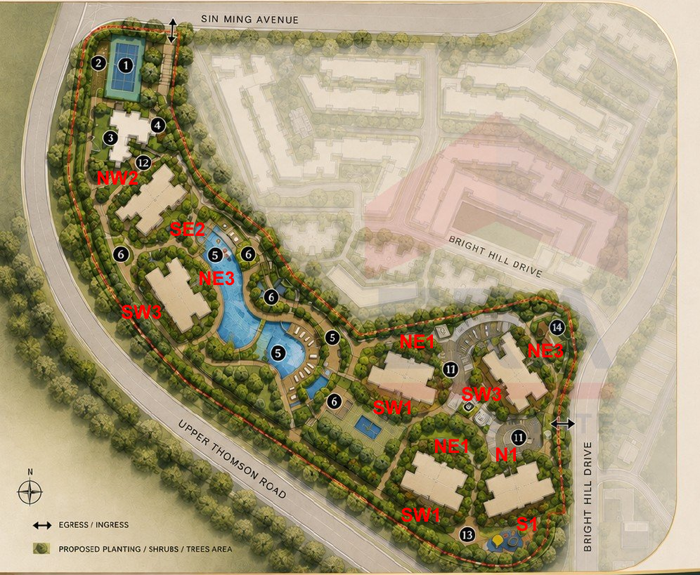
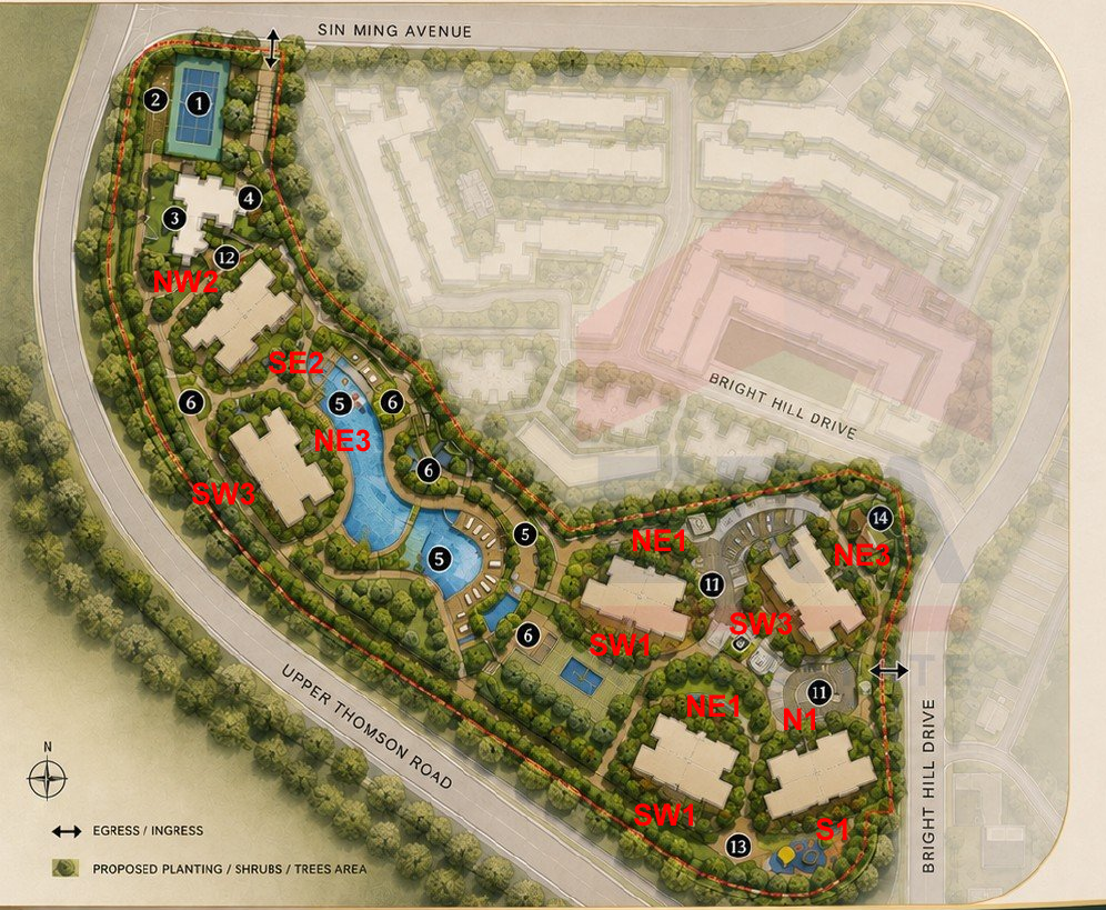
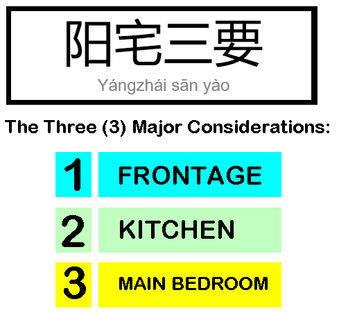
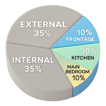
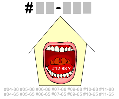
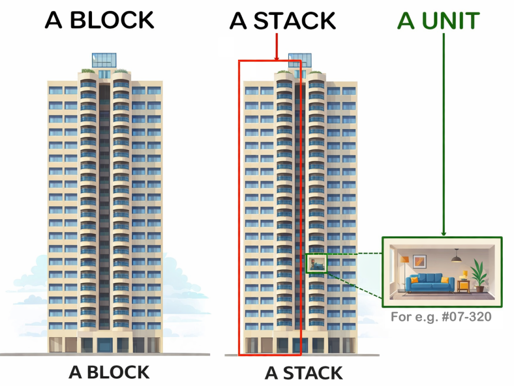
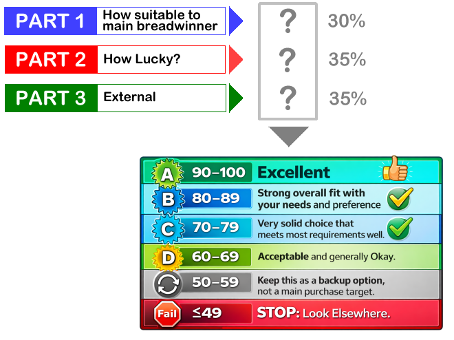
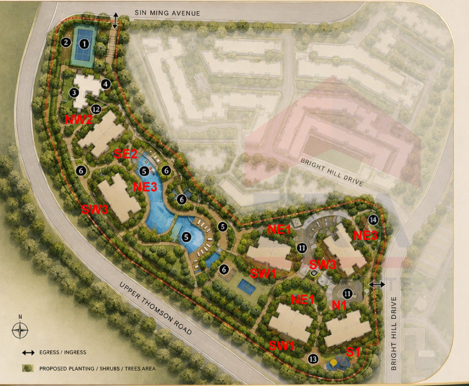
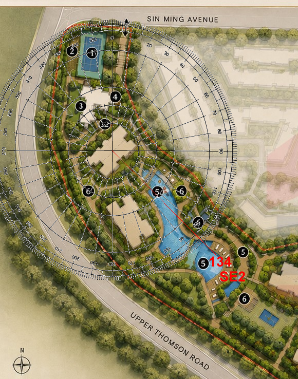
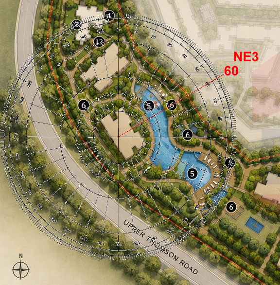
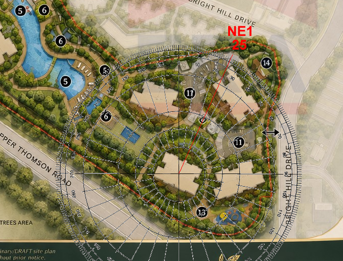
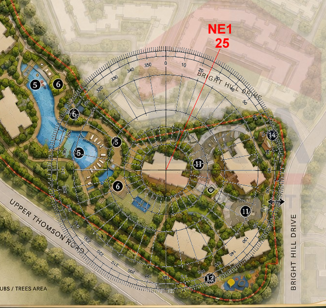
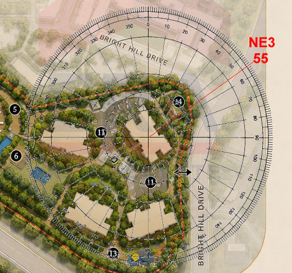
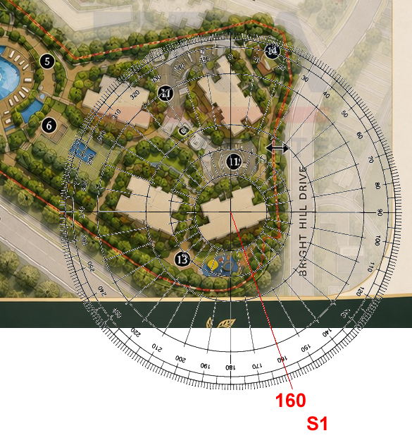
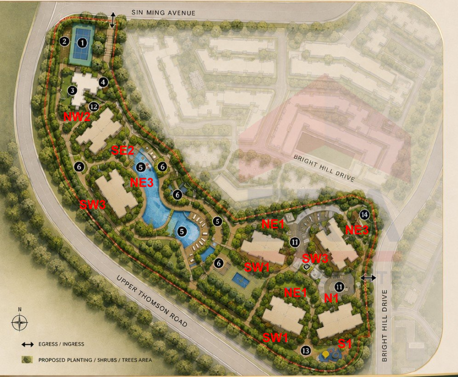
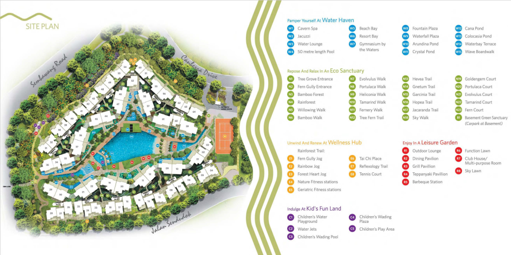
WHICH UNITS ARE LUCKY? Part 1: How is the luck of the Internal Feng Shui of this unit? [35 marks] Part 2: External Feng Shui luck? [35 marks] Part 3: How suitable is the unit - Frontage, Kitchen & Main Bedroom? [30 marks] +++ Depends on the Internal Layout & Sectors - How Lucky? Note: Currently, this site plan does not show block numbers. Good, Better, Best! NW2 = Very Lucky. Frontage has the auspicious double #9's. From 2024 till 2043. +++ NE3 = Very Lucky. Frontage has the auspicious double #9's.+++ S1 = Very Lucky. Frontage has the auspicious double #9's. From 2024 till 2043.+++ SW1 = Very Lucky. Frontage has the auspicious double #9's. From 2024 till 2043.+++ The Rest! N1 = Less Lucky as wealth luck [Double 9's] wasted at the rear.+++ SE2 = Less Lucky as wealth luck [Double 9's] wasted at the rear.+++ NE1 = Less Lucky as wealth luck [Double 9's] wasted at the rear. +++ SW3 = Less Lucky as wealth luck [Double 9's] wasted at the rear. ++++++++++++++++++++++++++++++++++ But also need to review/consider the individual Internal Layout Plan & this is just part of the many considerations in a home purchase. However the above does not take into consideration things like: Kitchen/Stove at Inauspicious Fire @ Heaven's Gate or Poison arrow aimed towards the unit, proximity to common bin etc.. +++++++++++++++++++++++++++ +++++++++++++++++ ++++ Location, location, location? Sha Qi? Poison Arrow? Watch Your Front, Sides & Back! Our New e-Book 12 Practical Tips for Choosing a new BTO Flat with External Feng Shui Considerations POOR SCORE? THESE ARE SOME CONCERNS: Sha Qi or Poison arrow(s) from Sharp Corner(s) 天斩煞 (tiān zhǎn shà) = Tian Zhan Sha etc... +++++++++++++++++++++++++++ +++++++++++++++++ ++++ How Suitable to breadwinner? Please note that has yet to take into consideration: 1. How suitable is the unit to the main breadwinner & 2. External Shapes and Forms of the unit TOTAL SCORE = 35 + 35 + 30 = 100% Get Expert Help: ++++++++++++++++++ +++++++++ How do you Feng Shui your high-rise home? Use your front door? Who are the Conservatives & the Modernist? +++ Type in the unit number to find out OPTION 1 Please go to this link to check a unit number: https://www.geomancy.net/content/personalised-reports/free-feng-shui-reports/house-number-report/about-house-number-report [Need to create a free account to access it] or OPTION 2 Go to URL: https://login.geomancy.net On the blue navigation on the left, click under Free Reports | House Number. +++ Geomancy.net e-books https://www.geomancy.net/forums/store/category/1-geomancynet-e-books/ +++ Master Robert Lee, Geomancy.net





















-
Flying Star Total Feng Shui Note: Currently, this site plan does not show block numbers. Flying Star Feng Shui Workings NE1 NE1 NE3 S1 SE2 NE3
-
Flying Star Feng Shui: Why You Cannot Simply “Eat, Sleep & Repeat” About this Case Study A client asked why my top-five HDB Farrer Park Arena stack rankings did not include stacks recommended in a TikTok by another Feng Shui Master. I explained I excluded those stacks because they have major Feng Shui flaws. Although stacks like #222, #226, #234, and #240 may look attractive and have similar facings to my top picks, their kitchen layout likely forces the stove into the NW sector (“Fire at Heaven’s Gate”), which is why they should be avoided. Since 1996 Learn More: +++ Our fees have stayed the same since 1996 Get a Quote: Cecil Lee, +65 9785-3171 support@geomancy.net





-
Personalised Analysis Reports Personalised Reports Free Analysis Reports Find out your Life Association Sectors Find out your Gua (Kua) Number? East or West Group Person? Find out your Horoscope? Find out your Characteristics? Find out your Personal Element? How suitable is your Home? Your Favourable Sleep Position? Your Favourable Study Position? Your Favourable Work Position? Your Favourable Bedroom Location? Is your Apartment Number Auspicious? Generate Free Reports Generate 4 Good & 4 Bad Direction Report Generate Ba Zi Luck Analysis, Personal Element & Horoscope Insights- (FREEBAZI.GEOMANCY.NET) Generate 30 Days Auspicious Date for ONE or TWO Persons(DATE.GEOMANCY.NET) More FREE Reports Welcome to Personalized Analysis ReportsSince 1996, Geomancy.net has guided individuals in understanding Feng Shui and Chinese divination. With our expertise, we have assisted thousands, becoming a trusted resource for those seeking knowledge. Our personalized analysis reports empower you to tap into these ancient practices, significantly improving your quality of life. Discover the Power of Personalized Analysis ReportsAt ONLINE.GEOMANCY.NET, we provide free personalized analysis reports that empower you to understand the intricate connections between your living environment and your personal well-being. By leveraging time-honored techniques from Feng Shui and Chinese divination, our reports help you uncover valuable insights that can guide your decisions and improve your lifestyle. What We OfferOur comprehensive reports are designed to give you a holistic view of your life associations and environmental influences. Here’s what you can expect from our personalized analysis: Life Association SectorsUnderstanding your life association sectors is crucial for achieving balance and harmony. Our reports will reveal the areas of your life that are most influenced by your environment, helping you to focus your energy where it matters most. Your Gua (Kua) NumberYour Gua number is a vital aspect of Feng Shui that determines your personal energy profile. By calculating your Gua number, you can gain insights into your strengths and weaknesses, allowing you to make informed decisions that align with your true nature. East or West Group Person?Identifying whether you belong to the East or West group can significantly impact your approach to life. Our analysis will classify you accordingly, providing tailored recommendations for your personal growth and development. Horoscope InsightsAstrology plays a significant role in understanding your personality traits and life path. Our reports will include your horoscope, offering insights into your character and potential challenges you may face. Understanding Your CharacteristicsEvery individual has unique characteristics shaped by various factors. Our personalized reports will analyze these traits, helping you to understand how they influence your interactions and relationships. Your Personal ElementIn Feng Shui, the five elements (Wood, Fire, Earth, Metal, Water) play a crucial role in shaping your life. Our analysis will determine your personal element, providing insights that can help you harmonize with your environment. Assessing Your Home's SuitabilityYour living space significantly affects your overall well-being. Our reports will evaluate how suitable your home is for you, considering factors such as layout, direction, and energy flow. This assessment can guide you in making necessary adjustments to enhance your living environment. Favorable Sleep PositionDid you know that your sleep position can impact your health? Our analysis will suggest the best sleep position for you based on your personal energy profile, helping you achieve better rest and rejuvenation. Optimal Study PositionFor students and professionals alike, the right study position can enhance focus and productivity. Our reports will provide recommendations for your ideal study position, allowing you to maximize your learning potential. Favorable Work PositionYour work environment plays a critical role in your success. We will analyze your work position to ensure it aligns with your personal energy, promoting productivity and satisfaction in your professional life. Bedroom LocationThe location of your bedroom can influence your relationships and personal energy. Our reports will offer insights into the most beneficial bedroom location for you, fostering a peaceful and harmonious space. Auspicious Apartment NumbersDid you know that the number of your apartment can carry significant meaning? Our analysis will determine whether your apartment number is auspicious, guiding you towards a more favorable living situation. Generate Your Free ReportsReady to take the next step? Generating your free personalized analysis reports is simple: Login or Sign Up: Access your account at ONLINE.GEOMANCY.NET to get started. Choose Your Reports: Select from various reports, including: 4 Good & 4 Bad Direction Report Ba Zi Luck Analysis Personal Element Insights Horoscope Insights Receive Your Analysis: Once generated, your reports will be available for you to explore.
-
Personalised Analysis Reports Personalised Reports Free Analysis Reports Find out your Life Association Sectors Find out your Gua (Kua) Number? East or West Group Person? Find out your Horoscope? Find out your Characteristics? Find out your Personal Element? How suitable is your Home? Your Favourable Sleep Position? Your Favourable Study Position? Your Favourable Work Position? Your Favourable Bedroom Location? Is your Apartment Number Auspicious? Generate Free Reports Generate 4 Good & 4 Bad Direction Report Generate Ba Zi Luck Analysis, Personal Element & Horoscope Insights- (FREEBAZI.GEOMANCY.NET) Generate 30 Days Auspicious Date for ONE or TWO Persons(DATE.GEOMANCY.NET) More FREE Reports Welcome to Personalized Analysis ReportsSince 1996, Geomancy.net has guided individuals in understanding Feng Shui and Chinese divination. With our expertise, we have assisted thousands, becoming a trusted resource for those seeking knowledge. Our personalized analysis reports empower you to tap into these ancient practices, significantly improving your quality of life. Discover the Power of Personalized Analysis ReportsAt ONLINE.GEOMANCY.NET, we provide free personalized analysis reports that empower you to understand the intricate connections between your living environment and your personal well-being. By leveraging time-honored techniques from Feng Shui and Chinese divination, our reports help you uncover valuable insights that can guide your decisions and improve your lifestyle. What We OfferOur comprehensive reports are designed to give you a holistic view of your life associations and environmental influences. Here’s what you can expect from our personalized analysis: Life Association SectorsUnderstanding your life association sectors is crucial for achieving balance and harmony. Our reports will reveal the areas of your life that are most influenced by your environment, helping you to focus your energy where it matters most. Your Gua (Kua) NumberYour Gua number is a vital aspect of Feng Shui that determines your personal energy profile. By calculating your Gua number, you can gain insights into your strengths and weaknesses, allowing you to make informed decisions that align with your true nature. East or West Group Person?Identifying whether you belong to the East or West group can significantly impact your approach to life. Our analysis will classify you accordingly, providing tailored recommendations for your personal growth and development. Horoscope InsightsAstrology plays a significant role in understanding your personality traits and life path. Our reports will include your horoscope, offering insights into your character and potential challenges you may face. Understanding Your CharacteristicsEvery individual has unique characteristics shaped by various factors. Our personalized reports will analyze these traits, helping you to understand how they influence your interactions and relationships. Your Personal ElementIn Feng Shui, the five elements (Wood, Fire, Earth, Metal, Water) play a crucial role in shaping your life. Our analysis will determine your personal element, providing insights that can help you harmonize with your environment. Assessing Your Home's SuitabilityYour living space significantly affects your overall well-being. Our reports will evaluate how suitable your home is for you, considering factors such as layout, direction, and energy flow. This assessment can guide you in making necessary adjustments to enhance your living environment. Favorable Sleep PositionDid you know that your sleep position can impact your health? Our analysis will suggest the best sleep position for you based on your personal energy profile, helping you achieve better rest and rejuvenation. Optimal Study PositionFor students and professionals alike, the right study position can enhance focus and productivity. Our reports will provide recommendations for your ideal study position, allowing you to maximize your learning potential. Favorable Work PositionYour work environment plays a critical role in your success. We will analyze your work position to ensure it aligns with your personal energy, promoting productivity and satisfaction in your professional life. Bedroom LocationThe location of your bedroom can influence your relationships and personal energy. Our reports will offer insights into the most beneficial bedroom location for you, fostering a peaceful and harmonious space. Auspicious Apartment NumbersDid you know that the number of your apartment can carry significant meaning? Our analysis will determine whether your apartment number is auspicious, guiding you towards a more favorable living situation. Generate Your Free ReportsReady to take the next step? Generating your free personalized analysis reports is simple: Login or Sign Up: Access your account at ONLINE.GEOMANCY.NET to get started. Choose Your Reports: Select from various reports, including: 4 Good & 4 Bad Direction Report Ba Zi Luck Analysis Personal Element Insights Horoscope Insights Receive Your Analysis: Once generated, your reports will be available for you to explore.
-
Unsolicited Advice on Fail-Safe Lock Technologies The situation described in the post: having a family trapped inside because both the electronic mechanism and the mechanical emergency key failed—is a severe safety hazard. In residential security, locks must guarantee "free egress," meaning you should always be able to get out in an emergency (like a fire) without a key or electricity. The failure here wasn't just an electronic glitch; it was a catastrophic mechanical failure of the internal tailpiece or bolt mechanism, which is unfortunately common in budget or lesser-known smart lock brands. If you want the convenience of smart technology without compromising on physical safety and reliability, here are the best options and technologies to consider: 1. Retrofit Smart Locks (The Ultimate Fail-Safe) If you are considering going "back to old school lock and key," a retrofit smart lock is the perfect compromise. * How it works: Brands like August, SwitchBot, or Wyze do not replace your entire lock. Instead, you install a high-quality, traditional deadbolt (like a heavy-duty Schlage or Yale), and the smart device only attaches to the inside thumbturn. * Why it’s a better fail-safe: The outside of your door remains a standard mechanical keyhole. The inside remains a physical thumbturn. The smart device simply turns the metal rod for you. If the motor breaks, the battery dies, or the electronics fry, you can still easily turn the thumbturn by hand from the inside or use a physical key from the outside. 2. ANSI/BHMA Grade 1 Certified Smart Locks The poster mentioned looking at "trusty brands like Yale." The difference between a trusted brand and an off-brand is usually the quality of the internal metal components. * The Technology: When shopping for a full-replacement smart lock, look for ANSI/BHMA Grade 1 or Grade 2 certification. This is a standard that tests locks for hundreds of thousands of cycles and brute-force attacks. * Recommendations: Brands like Schlage (Encode Plus), Yale (Assure line), and Kwikset build smart locks with high-grade internal mechanics. Their mechanical key overrides are directly linked to the bolt, bypassing the electronic motor entirely. 3. Independent Dual-Mechanism Locks Some advanced electronic locks separate the electronic mortise/bolt from the mechanical one. * If the electronic bolt jams, the lock has a completely independent mechanical cylinder that operates a separate lever or bolt to open the door. This redundancy ensures a single point of mechanical failure doesn't trap you. 4. Smart Locks with "Clutch" Mechanisms Higher-end commercial and residential smart locks use a mechanical clutch. When the correct code is entered, the clutch engages, connecting the handle to the bolt. When locked, the handle spins freely. * Fail-safe benefit: From the inside, the handle is always permanently connected to the bolt (never relying on the clutch or electronics). Pulling the inside handle mechanically retracts the bolt 100% of the time, guaranteeing safe exit. Summary Recommendation for the User Given the trauma of having a family trapped, do not buy another fully integrated, budget-brand smart lock. The best path forward is to buy a highly rated, purely mechanical deadbolt from a trusted brand (Schlage, Yale, Medeco) to ensure absolute physical reliability. Then, attach an August Wi-Fi Smart Lock to the inside of that deadbolt. This gives you app control, auto-locking, and digital access, but relies on a time-tested, unbreakable mechanical foundation for emergencies.
-
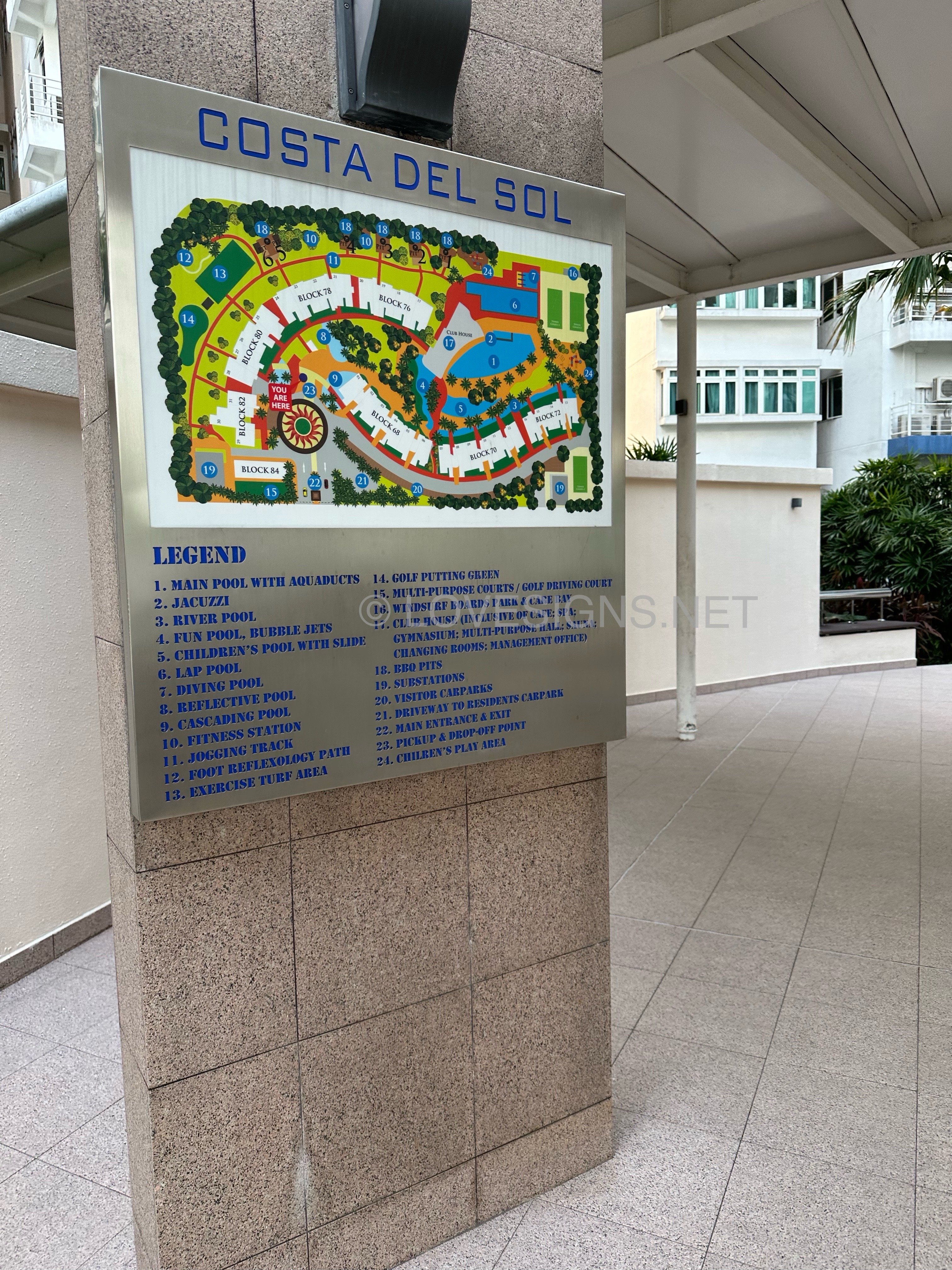
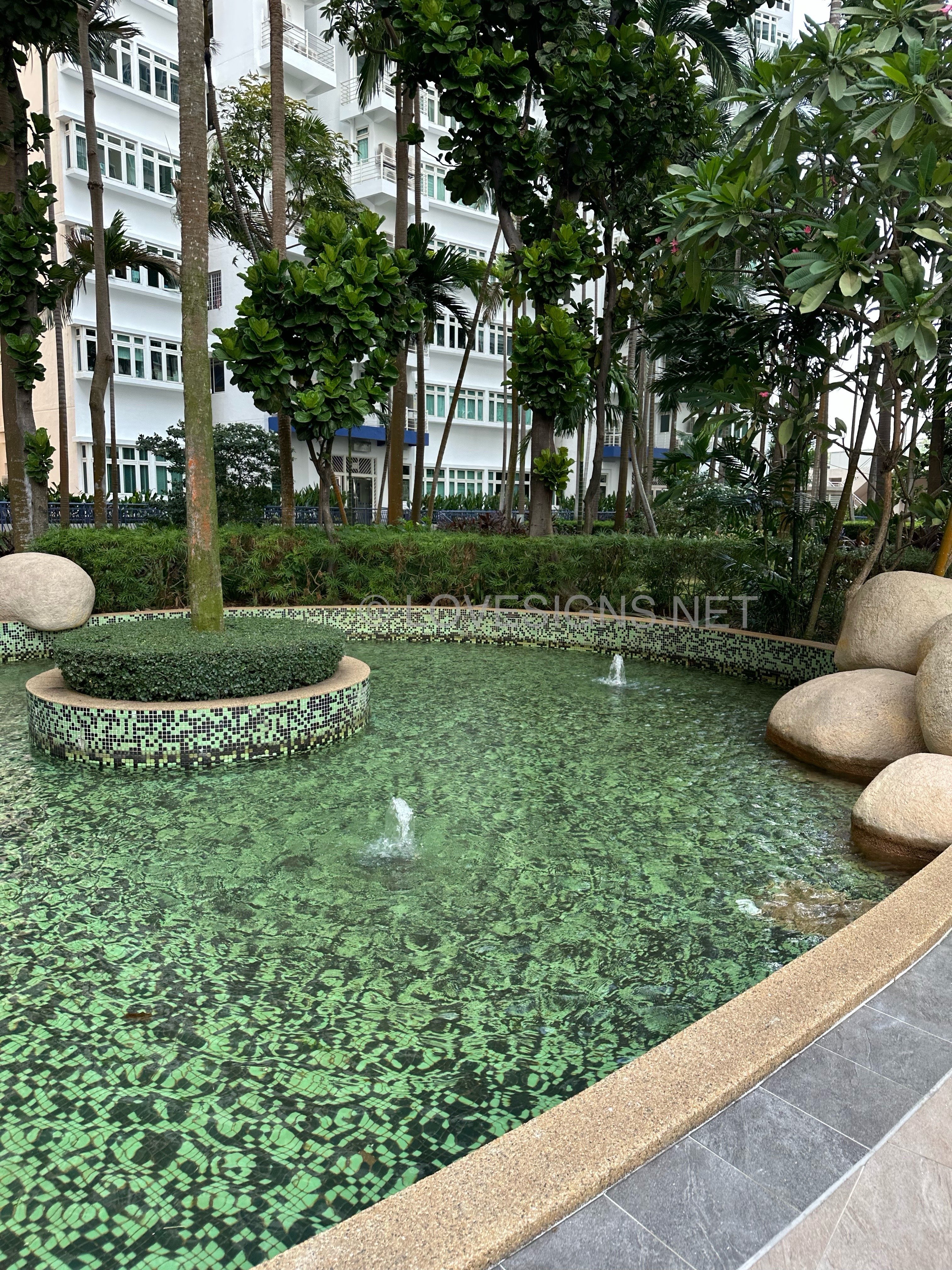
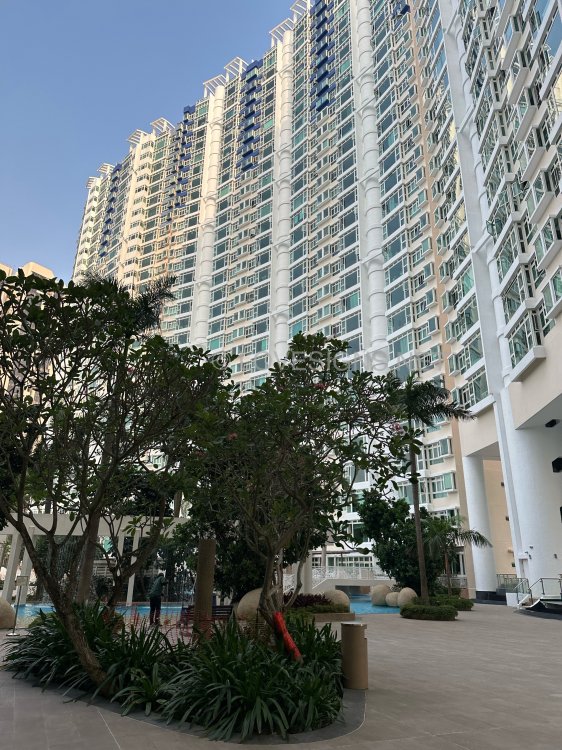
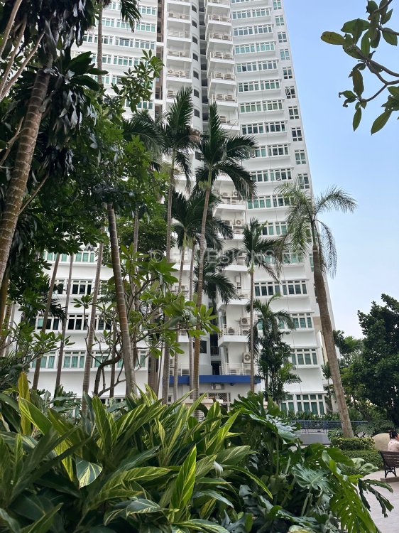
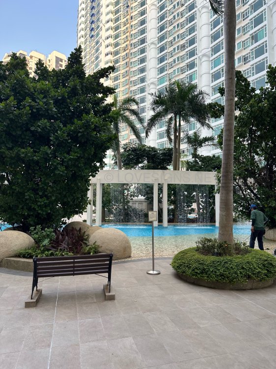
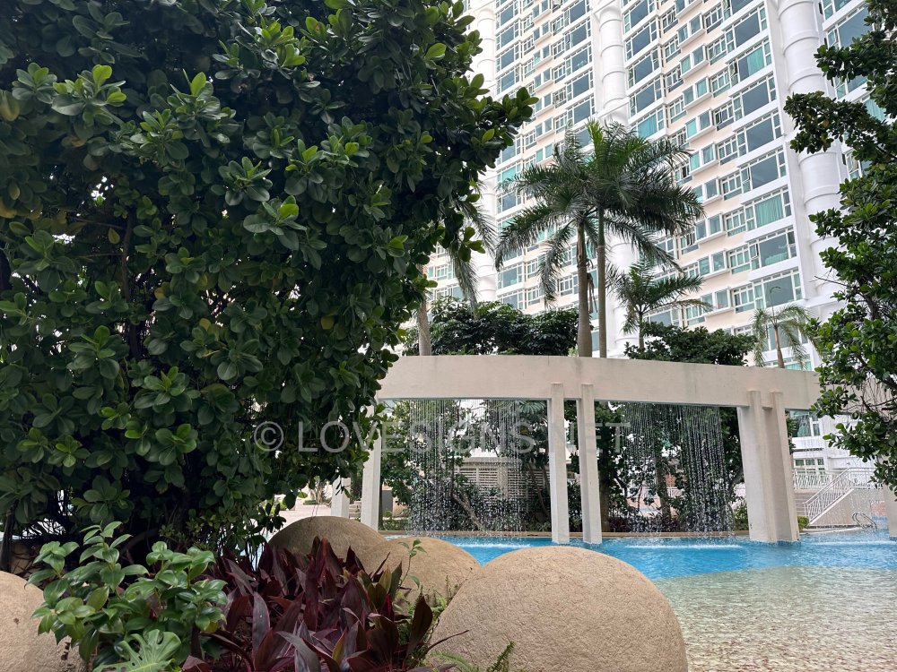
On 2nd September 2026 @ Costa Del Sol

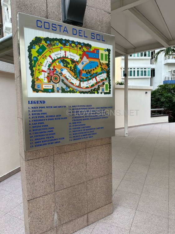
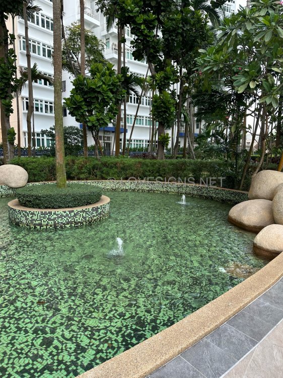
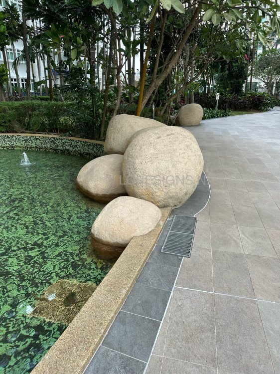
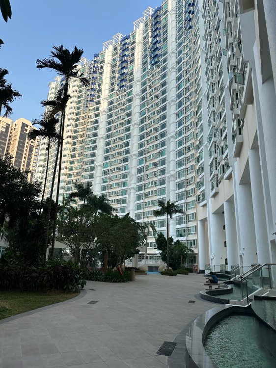
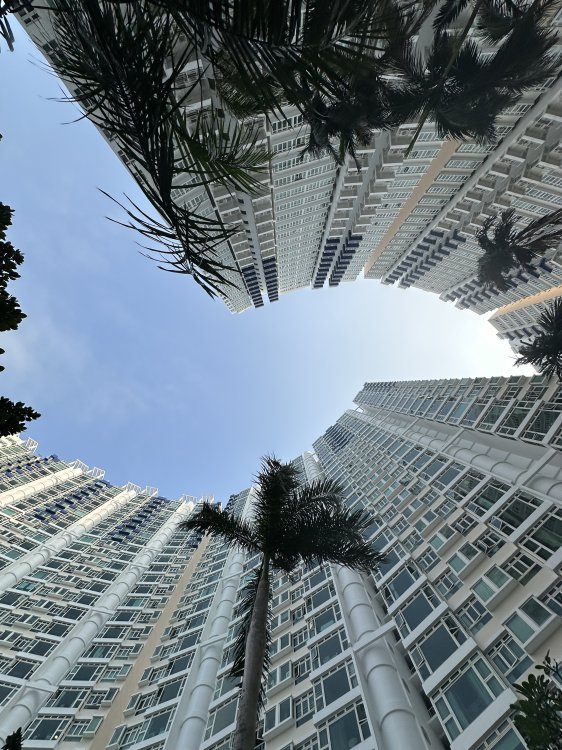
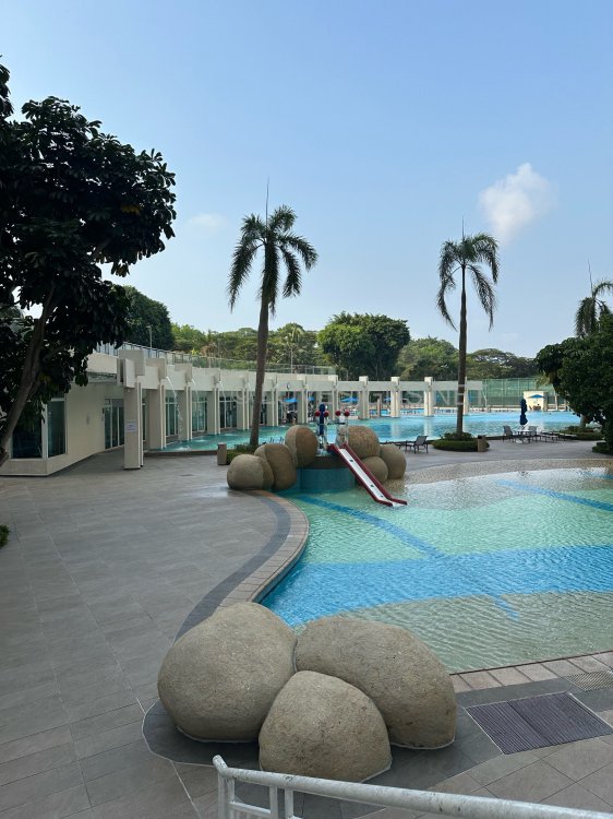
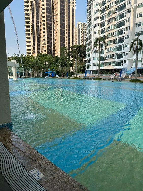
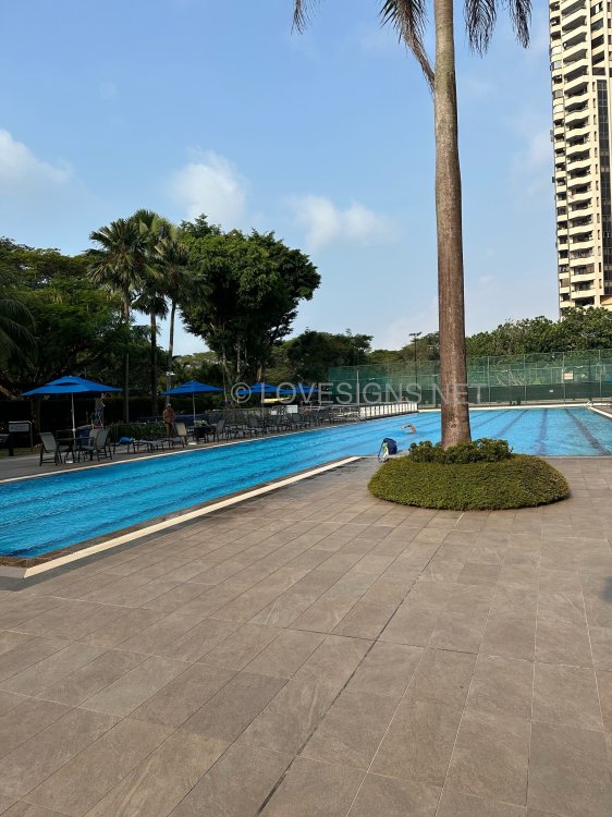
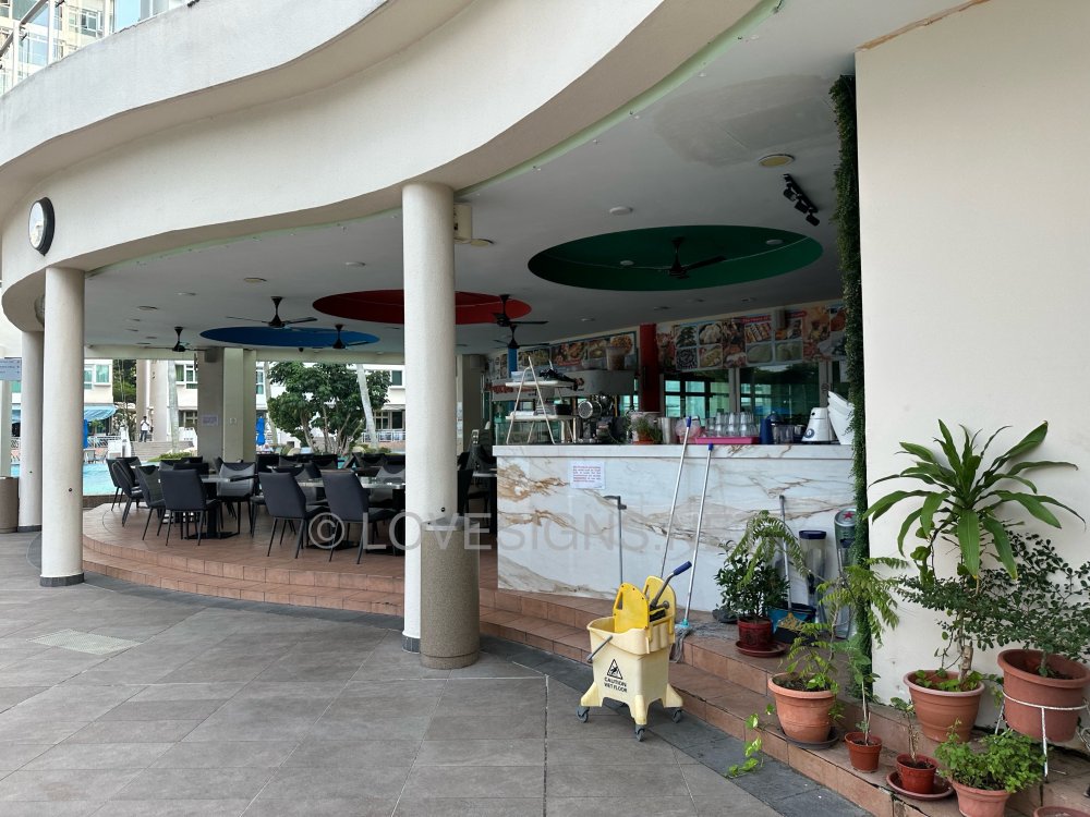
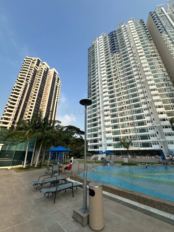
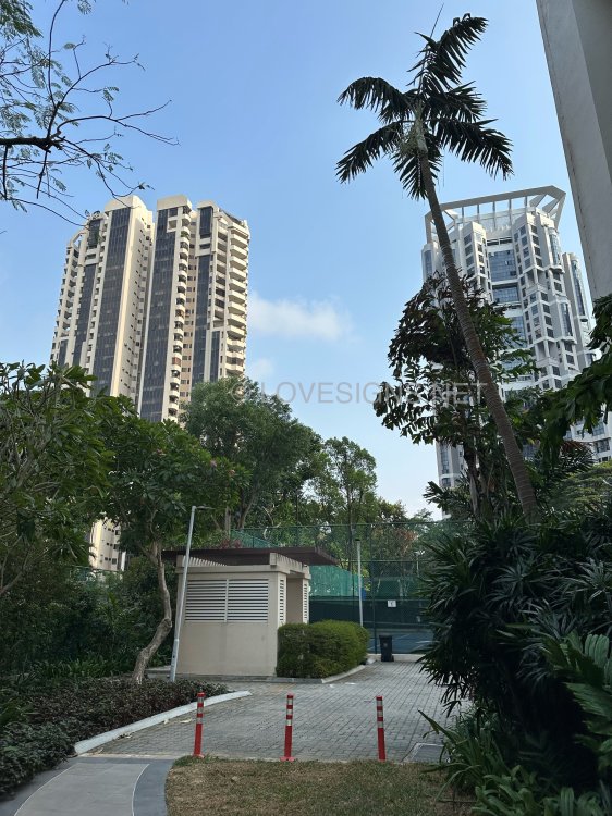
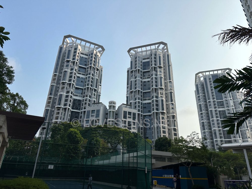
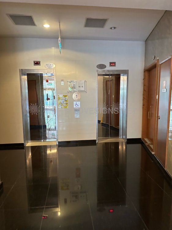
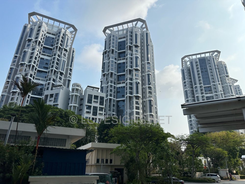
-
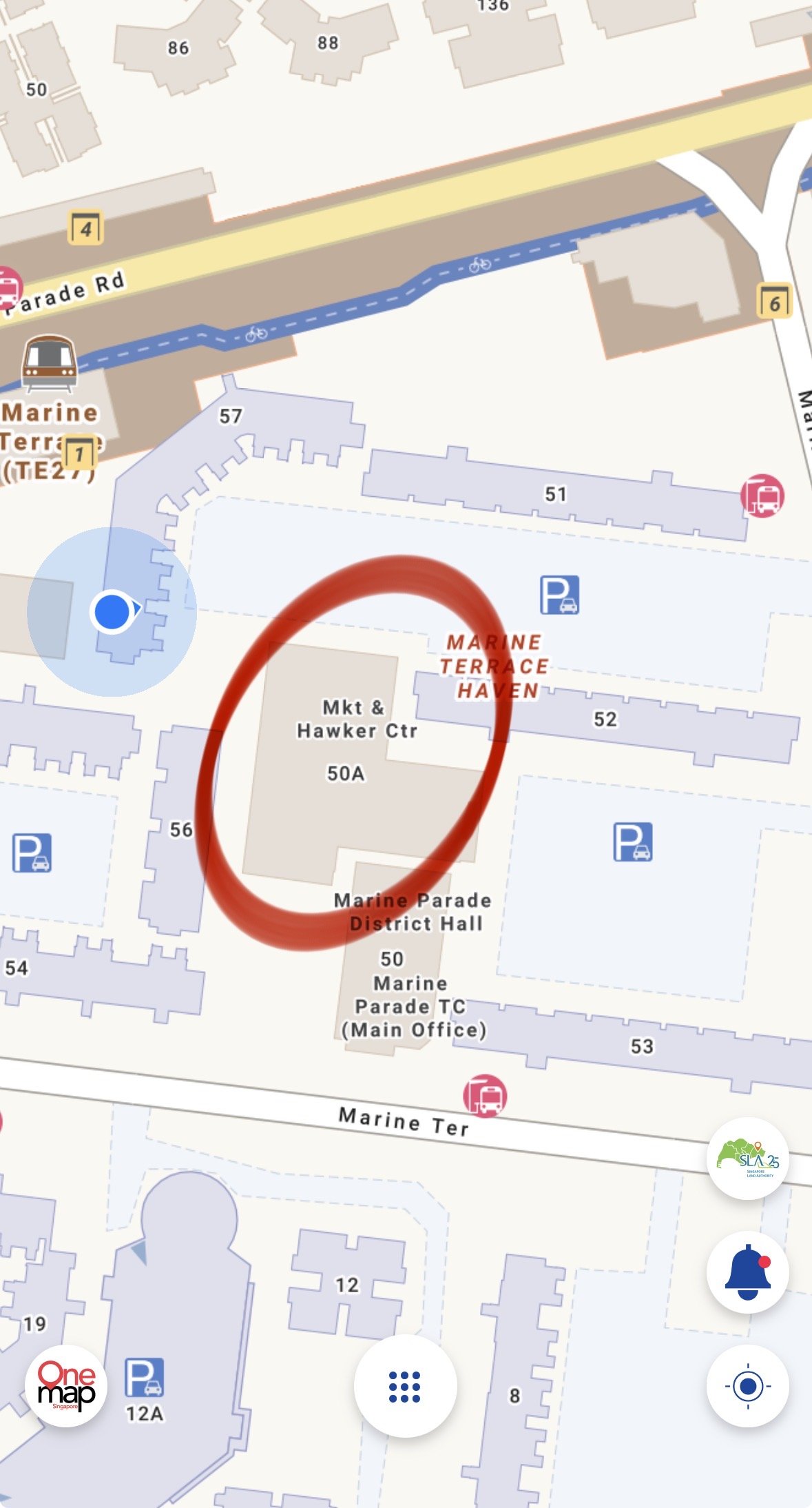
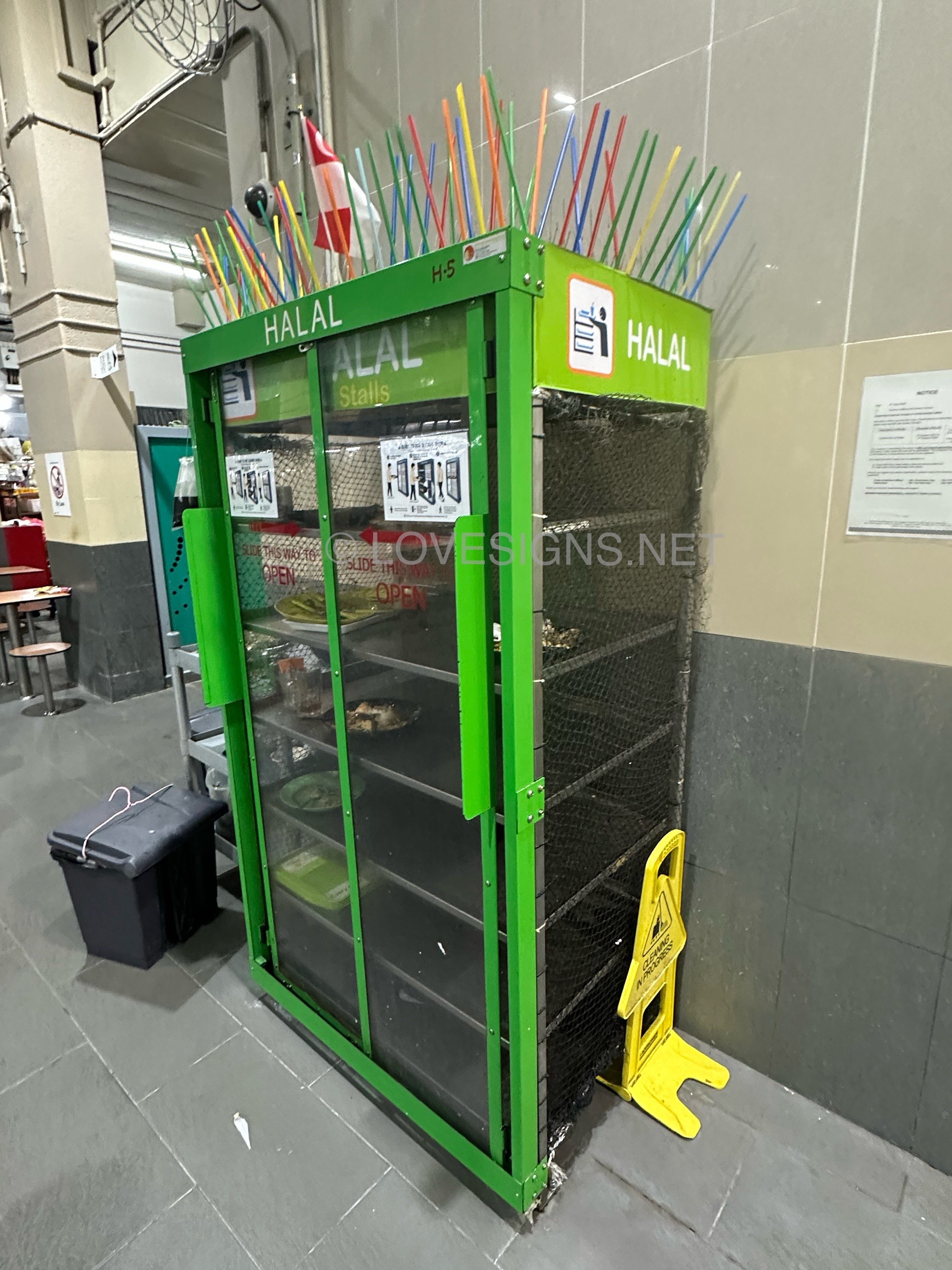
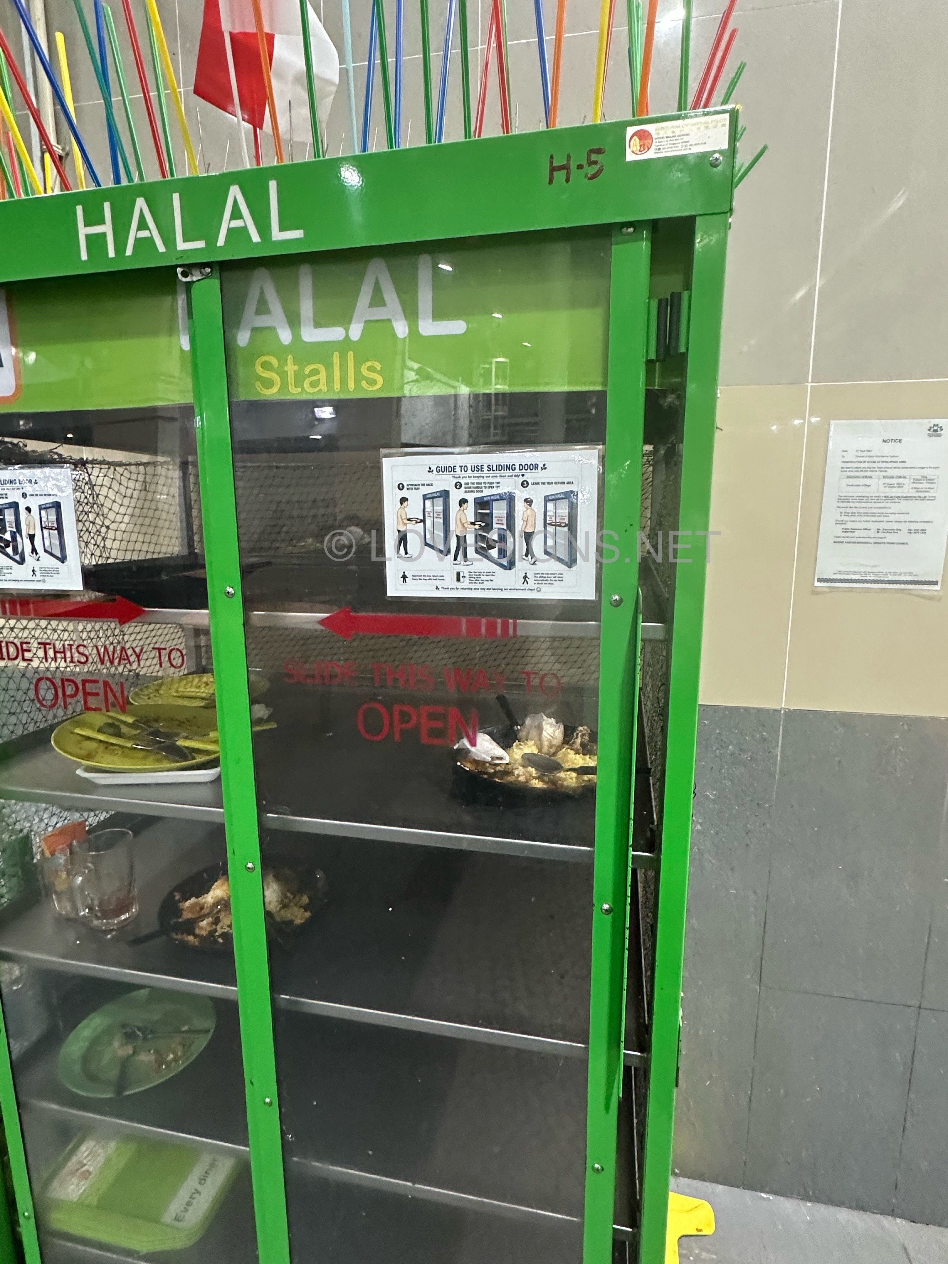
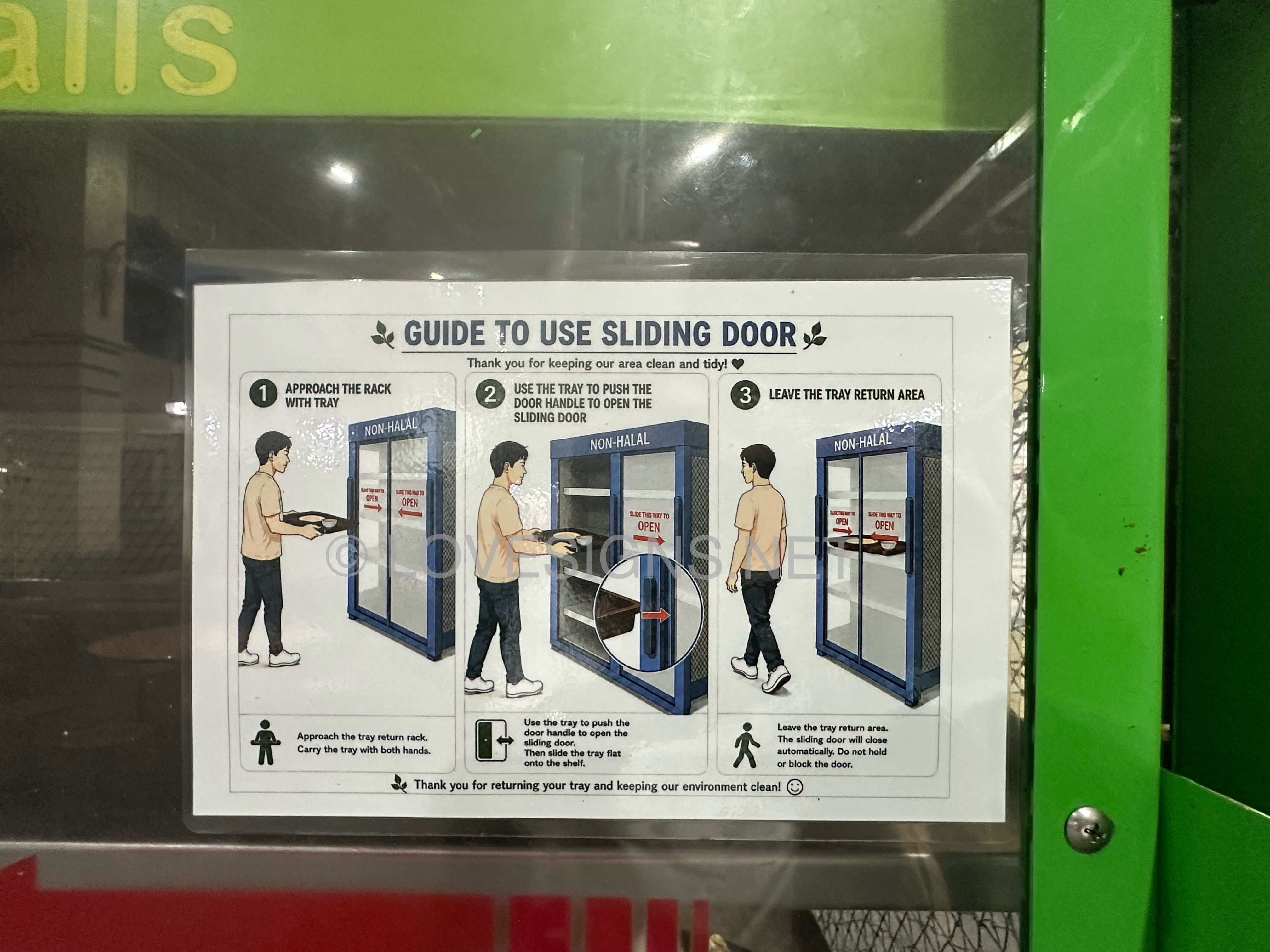
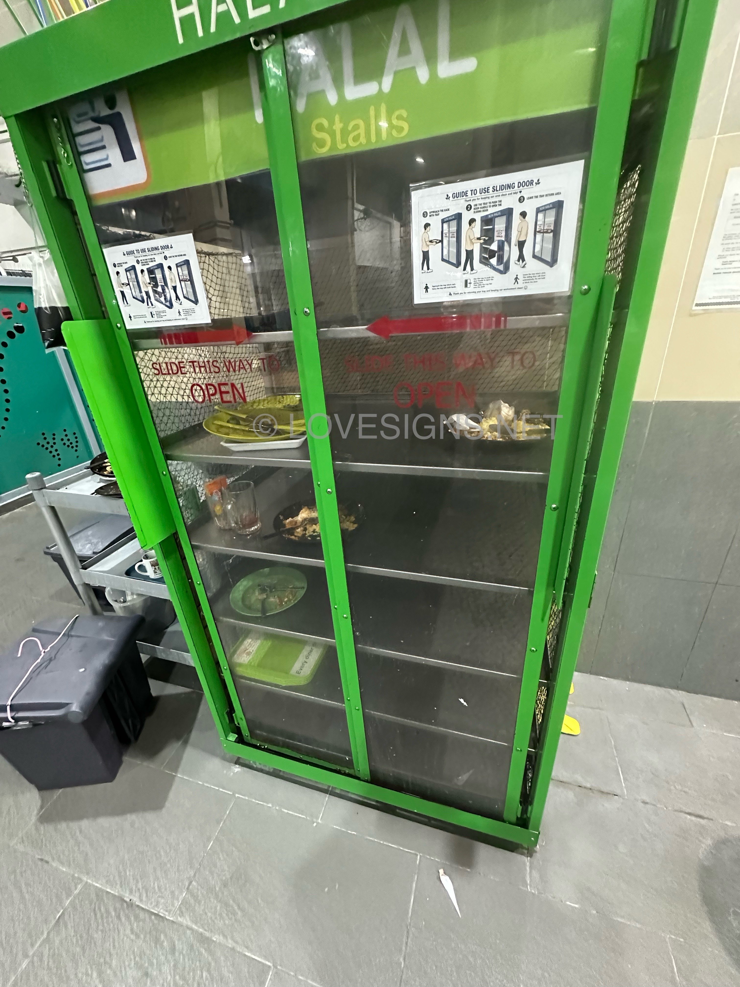
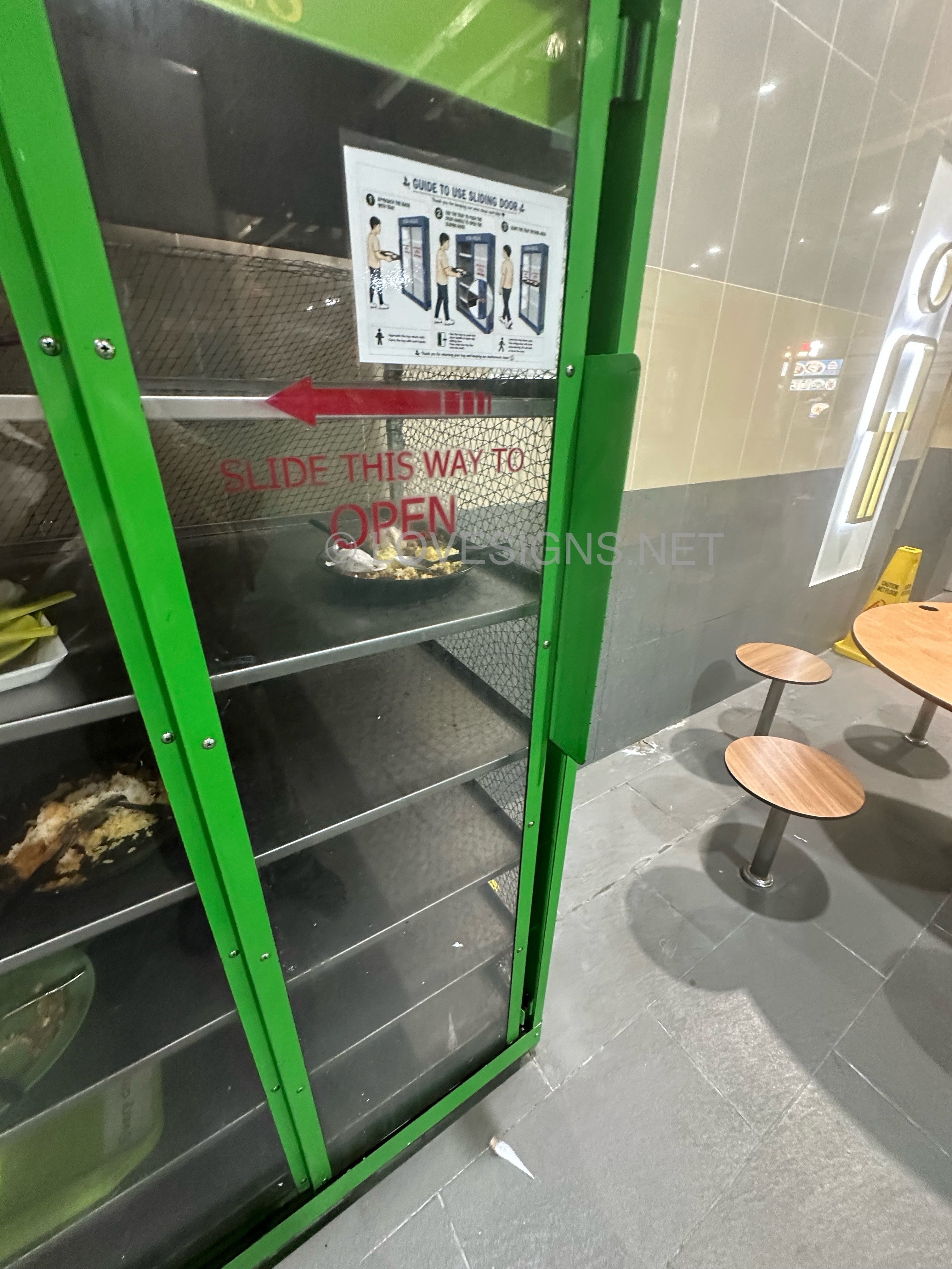
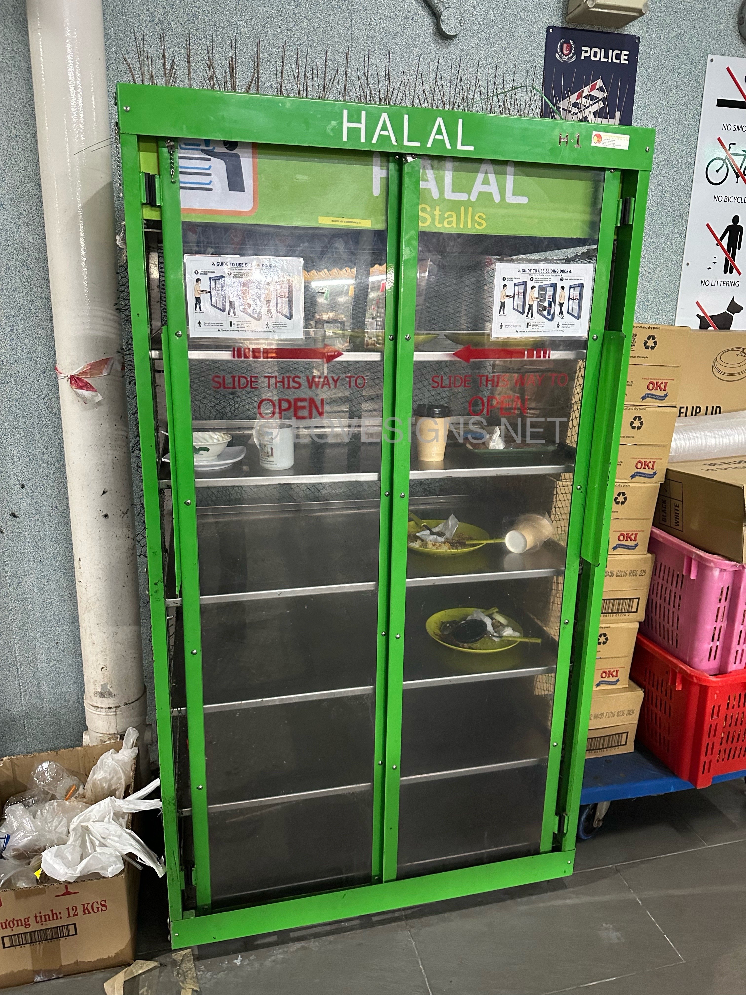
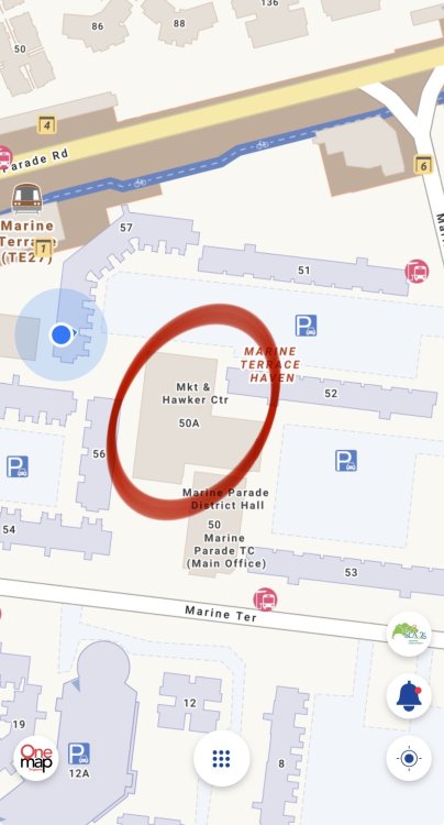
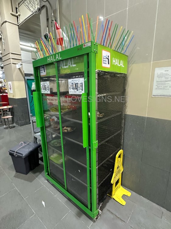
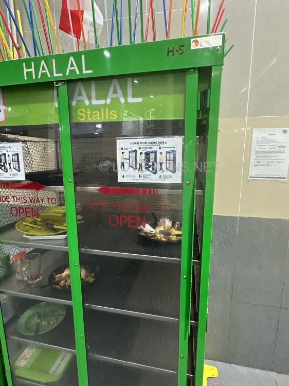
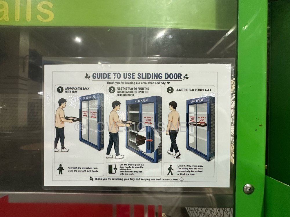
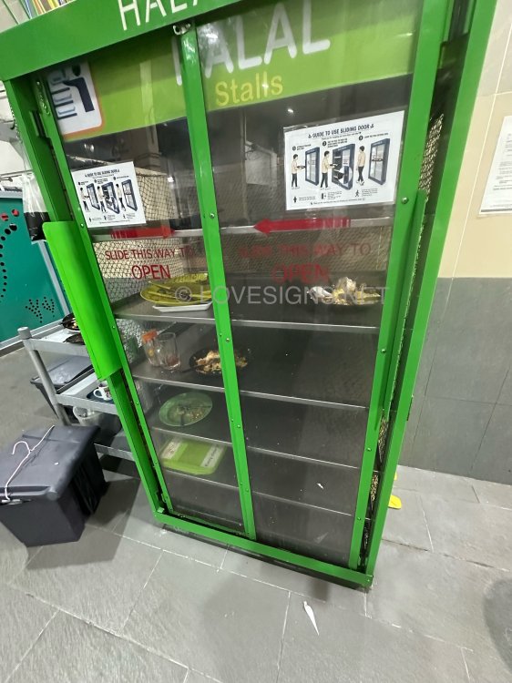
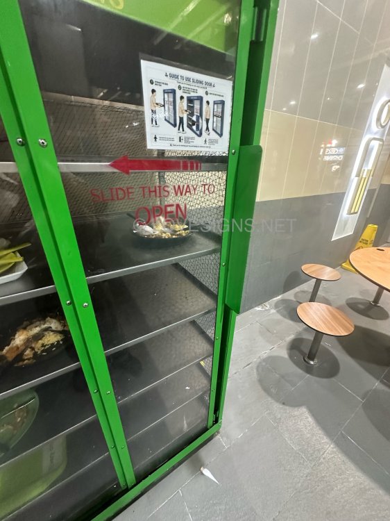
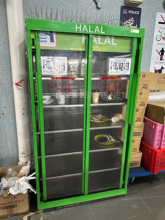
Location: Marine Terrace Hawker Centre Good anti-bird return tray area: mechanical self closing sliding doors
-
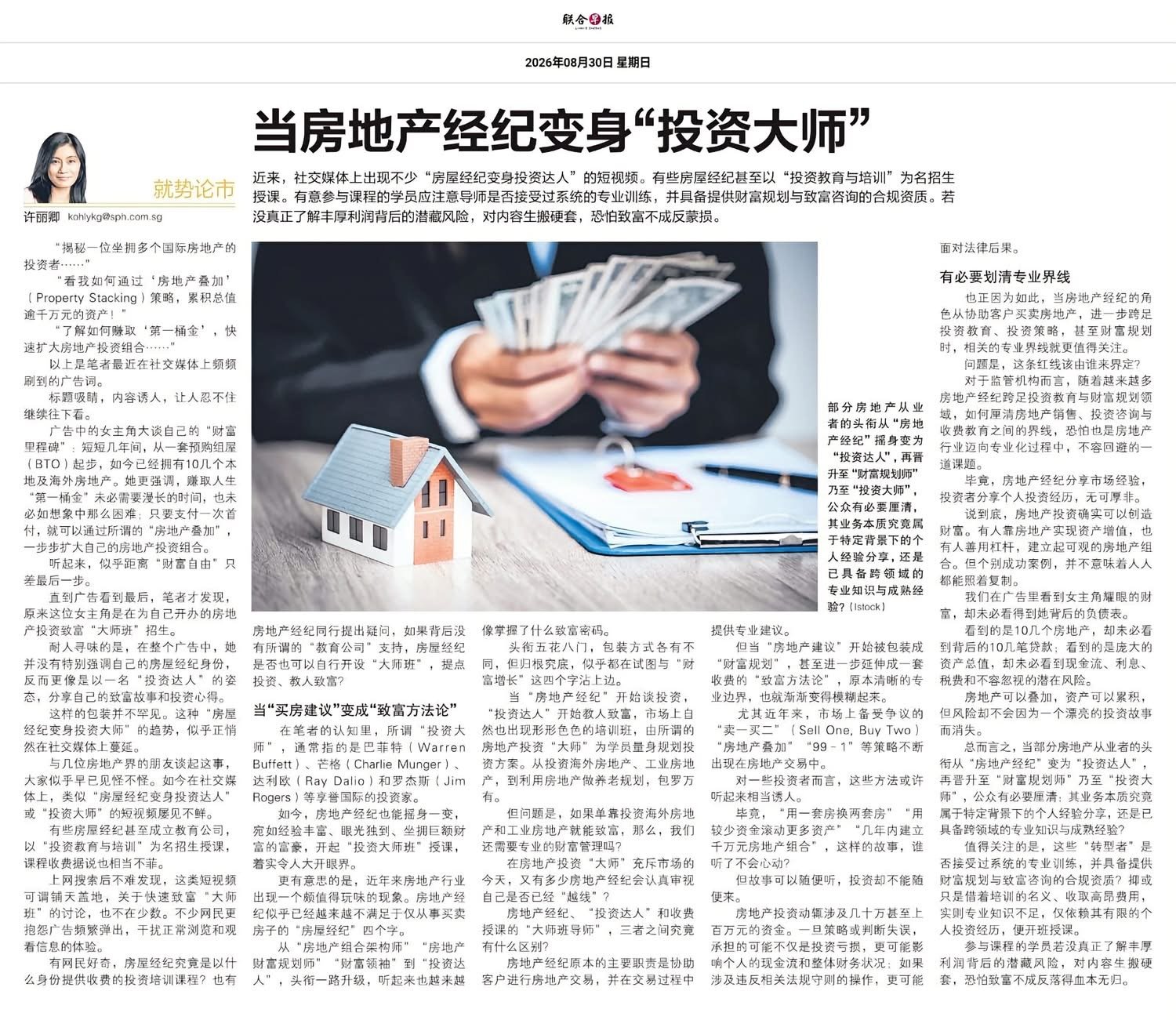
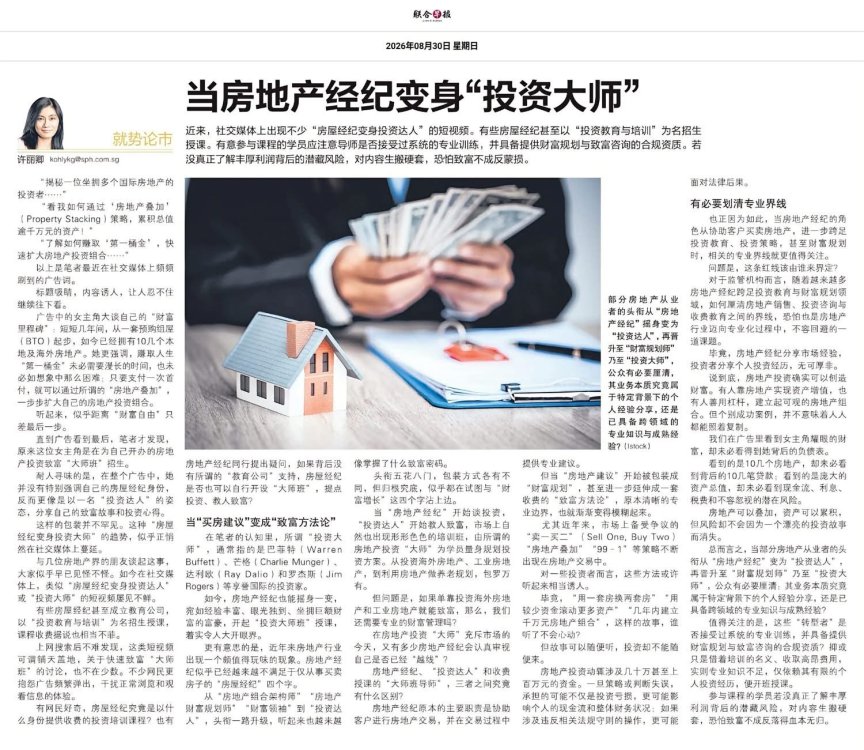
Source & Credit: From Property Agents to Wealth Coaches: The New Trend in Real Estate The Rise of Real Estate Agents Rebranding as Investment Masters Here's a condensed summary of the article in English: When Real Estate Agents Transform into "Investment Masters" The article discusses a growing trend on social media where real estate agents rebrand themselves as "investment experts" or "wealth coaches," often selling short videos or expensive courses on property investment and wealth creation. Key Points: * The Allure of Wealth: These agents often use enticing claims in their advertisements, such as strategies for "Property Stacking" to build multi-million dollar portfolios or quick ways to earn a "first pot of gold." They present a narrative of easy wealth accumulation through real estate, suggesting that financial freedom is just one step away. * From "Buying Advice" to "Wealth Creation Methodology": Traditionally, terms like "investment master" were reserved for figures like Warren Buffett. Now, some real estate agents are adopting these titles. The industry is seeing a shift from agents simply facilitating buying and selling to positioning themselves as "wealth planners" or "investment leaders." * Blurring the Lines: The article questions the boundary between a real estate agent's traditional role (assisting with transactions and providing professional advice) and their new guise as "investment mentors" charging for "wealth creation methodology." It raises concerns about whether these agents possess the necessary, specialized wealth management qualifications to offer such broad financial advice. * Risks for the Public: While some individuals may have successfully built wealth through real estate, these outcomes are not easily replicable by everyone. Advertisements often highlight glamorous wealth but ignore the underlying debt, cash flow issues, interest rates, and other potential risks. * Call for Clarity and Caution: The article emphasizes the need to clarify professional boundaries in the real estate industry. It urges the public to be cautious when agents transition into "wealth planners." Before engaging in paid courses, individuals should verify if the instructor has received systematic professional training and possesses the legal qualifications to provide wealth planning and consulting. Blindly following advice without understanding the underlying risks can lead to significant financial loss.
-
Personalised Analysis Reports Personalised Reports Free Analysis Reports Find out your Life Association Sectors Find out your Gua (Kua) Number? East or West Group Person? Find out your Horoscope? Find out your Characteristics? Find out your Personal Element? How suitable is your Home? Your Favourable Sleep Position? Your Favourable Study Position? Your Favourable Work Position? Your Favourable Bedroom Location? Is your Apartment Number Auspicious? Generate Free Reports Generate 4 Good & 4 Bad Direction Report Generate Ba Zi Luck Analysis, Personal Element & Horoscope Insights- (FREEBAZI.GEOMANCY.NET) Generate 30 Days Auspicious Date for ONE or TWO Persons(DATE.GEOMANCY.NET) More FREE Reports Welcome to Personalized Analysis ReportsSince 1996, Geomancy.net has guided individuals in understanding Feng Shui and Chinese divination. With our expertise, we have assisted thousands, becoming a trusted resource for those seeking knowledge. Our personalized analysis reports empower you to tap into these ancient practices, significantly improving your quality of life. Discover the Power of Personalized Analysis ReportsAt ONLINE.GEOMANCY.NET, we provide free personalized analysis reports that empower you to understand the intricate connections between your living environment and your personal well-being. By leveraging time-honored techniques from Feng Shui and Chinese divination, our reports help you uncover valuable insights that can guide your decisions and improve your lifestyle. What We OfferOur comprehensive reports are designed to give you a holistic view of your life associations and environmental influences. Here’s what you can expect from our personalized analysis: Life Association SectorsUnderstanding your life association sectors is crucial for achieving balance and harmony. Our reports will reveal the areas of your life that are most influenced by your environment, helping you to focus your energy where it matters most. Your Gua (Kua) NumberYour Gua number is a vital aspect of Feng Shui that determines your personal energy profile. By calculating your Gua number, you can gain insights into your strengths and weaknesses, allowing you to make informed decisions that align with your true nature. East or West Group Person?Identifying whether you belong to the East or West group can significantly impact your approach to life. Our analysis will classify you accordingly, providing tailored recommendations for your personal growth and development. Horoscope InsightsAstrology plays a significant role in understanding your personality traits and life path. Our reports will include your horoscope, offering insights into your character and potential challenges you may face. Understanding Your CharacteristicsEvery individual has unique characteristics shaped by various factors. Our personalized reports will analyze these traits, helping you to understand how they influence your interactions and relationships. Your Personal ElementIn Feng Shui, the five elements (Wood, Fire, Earth, Metal, Water) play a crucial role in shaping your life. Our analysis will determine your personal element, providing insights that can help you harmonize with your environment. Assessing Your Home's SuitabilityYour living space significantly affects your overall well-being. Our reports will evaluate how suitable your home is for you, considering factors such as layout, direction, and energy flow. This assessment can guide you in making necessary adjustments to enhance your living environment. Favorable Sleep PositionDid you know that your sleep position can impact your health? Our analysis will suggest the best sleep position for you based on your personal energy profile, helping you achieve better rest and rejuvenation. Optimal Study PositionFor students and professionals alike, the right study position can enhance focus and productivity. Our reports will provide recommendations for your ideal study position, allowing you to maximize your learning potential. Favorable Work PositionYour work environment plays a critical role in your success. We will analyze your work position to ensure it aligns with your personal energy, promoting productivity and satisfaction in your professional life. Bedroom LocationThe location of your bedroom can influence your relationships and personal energy. Our reports will offer insights into the most beneficial bedroom location for you, fostering a peaceful and harmonious space. Auspicious Apartment NumbersDid you know that the number of your apartment can carry significant meaning? Our analysis will determine whether your apartment number is auspicious, guiding you towards a more favorable living situation. Generate Your Free ReportsReady to take the next step? Generating your free personalized analysis reports is simple: Login or Sign Up: Access your account at ONLINE.GEOMANCY.NET to get started. Choose Your Reports: Select from various reports, including: 4 Good & 4 Bad Direction Report Ba Zi Luck Analysis Personal Element Insights Horoscope Insights Receive Your Analysis: Once generated, your reports will be available for you to explore.
-
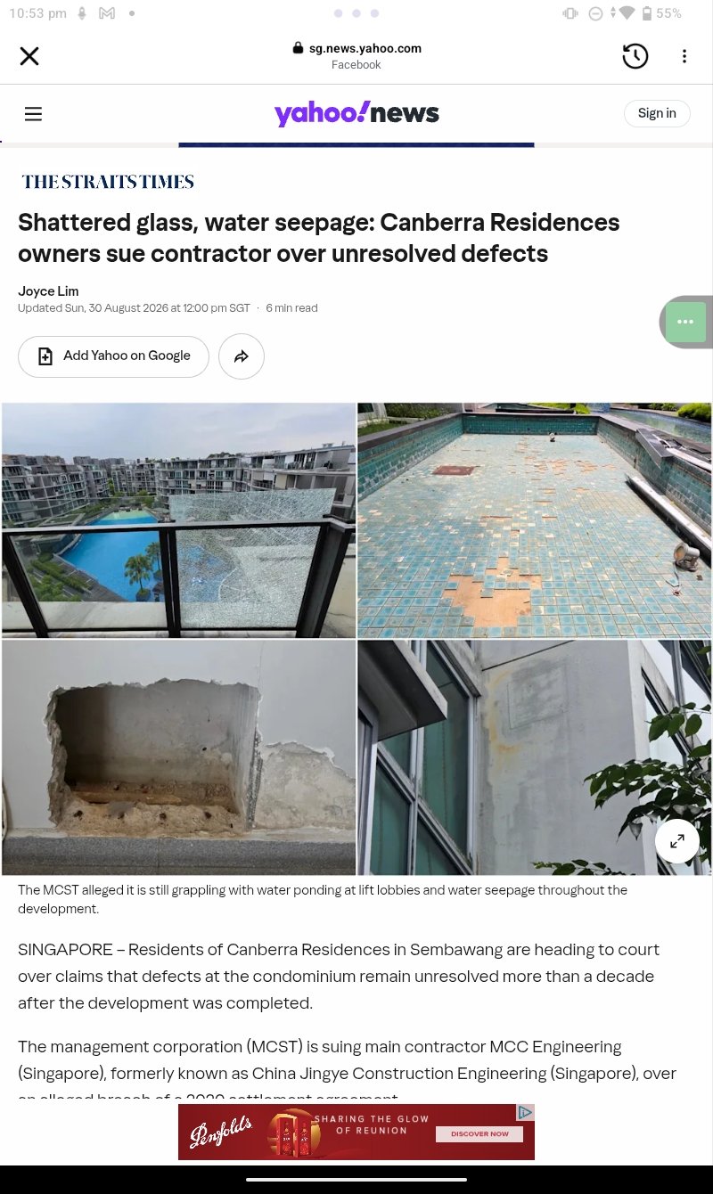
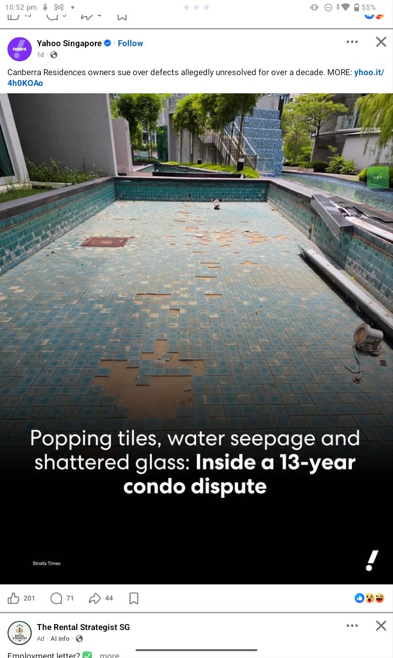
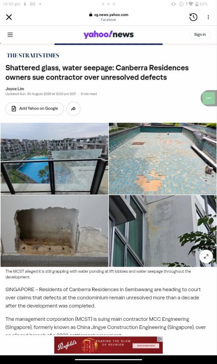
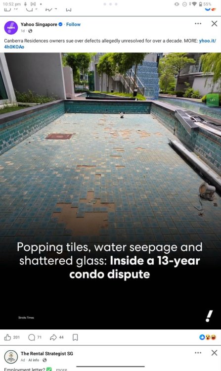
Poor Workmanship In addition, there goes our RESALE VALUE Poor Workmanship is not directly related to Feng Shui. Has more to do with Human or Man Luck The Holy Trinity of Chinese Luck system or The Sacred Trio of Chinese Fortune beliefs. - Caricatures: Laughter is good medicine & more... - FengShui.Geomancy.Net


-
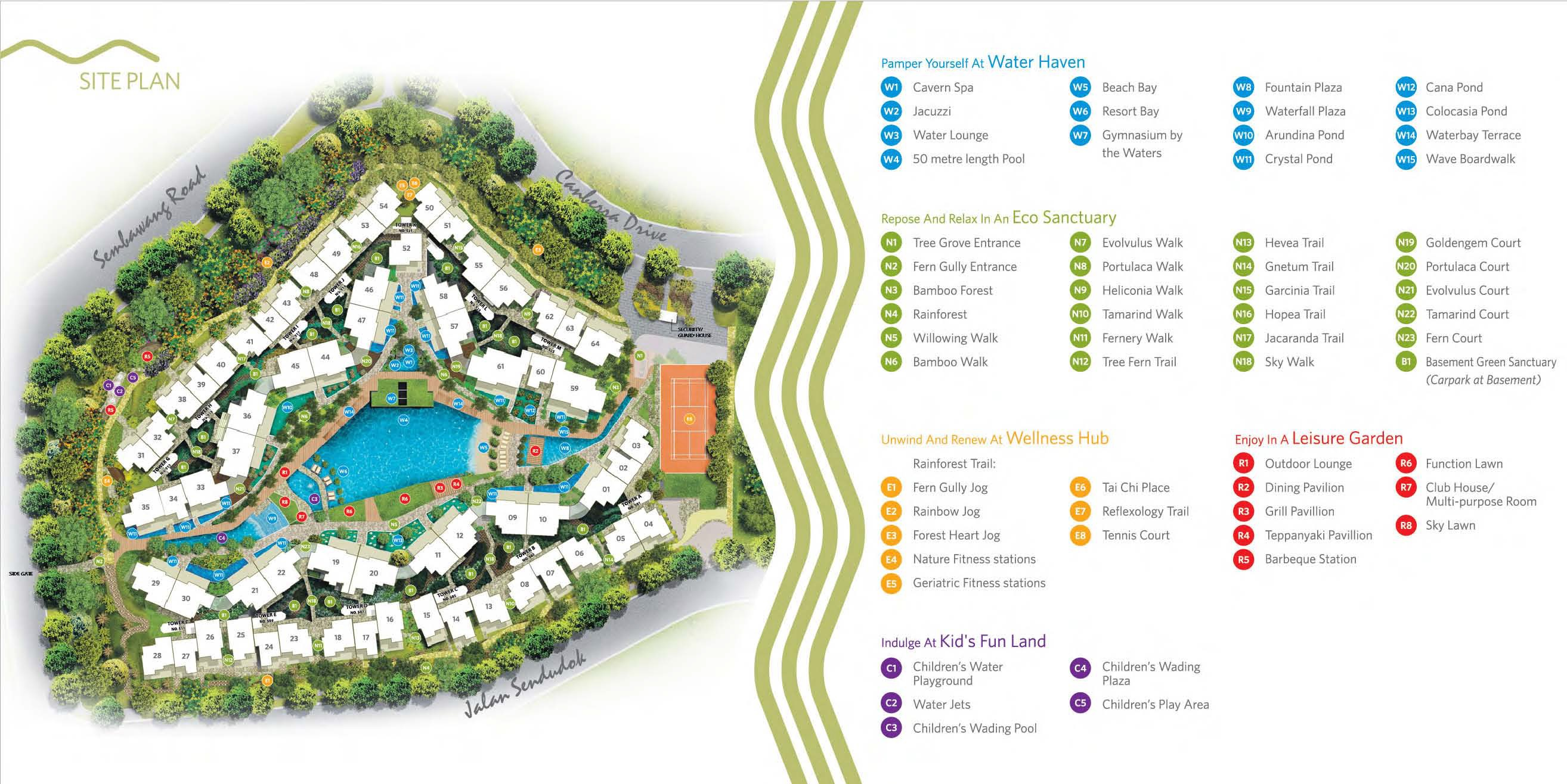
Canberra Residences Site Map
-
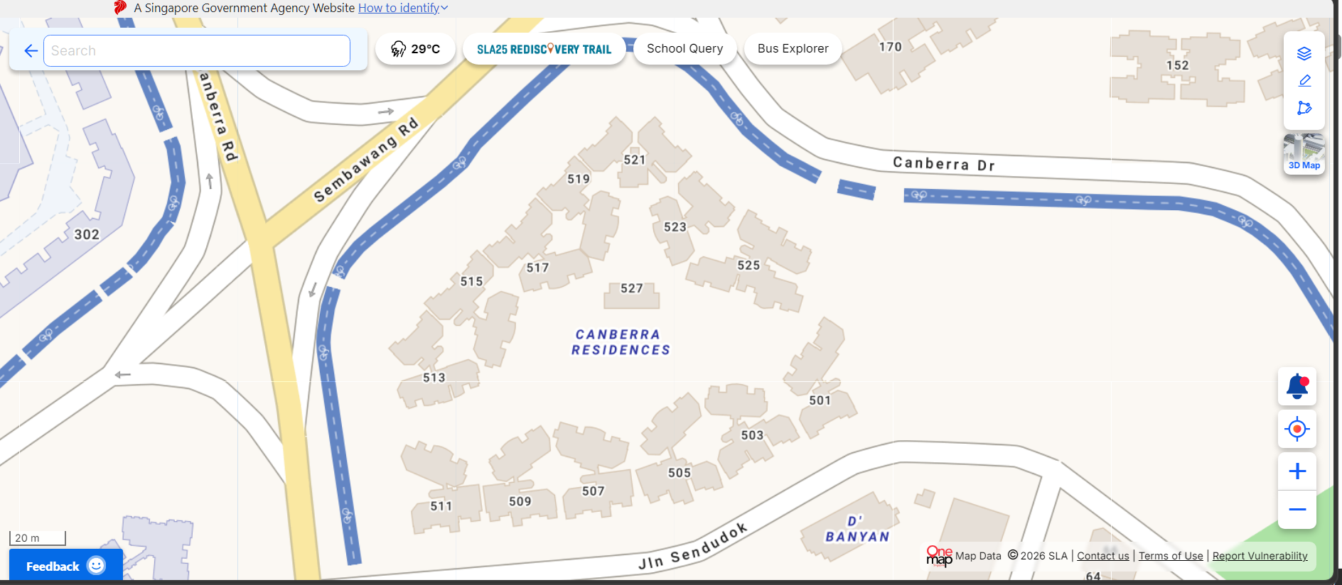
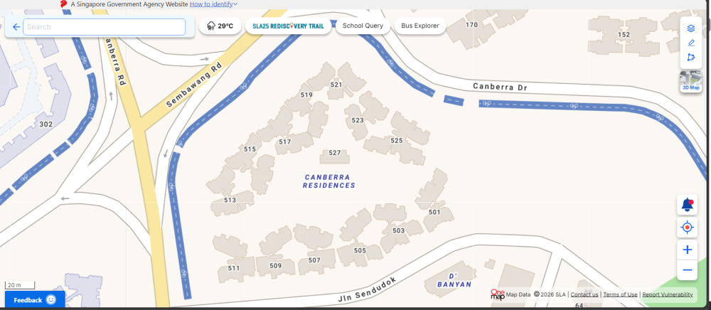
Canberra Residences
-
Personalised Analysis Reports Personalised Reports Free Analysis Reports Find out your Life Association Sectors Find out your Gua (Kua) Number? East or West Group Person? Find out your Horoscope? Find out your Characteristics? Find out your Personal Element? How suitable is your Home? Your Favourable Sleep Position? Your Favourable Study Position? Your Favourable Work Position? Your Favourable Bedroom Location? Is your Apartment Number Auspicious? Generate Free Reports Generate 4 Good & 4 Bad Direction Report Generate Ba Zi Luck Analysis, Personal Element & Horoscope Insights- (FREEBAZI.GEOMANCY.NET) Generate 30 Days Auspicious Date for ONE or TWO Persons(DATE.GEOMANCY.NET) More FREE Reports Welcome to Personalized Analysis ReportsSince 1996, Geomancy.net has guided individuals in understanding Feng Shui and Chinese divination. With our expertise, we have assisted thousands, becoming a trusted resource for those seeking knowledge. Our personalized analysis reports empower you to tap into these ancient practices, significantly improving your quality of life. Discover the Power of Personalized Analysis ReportsAt ONLINE.GEOMANCY.NET, we provide free personalized analysis reports that empower you to understand the intricate connections between your living environment and your personal well-being. By leveraging time-honored techniques from Feng Shui and Chinese divination, our reports help you uncover valuable insights that can guide your decisions and improve your lifestyle. What We OfferOur comprehensive reports are designed to give you a holistic view of your life associations and environmental influences. Here’s what you can expect from our personalized analysis: Life Association SectorsUnderstanding your life association sectors is crucial for achieving balance and harmony. Our reports will reveal the areas of your life that are most influenced by your environment, helping you to focus your energy where it matters most. Your Gua (Kua) NumberYour Gua number is a vital aspect of Feng Shui that determines your personal energy profile. By calculating your Gua number, you can gain insights into your strengths and weaknesses, allowing you to make informed decisions that align with your true nature. East or West Group Person?Identifying whether you belong to the East or West group can significantly impact your approach to life. Our analysis will classify you accordingly, providing tailored recommendations for your personal growth and development. Horoscope InsightsAstrology plays a significant role in understanding your personality traits and life path. Our reports will include your horoscope, offering insights into your character and potential challenges you may face. Understanding Your CharacteristicsEvery individual has unique characteristics shaped by various factors. Our personalized reports will analyze these traits, helping you to understand how they influence your interactions and relationships. Your Personal ElementIn Feng Shui, the five elements (Wood, Fire, Earth, Metal, Water) play a crucial role in shaping your life. Our analysis will determine your personal element, providing insights that can help you harmonize with your environment. Assessing Your Home's SuitabilityYour living space significantly affects your overall well-being. Our reports will evaluate how suitable your home is for you, considering factors such as layout, direction, and energy flow. This assessment can guide you in making necessary adjustments to enhance your living environment. Favorable Sleep PositionDid you know that your sleep position can impact your health? Our analysis will suggest the best sleep position for you based on your personal energy profile, helping you achieve better rest and rejuvenation. Optimal Study PositionFor students and professionals alike, the right study position can enhance focus and productivity. Our reports will provide recommendations for your ideal study position, allowing you to maximize your learning potential. Favorable Work PositionYour work environment plays a critical role in your success. We will analyze your work position to ensure it aligns with your personal energy, promoting productivity and satisfaction in your professional life. Bedroom LocationThe location of your bedroom can influence your relationships and personal energy. Our reports will offer insights into the most beneficial bedroom location for you, fostering a peaceful and harmonious space. Auspicious Apartment NumbersDid you know that the number of your apartment can carry significant meaning? Our analysis will determine whether your apartment number is auspicious, guiding you towards a more favorable living situation. Generate Your Free ReportsReady to take the next step? Generating your free personalized analysis reports is simple: Login or Sign Up: Access your account at ONLINE.GEOMANCY.NET to get started. Choose Your Reports: Select from various reports, including: 4 Good & 4 Bad Direction Report Ba Zi Luck Analysis Personal Element Insights Horoscope Insights Receive Your Analysis: Once generated, your reports will be available for you to explore.
-
Source & Credit:
-
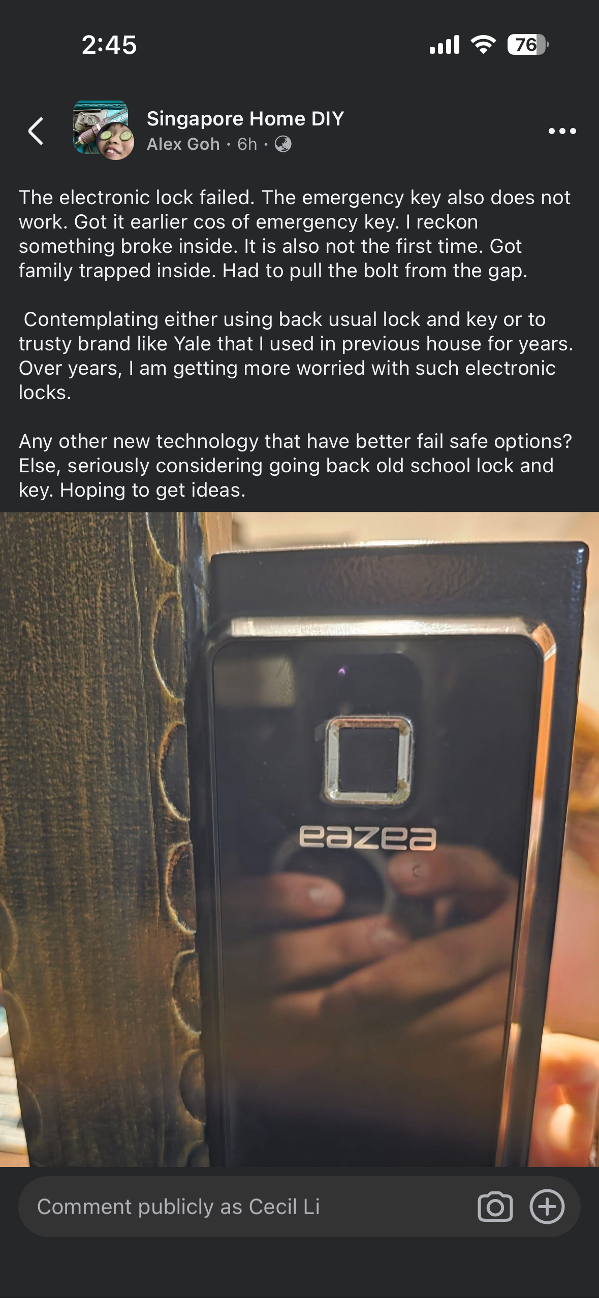
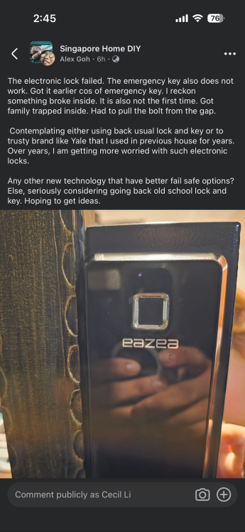
Even the emergency key does not work Source & Credit: Group: Singapore Home DIY User: Alex Goh "The electronic lock failed. The emergency key also does not work. Got it earlier cos of emergency key. I reckon something broke inside. It is also not the first time. Got family trapped inside. Had to pull the bolt from the gap. Contemplating either using back usual lock and key or to trusty brand like Yale that I used in previous house for years. Over years, I am getting more worried with such electronic locks. Any other new technology that have better fail safe options? Else, seriously considering going back old school lock and key. Hoping to get ideas." (Note: The brand of the lock shown in the image is "eazea".)
-
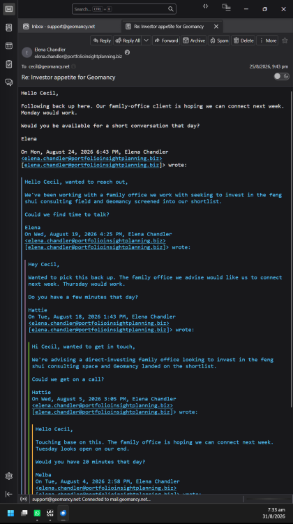
It might also be an elaborate scam. LOL Nigerian Scam, Business Scam, Ransom Scam, Investment Scam, Pyramid Investment Scam & more scams - Current Affairs & Lifestyle - FengShui.Geomancy.Net

-
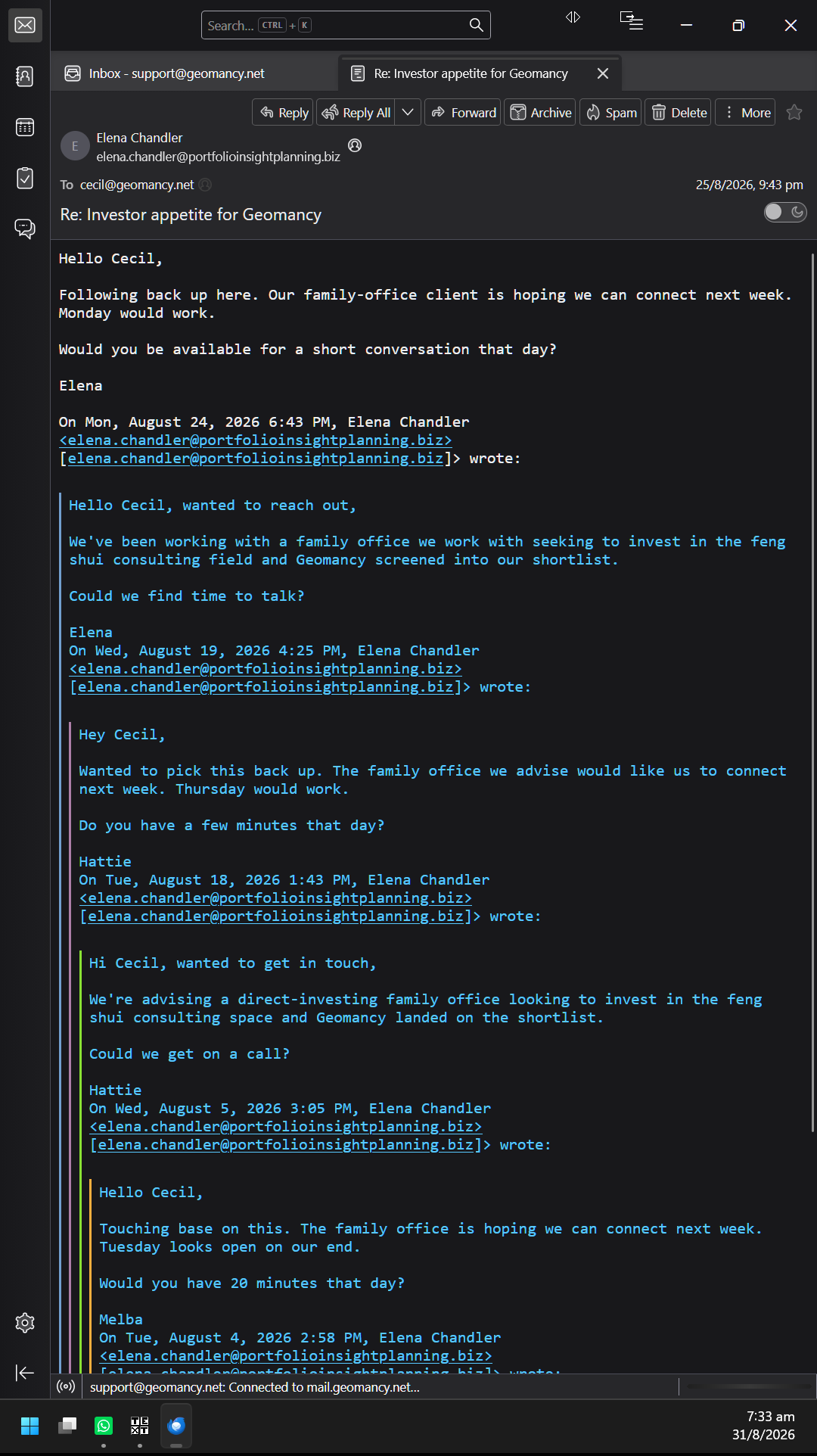
Investor appetite for Geomancy

-
Personalised Analysis Reports Personalised Reports Free Analysis Reports Find out your Life Association Sectors Find out your Gua (Kua) Number? East or West Group Person? Find out your Horoscope? Find out your Characteristics? Find out your Personal Element? How suitable is your Home? Your Favourable Sleep Position? Your Favourable Study Position? Your Favourable Work Position? Your Favourable Bedroom Location? Is your Apartment Number Auspicious? Generate Free Reports Generate 4 Good & 4 Bad Direction Report Generate Ba Zi Luck Analysis, Personal Element & Horoscope Insights- (FREEBAZI.GEOMANCY.NET) Generate 30 Days Auspicious Date for ONE or TWO Persons(DATE.GEOMANCY.NET) More FREE Reports Welcome to Personalized Analysis ReportsSince 1996, Geomancy.net has guided individuals in understanding Feng Shui and Chinese divination. With our expertise, we have assisted thousands, becoming a trusted resource for those seeking knowledge. Our personalized analysis reports empower you to tap into these ancient practices, significantly improving your quality of life. Discover the Power of Personalized Analysis ReportsAt ONLINE.GEOMANCY.NET, we provide free personalized analysis reports that empower you to understand the intricate connections between your living environment and your personal well-being. By leveraging time-honored techniques from Feng Shui and Chinese divination, our reports help you uncover valuable insights that can guide your decisions and improve your lifestyle. What We OfferOur comprehensive reports are designed to give you a holistic view of your life associations and environmental influences. Here’s what you can expect from our personalized analysis: Life Association SectorsUnderstanding your life association sectors is crucial for achieving balance and harmony. Our reports will reveal the areas of your life that are most influenced by your environment, helping you to focus your energy where it matters most. Your Gua (Kua) NumberYour Gua number is a vital aspect of Feng Shui that determines your personal energy profile. By calculating your Gua number, you can gain insights into your strengths and weaknesses, allowing you to make informed decisions that align with your true nature. East or West Group Person?Identifying whether you belong to the East or West group can significantly impact your approach to life. Our analysis will classify you accordingly, providing tailored recommendations for your personal growth and development. Horoscope InsightsAstrology plays a significant role in understanding your personality traits and life path. Our reports will include your horoscope, offering insights into your character and potential challenges you may face. Understanding Your CharacteristicsEvery individual has unique characteristics shaped by various factors. Our personalized reports will analyze these traits, helping you to understand how they influence your interactions and relationships. Your Personal ElementIn Feng Shui, the five elements (Wood, Fire, Earth, Metal, Water) play a crucial role in shaping your life. Our analysis will determine your personal element, providing insights that can help you harmonize with your environment. Assessing Your Home's SuitabilityYour living space significantly affects your overall well-being. Our reports will evaluate how suitable your home is for you, considering factors such as layout, direction, and energy flow. This assessment can guide you in making necessary adjustments to enhance your living environment. Favorable Sleep PositionDid you know that your sleep position can impact your health? Our analysis will suggest the best sleep position for you based on your personal energy profile, helping you achieve better rest and rejuvenation. Optimal Study PositionFor students and professionals alike, the right study position can enhance focus and productivity. Our reports will provide recommendations for your ideal study position, allowing you to maximize your learning potential. Favorable Work PositionYour work environment plays a critical role in your success. We will analyze your work position to ensure it aligns with your personal energy, promoting productivity and satisfaction in your professional life. Bedroom LocationThe location of your bedroom can influence your relationships and personal energy. Our reports will offer insights into the most beneficial bedroom location for you, fostering a peaceful and harmonious space. Auspicious Apartment NumbersDid you know that the number of your apartment can carry significant meaning? Our analysis will determine whether your apartment number is auspicious, guiding you towards a more favorable living situation. Generate Your Free ReportsReady to take the next step? Generating your free personalized analysis reports is simple: Login or Sign Up: Access your account at ONLINE.GEOMANCY.NET to get started. Choose Your Reports: Select from various reports, including: 4 Good & 4 Bad Direction Report Ba Zi Luck Analysis Personal Element Insights Horoscope Insights Receive Your Analysis: Once generated, your reports will be available for you to explore.
-
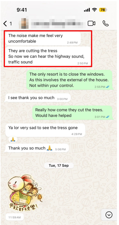
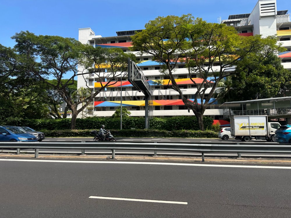
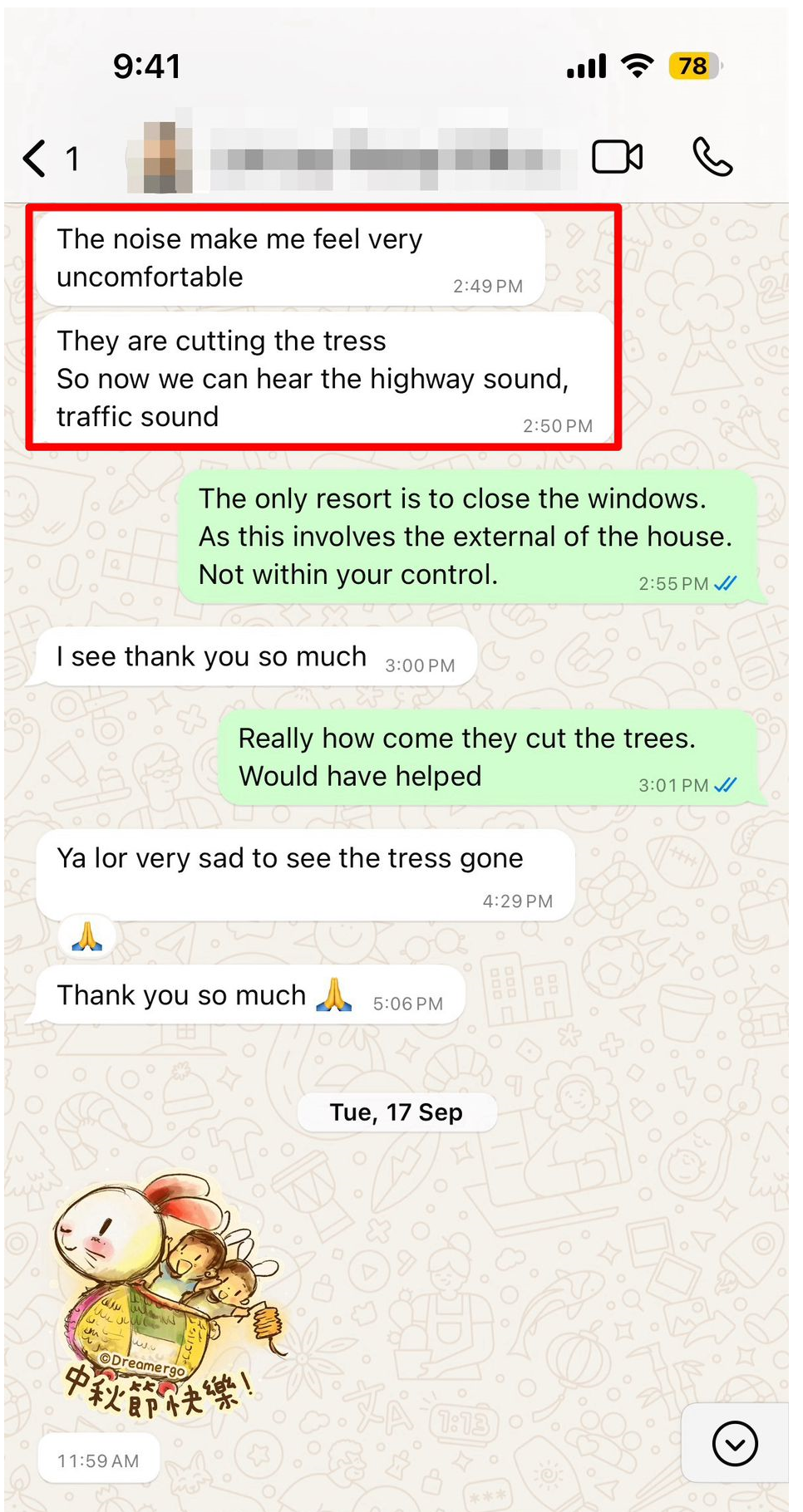
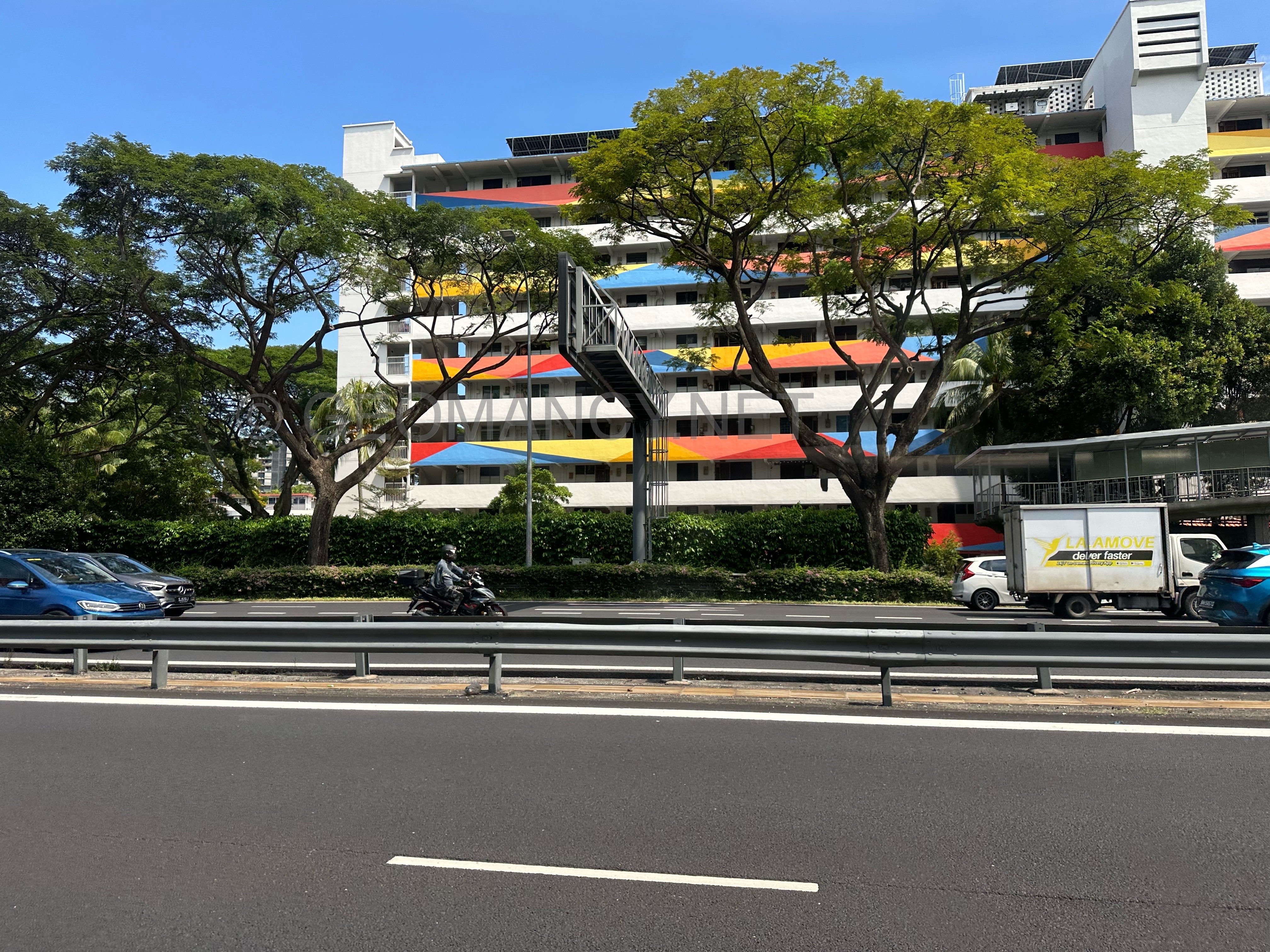
THIS IS NOT FENG SHUI ARE YOU THINKING ABOUT BUYING A UNIT THAT FACES BUKIT TIMAH LINK? Many clients have said that when they visited, the noise was not very loud. However, their visits were often on Sundays or public holidays, when there is less traffic. This made them think these units are not too noisy. Make sure to check the noise levels yourself before deciding. +++ Related: How too much noise can affect you +++ It’s already too late "The noise make me feel very uncomfortable. They are cutting the tress So now we can hear the highway sound, traffic sound"