


Cecil Lee
Staff
-
Joined
-
Last visited
Everything posted by Cecil Lee
-
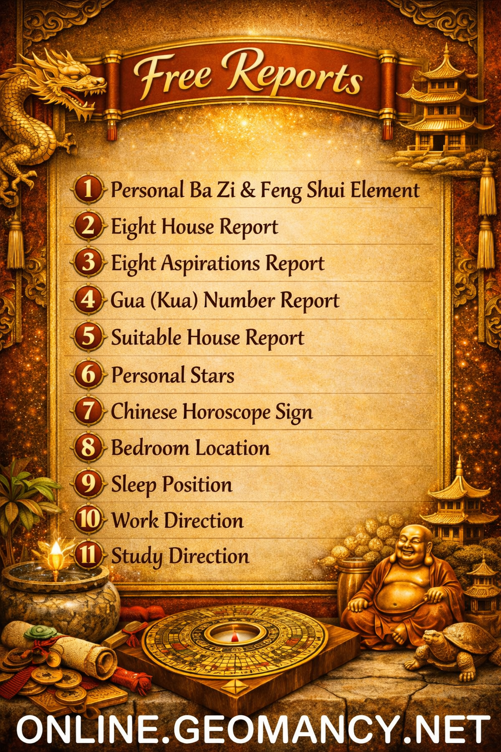
Free Personalised Analysis Reports Personalised Reports Free Analysis Reports Find out your Life Association Sectors Find out your Gua (Kua) Number? East or West Group Person? Find out your Horoscope? Find out your Characteristics? Find out your Personal Element? How suitable is your Home? Your Favourable Sleep Position? Your Favourable Study Position? Your Favourable Work Position? Your Favourable Bedroom Location? Is your Apartment Number Auspicious? Generate Free Reports Generate 4 Good & 4 Bad Direction Report Generate Ba Zi Luck Analysis, Personal Element & Horoscope Insights- (FREEBAZI.GEOMANCY.NET) Generate 30 Days Auspicious Date for ONE or TWO Persons(DATE.GEOMANCY.NET) More FREE Reports Welcome to Personalized Analysis ReportsSince 1996, Geomancy.net has guided individuals in understanding Feng Shui and Chinese divination. With our expertise, we have assisted thousands, becoming a trusted resource for those seeking knowledge. Our personalized analysis reports empower you to tap into these ancient practices, significantly improving your quality of life. Discover the Power of Personalized Analysis ReportsAt ONLINE.GEOMANCY.NET, we provide free personalized analysis reports that empower you to understand the intricate connections between your living environment and your personal well-being. By leveraging time-honored techniques from Feng Shui and Chinese divination, our reports help you uncover valuable insights that can guide your decisions and improve your lifestyle. What We OfferOur comprehensive reports are designed to give you a holistic view of your life associations and environmental influences. Here’s what you can expect from our personalized analysis: Life Association SectorsUnderstanding your life association sectors is crucial for achieving balance and harmony. Our reports will reveal the areas of your life that are most influenced by your environment, helping you to focus your energy where it matters most. Your Gua (Kua) NumberYour Gua number is a vital aspect of Feng Shui that determines your personal energy profile. By calculating your Gua number, you can gain insights into your strengths and weaknesses, allowing you to make informed decisions that align with your true nature. East or West Group Person?Identifying whether you belong to the East or West group can significantly impact your approach to life. Our analysis will classify you accordingly, providing tailored recommendations for your personal growth and development. Horoscope InsightsAstrology plays a significant role in understanding your personality traits and life path. Our reports will include your horoscope, offering insights into your character and potential challenges you may face. Understanding Your CharacteristicsEvery individual has unique characteristics shaped by various factors. Our personalized reports will analyze these traits, helping you to understand how they influence your interactions and relationships. Your Personal ElementIn Feng Shui, the five elements (Wood, Fire, Earth, Metal, Water) play a crucial role in shaping your life. Our analysis will determine your personal element, providing insights that can help you harmonize with your environment. Assessing Your Home's SuitabilityYour living space significantly affects your overall well-being. Our reports will evaluate how suitable your home is for you, considering factors such as layout, direction, and energy flow. This assessment can guide you in making necessary adjustments to enhance your living environment. Favorable Sleep PositionDid you know that your sleep position can impact your health? Our analysis will suggest the best sleep position for you based on your personal energy profile, helping you achieve better rest and rejuvenation. Optimal Study PositionFor students and professionals alike, the right study position can enhance focus and productivity. Our reports will provide recommendations for your ideal study position, allowing you to maximize your learning potential. Favorable Work PositionYour work environment plays a critical role in your success. We will analyze your work position to ensure it aligns with your personal energy, promoting productivity and satisfaction in your professional life. Bedroom LocationThe location of your bedroom can influence your relationships and personal energy. Our reports will offer insights into the most beneficial bedroom location for you, fostering a peaceful and harmonious space. Auspicious Apartment NumbersDid you know that the number of your apartment can carry significant meaning? Our analysis will determine whether your apartment number is auspicious, guiding you towards a more favorable living situation. Generate Your Free ReportsReady to take the next step? Generating your free personalized analysis reports is simple: Login or Sign Up: Access your account at ONLINE.GEOMANCY.NET to get started. Choose Your Reports: Select from various reports, including: 4 Good & 4 Bad Direction Report Ba Zi Luck Analysis Personal Element Insights Horoscope Insights Receive Your Analysis: Once generated, your reports will be available for you to explore.
-
Free Personalised Analysis Reports Personalised Reports Free Analysis Reports Find out your Life Association Sectors Find out your Gua (Kua) Number? East or West Group Person? Find out your Horoscope? Find out your Characteristics? Find out your Personal Element? How suitable is your Home? Your Favourable Sleep Position? Your Favourable Study Position? Your Favourable Work Position? Your Favourable Bedroom Location? Is your Apartment Number Auspicious? Generate Free Reports Generate 4 Good & 4 Bad Direction Report Generate Ba Zi Luck Analysis, Personal Element & Horoscope Insights- (FREEBAZI.GEOMANCY.NET) Generate 30 Days Auspicious Date for ONE or TWO Persons(DATE.GEOMANCY.NET) More FREE Reports Welcome to Personalized Analysis ReportsSince 1996, Geomancy.net has guided individuals in understanding Feng Shui and Chinese divination. With our expertise, we have assisted thousands, becoming a trusted resource for those seeking knowledge. Our personalized analysis reports empower you to tap into these ancient practices, significantly improving your quality of life. Discover the Power of Personalized Analysis ReportsAt ONLINE.GEOMANCY.NET, we provide free personalized analysis reports that empower you to understand the intricate connections between your living environment and your personal well-being. By leveraging time-honored techniques from Feng Shui and Chinese divination, our reports help you uncover valuable insights that can guide your decisions and improve your lifestyle. What We OfferOur comprehensive reports are designed to give you a holistic view of your life associations and environmental influences. Here’s what you can expect from our personalized analysis: Life Association SectorsUnderstanding your life association sectors is crucial for achieving balance and harmony. Our reports will reveal the areas of your life that are most influenced by your environment, helping you to focus your energy where it matters most. Your Gua (Kua) NumberYour Gua number is a vital aspect of Feng Shui that determines your personal energy profile. By calculating your Gua number, you can gain insights into your strengths and weaknesses, allowing you to make informed decisions that align with your true nature. East or West Group Person?Identifying whether you belong to the East or West group can significantly impact your approach to life. Our analysis will classify you accordingly, providing tailored recommendations for your personal growth and development. Horoscope InsightsAstrology plays a significant role in understanding your personality traits and life path. Our reports will include your horoscope, offering insights into your character and potential challenges you may face. Understanding Your CharacteristicsEvery individual has unique characteristics shaped by various factors. Our personalized reports will analyze these traits, helping you to understand how they influence your interactions and relationships. Your Personal ElementIn Feng Shui, the five elements (Wood, Fire, Earth, Metal, Water) play a crucial role in shaping your life. Our analysis will determine your personal element, providing insights that can help you harmonize with your environment. Assessing Your Home's SuitabilityYour living space significantly affects your overall well-being. Our reports will evaluate how suitable your home is for you, considering factors such as layout, direction, and energy flow. This assessment can guide you in making necessary adjustments to enhance your living environment. Favorable Sleep PositionDid you know that your sleep position can impact your health? Our analysis will suggest the best sleep position for you based on your personal energy profile, helping you achieve better rest and rejuvenation. Optimal Study PositionFor students and professionals alike, the right study position can enhance focus and productivity. Our reports will provide recommendations for your ideal study position, allowing you to maximize your learning potential. Favorable Work PositionYour work environment plays a critical role in your success. We will analyze your work position to ensure it aligns with your personal energy, promoting productivity and satisfaction in your professional life. Bedroom LocationThe location of your bedroom can influence your relationships and personal energy. Our reports will offer insights into the most beneficial bedroom location for you, fostering a peaceful and harmonious space. Auspicious Apartment NumbersDid you know that the number of your apartment can carry significant meaning? Our analysis will determine whether your apartment number is auspicious, guiding you towards a more favorable living situation. Generate Your Free ReportsReady to take the next step? Generating your free personalized analysis reports is simple: Login or Sign Up: Access your account at ONLINE.GEOMANCY.NET to get started. Choose Your Reports: Select from various reports, including: 4 Good & 4 Bad Direction Report Ba Zi Luck Analysis Personal Element Insights Horoscope Insights Receive Your Analysis: Once generated, your reports will be available for you to explore.
-
Free Personalised Analysis Reports Personalised Reports Free Analysis Reports Find out your Life Association Sectors Find out your Gua (Kua) Number? East or West Group Person? Find out your Horoscope? Find out your Characteristics? Find out your Personal Element? How suitable is your Home? Your Favourable Sleep Position? Your Favourable Study Position? Your Favourable Work Position? Your Favourable Bedroom Location? Is your Apartment Number Auspicious? Generate Free Reports Generate 4 Good & 4 Bad Direction Report Generate Ba Zi Luck Analysis, Personal Element & Horoscope Insights- (FREEBAZI.GEOMANCY.NET) Generate 30 Days Auspicious Date for ONE or TWO Persons(DATE.GEOMANCY.NET) More FREE Reports Welcome to Personalized Analysis ReportsSince 1996, Geomancy.net has guided individuals in understanding Feng Shui and Chinese divination. With our expertise, we have assisted thousands, becoming a trusted resource for those seeking knowledge. Our personalized analysis reports empower you to tap into these ancient practices, significantly improving your quality of life. Discover the Power of Personalized Analysis ReportsAt ONLINE.GEOMANCY.NET, we provide free personalized analysis reports that empower you to understand the intricate connections between your living environment and your personal well-being. By leveraging time-honored techniques from Feng Shui and Chinese divination, our reports help you uncover valuable insights that can guide your decisions and improve your lifestyle. What We OfferOur comprehensive reports are designed to give you a holistic view of your life associations and environmental influences. Here’s what you can expect from our personalized analysis: Life Association SectorsUnderstanding your life association sectors is crucial for achieving balance and harmony. Our reports will reveal the areas of your life that are most influenced by your environment, helping you to focus your energy where it matters most. Your Gua (Kua) NumberYour Gua number is a vital aspect of Feng Shui that determines your personal energy profile. By calculating your Gua number, you can gain insights into your strengths and weaknesses, allowing you to make informed decisions that align with your true nature. East or West Group Person?Identifying whether you belong to the East or West group can significantly impact your approach to life. Our analysis will classify you accordingly, providing tailored recommendations for your personal growth and development. Horoscope InsightsAstrology plays a significant role in understanding your personality traits and life path. Our reports will include your horoscope, offering insights into your character and potential challenges you may face. Understanding Your CharacteristicsEvery individual has unique characteristics shaped by various factors. Our personalized reports will analyze these traits, helping you to understand how they influence your interactions and relationships. Your Personal ElementIn Feng Shui, the five elements (Wood, Fire, Earth, Metal, Water) play a crucial role in shaping your life. Our analysis will determine your personal element, providing insights that can help you harmonize with your environment. Assessing Your Home's SuitabilityYour living space significantly affects your overall well-being. Our reports will evaluate how suitable your home is for you, considering factors such as layout, direction, and energy flow. This assessment can guide you in making necessary adjustments to enhance your living environment. Favorable Sleep PositionDid you know that your sleep position can impact your health? Our analysis will suggest the best sleep position for you based on your personal energy profile, helping you achieve better rest and rejuvenation. Optimal Study PositionFor students and professionals alike, the right study position can enhance focus and productivity. Our reports will provide recommendations for your ideal study position, allowing you to maximize your learning potential. Favorable Work PositionYour work environment plays a critical role in your success. We will analyze your work position to ensure it aligns with your personal energy, promoting productivity and satisfaction in your professional life. Bedroom LocationThe location of your bedroom can influence your relationships and personal energy. Our reports will offer insights into the most beneficial bedroom location for you, fostering a peaceful and harmonious space. Auspicious Apartment NumbersDid you know that the number of your apartment can carry significant meaning? Our analysis will determine whether your apartment number is auspicious, guiding you towards a more favorable living situation. Generate Your Free ReportsReady to take the next step? Generating your free personalized analysis reports is simple: Login or Sign Up: Access your account at ONLINE.GEOMANCY.NET to get started. Choose Your Reports: Select from various reports, including: 4 Good & 4 Bad Direction Report Ba Zi Luck Analysis Personal Element Insights Horoscope Insights Receive Your Analysis: Once generated, your reports will be available for you to explore.
-
Free Personalised Analysis Reports Personalised Reports Free Analysis Reports Find out your Life Association Sectors Find out your Gua (Kua) Number? East or West Group Person? Find out your Horoscope? Find out your Characteristics? Find out your Personal Element? How suitable is your Home? Your Favourable Sleep Position? Your Favourable Study Position? Your Favourable Work Position? Your Favourable Bedroom Location? Is your Apartment Number Auspicious? Generate Free Reports Generate 4 Good & 4 Bad Direction Report Generate Ba Zi Luck Analysis, Personal Element & Horoscope Insights- (FREEBAZI.GEOMANCY.NET) Generate 30 Days Auspicious Date for ONE or TWO Persons(DATE.GEOMANCY.NET) More FREE Reports Welcome to Personalized Analysis ReportsSince 1996, Geomancy.net has guided individuals in understanding Feng Shui and Chinese divination. With our expertise, we have assisted thousands, becoming a trusted resource for those seeking knowledge. Our personalized analysis reports empower you to tap into these ancient practices, significantly improving your quality of life. Discover the Power of Personalized Analysis ReportsAt ONLINE.GEOMANCY.NET, we provide free personalized analysis reports that empower you to understand the intricate connections between your living environment and your personal well-being. By leveraging time-honored techniques from Feng Shui and Chinese divination, our reports help you uncover valuable insights that can guide your decisions and improve your lifestyle. What We OfferOur comprehensive reports are designed to give you a holistic view of your life associations and environmental influences. Here’s what you can expect from our personalized analysis: Life Association SectorsUnderstanding your life association sectors is crucial for achieving balance and harmony. Our reports will reveal the areas of your life that are most influenced by your environment, helping you to focus your energy where it matters most. Your Gua (Kua) NumberYour Gua number is a vital aspect of Feng Shui that determines your personal energy profile. By calculating your Gua number, you can gain insights into your strengths and weaknesses, allowing you to make informed decisions that align with your true nature. East or West Group Person?Identifying whether you belong to the East or West group can significantly impact your approach to life. Our analysis will classify you accordingly, providing tailored recommendations for your personal growth and development. Horoscope InsightsAstrology plays a significant role in understanding your personality traits and life path. Our reports will include your horoscope, offering insights into your character and potential challenges you may face. Understanding Your CharacteristicsEvery individual has unique characteristics shaped by various factors. Our personalized reports will analyze these traits, helping you to understand how they influence your interactions and relationships. Your Personal ElementIn Feng Shui, the five elements (Wood, Fire, Earth, Metal, Water) play a crucial role in shaping your life. Our analysis will determine your personal element, providing insights that can help you harmonize with your environment. Assessing Your Home's SuitabilityYour living space significantly affects your overall well-being. Our reports will evaluate how suitable your home is for you, considering factors such as layout, direction, and energy flow. This assessment can guide you in making necessary adjustments to enhance your living environment. Favorable Sleep PositionDid you know that your sleep position can impact your health? Our analysis will suggest the best sleep position for you based on your personal energy profile, helping you achieve better rest and rejuvenation. Optimal Study PositionFor students and professionals alike, the right study position can enhance focus and productivity. Our reports will provide recommendations for your ideal study position, allowing you to maximize your learning potential. Favorable Work PositionYour work environment plays a critical role in your success. We will analyze your work position to ensure it aligns with your personal energy, promoting productivity and satisfaction in your professional life. Bedroom LocationThe location of your bedroom can influence your relationships and personal energy. Our reports will offer insights into the most beneficial bedroom location for you, fostering a peaceful and harmonious space. Auspicious Apartment NumbersDid you know that the number of your apartment can carry significant meaning? Our analysis will determine whether your apartment number is auspicious, guiding you towards a more favorable living situation. Generate Your Free ReportsReady to take the next step? Generating your free personalized analysis reports is simple: Login or Sign Up: Access your account at ONLINE.GEOMANCY.NET to get started. Choose Your Reports: Select from various reports, including: 4 Good & 4 Bad Direction Report Ba Zi Luck Analysis Personal Element Insights Horoscope Insights Receive Your Analysis: Once generated, your reports will be available for you to explore.
-
Free Personalised Analysis Reports Personalised Reports Free Analysis Reports Find out your Life Association Sectors Find out your Gua (Kua) Number? East or West Group Person? Find out your Horoscope? Find out your Characteristics? Find out your Personal Element? How suitable is your Home? Your Favourable Sleep Position? Your Favourable Study Position? Your Favourable Work Position? Your Favourable Bedroom Location? Is your Apartment Number Auspicious? Generate Free Reports Generate 4 Good & 4 Bad Direction Report Generate Ba Zi Luck Analysis, Personal Element & Horoscope Insights- (FREEBAZI.GEOMANCY.NET) Generate 30 Days Auspicious Date for ONE or TWO Persons(DATE.GEOMANCY.NET) More FREE Reports Welcome to Personalized Analysis ReportsSince 1996, Geomancy.net has guided individuals in understanding Feng Shui and Chinese divination. With our expertise, we have assisted thousands, becoming a trusted resource for those seeking knowledge. Our personalized analysis reports empower you to tap into these ancient practices, significantly improving your quality of life. Discover the Power of Personalized Analysis ReportsAt ONLINE.GEOMANCY.NET, we provide free personalized analysis reports that empower you to understand the intricate connections between your living environment and your personal well-being. By leveraging time-honored techniques from Feng Shui and Chinese divination, our reports help you uncover valuable insights that can guide your decisions and improve your lifestyle. What We OfferOur comprehensive reports are designed to give you a holistic view of your life associations and environmental influences. Here’s what you can expect from our personalized analysis: Life Association SectorsUnderstanding your life association sectors is crucial for achieving balance and harmony. Our reports will reveal the areas of your life that are most influenced by your environment, helping you to focus your energy where it matters most. Your Gua (Kua) NumberYour Gua number is a vital aspect of Feng Shui that determines your personal energy profile. By calculating your Gua number, you can gain insights into your strengths and weaknesses, allowing you to make informed decisions that align with your true nature. East or West Group Person?Identifying whether you belong to the East or West group can significantly impact your approach to life. Our analysis will classify you accordingly, providing tailored recommendations for your personal growth and development. Horoscope InsightsAstrology plays a significant role in understanding your personality traits and life path. Our reports will include your horoscope, offering insights into your character and potential challenges you may face. Understanding Your CharacteristicsEvery individual has unique characteristics shaped by various factors. Our personalized reports will analyze these traits, helping you to understand how they influence your interactions and relationships. Your Personal ElementIn Feng Shui, the five elements (Wood, Fire, Earth, Metal, Water) play a crucial role in shaping your life. Our analysis will determine your personal element, providing insights that can help you harmonize with your environment. Assessing Your Home's SuitabilityYour living space significantly affects your overall well-being. Our reports will evaluate how suitable your home is for you, considering factors such as layout, direction, and energy flow. This assessment can guide you in making necessary adjustments to enhance your living environment. Favorable Sleep PositionDid you know that your sleep position can impact your health? Our analysis will suggest the best sleep position for you based on your personal energy profile, helping you achieve better rest and rejuvenation. Optimal Study PositionFor students and professionals alike, the right study position can enhance focus and productivity. Our reports will provide recommendations for your ideal study position, allowing you to maximize your learning potential. Favorable Work PositionYour work environment plays a critical role in your success. We will analyze your work position to ensure it aligns with your personal energy, promoting productivity and satisfaction in your professional life. Bedroom LocationThe location of your bedroom can influence your relationships and personal energy. Our reports will offer insights into the most beneficial bedroom location for you, fostering a peaceful and harmonious space. Auspicious Apartment NumbersDid you know that the number of your apartment can carry significant meaning? Our analysis will determine whether your apartment number is auspicious, guiding you towards a more favorable living situation. Generate Your Free ReportsReady to take the next step? Generating your free personalized analysis reports is simple: Login or Sign Up: Access your account at ONLINE.GEOMANCY.NET to get started. Choose Your Reports: Select from various reports, including: 4 Good & 4 Bad Direction Report Ba Zi Luck Analysis Personal Element Insights Horoscope Insights Receive Your Analysis: Once generated, your reports will be available for you to explore.
-
Free Personalised Analysis Reports Personalised Reports Free Analysis Reports Find out your Life Association Sectors Find out your Gua (Kua) Number? East or West Group Person? Find out your Horoscope? Find out your Characteristics? Find out your Personal Element? How suitable is your Home? Your Favourable Sleep Position? Your Favourable Study Position? Your Favourable Work Position? Your Favourable Bedroom Location? Is your Apartment Number Auspicious? Generate Free Reports Generate 4 Good & 4 Bad Direction Report Generate Ba Zi Luck Analysis, Personal Element & Horoscope Insights- (FREEBAZI.GEOMANCY.NET) Generate 30 Days Auspicious Date for ONE or TWO Persons(DATE.GEOMANCY.NET) More FREE Reports Welcome to Personalized Analysis ReportsSince 1996, Geomancy.net has guided individuals in understanding Feng Shui and Chinese divination. With our expertise, we have assisted thousands, becoming a trusted resource for those seeking knowledge. Our personalized analysis reports empower you to tap into these ancient practices, significantly improving your quality of life. Discover the Power of Personalized Analysis ReportsAt ONLINE.GEOMANCY.NET, we provide free personalized analysis reports that empower you to understand the intricate connections between your living environment and your personal well-being. By leveraging time-honored techniques from Feng Shui and Chinese divination, our reports help you uncover valuable insights that can guide your decisions and improve your lifestyle. What We OfferOur comprehensive reports are designed to give you a holistic view of your life associations and environmental influences. Here’s what you can expect from our personalized analysis: Life Association SectorsUnderstanding your life association sectors is crucial for achieving balance and harmony. Our reports will reveal the areas of your life that are most influenced by your environment, helping you to focus your energy where it matters most. Your Gua (Kua) NumberYour Gua number is a vital aspect of Feng Shui that determines your personal energy profile. By calculating your Gua number, you can gain insights into your strengths and weaknesses, allowing you to make informed decisions that align with your true nature. East or West Group Person?Identifying whether you belong to the East or West group can significantly impact your approach to life. Our analysis will classify you accordingly, providing tailored recommendations for your personal growth and development. Horoscope InsightsAstrology plays a significant role in understanding your personality traits and life path. Our reports will include your horoscope, offering insights into your character and potential challenges you may face. Understanding Your CharacteristicsEvery individual has unique characteristics shaped by various factors. Our personalized reports will analyze these traits, helping you to understand how they influence your interactions and relationships. Your Personal ElementIn Feng Shui, the five elements (Wood, Fire, Earth, Metal, Water) play a crucial role in shaping your life. Our analysis will determine your personal element, providing insights that can help you harmonize with your environment. Assessing Your Home's SuitabilityYour living space significantly affects your overall well-being. Our reports will evaluate how suitable your home is for you, considering factors such as layout, direction, and energy flow. This assessment can guide you in making necessary adjustments to enhance your living environment. Favorable Sleep PositionDid you know that your sleep position can impact your health? Our analysis will suggest the best sleep position for you based on your personal energy profile, helping you achieve better rest and rejuvenation. Optimal Study PositionFor students and professionals alike, the right study position can enhance focus and productivity. Our reports will provide recommendations for your ideal study position, allowing you to maximize your learning potential. Favorable Work PositionYour work environment plays a critical role in your success. We will analyze your work position to ensure it aligns with your personal energy, promoting productivity and satisfaction in your professional life. Bedroom LocationThe location of your bedroom can influence your relationships and personal energy. Our reports will offer insights into the most beneficial bedroom location for you, fostering a peaceful and harmonious space. Auspicious Apartment NumbersDid you know that the number of your apartment can carry significant meaning? Our analysis will determine whether your apartment number is auspicious, guiding you towards a more favorable living situation. Generate Your Free ReportsReady to take the next step? Generating your free personalized analysis reports is simple: Login or Sign Up: Access your account at ONLINE.GEOMANCY.NET to get started. Choose Your Reports: Select from various reports, including: 4 Good & 4 Bad Direction Report Ba Zi Luck Analysis Personal Element Insights Horoscope Insights Receive Your Analysis: Once generated, your reports will be available for you to explore.
-
Free Personalised Analysis Reports Personalised Reports Free Analysis Reports Find out your Life Association Sectors Find out your Gua (Kua) Number? East or West Group Person? Find out your Horoscope? Find out your Characteristics? Find out your Personal Element? How suitable is your Home? Your Favourable Sleep Position? Your Favourable Study Position? Your Favourable Work Position? Your Favourable Bedroom Location? Is your Apartment Number Auspicious? Generate Free Reports Generate 4 Good & 4 Bad Direction Report Generate Ba Zi Luck Analysis, Personal Element & Horoscope Insights- (FREEBAZI.GEOMANCY.NET) Generate 30 Days Auspicious Date for ONE or TWO Persons(DATE.GEOMANCY.NET) More FREE Reports Welcome to Personalized Analysis ReportsSince 1996, Geomancy.net has guided individuals in understanding Feng Shui and Chinese divination. With our expertise, we have assisted thousands, becoming a trusted resource for those seeking knowledge. Our personalized analysis reports empower you to tap into these ancient practices, significantly improving your quality of life. Discover the Power of Personalized Analysis ReportsAt ONLINE.GEOMANCY.NET, we provide free personalized analysis reports that empower you to understand the intricate connections between your living environment and your personal well-being. By leveraging time-honored techniques from Feng Shui and Chinese divination, our reports help you uncover valuable insights that can guide your decisions and improve your lifestyle. What We OfferOur comprehensive reports are designed to give you a holistic view of your life associations and environmental influences. Here’s what you can expect from our personalized analysis: Life Association SectorsUnderstanding your life association sectors is crucial for achieving balance and harmony. Our reports will reveal the areas of your life that are most influenced by your environment, helping you to focus your energy where it matters most. Your Gua (Kua) NumberYour Gua number is a vital aspect of Feng Shui that determines your personal energy profile. By calculating your Gua number, you can gain insights into your strengths and weaknesses, allowing you to make informed decisions that align with your true nature. East or West Group Person?Identifying whether you belong to the East or West group can significantly impact your approach to life. Our analysis will classify you accordingly, providing tailored recommendations for your personal growth and development. Horoscope InsightsAstrology plays a significant role in understanding your personality traits and life path. Our reports will include your horoscope, offering insights into your character and potential challenges you may face. Understanding Your CharacteristicsEvery individual has unique characteristics shaped by various factors. Our personalized reports will analyze these traits, helping you to understand how they influence your interactions and relationships. Your Personal ElementIn Feng Shui, the five elements (Wood, Fire, Earth, Metal, Water) play a crucial role in shaping your life. Our analysis will determine your personal element, providing insights that can help you harmonize with your environment. Assessing Your Home's SuitabilityYour living space significantly affects your overall well-being. Our reports will evaluate how suitable your home is for you, considering factors such as layout, direction, and energy flow. This assessment can guide you in making necessary adjustments to enhance your living environment. Favorable Sleep PositionDid you know that your sleep position can impact your health? Our analysis will suggest the best sleep position for you based on your personal energy profile, helping you achieve better rest and rejuvenation. Optimal Study PositionFor students and professionals alike, the right study position can enhance focus and productivity. Our reports will provide recommendations for your ideal study position, allowing you to maximize your learning potential. Favorable Work PositionYour work environment plays a critical role in your success. We will analyze your work position to ensure it aligns with your personal energy, promoting productivity and satisfaction in your professional life. Bedroom LocationThe location of your bedroom can influence your relationships and personal energy. Our reports will offer insights into the most beneficial bedroom location for you, fostering a peaceful and harmonious space. Auspicious Apartment NumbersDid you know that the number of your apartment can carry significant meaning? Our analysis will determine whether your apartment number is auspicious, guiding you towards a more favorable living situation. Generate Your Free ReportsReady to take the next step? Generating your free personalized analysis reports is simple: Login or Sign Up: Access your account at ONLINE.GEOMANCY.NET to get started. Choose Your Reports: Select from various reports, including: 4 Good & 4 Bad Direction Report Ba Zi Luck Analysis Personal Element Insights Horoscope Insights Receive Your Analysis: Once generated, your reports will be available for you to explore.
-
Free Personalised Analysis Reports Personalised Reports Free Analysis Reports Find out your Life Association Sectors Find out your Gua (Kua) Number? East or West Group Person? Find out your Horoscope? Find out your Characteristics? Find out your Personal Element? How suitable is your Home? Your Favourable Sleep Position? Your Favourable Study Position? Your Favourable Work Position? Your Favourable Bedroom Location? Is your Apartment Number Auspicious? Generate Free Reports Generate 4 Good & 4 Bad Direction Report Generate Ba Zi Luck Analysis, Personal Element & Horoscope Insights- (FREEBAZI.GEOMANCY.NET) Generate 30 Days Auspicious Date for ONE or TWO Persons(DATE.GEOMANCY.NET) More FREE Reports Welcome to Personalized Analysis ReportsSince 1996, Geomancy.net has guided individuals in understanding Feng Shui and Chinese divination. With our expertise, we have assisted thousands, becoming a trusted resource for those seeking knowledge. Our personalized analysis reports empower you to tap into these ancient practices, significantly improving your quality of life. Discover the Power of Personalized Analysis ReportsAt ONLINE.GEOMANCY.NET, we provide free personalized analysis reports that empower you to understand the intricate connections between your living environment and your personal well-being. By leveraging time-honored techniques from Feng Shui and Chinese divination, our reports help you uncover valuable insights that can guide your decisions and improve your lifestyle. What We OfferOur comprehensive reports are designed to give you a holistic view of your life associations and environmental influences. Here’s what you can expect from our personalized analysis: Life Association SectorsUnderstanding your life association sectors is crucial for achieving balance and harmony. Our reports will reveal the areas of your life that are most influenced by your environment, helping you to focus your energy where it matters most. Your Gua (Kua) NumberYour Gua number is a vital aspect of Feng Shui that determines your personal energy profile. By calculating your Gua number, you can gain insights into your strengths and weaknesses, allowing you to make informed decisions that align with your true nature. East or West Group Person?Identifying whether you belong to the East or West group can significantly impact your approach to life. Our analysis will classify you accordingly, providing tailored recommendations for your personal growth and development. Horoscope InsightsAstrology plays a significant role in understanding your personality traits and life path. Our reports will include your horoscope, offering insights into your character and potential challenges you may face. Understanding Your CharacteristicsEvery individual has unique characteristics shaped by various factors. Our personalized reports will analyze these traits, helping you to understand how they influence your interactions and relationships. Your Personal ElementIn Feng Shui, the five elements (Wood, Fire, Earth, Metal, Water) play a crucial role in shaping your life. Our analysis will determine your personal element, providing insights that can help you harmonize with your environment. Assessing Your Home's SuitabilityYour living space significantly affects your overall well-being. Our reports will evaluate how suitable your home is for you, considering factors such as layout, direction, and energy flow. This assessment can guide you in making necessary adjustments to enhance your living environment. Favorable Sleep PositionDid you know that your sleep position can impact your health? Our analysis will suggest the best sleep position for you based on your personal energy profile, helping you achieve better rest and rejuvenation. Optimal Study PositionFor students and professionals alike, the right study position can enhance focus and productivity. Our reports will provide recommendations for your ideal study position, allowing you to maximize your learning potential. Favorable Work PositionYour work environment plays a critical role in your success. We will analyze your work position to ensure it aligns with your personal energy, promoting productivity and satisfaction in your professional life. Bedroom LocationThe location of your bedroom can influence your relationships and personal energy. Our reports will offer insights into the most beneficial bedroom location for you, fostering a peaceful and harmonious space. Auspicious Apartment NumbersDid you know that the number of your apartment can carry significant meaning? Our analysis will determine whether your apartment number is auspicious, guiding you towards a more favorable living situation. Generate Your Free ReportsReady to take the next step? Generating your free personalized analysis reports is simple: Login or Sign Up: Access your account at ONLINE.GEOMANCY.NET to get started. Choose Your Reports: Select from various reports, including: 4 Good & 4 Bad Direction Report Ba Zi Luck Analysis Personal Element Insights Horoscope Insights Receive Your Analysis: Once generated, your reports will be available for you to explore.
-
Free Personalised Analysis Reports Personalised Reports Free Analysis Reports Find out your Life Association Sectors Find out your Gua (Kua) Number? East or West Group Person? Find out your Horoscope? Find out your Characteristics? Find out your Personal Element? How suitable is your Home? Your Favourable Sleep Position? Your Favourable Study Position? Your Favourable Work Position? Your Favourable Bedroom Location? Is your Apartment Number Auspicious? Generate Free Reports Generate 4 Good & 4 Bad Direction Report Generate Ba Zi Luck Analysis, Personal Element & Horoscope Insights- (FREEBAZI.GEOMANCY.NET) Generate 30 Days Auspicious Date for ONE or TWO Persons(DATE.GEOMANCY.NET) More FREE Reports Welcome to Personalized Analysis ReportsSince 1996, Geomancy.net has guided individuals in understanding Feng Shui and Chinese divination. With our expertise, we have assisted thousands, becoming a trusted resource for those seeking knowledge. Our personalized analysis reports empower you to tap into these ancient practices, significantly improving your quality of life. Discover the Power of Personalized Analysis ReportsAt ONLINE.GEOMANCY.NET, we provide free personalized analysis reports that empower you to understand the intricate connections between your living environment and your personal well-being. By leveraging time-honored techniques from Feng Shui and Chinese divination, our reports help you uncover valuable insights that can guide your decisions and improve your lifestyle. What We OfferOur comprehensive reports are designed to give you a holistic view of your life associations and environmental influences. Here’s what you can expect from our personalized analysis: Life Association SectorsUnderstanding your life association sectors is crucial for achieving balance and harmony. Our reports will reveal the areas of your life that are most influenced by your environment, helping you to focus your energy where it matters most. Your Gua (Kua) NumberYour Gua number is a vital aspect of Feng Shui that determines your personal energy profile. By calculating your Gua number, you can gain insights into your strengths and weaknesses, allowing you to make informed decisions that align with your true nature. East or West Group Person?Identifying whether you belong to the East or West group can significantly impact your approach to life. Our analysis will classify you accordingly, providing tailored recommendations for your personal growth and development. Horoscope InsightsAstrology plays a significant role in understanding your personality traits and life path. Our reports will include your horoscope, offering insights into your character and potential challenges you may face. Understanding Your CharacteristicsEvery individual has unique characteristics shaped by various factors. Our personalized reports will analyze these traits, helping you to understand how they influence your interactions and relationships. Your Personal ElementIn Feng Shui, the five elements (Wood, Fire, Earth, Metal, Water) play a crucial role in shaping your life. Our analysis will determine your personal element, providing insights that can help you harmonize with your environment. Assessing Your Home's SuitabilityYour living space significantly affects your overall well-being. Our reports will evaluate how suitable your home is for you, considering factors such as layout, direction, and energy flow. This assessment can guide you in making necessary adjustments to enhance your living environment. Favorable Sleep PositionDid you know that your sleep position can impact your health? Our analysis will suggest the best sleep position for you based on your personal energy profile, helping you achieve better rest and rejuvenation. Optimal Study PositionFor students and professionals alike, the right study position can enhance focus and productivity. Our reports will provide recommendations for your ideal study position, allowing you to maximize your learning potential. Favorable Work PositionYour work environment plays a critical role in your success. We will analyze your work position to ensure it aligns with your personal energy, promoting productivity and satisfaction in your professional life. Bedroom LocationThe location of your bedroom can influence your relationships and personal energy. Our reports will offer insights into the most beneficial bedroom location for you, fostering a peaceful and harmonious space. Auspicious Apartment NumbersDid you know that the number of your apartment can carry significant meaning? Our analysis will determine whether your apartment number is auspicious, guiding you towards a more favorable living situation. Generate Your Free ReportsReady to take the next step? Generating your free personalized analysis reports is simple: Login or Sign Up: Access your account at ONLINE.GEOMANCY.NET to get started. Choose Your Reports: Select from various reports, including: 4 Good & 4 Bad Direction Report Ba Zi Luck Analysis Personal Element Insights Horoscope Insights Receive Your Analysis: Once generated, your reports will be available for you to explore.
-
Free Personalised Analysis Reports Personalised Reports Free Analysis Reports Find out your Life Association Sectors Find out your Gua (Kua) Number? East or West Group Person? Find out your Horoscope? Find out your Characteristics? Find out your Personal Element? How suitable is your Home? Your Favourable Sleep Position? Your Favourable Study Position? Your Favourable Work Position? Your Favourable Bedroom Location? Is your Apartment Number Auspicious? Generate Free Reports Generate 4 Good & 4 Bad Direction Report Generate Ba Zi Luck Analysis, Personal Element & Horoscope Insights- (FREEBAZI.GEOMANCY.NET) Generate 30 Days Auspicious Date for ONE or TWO Persons(DATE.GEOMANCY.NET) More FREE Reports Welcome to Personalized Analysis ReportsSince 1996, Geomancy.net has guided individuals in understanding Feng Shui and Chinese divination. With our expertise, we have assisted thousands, becoming a trusted resource for those seeking knowledge. Our personalized analysis reports empower you to tap into these ancient practices, significantly improving your quality of life. Discover the Power of Personalized Analysis ReportsAt ONLINE.GEOMANCY.NET, we provide free personalized analysis reports that empower you to understand the intricate connections between your living environment and your personal well-being. By leveraging time-honored techniques from Feng Shui and Chinese divination, our reports help you uncover valuable insights that can guide your decisions and improve your lifestyle. What We OfferOur comprehensive reports are designed to give you a holistic view of your life associations and environmental influences. Here’s what you can expect from our personalized analysis: Life Association SectorsUnderstanding your life association sectors is crucial for achieving balance and harmony. Our reports will reveal the areas of your life that are most influenced by your environment, helping you to focus your energy where it matters most. Your Gua (Kua) NumberYour Gua number is a vital aspect of Feng Shui that determines your personal energy profile. By calculating your Gua number, you can gain insights into your strengths and weaknesses, allowing you to make informed decisions that align with your true nature. East or West Group Person?Identifying whether you belong to the East or West group can significantly impact your approach to life. Our analysis will classify you accordingly, providing tailored recommendations for your personal growth and development. Horoscope InsightsAstrology plays a significant role in understanding your personality traits and life path. Our reports will include your horoscope, offering insights into your character and potential challenges you may face. Understanding Your CharacteristicsEvery individual has unique characteristics shaped by various factors. Our personalized reports will analyze these traits, helping you to understand how they influence your interactions and relationships. Your Personal ElementIn Feng Shui, the five elements (Wood, Fire, Earth, Metal, Water) play a crucial role in shaping your life. Our analysis will determine your personal element, providing insights that can help you harmonize with your environment. Assessing Your Home's SuitabilityYour living space significantly affects your overall well-being. Our reports will evaluate how suitable your home is for you, considering factors such as layout, direction, and energy flow. This assessment can guide you in making necessary adjustments to enhance your living environment. Favorable Sleep PositionDid you know that your sleep position can impact your health? Our analysis will suggest the best sleep position for you based on your personal energy profile, helping you achieve better rest and rejuvenation. Optimal Study PositionFor students and professionals alike, the right study position can enhance focus and productivity. Our reports will provide recommendations for your ideal study position, allowing you to maximize your learning potential. Favorable Work PositionYour work environment plays a critical role in your success. We will analyze your work position to ensure it aligns with your personal energy, promoting productivity and satisfaction in your professional life. Bedroom LocationThe location of your bedroom can influence your relationships and personal energy. Our reports will offer insights into the most beneficial bedroom location for you, fostering a peaceful and harmonious space. Auspicious Apartment NumbersDid you know that the number of your apartment can carry significant meaning? Our analysis will determine whether your apartment number is auspicious, guiding you towards a more favorable living situation. Generate Your Free ReportsReady to take the next step? Generating your free personalized analysis reports is simple: Login or Sign Up: Access your account at ONLINE.GEOMANCY.NET to get started. Choose Your Reports: Select from various reports, including: 4 Good & 4 Bad Direction Report Ba Zi Luck Analysis Personal Element Insights Horoscope Insights Receive Your Analysis: Once generated, your reports will be available for you to explore.
-
Get a Quote Our fees have stayed the same since 1996 Cecil Lee, +65 9785-3171 support@geomancy.net



-
Get a Quote Our fees have stayed the same since 1996 Cecil Lee, +65 9785-3171 support@geomancy.net
-
Free Personalised Analysis Reports Personalised Reports Free Analysis Reports Find out your Life Association Sectors Find out your Gua (Kua) Number? East or West Group Person? Find out your Horoscope? Find out your Characteristics? Find out your Personal Element? How suitable is your Home? Your Favourable Sleep Position? Your Favourable Study Position? Your Favourable Work Position? Your Favourable Bedroom Location? Is your Apartment Number Auspicious? Generate Free Reports Generate 4 Good & 4 Bad Direction Report Generate Ba Zi Luck Analysis, Personal Element & Horoscope Insights- (FREEBAZI.GEOMANCY.NET) Generate 30 Days Auspicious Date for ONE or TWO Persons(DATE.GEOMANCY.NET) More FREE Reports Welcome to Personalized Analysis ReportsSince 1996, Geomancy.net has guided individuals in understanding Feng Shui and Chinese divination. With our expertise, we have assisted thousands, becoming a trusted resource for those seeking knowledge. Our personalized analysis reports empower you to tap into these ancient practices, significantly improving your quality of life. Discover the Power of Personalized Analysis ReportsAt ONLINE.GEOMANCY.NET, we provide free personalized analysis reports that empower you to understand the intricate connections between your living environment and your personal well-being. By leveraging time-honored techniques from Feng Shui and Chinese divination, our reports help you uncover valuable insights that can guide your decisions and improve your lifestyle. What We OfferOur comprehensive reports are designed to give you a holistic view of your life associations and environmental influences. Here’s what you can expect from our personalized analysis: Life Association SectorsUnderstanding your life association sectors is crucial for achieving balance and harmony. Our reports will reveal the areas of your life that are most influenced by your environment, helping you to focus your energy where it matters most. Your Gua (Kua) NumberYour Gua number is a vital aspect of Feng Shui that determines your personal energy profile. By calculating your Gua number, you can gain insights into your strengths and weaknesses, allowing you to make informed decisions that align with your true nature. East or West Group Person?Identifying whether you belong to the East or West group can significantly impact your approach to life. Our analysis will classify you accordingly, providing tailored recommendations for your personal growth and development. Horoscope InsightsAstrology plays a significant role in understanding your personality traits and life path. Our reports will include your horoscope, offering insights into your character and potential challenges you may face. Understanding Your CharacteristicsEvery individual has unique characteristics shaped by various factors. Our personalized reports will analyze these traits, helping you to understand how they influence your interactions and relationships. Your Personal ElementIn Feng Shui, the five elements (Wood, Fire, Earth, Metal, Water) play a crucial role in shaping your life. Our analysis will determine your personal element, providing insights that can help you harmonize with your environment. Assessing Your Home's SuitabilityYour living space significantly affects your overall well-being. Our reports will evaluate how suitable your home is for you, considering factors such as layout, direction, and energy flow. This assessment can guide you in making necessary adjustments to enhance your living environment. Favorable Sleep PositionDid you know that your sleep position can impact your health? Our analysis will suggest the best sleep position for you based on your personal energy profile, helping you achieve better rest and rejuvenation. Optimal Study PositionFor students and professionals alike, the right study position can enhance focus and productivity. Our reports will provide recommendations for your ideal study position, allowing you to maximize your learning potential. Favorable Work PositionYour work environment plays a critical role in your success. We will analyze your work position to ensure it aligns with your personal energy, promoting productivity and satisfaction in your professional life. Bedroom LocationThe location of your bedroom can influence your relationships and personal energy. Our reports will offer insights into the most beneficial bedroom location for you, fostering a peaceful and harmonious space. Auspicious Apartment NumbersDid you know that the number of your apartment can carry significant meaning? Our analysis will determine whether your apartment number is auspicious, guiding you towards a more favorable living situation. Generate Your Free ReportsReady to take the next step? Generating your free personalized analysis reports is simple: Login or Sign Up: Access your account at ONLINE.GEOMANCY.NET to get started. Choose Your Reports: Select from various reports, including: 4 Good & 4 Bad Direction Report Ba Zi Luck Analysis Personal Element Insights Horoscope Insights Receive Your Analysis: Once generated, your reports will be available for you to explore.
-
Get a Quote Our fees have stayed the same since 1996 Cecil Lee, +65 9785-3171 support@geomancy.net
-
Get a Quote Our fees have stayed the same since 1996 Cecil Lee, +65 9785-3171 support@geomancy.net
-
Sorry, posting was in 2000 and image is no longer available. +++ Free Personalised Analysis Reports Personalised Reports Free Analysis Reports Find out your Life Association Sectors Find out your Gua (Kua) Number? East or West Group Person? Find out your Horoscope? Find out your Characteristics? Find out your Personal Element? How suitable is your Home? Your Favourable Sleep Position? Your Favourable Study Position? Your Favourable Work Position? Your Favourable Bedroom Location? Is your Apartment Number Auspicious? Generate Free Reports Generate 4 Good & 4 Bad Direction Report Generate Ba Zi Luck Analysis, Personal Element & Horoscope Insights- (FREEBAZI.GEOMANCY.NET) Generate 30 Days Auspicious Date for ONE or TWO Persons(DATE.GEOMANCY.NET) More FREE Reports Welcome to Personalized Analysis ReportsSince 1996, Geomancy.net has guided individuals in understanding Feng Shui and Chinese divination. With our expertise, we have assisted thousands, becoming a trusted resource for those seeking knowledge. Our personalized analysis reports empower you to tap into these ancient practices, significantly improving your quality of life. Discover the Power of Personalized Analysis ReportsAt ONLINE.GEOMANCY.NET, we provide free personalized analysis reports that empower you to understand the intricate connections between your living environment and your personal well-being. By leveraging time-honored techniques from Feng Shui and Chinese divination, our reports help you uncover valuable insights that can guide your decisions and improve your lifestyle. What We OfferOur comprehensive reports are designed to give you a holistic view of your life associations and environmental influences. Here’s what you can expect from our personalized analysis: Life Association SectorsUnderstanding your life association sectors is crucial for achieving balance and harmony. Our reports will reveal the areas of your life that are most influenced by your environment, helping you to focus your energy where it matters most. Your Gua (Kua) NumberYour Gua number is a vital aspect of Feng Shui that determines your personal energy profile. By calculating your Gua number, you can gain insights into your strengths and weaknesses, allowing you to make informed decisions that align with your true nature. East or West Group Person?Identifying whether you belong to the East or West group can significantly impact your approach to life. Our analysis will classify you accordingly, providing tailored recommendations for your personal growth and development. Horoscope InsightsAstrology plays a significant role in understanding your personality traits and life path. Our reports will include your horoscope, offering insights into your character and potential challenges you may face. Understanding Your CharacteristicsEvery individual has unique characteristics shaped by various factors. Our personalized reports will analyze these traits, helping you to understand how they influence your interactions and relationships. Your Personal ElementIn Feng Shui, the five elements (Wood, Fire, Earth, Metal, Water) play a crucial role in shaping your life. Our analysis will determine your personal element, providing insights that can help you harmonize with your environment. Assessing Your Home's SuitabilityYour living space significantly affects your overall well-being. Our reports will evaluate how suitable your home is for you, considering factors such as layout, direction, and energy flow. This assessment can guide you in making necessary adjustments to enhance your living environment. Favorable Sleep PositionDid you know that your sleep position can impact your health? Our analysis will suggest the best sleep position for you based on your personal energy profile, helping you achieve better rest and rejuvenation. Optimal Study PositionFor students and professionals alike, the right study position can enhance focus and productivity. Our reports will provide recommendations for your ideal study position, allowing you to maximize your learning potential. Favorable Work PositionYour work environment plays a critical role in your success. We will analyze your work position to ensure it aligns with your personal energy, promoting productivity and satisfaction in your professional life. Bedroom LocationThe location of your bedroom can influence your relationships and personal energy. Our reports will offer insights into the most beneficial bedroom location for you, fostering a peaceful and harmonious space. Auspicious Apartment NumbersDid you know that the number of your apartment can carry significant meaning? Our analysis will determine whether your apartment number is auspicious, guiding you towards a more favorable living situation. Generate Your Free ReportsReady to take the next step? Generating your free personalized analysis reports is simple: Login or Sign Up: Access your account at ONLINE.GEOMANCY.NET to get started. Choose Your Reports: Select from various reports, including: 4 Good & 4 Bad Direction Report Ba Zi Luck Analysis Personal Element Insights Horoscope Insights Receive Your Analysis: Once generated, your reports will be available for you to explore.

-
Geomancy.net
-
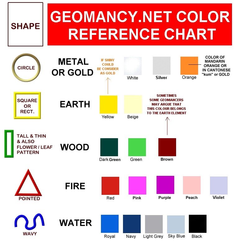
Free Personalised Analysis ReportsFind out your best car colour = Find out your Personal Element? Personalised Reports Free Analysis Reports Find out your Life Association Sectors Find out your Gua (Kua) Number? East or West Group Person? Find out your Horoscope? Find out your Characteristics? Find out your Personal Element? How suitable is your Home? Your Favourable Sleep Position? Your Favourable Study Position? Your Favourable Work Position? Your Favourable Bedroom Location? Is your Apartment Number Auspicious? Generate Free Reports Generate 4 Good & 4 Bad Direction Report Generate Ba Zi Luck Analysis, Personal Element & Horoscope Insights- (FREEBAZI.GEOMANCY.NET) Generate 30 Days Auspicious Date for ONE or TWO Persons(DATE.GEOMANCY.NET) More FREE Reports Welcome to Personalized Analysis ReportsSince 1996, Geomancy.net has guided individuals in understanding Feng Shui and Chinese divination. With our expertise, we have assisted thousands, becoming a trusted resource for those seeking knowledge. Our personalized analysis reports empower you to tap into these ancient practices, significantly improving your quality of life. Discover the Power of Personalized Analysis ReportsAt ONLINE.GEOMANCY.NET, we provide free personalized analysis reports that empower you to understand the intricate connections between your living environment and your personal well-being. By leveraging time-honored techniques from Feng Shui and Chinese divination, our reports help you uncover valuable insights that can guide your decisions and improve your lifestyle. What We OfferOur comprehensive reports are designed to give you a holistic view of your life associations and environmental influences. Here’s what you can expect from our personalized analysis: Life Association SectorsUnderstanding your life association sectors is crucial for achieving balance and harmony. Our reports will reveal the areas of your life that are most influenced by your environment, helping you to focus your energy where it matters most. Your Gua (Kua) NumberYour Gua number is a vital aspect of Feng Shui that determines your personal energy profile. By calculating your Gua number, you can gain insights into your strengths and weaknesses, allowing you to make informed decisions that align with your true nature. East or West Group Person?Identifying whether you belong to the East or West group can significantly impact your approach to life. Our analysis will classify you accordingly, providing tailored recommendations for your personal growth and development. Horoscope InsightsAstrology plays a significant role in understanding your personality traits and life path. Our reports will include your horoscope, offering insights into your character and potential challenges you may face. Understanding Your CharacteristicsEvery individual has unique characteristics shaped by various factors. Our personalized reports will analyze these traits, helping you to understand how they influence your interactions and relationships. Your Personal ElementIn Feng Shui, the five elements (Wood, Fire, Earth, Metal, Water) play a crucial role in shaping your life. Our analysis will determine your personal element, providing insights that can help you harmonize with your environment. Assessing Your Home's SuitabilityYour living space significantly affects your overall well-being. Our reports will evaluate how suitable your home is for you, considering factors such as layout, direction, and energy flow. This assessment can guide you in making necessary adjustments to enhance your living environment. Favorable Sleep PositionDid you know that your sleep position can impact your health? Our analysis will suggest the best sleep position for you based on your personal energy profile, helping you achieve better rest and rejuvenation. Optimal Study PositionFor students and professionals alike, the right study position can enhance focus and productivity. Our reports will provide recommendations for your ideal study position, allowing you to maximize your learning potential. Favorable Work PositionYour work environment plays a critical role in your success. We will analyze your work position to ensure it aligns with your personal energy, promoting productivity and satisfaction in your professional life. Bedroom LocationThe location of your bedroom can influence your relationships and personal energy. Our reports will offer insights into the most beneficial bedroom location for you, fostering a peaceful and harmonious space. Auspicious Apartment NumbersDid you know that the number of your apartment can carry significant meaning? Our analysis will determine whether your apartment number is auspicious, guiding you towards a more favorable living situation. Generate Your Free ReportsReady to take the next step? Generating your free personalized analysis reports is simple: Login or Sign Up: Access your account at ONLINE.GEOMANCY.NET to get started. Choose Your Reports: Select from various reports, including: 4 Good & 4 Bad Direction Report Ba Zi Luck Analysis Personal Element Insights Horoscope Insights Receive Your Analysis: Once generated, your reports will be available for you to explore.
-
Free Personalised Analysis Reports Personalised Reports Free Analysis Reports Find out your Life Association Sectors Find out your Gua (Kua) Number? East or West Group Person? Find out your Horoscope? Find out your Characteristics? Find out your Personal Element? How suitable is your Home? Your Favourable Sleep Position? Your Favourable Study Position? Your Favourable Work Position? Your Favourable Bedroom Location? Is your Apartment Number Auspicious? Generate Free Reports Generate 4 Good & 4 Bad Direction Report Generate Ba Zi Luck Analysis, Personal Element & Horoscope Insights- (FREEBAZI.GEOMANCY.NET) Generate 30 Days Auspicious Date for ONE or TWO Persons(DATE.GEOMANCY.NET) More FREE Reports Welcome to Personalized Analysis ReportsSince 1996, Geomancy.net has guided individuals in understanding Feng Shui and Chinese divination. With our expertise, we have assisted thousands, becoming a trusted resource for those seeking knowledge. Our personalized analysis reports empower you to tap into these ancient practices, significantly improving your quality of life. Discover the Power of Personalized Analysis ReportsAt ONLINE.GEOMANCY.NET, we provide free personalized analysis reports that empower you to understand the intricate connections between your living environment and your personal well-being. By leveraging time-honored techniques from Feng Shui and Chinese divination, our reports help you uncover valuable insights that can guide your decisions and improve your lifestyle. What We OfferOur comprehensive reports are designed to give you a holistic view of your life associations and environmental influences. Here’s what you can expect from our personalized analysis: Life Association SectorsUnderstanding your life association sectors is crucial for achieving balance and harmony. Our reports will reveal the areas of your life that are most influenced by your environment, helping you to focus your energy where it matters most. Your Gua (Kua) NumberYour Gua number is a vital aspect of Feng Shui that determines your personal energy profile. By calculating your Gua number, you can gain insights into your strengths and weaknesses, allowing you to make informed decisions that align with your true nature. East or West Group Person?Identifying whether you belong to the East or West group can significantly impact your approach to life. Our analysis will classify you accordingly, providing tailored recommendations for your personal growth and development. Horoscope InsightsAstrology plays a significant role in understanding your personality traits and life path. Our reports will include your horoscope, offering insights into your character and potential challenges you may face. Understanding Your CharacteristicsEvery individual has unique characteristics shaped by various factors. Our personalized reports will analyze these traits, helping you to understand how they influence your interactions and relationships. Your Personal ElementIn Feng Shui, the five elements (Wood, Fire, Earth, Metal, Water) play a crucial role in shaping your life. Our analysis will determine your personal element, providing insights that can help you harmonize with your environment. Assessing Your Home's SuitabilityYour living space significantly affects your overall well-being. Our reports will evaluate how suitable your home is for you, considering factors such as layout, direction, and energy flow. This assessment can guide you in making necessary adjustments to enhance your living environment. Favorable Sleep PositionDid you know that your sleep position can impact your health? Our analysis will suggest the best sleep position for you based on your personal energy profile, helping you achieve better rest and rejuvenation. Optimal Study PositionFor students and professionals alike, the right study position can enhance focus and productivity. Our reports will provide recommendations for your ideal study position, allowing you to maximize your learning potential. Favorable Work PositionYour work environment plays a critical role in your success. We will analyze your work position to ensure it aligns with your personal energy, promoting productivity and satisfaction in your professional life. Bedroom LocationThe location of your bedroom can influence your relationships and personal energy. Our reports will offer insights into the most beneficial bedroom location for you, fostering a peaceful and harmonious space. Auspicious Apartment NumbersDid you know that the number of your apartment can carry significant meaning? Our analysis will determine whether your apartment number is auspicious, guiding you towards a more favorable living situation. Generate Your Free ReportsReady to take the next step? Generating your free personalized analysis reports is simple: Login or Sign Up: Access your account at ONLINE.GEOMANCY.NET to get started. Choose Your Reports: Select from various reports, including: 4 Good & 4 Bad Direction Report Ba Zi Luck Analysis Personal Element Insights Horoscope Insights Receive Your Analysis: Once generated, your reports will be available for you to explore.
-
Get a Quote Our fees have stayed the same since 1996 Cecil Lee, +65 9785-3171 support@geomancy.net
-
Free Personalised Analysis Reports Personalised Reports Free Analysis Reports Find out your Life Association Sectors Find out your Gua (Kua) Number? East or West Group Person? Find out your Horoscope? Find out your Characteristics? Find out your Personal Element? How suitable is your Home? Your Favourable Sleep Position? Your Favourable Study Position? Your Favourable Work Position? Your Favourable Bedroom Location? Is your Apartment Number Auspicious? Generate Free Reports Generate 4 Good & 4 Bad Direction Report Generate Ba Zi Luck Analysis, Personal Element & Horoscope Insights- (FREEBAZI.GEOMANCY.NET) Generate 30 Days Auspicious Date for ONE or TWO Persons(DATE.GEOMANCY.NET) More FREE Reports Welcome to Personalized Analysis ReportsSince 1996, Geomancy.net has guided individuals in understanding Feng Shui and Chinese divination. With our expertise, we have assisted thousands, becoming a trusted resource for those seeking knowledge. Our personalized analysis reports empower you to tap into these ancient practices, significantly improving your quality of life. Discover the Power of Personalized Analysis ReportsAt ONLINE.GEOMANCY.NET, we provide free personalized analysis reports that empower you to understand the intricate connections between your living environment and your personal well-being. By leveraging time-honored techniques from Feng Shui and Chinese divination, our reports help you uncover valuable insights that can guide your decisions and improve your lifestyle. What We OfferOur comprehensive reports are designed to give you a holistic view of your life associations and environmental influences. Here’s what you can expect from our personalized analysis: Life Association SectorsUnderstanding your life association sectors is crucial for achieving balance and harmony. Our reports will reveal the areas of your life that are most influenced by your environment, helping you to focus your energy where it matters most. Your Gua (Kua) NumberYour Gua number is a vital aspect of Feng Shui that determines your personal energy profile. By calculating your Gua number, you can gain insights into your strengths and weaknesses, allowing you to make informed decisions that align with your true nature. East or West Group Person?Identifying whether you belong to the East or West group can significantly impact your approach to life. Our analysis will classify you accordingly, providing tailored recommendations for your personal growth and development. Horoscope InsightsAstrology plays a significant role in understanding your personality traits and life path. Our reports will include your horoscope, offering insights into your character and potential challenges you may face. Understanding Your CharacteristicsEvery individual has unique characteristics shaped by various factors. Our personalized reports will analyze these traits, helping you to understand how they influence your interactions and relationships. Your Personal ElementIn Feng Shui, the five elements (Wood, Fire, Earth, Metal, Water) play a crucial role in shaping your life. Our analysis will determine your personal element, providing insights that can help you harmonize with your environment. Assessing Your Home's SuitabilityYour living space significantly affects your overall well-being. Our reports will evaluate how suitable your home is for you, considering factors such as layout, direction, and energy flow. This assessment can guide you in making necessary adjustments to enhance your living environment. Favorable Sleep PositionDid you know that your sleep position can impact your health? Our analysis will suggest the best sleep position for you based on your personal energy profile, helping you achieve better rest and rejuvenation. Optimal Study PositionFor students and professionals alike, the right study position can enhance focus and productivity. Our reports will provide recommendations for your ideal study position, allowing you to maximize your learning potential. Favorable Work PositionYour work environment plays a critical role in your success. We will analyze your work position to ensure it aligns with your personal energy, promoting productivity and satisfaction in your professional life. Bedroom LocationThe location of your bedroom can influence your relationships and personal energy. Our reports will offer insights into the most beneficial bedroom location for you, fostering a peaceful and harmonious space. Auspicious Apartment NumbersDid you know that the number of your apartment can carry significant meaning? Our analysis will determine whether your apartment number is auspicious, guiding you towards a more favorable living situation. Generate Your Free ReportsReady to take the next step? Generating your free personalized analysis reports is simple: Login or Sign Up: Access your account at ONLINE.GEOMANCY.NET to get started. Choose Your Reports: Select from various reports, including: 4 Good & 4 Bad Direction Report Ba Zi Luck Analysis Personal Element Insights Horoscope Insights Receive Your Analysis: Once generated, your reports will be available for you to explore.
-
Get a Quote Our fees have stayed the same since 1996 Cecil Lee, +65 9785-3171 support@geomancy.net
-
Get a Quote Our fees have stayed the same since 1996 Cecil Lee, +65 9785-3171 support@geomancy.net
-
Free Personalised Analysis Reports Personalised Reports Free Analysis Reports Find out your Life Association Sectors Find out your Gua (Kua) Number? East or West Group Person? Find out your Horoscope? Find out your Characteristics? Find out your Personal Element? How suitable is your Home? Your Favourable Sleep Position? Your Favourable Study Position? Your Favourable Work Position? Your Favourable Bedroom Location? Is your Apartment Number Auspicious? Generate Free Reports Generate 4 Good & 4 Bad Direction Report Generate Ba Zi Luck Analysis, Personal Element & Horoscope Insights- (FREEBAZI.GEOMANCY.NET) Generate 30 Days Auspicious Date for ONE or TWO Persons(DATE.GEOMANCY.NET) More FREE Reports Welcome to Personalized Analysis ReportsSince 1996, Geomancy.net has guided individuals in understanding Feng Shui and Chinese divination. With our expertise, we have assisted thousands, becoming a trusted resource for those seeking knowledge. Our personalized analysis reports empower you to tap into these ancient practices, significantly improving your quality of life. Discover the Power of Personalized Analysis ReportsAt ONLINE.GEOMANCY.NET, we provide free personalized analysis reports that empower you to understand the intricate connections between your living environment and your personal well-being. By leveraging time-honored techniques from Feng Shui and Chinese divination, our reports help you uncover valuable insights that can guide your decisions and improve your lifestyle. What We OfferOur comprehensive reports are designed to give you a holistic view of your life associations and environmental influences. Here’s what you can expect from our personalized analysis: Life Association SectorsUnderstanding your life association sectors is crucial for achieving balance and harmony. Our reports will reveal the areas of your life that are most influenced by your environment, helping you to focus your energy where it matters most. Your Gua (Kua) NumberYour Gua number is a vital aspect of Feng Shui that determines your personal energy profile. By calculating your Gua number, you can gain insights into your strengths and weaknesses, allowing you to make informed decisions that align with your true nature. East or West Group Person?Identifying whether you belong to the East or West group can significantly impact your approach to life. Our analysis will classify you accordingly, providing tailored recommendations for your personal growth and development. Horoscope InsightsAstrology plays a significant role in understanding your personality traits and life path. Our reports will include your horoscope, offering insights into your character and potential challenges you may face. Understanding Your CharacteristicsEvery individual has unique characteristics shaped by various factors. Our personalized reports will analyze these traits, helping you to understand how they influence your interactions and relationships. Your Personal ElementIn Feng Shui, the five elements (Wood, Fire, Earth, Metal, Water) play a crucial role in shaping your life. Our analysis will determine your personal element, providing insights that can help you harmonize with your environment. Assessing Your Home's SuitabilityYour living space significantly affects your overall well-being. Our reports will evaluate how suitable your home is for you, considering factors such as layout, direction, and energy flow. This assessment can guide you in making necessary adjustments to enhance your living environment. Favorable Sleep PositionDid you know that your sleep position can impact your health? Our analysis will suggest the best sleep position for you based on your personal energy profile, helping you achieve better rest and rejuvenation. Optimal Study PositionFor students and professionals alike, the right study position can enhance focus and productivity. Our reports will provide recommendations for your ideal study position, allowing you to maximize your learning potential. Favorable Work PositionYour work environment plays a critical role in your success. We will analyze your work position to ensure it aligns with your personal energy, promoting productivity and satisfaction in your professional life. Bedroom LocationThe location of your bedroom can influence your relationships and personal energy. Our reports will offer insights into the most beneficial bedroom location for you, fostering a peaceful and harmonious space. Auspicious Apartment NumbersDid you know that the number of your apartment can carry significant meaning? Our analysis will determine whether your apartment number is auspicious, guiding you towards a more favorable living situation. Generate Your Free ReportsReady to take the next step? Generating your free personalized analysis reports is simple: Login or Sign Up: Access your account at ONLINE.GEOMANCY.NET to get started. Choose Your Reports: Select from various reports, including: 4 Good & 4 Bad Direction Report Ba Zi Luck Analysis Personal Element Insights Horoscope Insights Receive Your Analysis: Once generated, your reports will be available for you to explore.
-
Get a Quote Our fees have stayed the same since 1996 Cecil Lee, +65 9785-3171 support@geomancy.net