

Cecil Lee
Staff
-
Joined
-
Last visited
Everything posted by Cecil Lee
-
All about Mirrors A Two Piece Mirror Avoid a Spilt line at the middle of the dining area A Three Piece Mirror Variation of a Three Piece Mirror Does it matter if the Mirror has odd or even pieces? A full length Mirror Avoid Mirror below an air-conditioner unit Any issue with tinted Mirrors Dressing table Mirror 2018 (C) Geomancy.net VER 8.8.2019

-
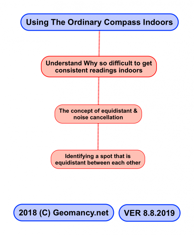
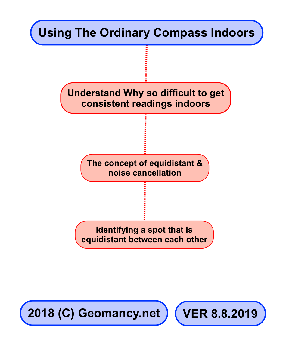
Using The Ordinary Compass Indoors Understand Why so difficult to get consistent readings indoors The concept of equidistant & noise cancellation Identifying a spot that is equidistant between each other 2018 (C) Geomancy.net VER 8.8.2019
-
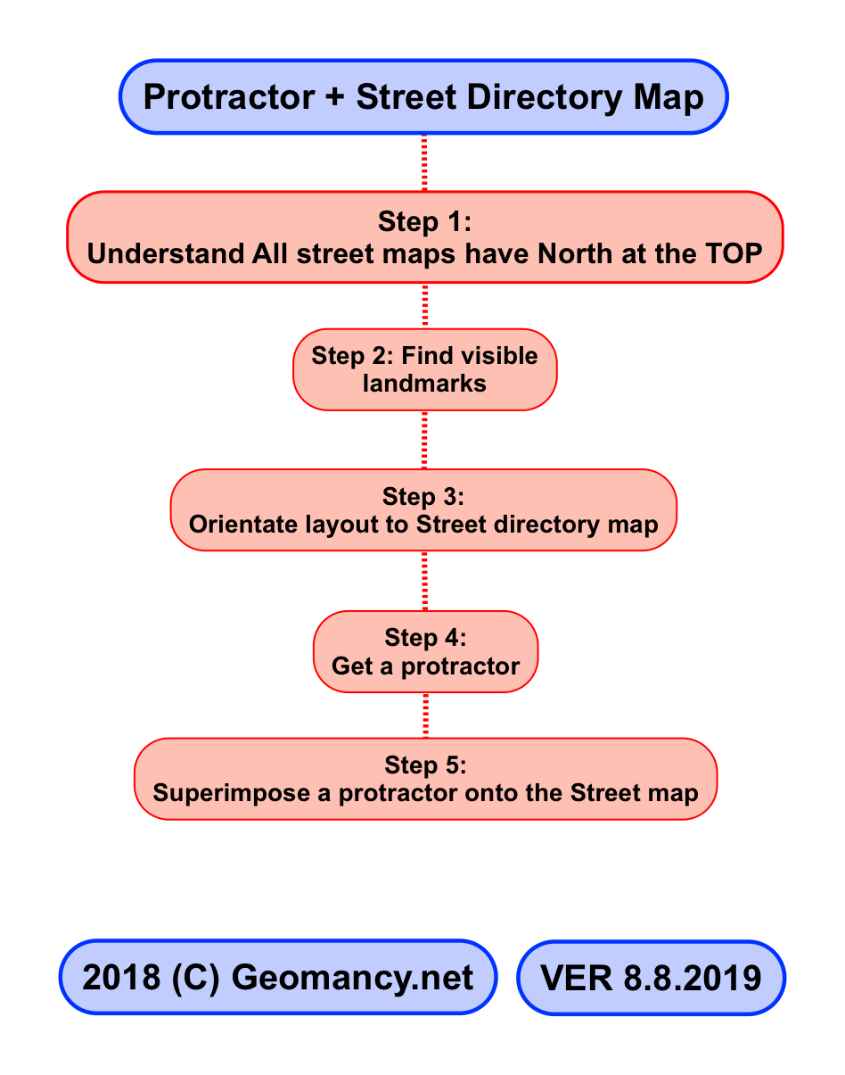
Protractor + Street Directory Map Step 1: Understand All street maps have North at the TOP Step 2: Find visible landmarks Step 3: Orientate layout to Street directory map Step 4: Get a protractor Step 5: Superimpose a protractor onto the Street map 2018 (C) Geomancy.net VER 8.8.2019

-
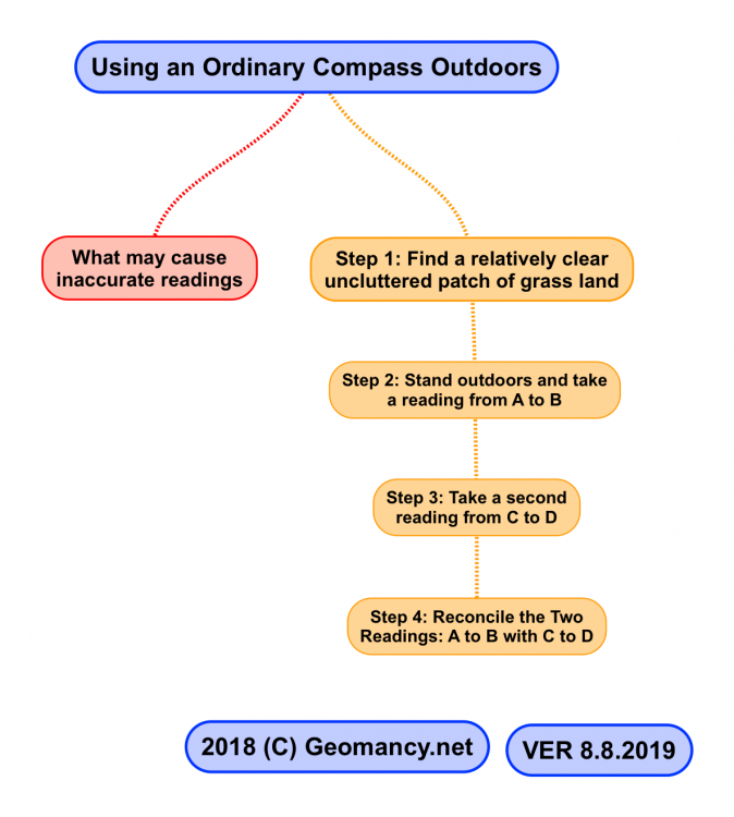
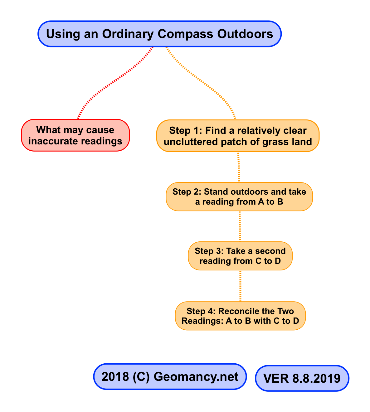
Using an Ordinary Compass Outdoors What may cause inaccurate readings Step 1: Find a relatively clear uncluttered patch of grass land Step 2: Stand outdoors and take a reading from A to B Step 3: Take a second reading from C to D Step 4: Reconcile the Two Readings: A to B with C to D 2018 (C) Geomancy.net VER 8.8.2019
-
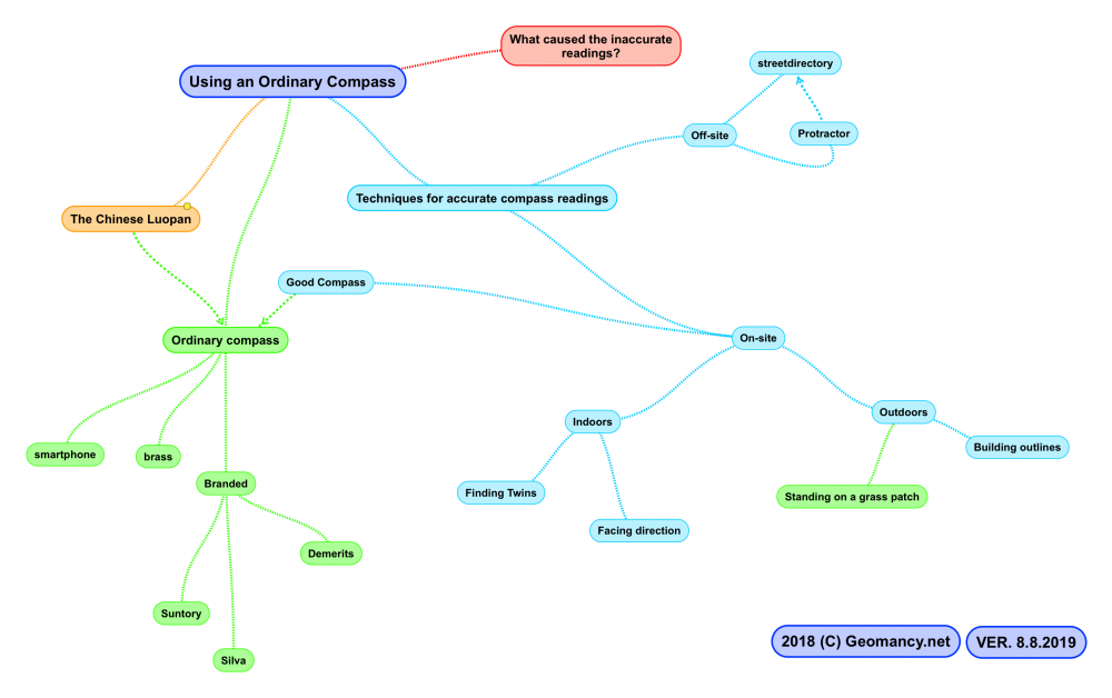
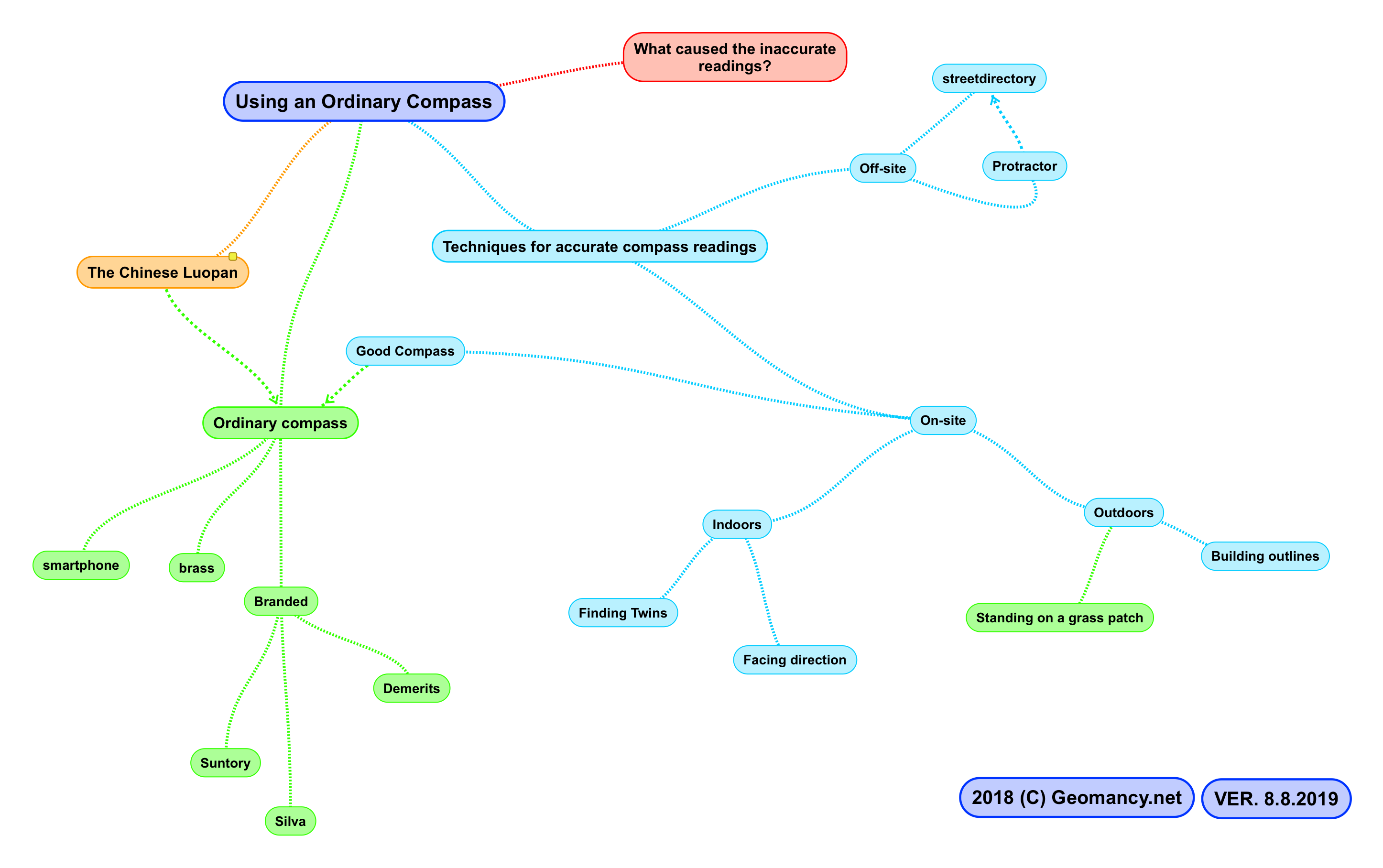
Using an Ordinary Compass The Chinese Luopan Differences Ordinary compass smartphone brass Branded Suntory Silva Demerits Techniques for accurate compass readings On-site Good Compass Indoors Finding Twins Facing direction Outdoors Standing on a grass patch Building outlines Off-site streetdirectory Protractor What caused the inaccurate readings? 2018 (C) Geomancy.net VER. 8.8.2019
-
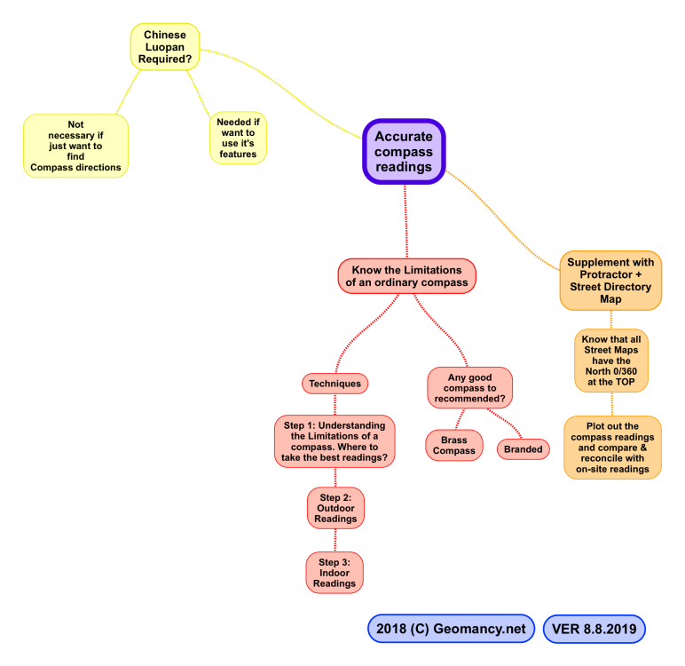
Accurate compass readings Know the Limitations of an ordinary compass Techniques Step 1: Understanding the Limitations of a compass. Where to take the best readings? Step 2: Outdoor Readings Step 3: Indoor Readings Any good compass to recommended? Brass Compass Branded Supplement with Protractor + Street Directory Map Know that all Street Maps have the North 0/360 at the TOP Plot out the compass readings and compare & reconcile with on-site readings Chinese Luopan Required? Not necessary if just want to find Compass directions Needed if want to use it's features 2018 (C) Geomancy.net VER 8.8.2019
-
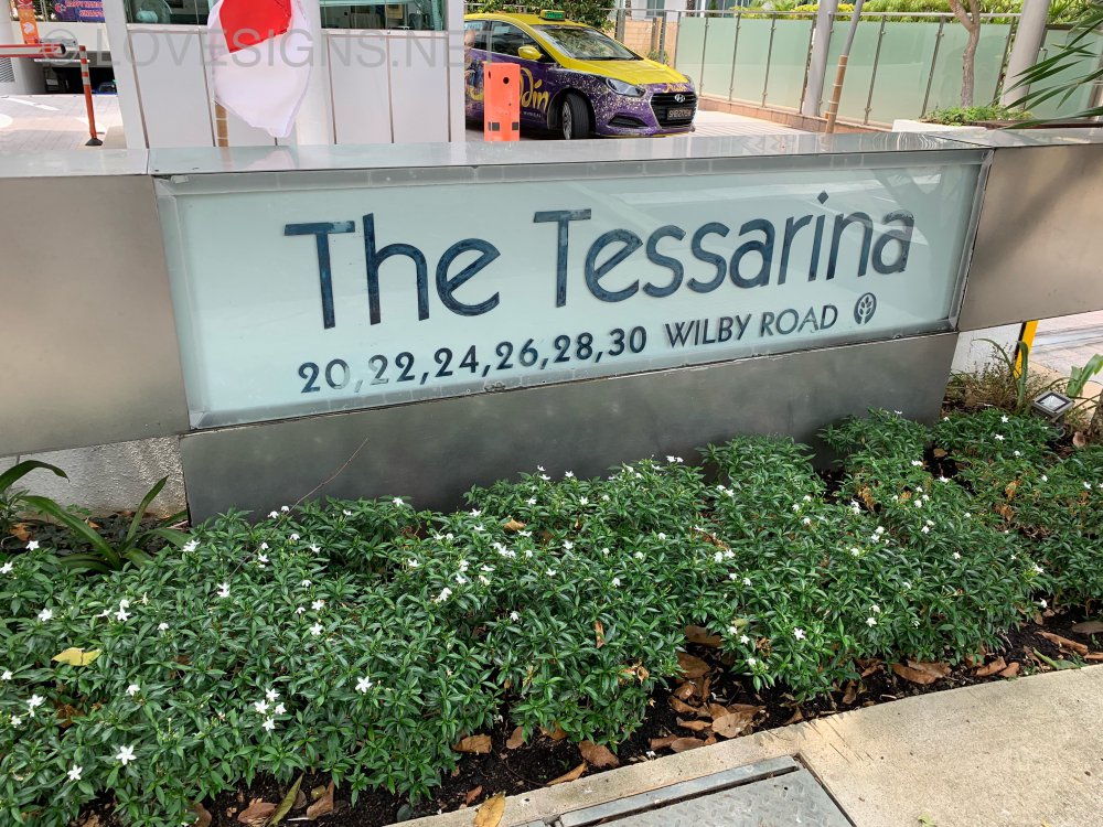
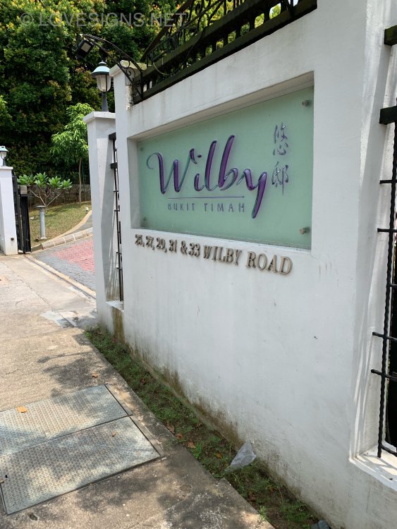
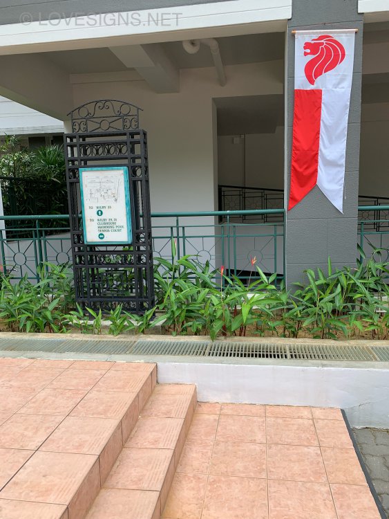
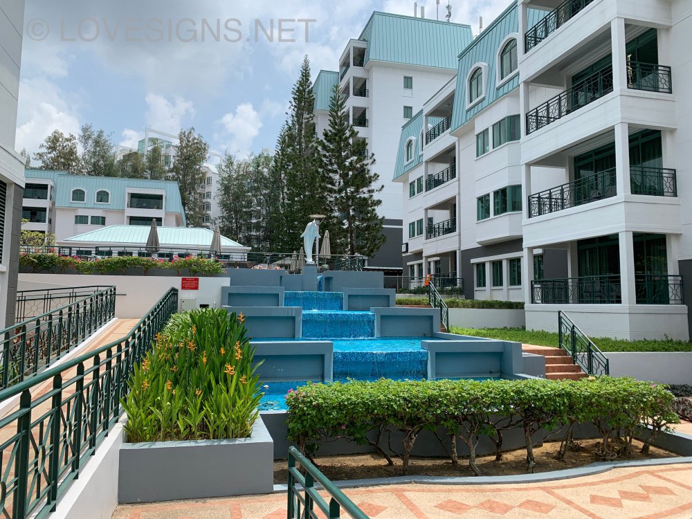
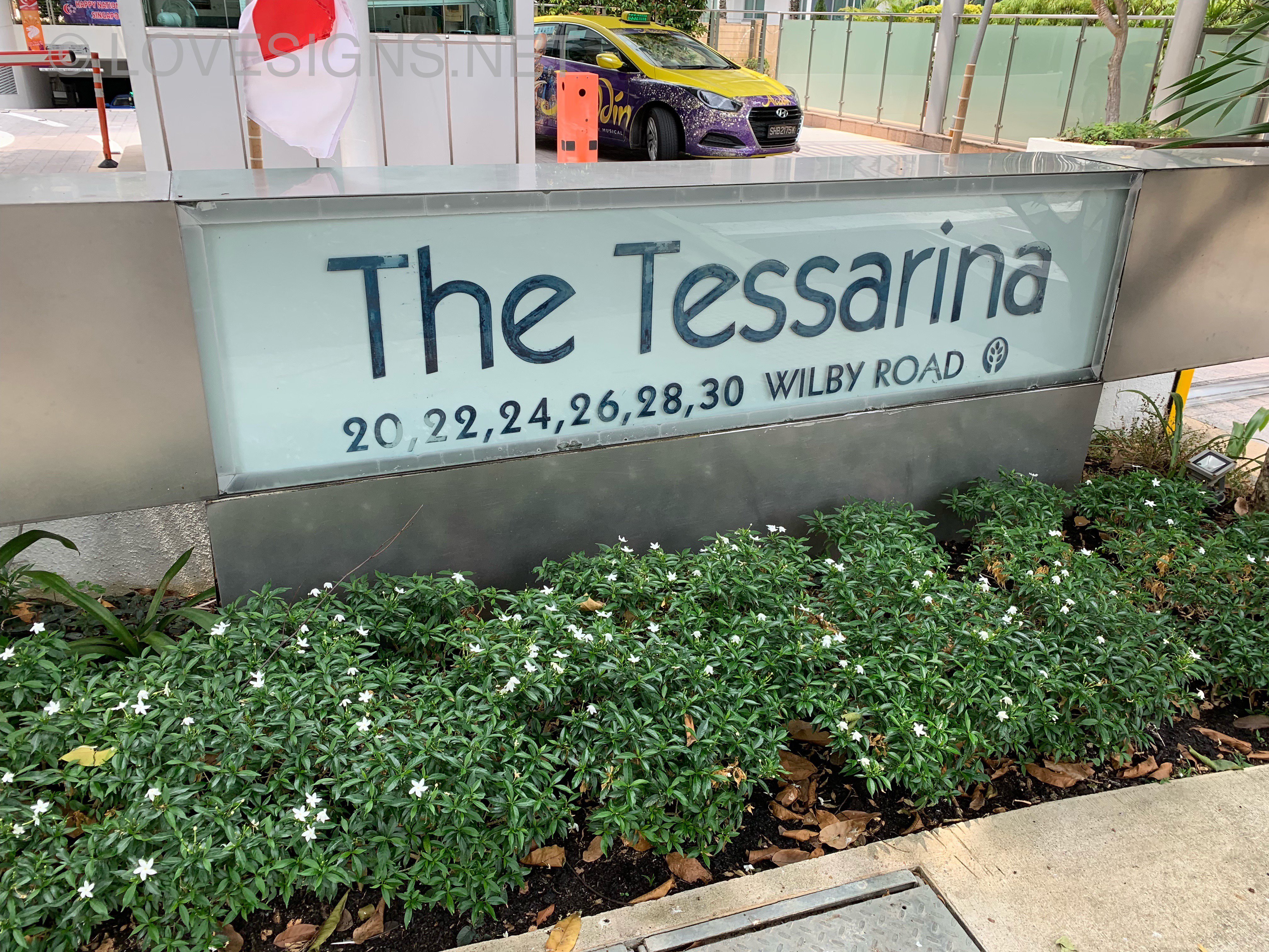
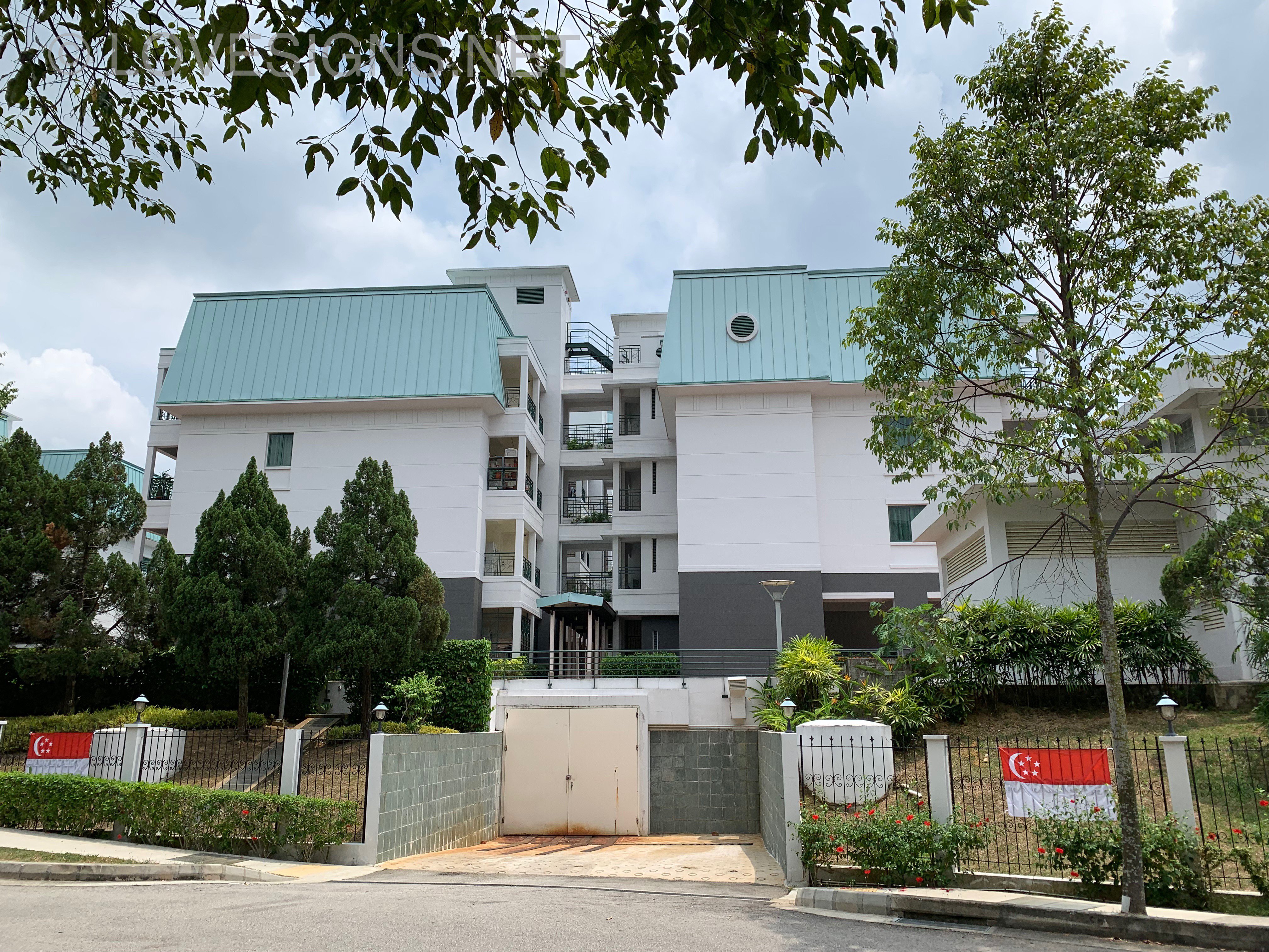
Wilby At BUKIT Timah at Wilby Road


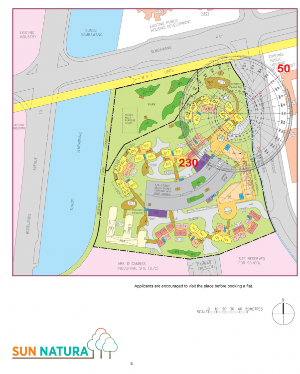
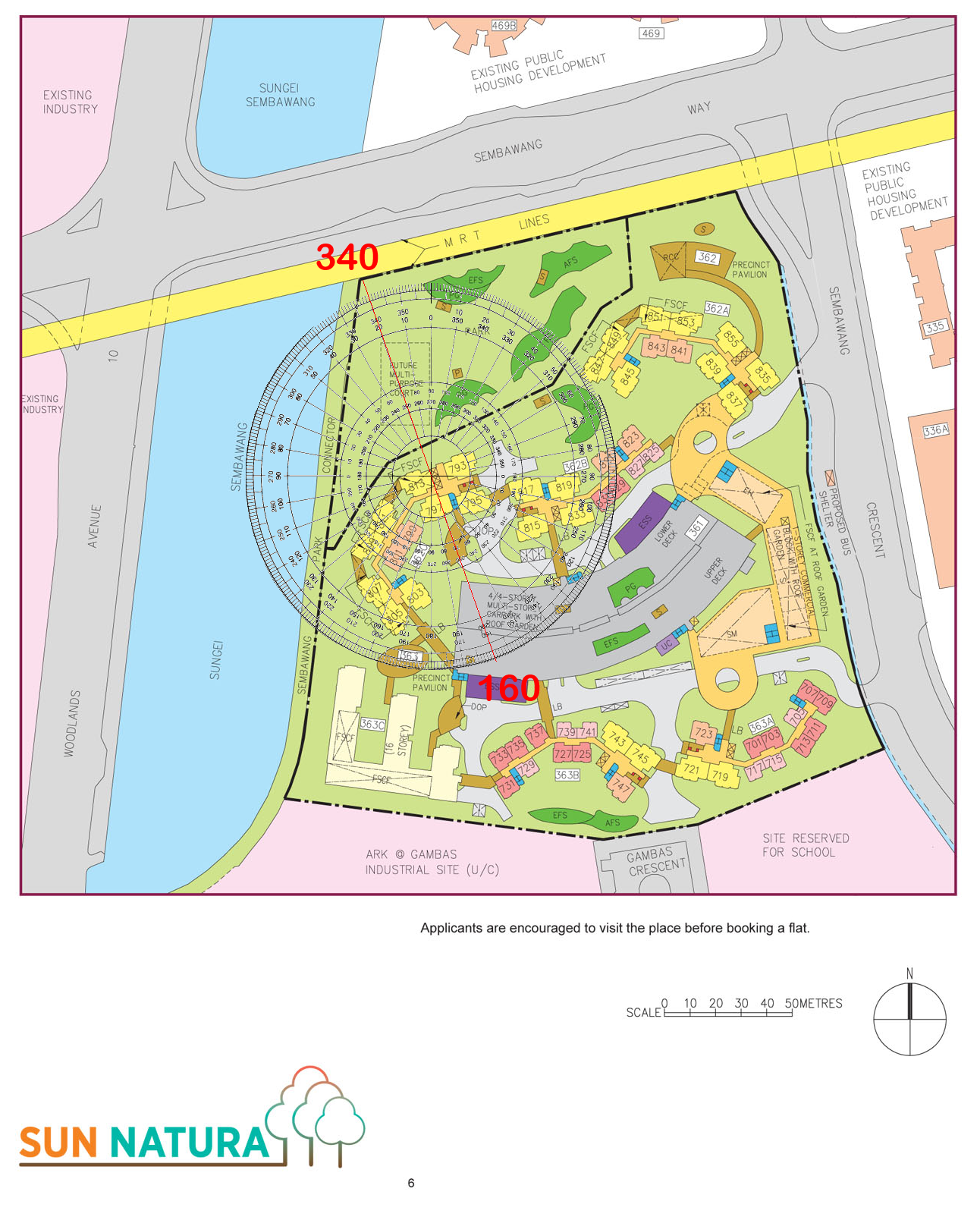
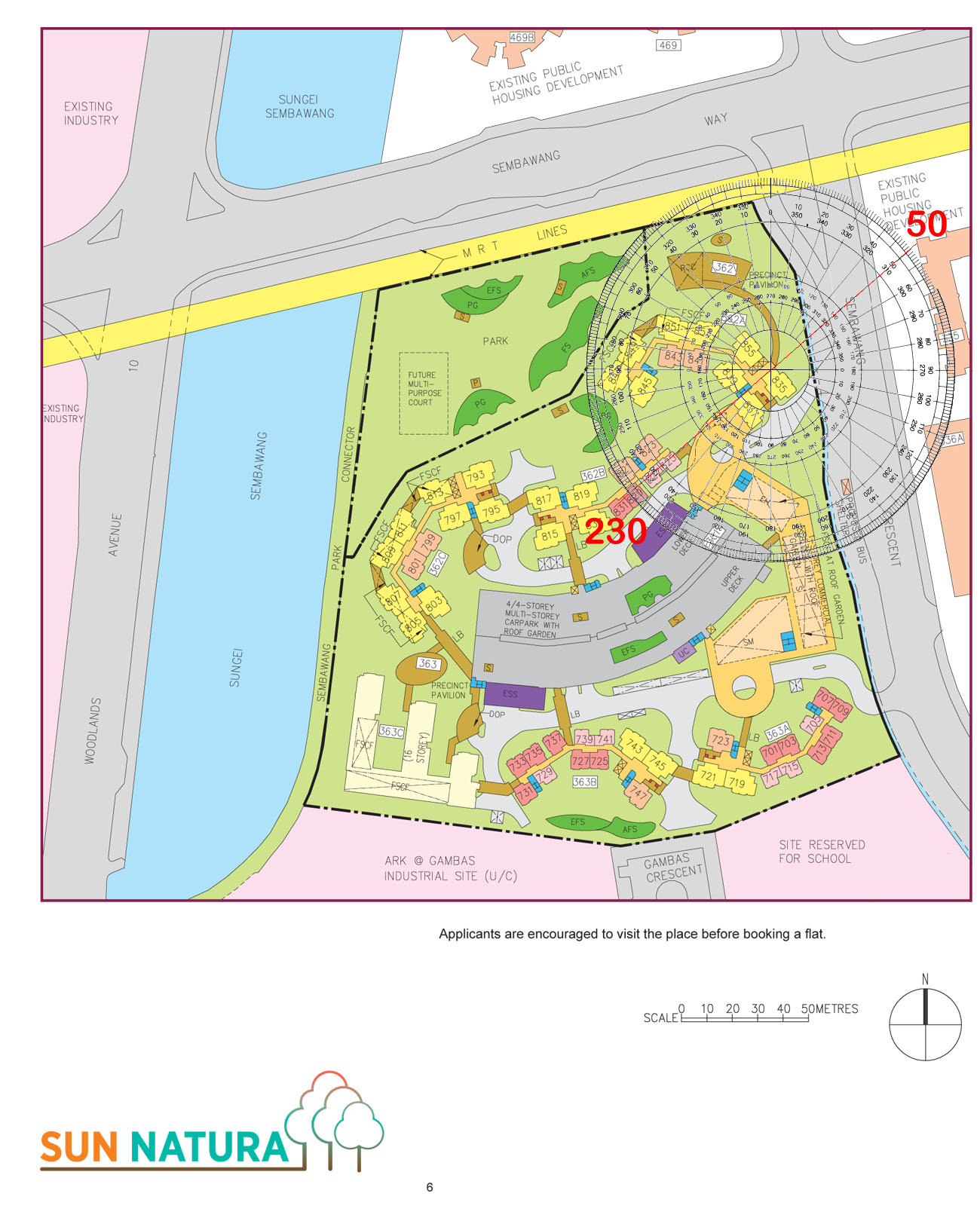
 Sun Natura Sales Brochure: Site Plan and Floor Plans sun-natura.pdf HDB Sun Natura Period 8 Flying Stars Feng Shui of specific stacks/units
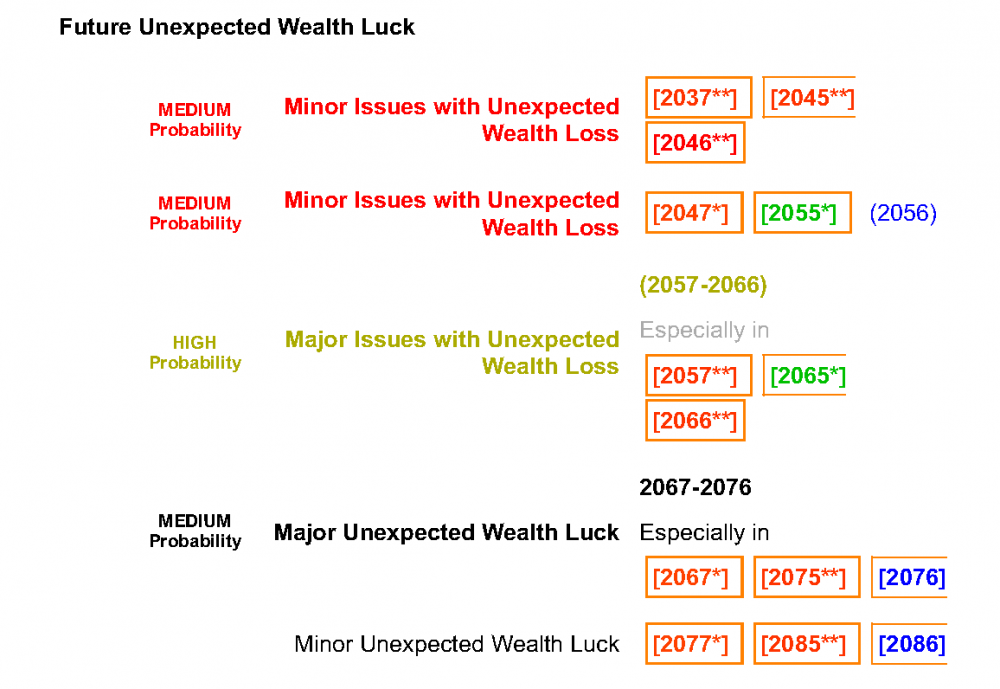
 [9.] How's my lottery / 4D luck?
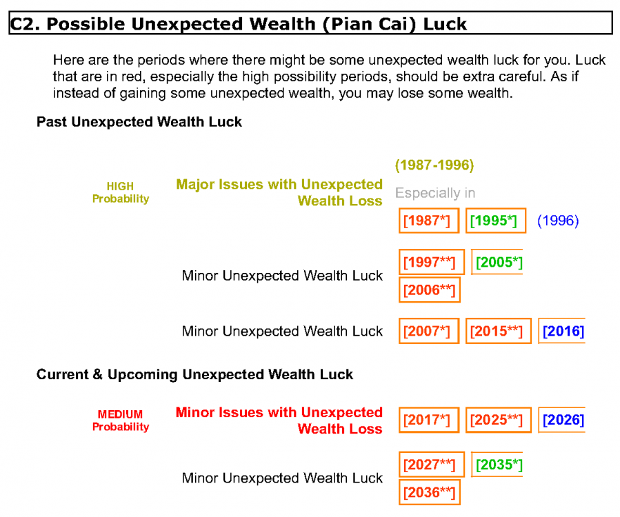
 A recent new client showed this to me ... about her previous Feng Shui Master
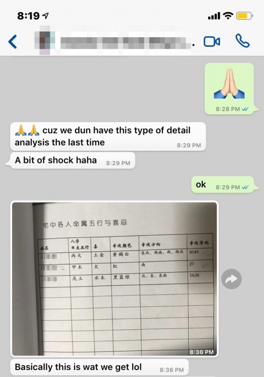 Question: Do you also do astrology? Reply: We only have Ba Zi Life Reading Review since this related to the Heavenly Luck. However, we don't really do Chinese Horoscope/Chinese Astrology as those are usually more for compatibility or for fun. Also, usually when it comes to relationship analysis, the Human Luck factor plays an equally important aspect for relationship which is why most Chinese Horoscope/Chinese Astrology reading is usually not very accurate as it is unable to consider the human luck factors. In any case, most of the useful compatibility analysis is already found and is already part of our Ba Zi Life Reading Review:- URL: Hope that helps. Question: Its for health not compatiblilty Reply: As mentioned, we use the Ba Zi Life Reading as it covers a lot of areas such as luck, career, health, relationship and so forth. As it is has the most direct influence to the Heaven Luck factor.
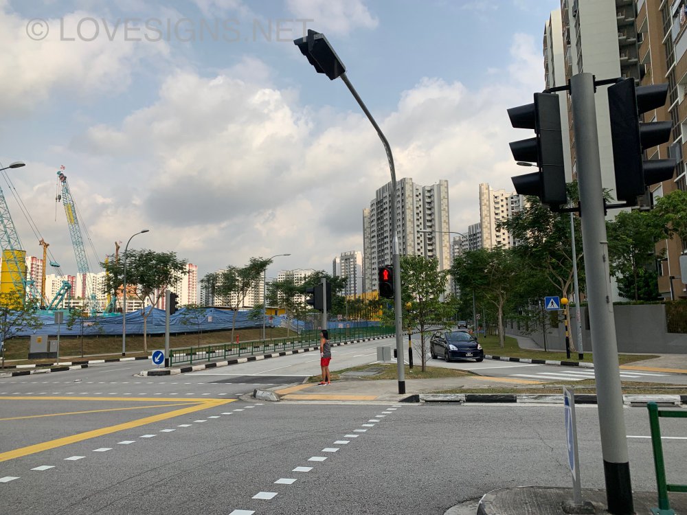
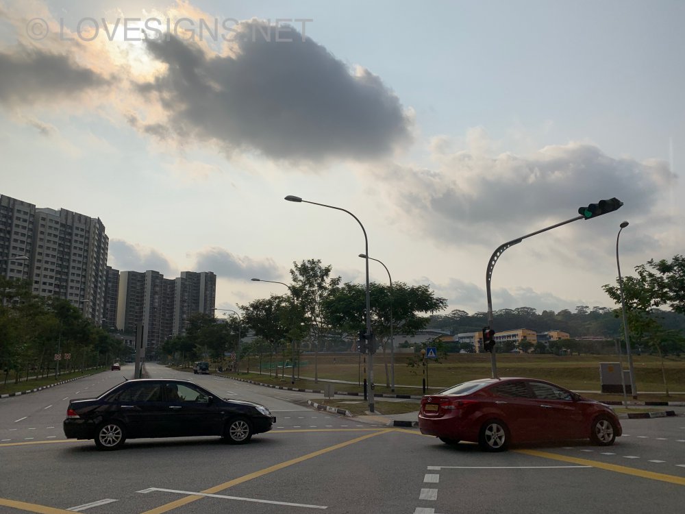
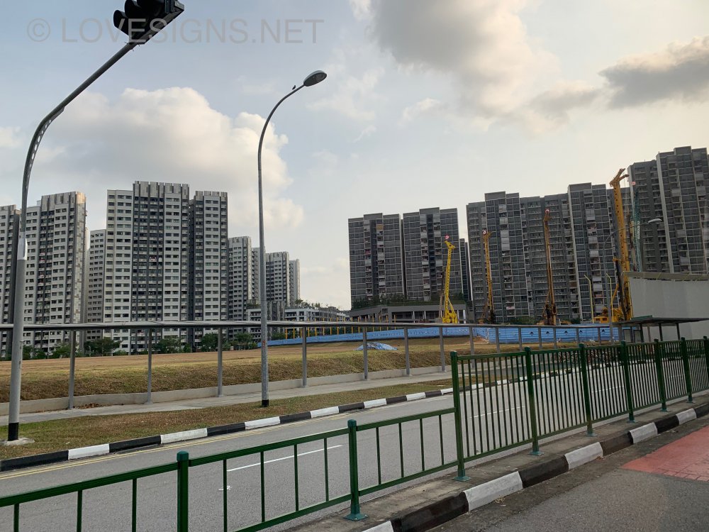
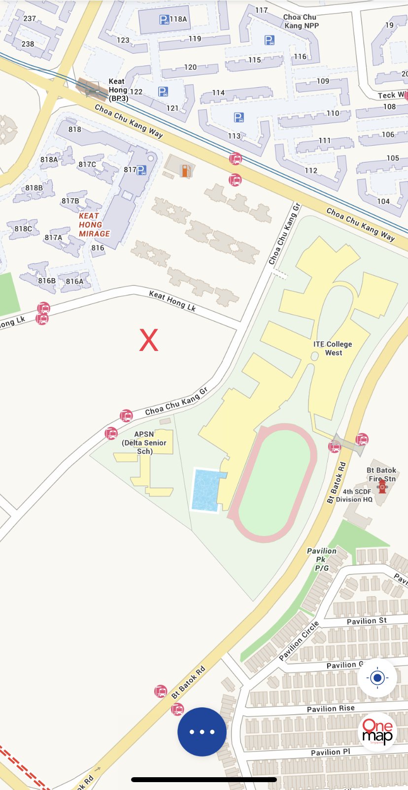
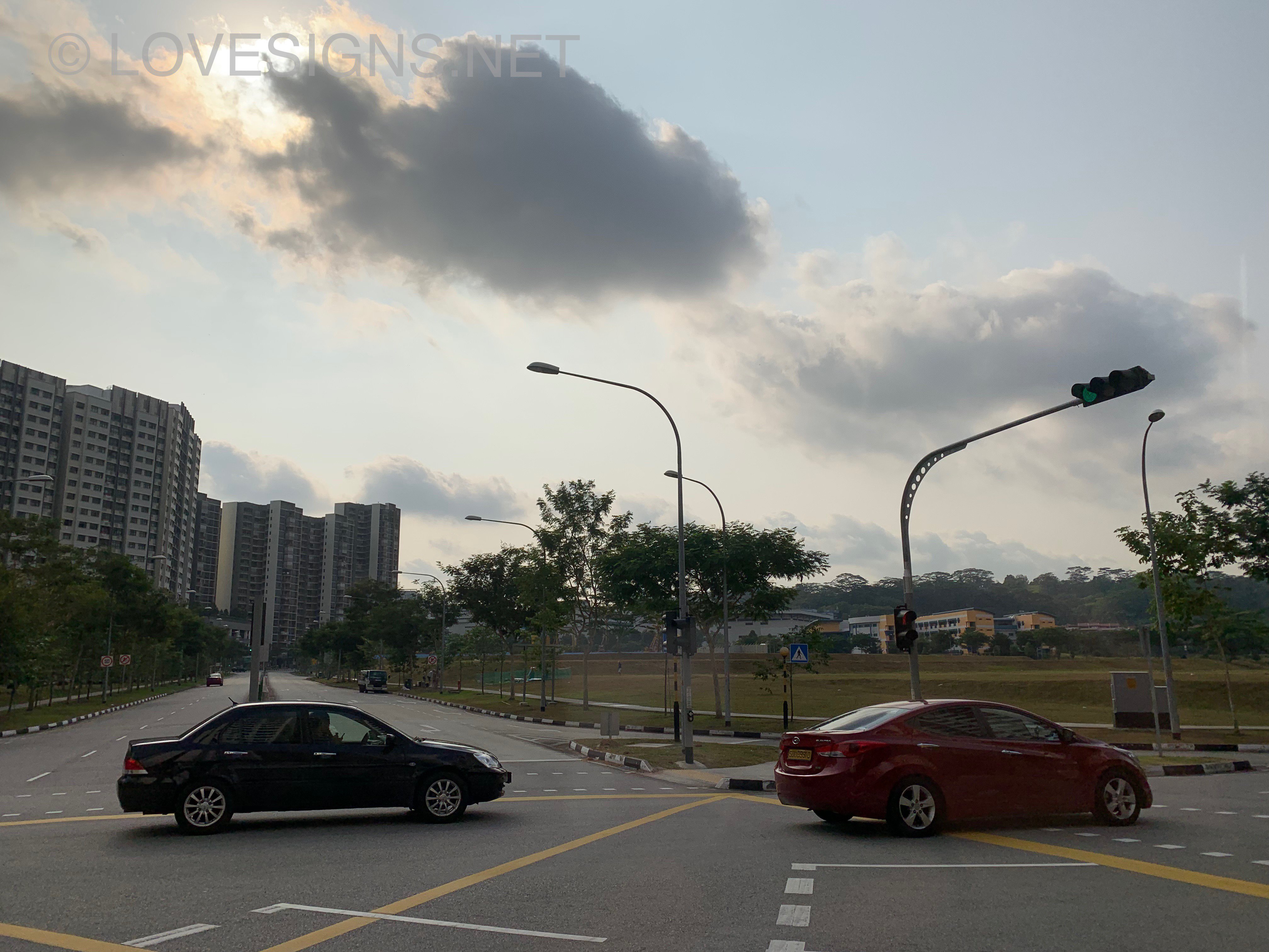
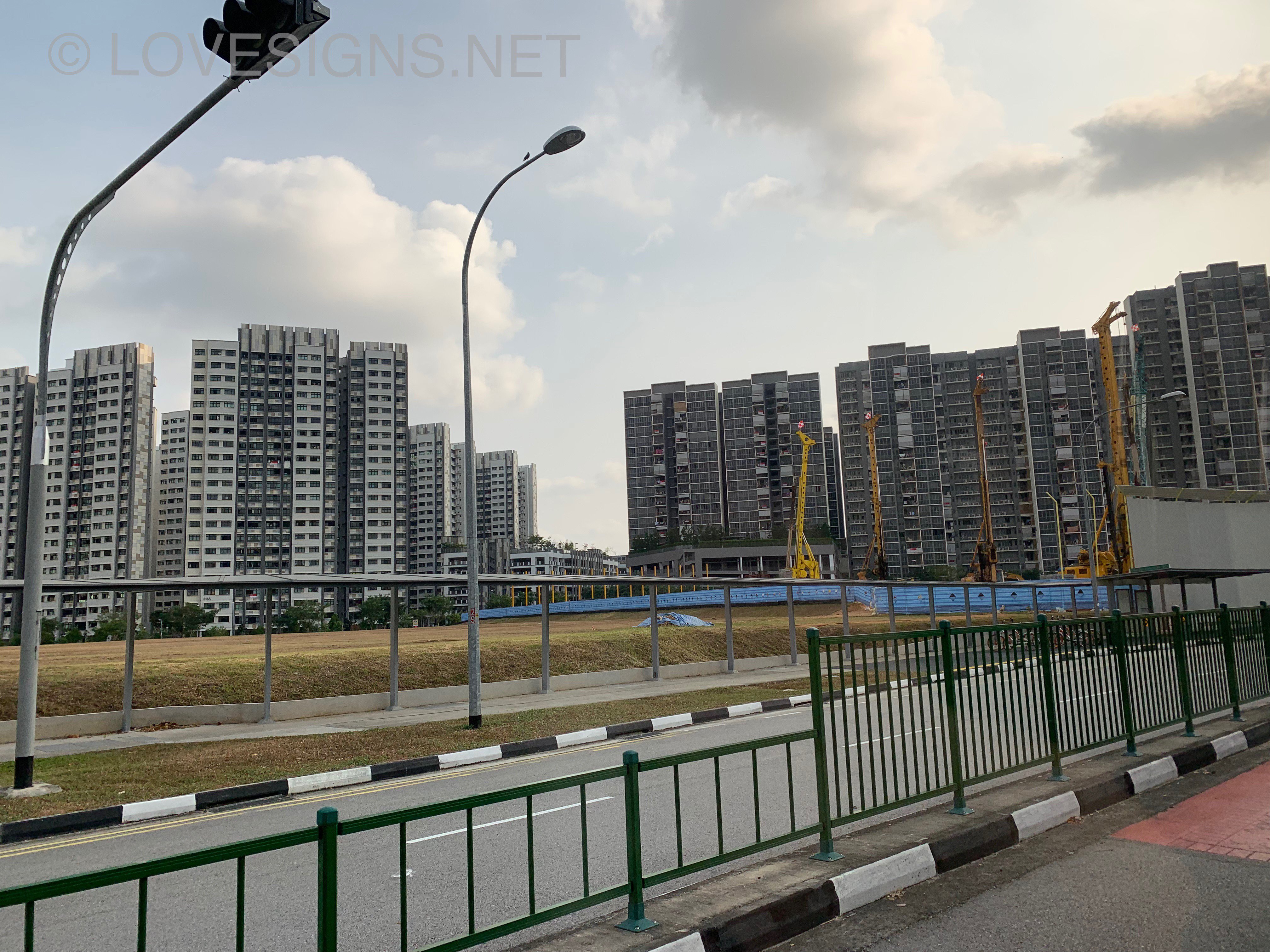
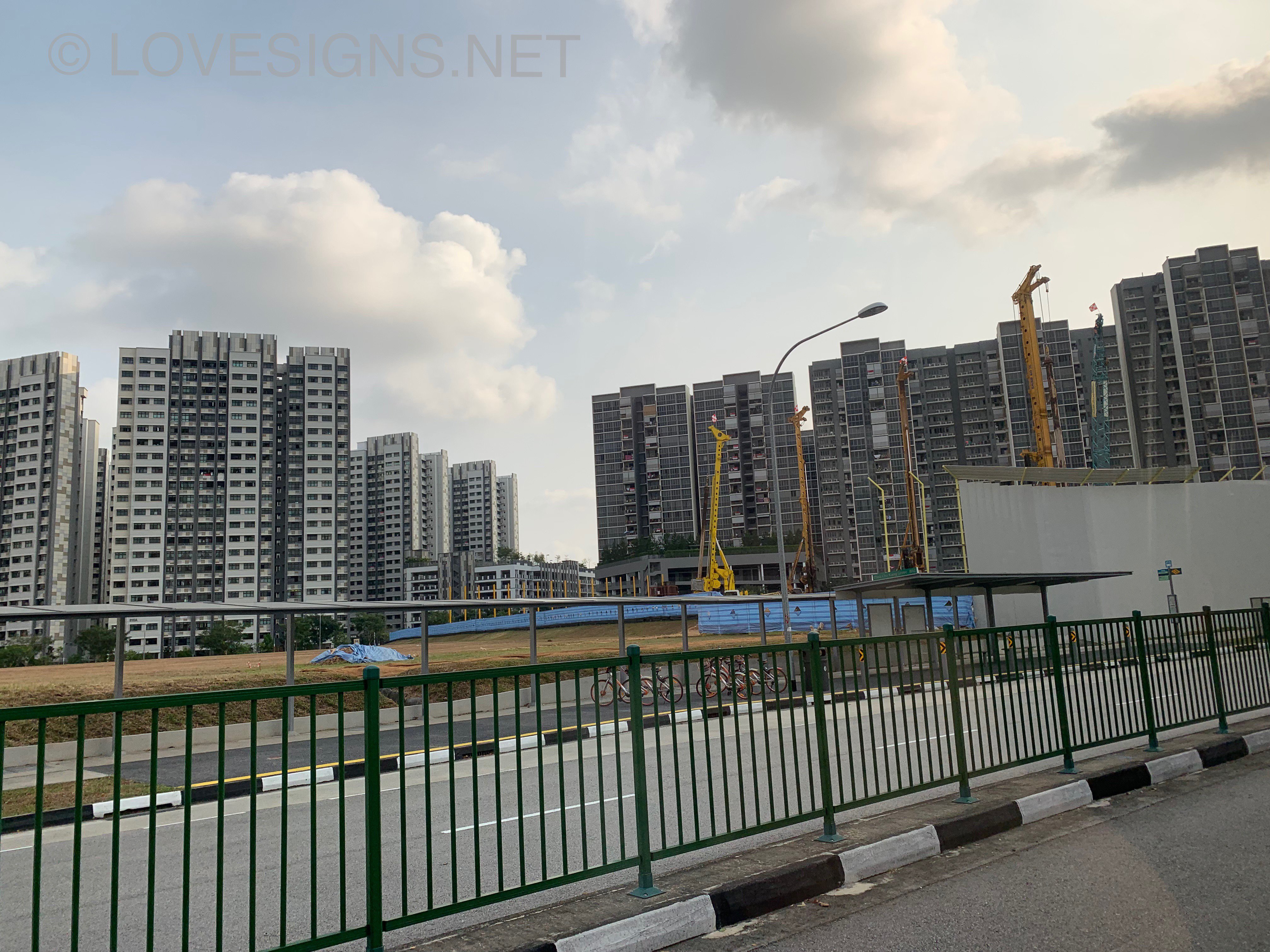
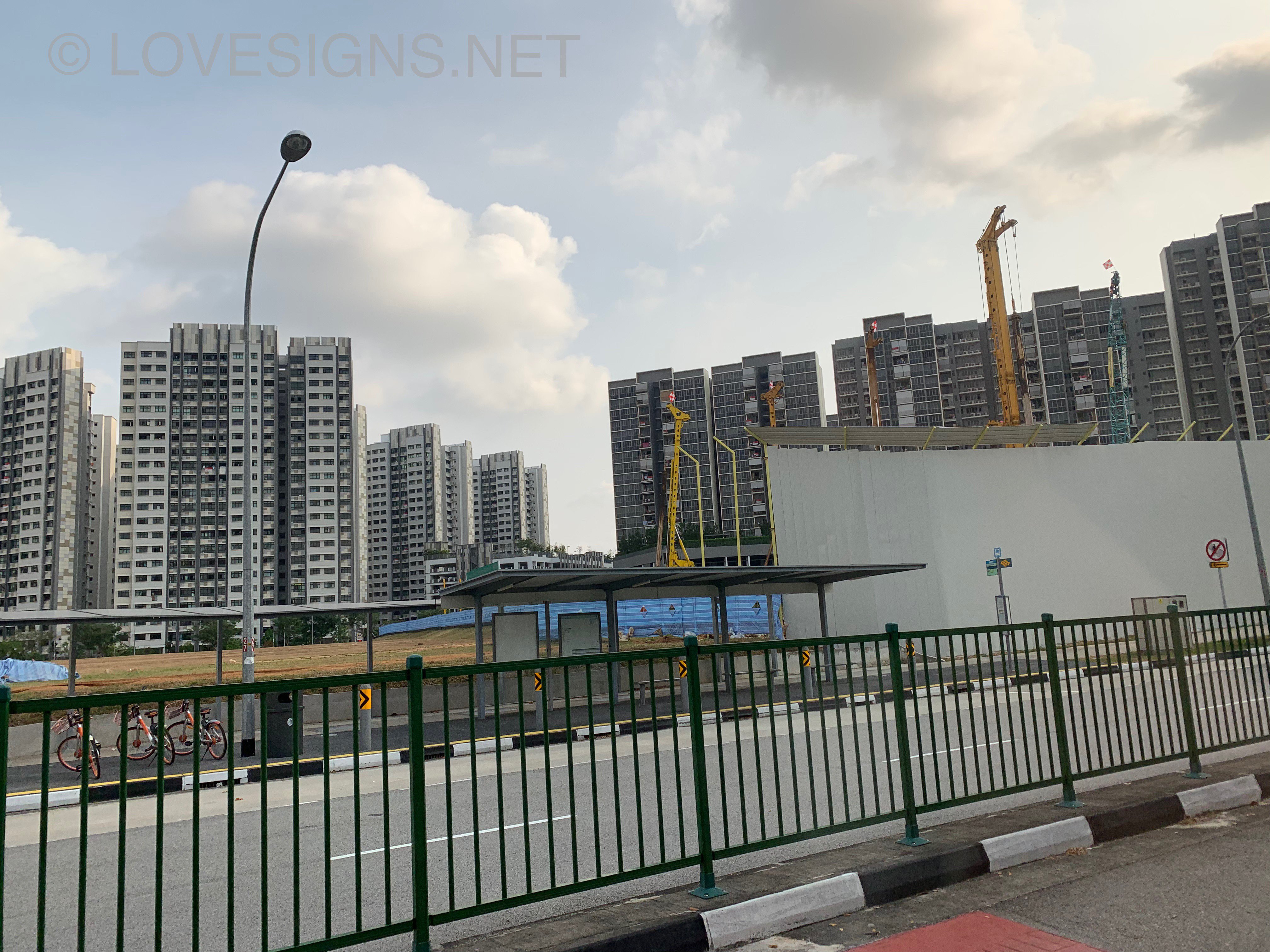
 Frankly, you are not alone. Many districts in Singapore also face the same situation. For example in Meyer Road area, there are also freehold condos where often when one step out of the unit: it is like a mini united nations of Americans, Koreans, Japanese, Europeans, China (Chinese) etc... Especially on weekends, the pool has that many foreigners. Here, in Katong, (many freehold) ... also like this. This government's expectations will be 10 million population. Thus please don't "complain". LOL... Freehold so what... so long as these are not landed... what is stopping PRs/foreigners from purchasing all of them. Another LOL... I also recalled when Lakelife EC just T.O.P. one of the guards felt and mentioned that he FELT that there were so many Mainland China PRs. (Not sure if this is absolutely true or not).The text emphasizes the importance of individual perspectives, acknowledging that while certain viewpoints may seem illogical, everyone has the right to their own opinions. This highlights the subjective nature of understanding and interpretation in discussions.In Singapore, often it is preferred not to buy a home (an apartment at low floors/storeys) facing a vacant plot of land. In addition depending on the type of buildings.. construction may last between 1.5 to 3 years. Noise and dusts... X marks the plot of land currently under development... No known HDB flats or condo/EC. Understand could be mixed shops or a market?
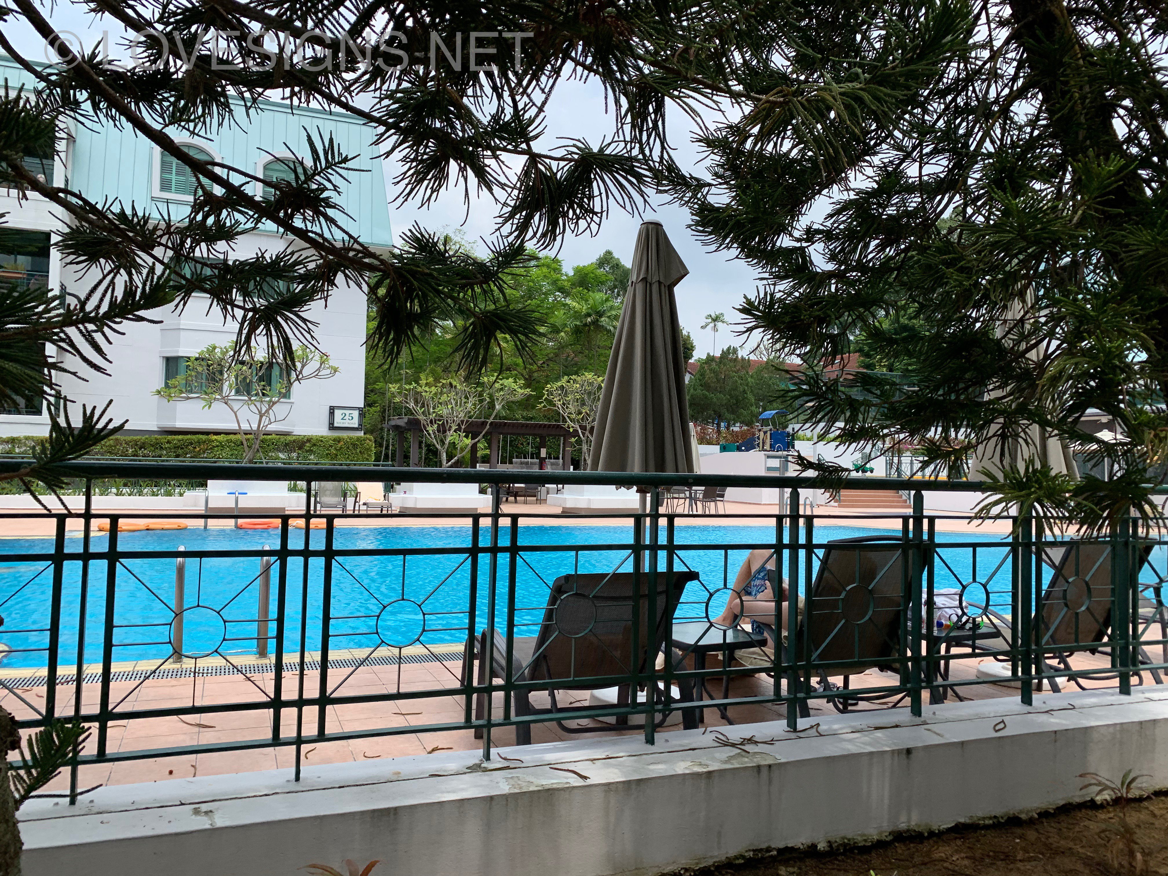
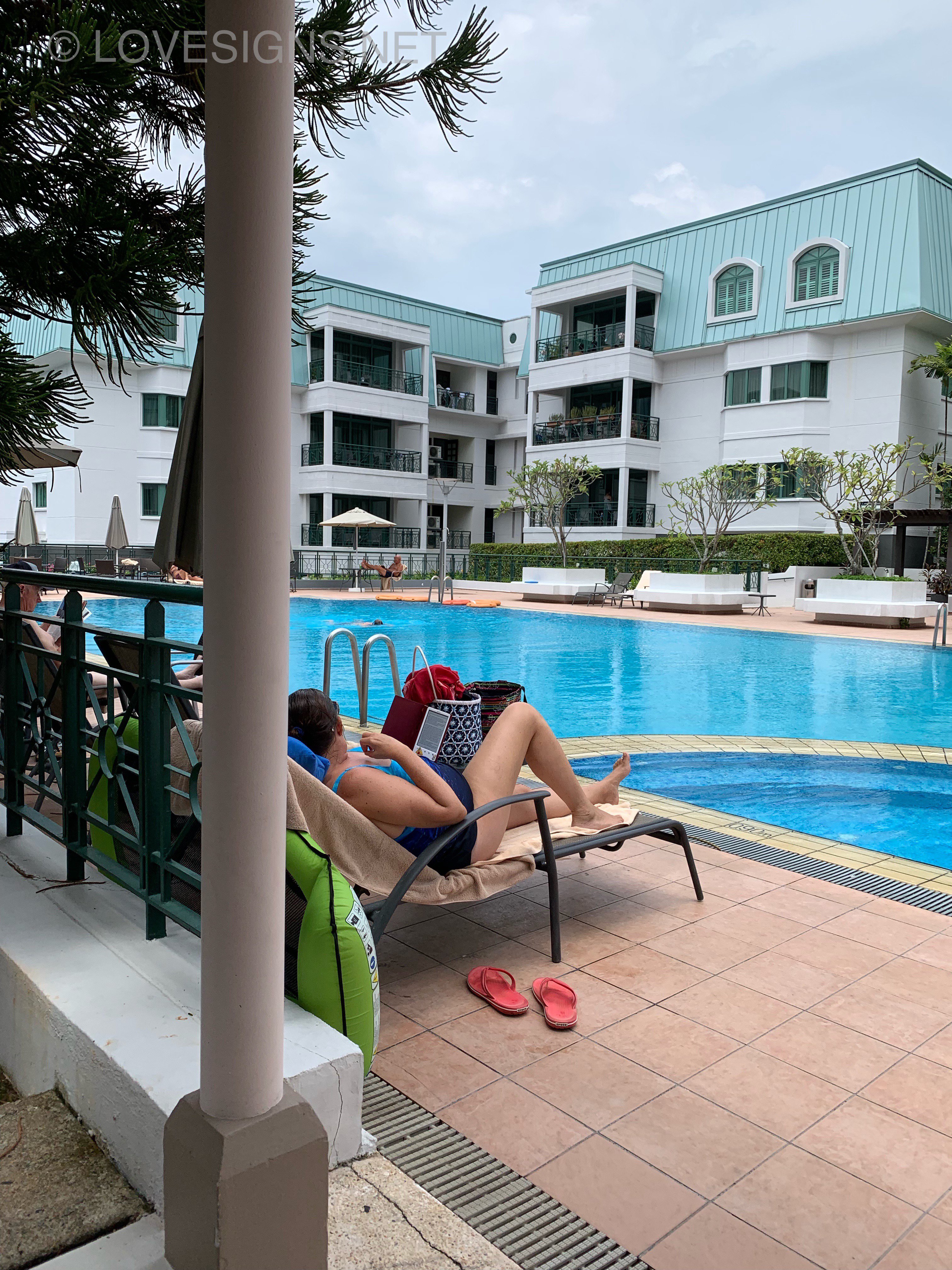
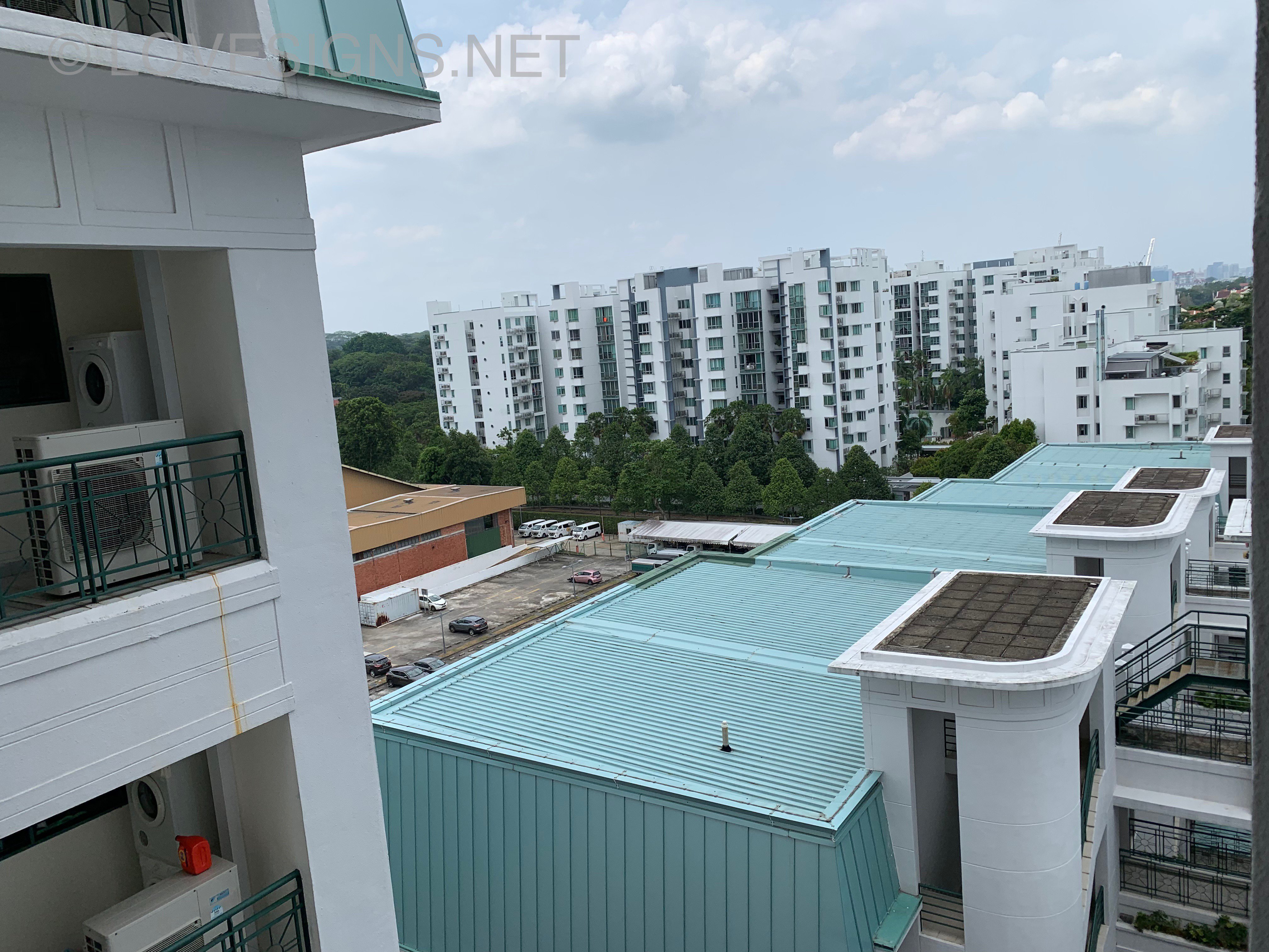
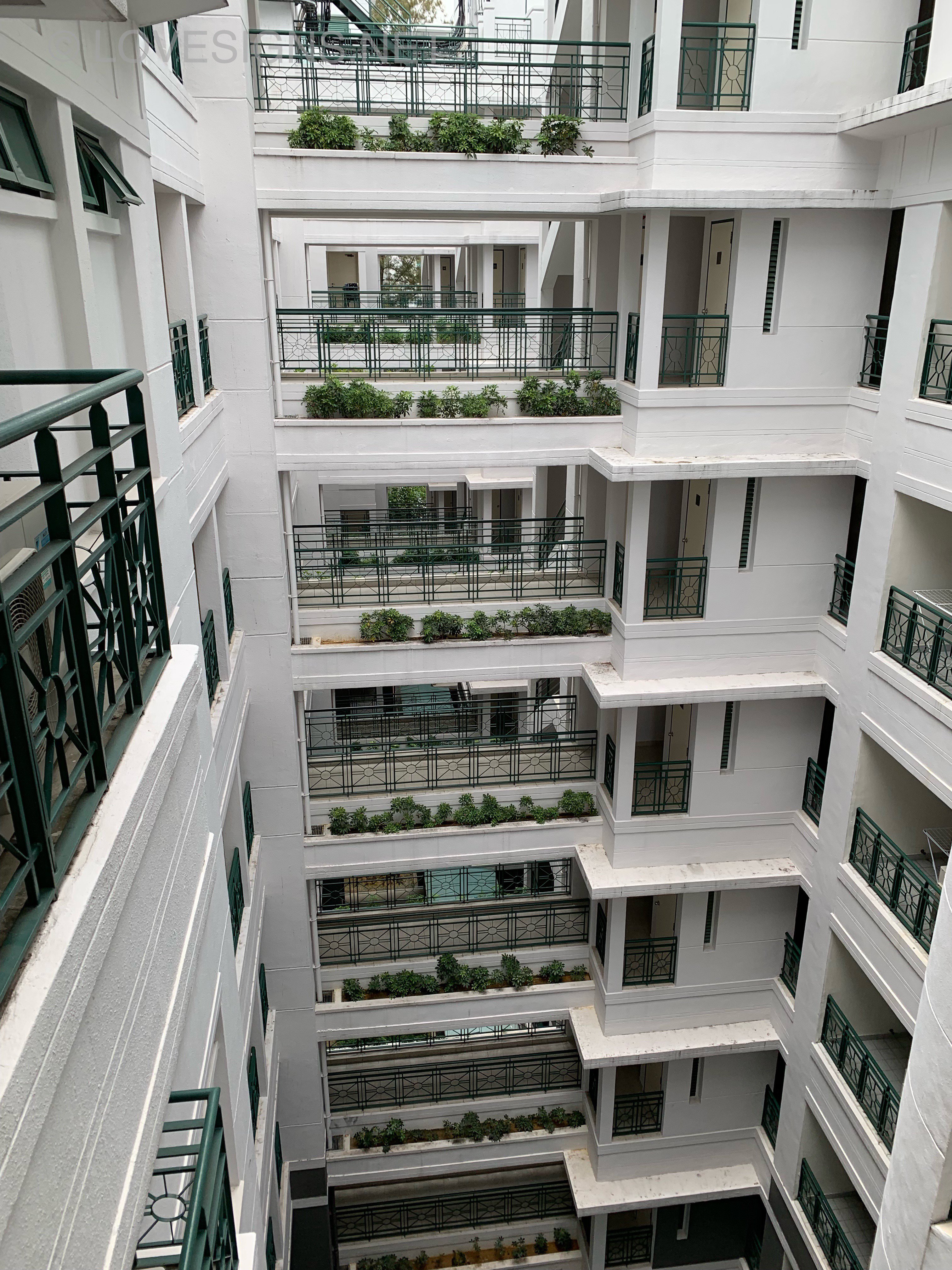
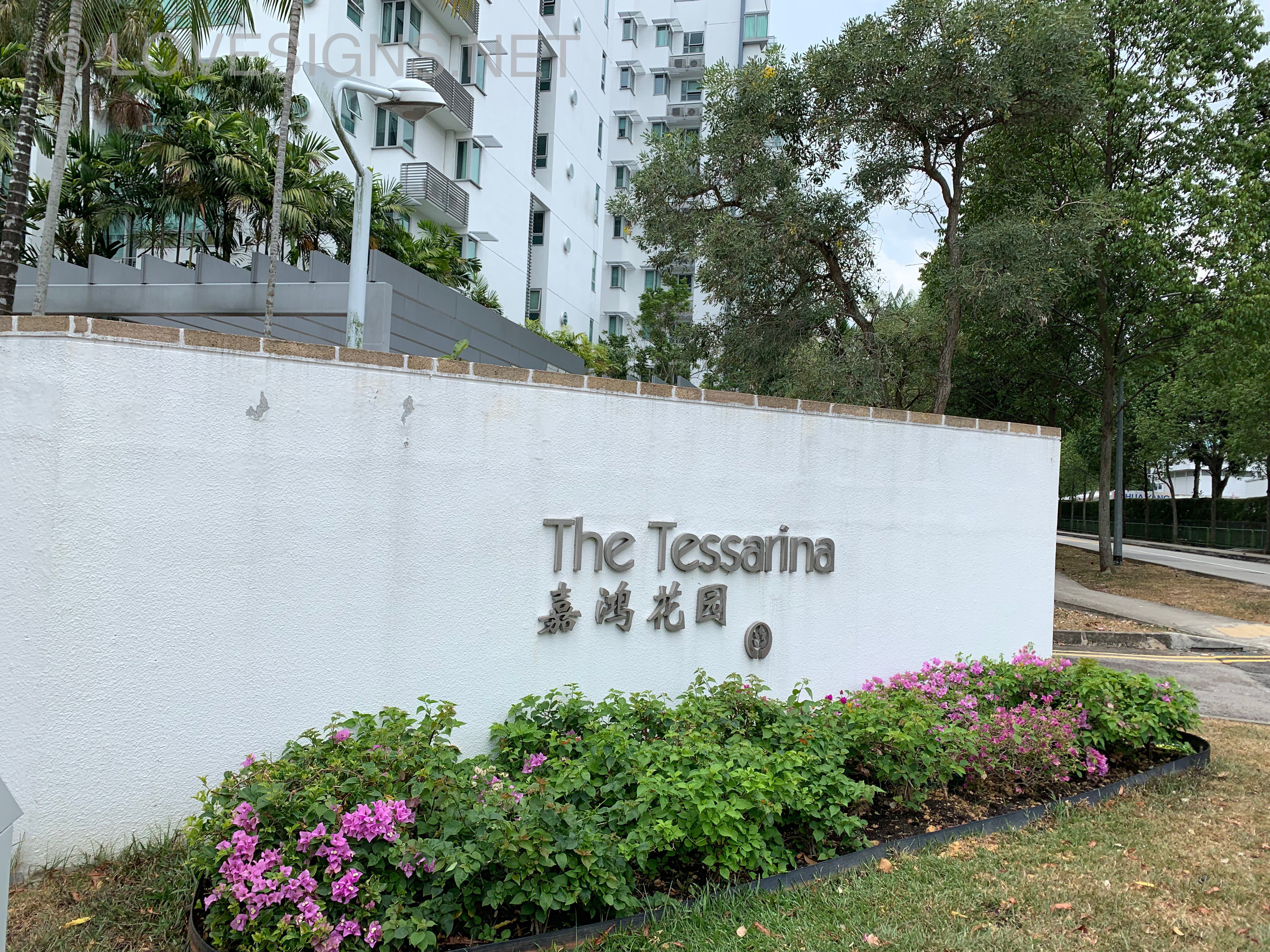
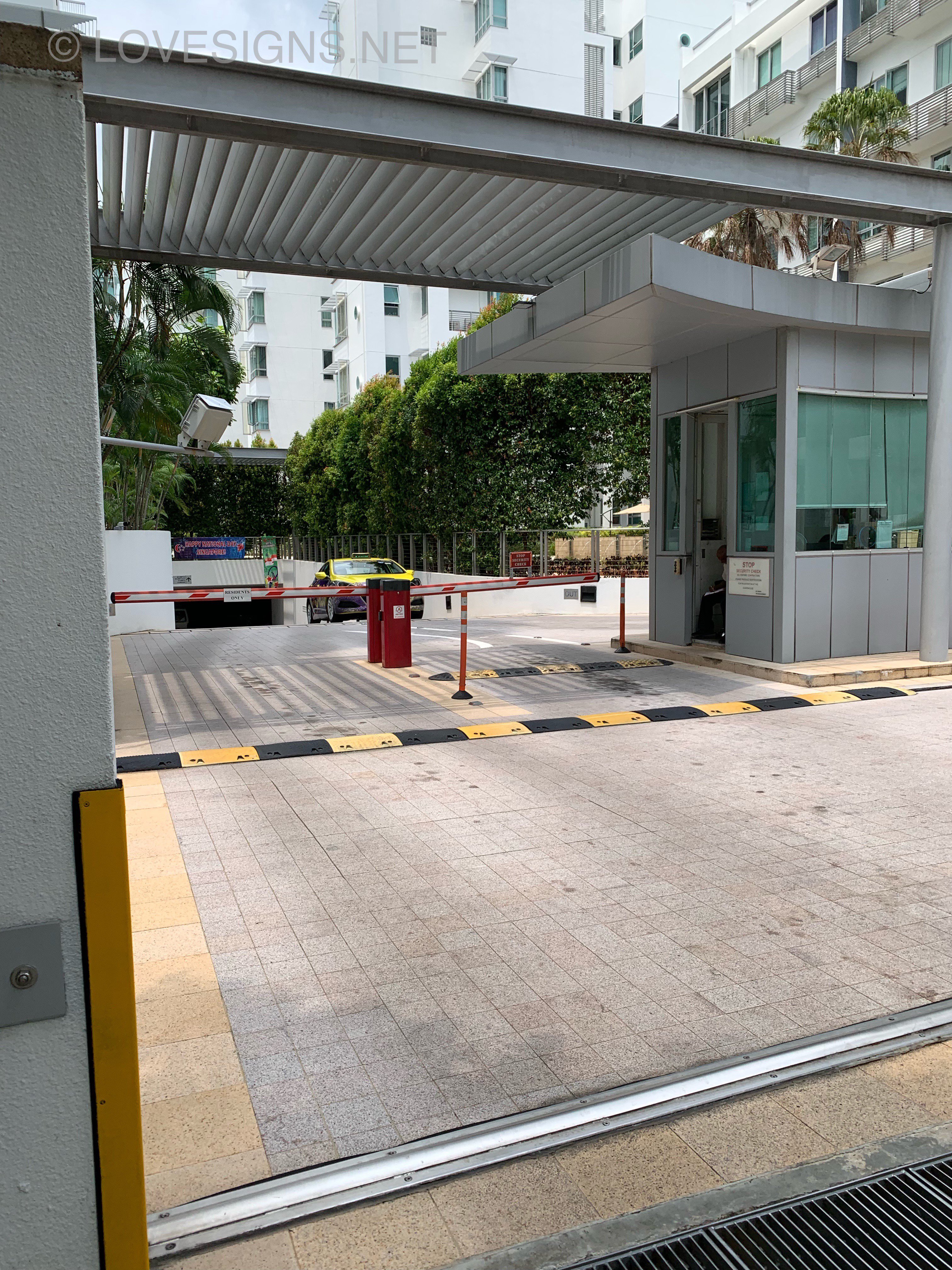
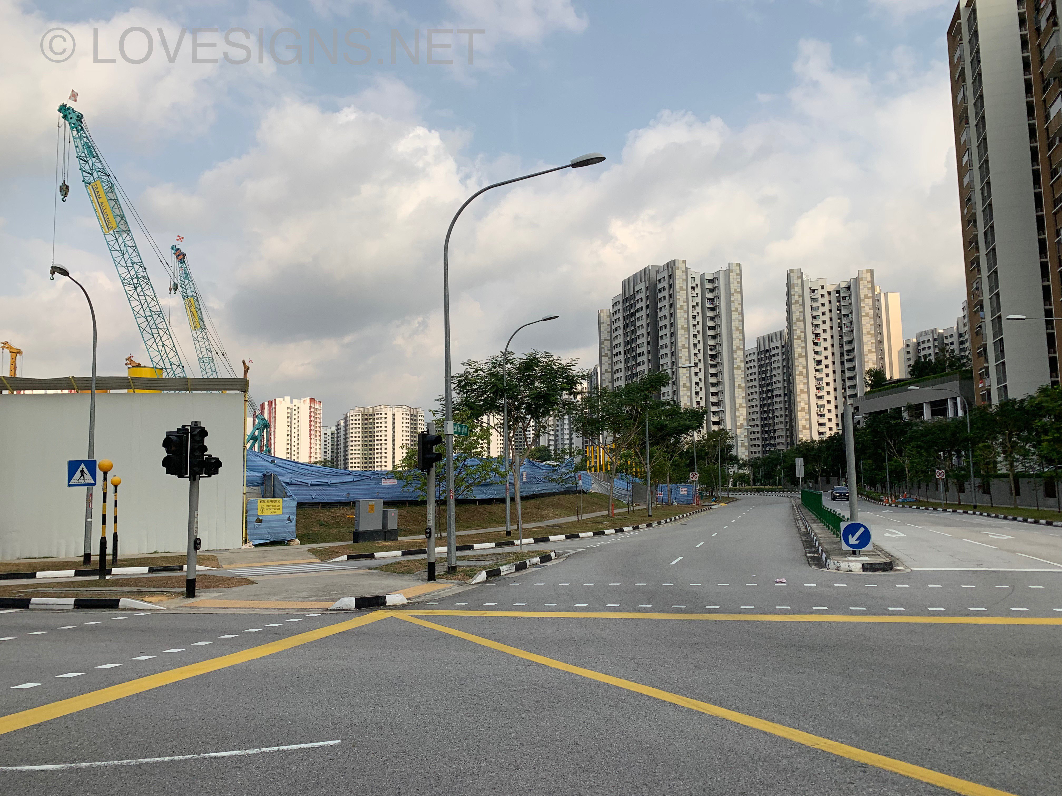
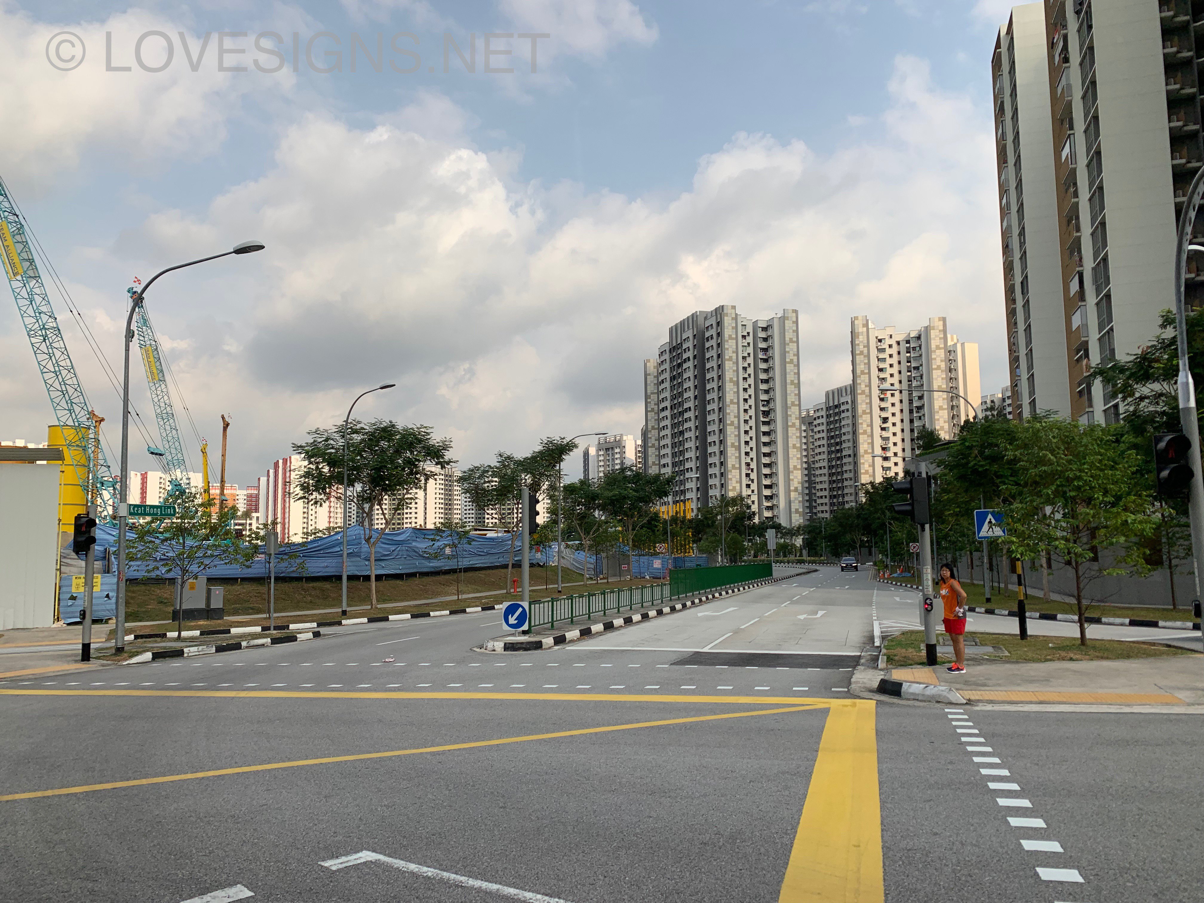
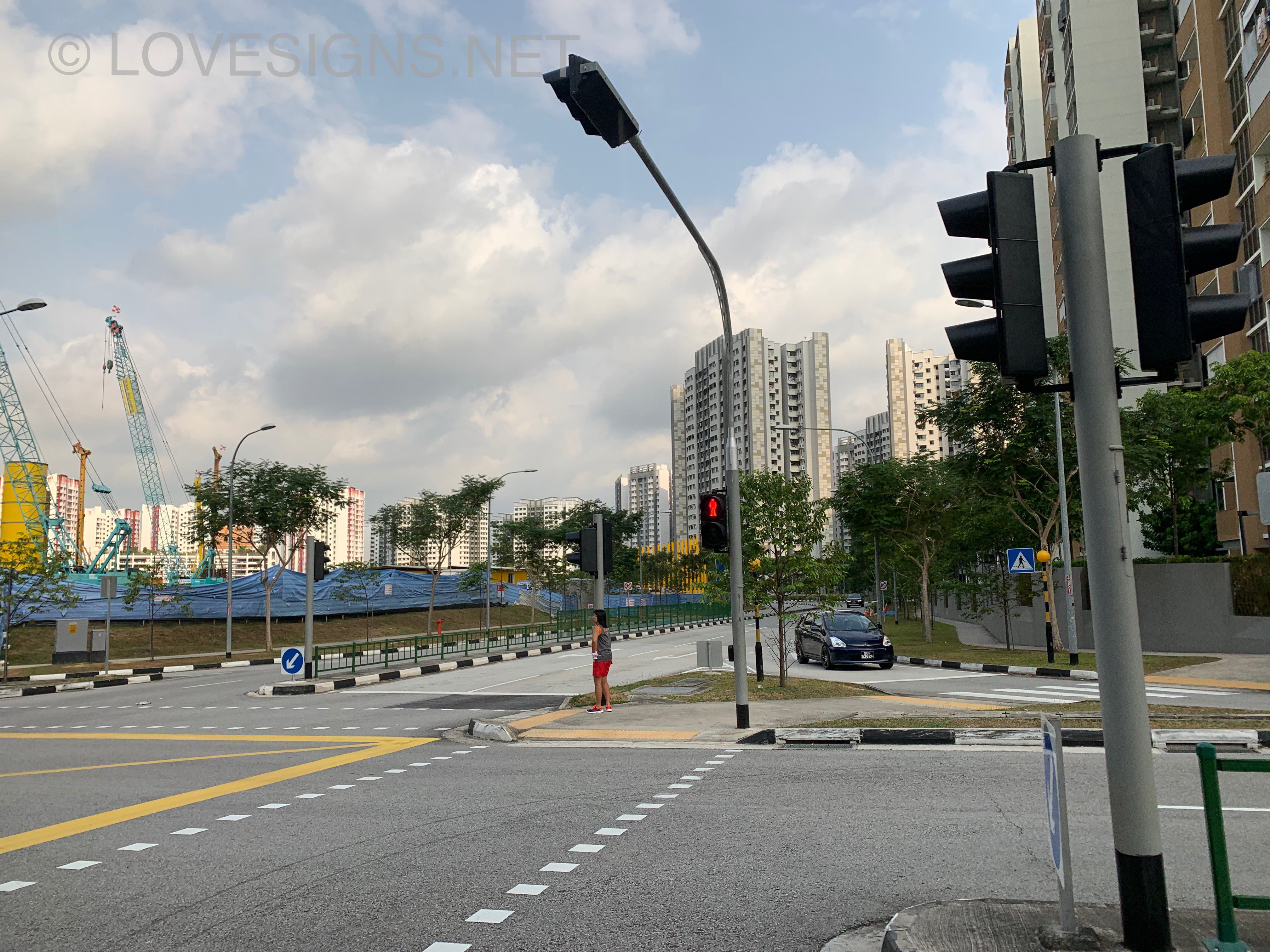
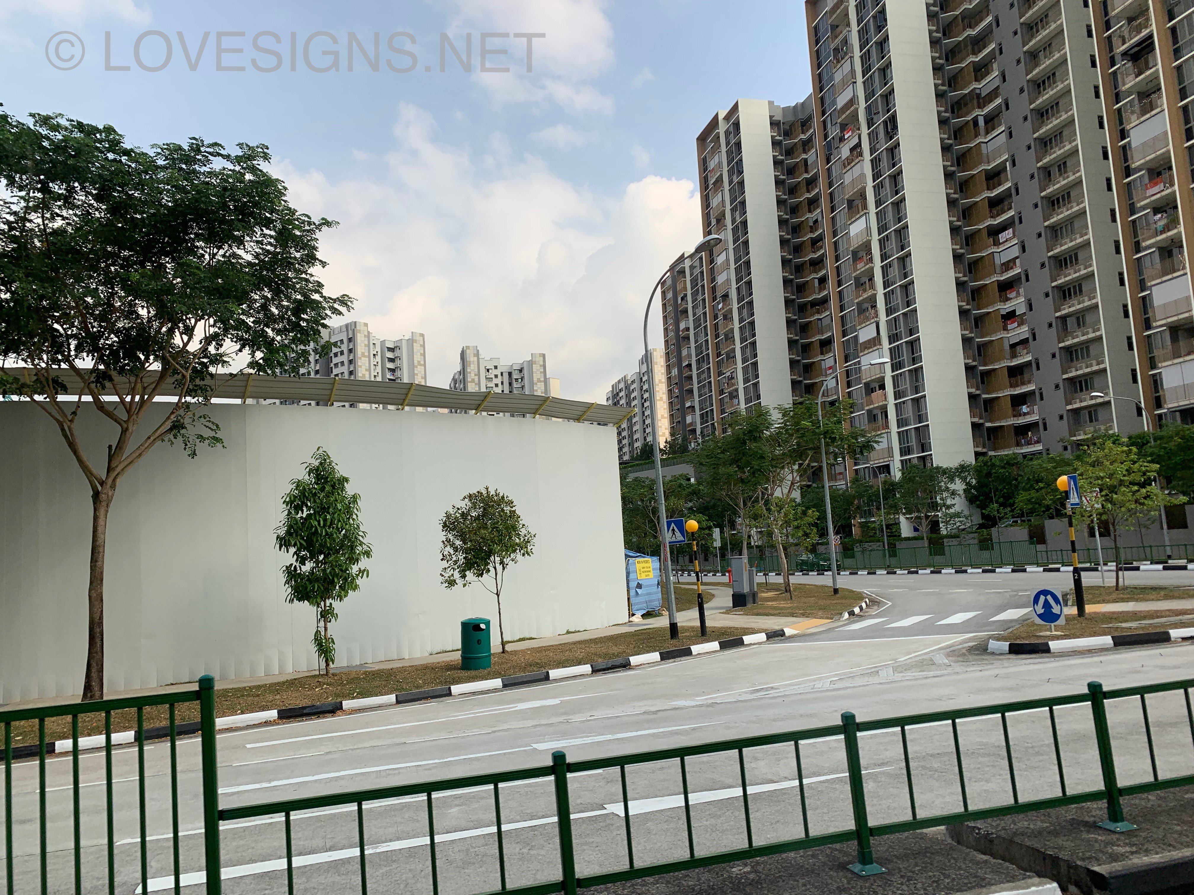
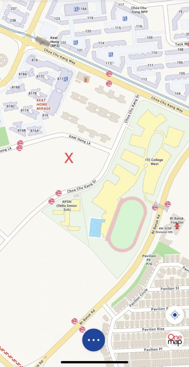

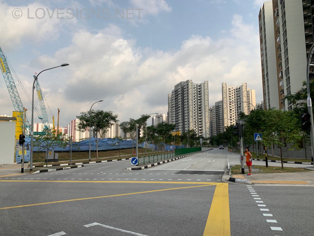


 HDB Teck Whye Vista Sales Brochure: Site Plan and Floor Plans teck-whye-vista.pdfPaid a few more visits... 26.2.2020... Early morning..prior to visiting a client at Verde Avenue... perk me up breakfast:

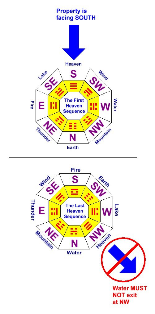
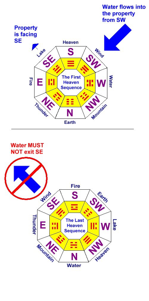
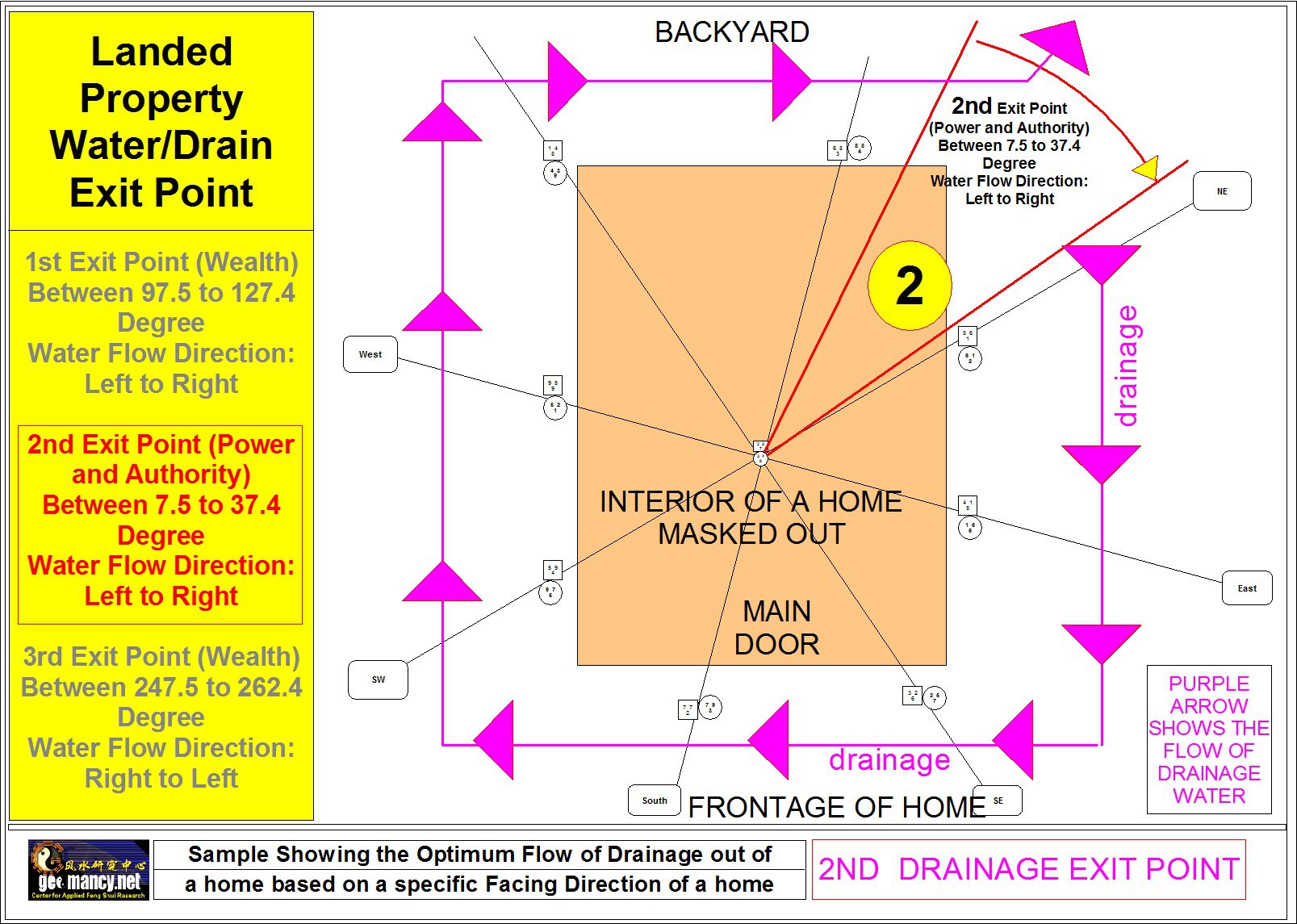
 We can use some formulas to look at it. Especially to see the flow direction of the longkang. Anyway, what is so bad about Singapore’s longkang might I add? Or unless one is say a Malaysian. And visualise the longkangs in K.L.? LOL These are some of the many techniques used ..to determine the flow of the longkang water. By the way, so Long as the longkang is not covered, it has to be examined ... under Feng Shui ... good or bad...
 1. More to do with the individual or if married couples their ba zi elements to see a preferred Guan Yin figure. 1.1 Unless one is going to be “married” for life to the same home.. then can do do. Else foolish to buy a Guan Yin based on just that home’s placement direction. 1.2 In Singapore, most young couples do change or upgrade a home several times. Do how’s your logic for this? Especially if the future direction may differ from this home that you are talking about. 2. There can be differences in opinions. Some is based on common sense. Some based on preferrences. 2.1 As through the years, some are horrified or felt that it is a stigma to use white. And or some feel that it can easily turn yellowish thru time due to the burning of incense.A. May be preferred. But no one should sleep exactly behind the same wall as the altar even if it is raised - up. And another concern may be the noise from the TV set. Sometimes it may be better to be at the sofa side... even if it faces the “bedrooms”. Thus placed closed to the balcony side (if any) or living room windows. B. NE and SW significance...Based on the water classics, yes, it does fit the auspicious profile.
 Cool furnitures and fittings https://www.facebook.com/100000175145968/posts/2963071940375282?s=100002404263621&sfns=moPart 4: Common sense says bring all family members for viewing of the unit... "Sir! This is a brand new home. So how to view? Huh?" Sorry... "My BAD".... Please ignore.. LOL...


Account
Navigation
Search
Configure browser push notifications
Chrome (Android)
- Tap the lock icon next to the address bar.
- Tap Permissions → Notifications.
- Adjust your preference.
Chrome (Desktop)
- Click the padlock icon in the address bar.
- Select Site settings.
- Find Notifications and adjust your preference.
Safari (iOS 16.4+)
- Ensure the site is installed via Add to Home Screen.
- Open Settings App → Notifications.
- Find your app name and adjust your preference.
Safari (macOS)
- Go to Safari → Preferences.
- Click the Websites tab.
- Select Notifications in the sidebar.
- Find this website and adjust your preference.
Edge (Android)
- Tap the lock icon next to the address bar.
- Tap Permissions.
- Find Notifications and adjust your preference.
Edge (Desktop)
- Click the padlock icon in the address bar.
- Click Permissions for this site.
- Find Notifications and adjust your preference.
Firefox (Android)
- Go to Settings → Site permissions.
- Tap Notifications.
- Find this site in the list and adjust your preference.
Firefox (Desktop)
- Open Firefox Settings.
- Search for Notifications.
- Find this site in the list and adjust your preference.